
Files
Download Thumbnail Sheet (614 KB)
Download Poster Set 2 and Books (1.2 MB)
Download "Rock" with Poster (2.6 MB)
Download "Scissors" with Poster (2.5 MB)
Download "Paper" with Poster (2.9 MB)
Download Title Vinyl (1.2 MB)
Download Alan Vinyl and Artist Statement (841 KB)
Download Show Postcard (Front) (120 KB)
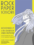
Download Show Poster (1.8 MB)
Academic Level at Time of Creation
Senior
Date of Creation
Fall 11-17-2017
Artist Statement
Rock, Paper, Scissors is a set of graphic novels that I created while investigating and commenting on the abolishment of social boundaries for the sake of contributing to a greater cause. The viewer can witness three di erent triads as they explore the work. First is the trio of characters that the reader will follow through the novels. Each character is derived from each of the social classes. The next triad is the set of primary colors that the books are illustrated in. The colors are also tied to social class, and, while the characters are separate, will make up the palette of the illustrations. However, as the characters come together, the palette will extend to include the other primary colors, developing the world into something greater than when they were alone. This development of color is meant to reinforce the concept of the uniting of the characters, and building something stronger than what existed before.
The final triad is rock, paper and scissors. This familiar triad is one that is widely recognized as a beloved children’s game. This game only works when all three of the triad are present. Rock beats scissors, scissors cuts paper, and paper covers rock. Likewise, this greater existence is not possible without all three characters, or more clearly, all three classes working together.
I created the novels so that, when held, they feel like a childhood storybook. This, combined with the childhood game of rock paper scissors, is intended to connect to any viewer as we have hopefully all read a storybook, and hopefully played at least one round of this game.
I hope that through these novels I can communicate the bene ts of working together towards a common goal, rather than allowing our di erences to segregate us. My in uences include John Chad’s graphic novels. Their level of detail inspires me to create a more intricate environment for the characters and the reader to inter- act with. I also reference Lucian Bernhard’s contrast between bold typography and cell-shaded illustrations to give my novels a dramatic, but readable quality.
Advisor/Mentor
Jim Bryant
Description
The gallery was designed to capture visitors’ attention and guide them to an intimate space where they could spend time in the graphic novels and reflect on the novel’s message. Two sets of posters were created to supplement the books themselves and serve as advertisements of a book release, similar to signs one might see in a bookstore before an anticipated volume reaches the shelves. The more vibrant colors from the first set of posters and the vinyl figures guided viewers through entrance of the gallery space toward the books displayed on a balcony.
Poster Set 1 was in the spotlights on the main wall of the Clara M. Eagle Gallery for viewers to see upon entrance. The playful colors were intended to attract attention in the windows of a bookstore and direct patrons to the entrance. This same elements were used to pull the viewer into the gallery space and direct their attention to the graphic novels.
The final poster of Alan pointing to the right aligned with the vinyl in the viewer’s line of sight from the entrance. This invited movement to the more intimate area on the balcony as the characters played a visual tag through the spaces. When standing closer to the wall, visitors could perceive Alan to gesture toward the show logo where visitors could take a postcard, sign the registry, or comment on the show before moving further into the exhibit. When repeated in the vinyl on a parallel wall of the balcony, Alan directed attention to Poster Set 2 and the corresponding graphic novels displayed on individual pedestals books.
The second set of posters were not intended to be attention grabbing, but invite attention to each of the three books. The panels are each taken from the books they represent. Their muted colors, vertical lines, and negative spaces were chosen to attract attention. The poster with the black, gray, and white book bindings to produced a harmonious relationship.
The books themselves were set out on pedestals with vinyl that strengthened the identity of the book with rock, paper, or scissors on their surfaces. The vinyl linework on each pedestal was understated and covered by the books themselves to be discovered when the books were lifted by a reader. This element was chosen for visual interest and to help solidify that relationship between books and icons on the corner of the three posters behind the books to unify the exhibit. Gallery viewers were encouraged to wander through space with these visual cues to bring them to the books. Having arrived, they were invited to read the books and consider the concept for themselves.
Photo Credit
Lauren Brown
Creative Commons License

This work is licensed under a Creative Commons Attribution 4.0 International License.
Recommended Citation
Hutson, Sara A., "Rock, Paper, Scissors" (2017). B.F.A. Practicum Exhibition (ART 498). 20.
https://digitalcommons.murraystate.edu/art498/20