Files
Academic Level at Time of Creation
Senior
Date of Creation
Spring 5-15-2018
Artist Statement
The importance of people and their roles in society are of great interest to me. Within our society the idea that certain individuals are held higher than others is the most interesting of others, usually based off of the privileges they have such as money, class, respect from others that not everyone gets. The ideas of our current societal norms paired with expectations are fascinating to me and how we as humans begin to react to them is something I enjoy including in my work. I am a designer, an innovator, artist and creator of things. I focus on the digital world of creating but 3 dimensional beings have always been something that will grab my eye. Using these ideas with geometry and dynamism is what I find when looking to create.
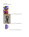
I use photography to start the creations of my digital illustrations. This imagery, creating a focal point and then accompanying it with geometric shapes is something that feels natural to me. Along with these ideas, I like to create pattern with textures and shapes, this helping the central theme. The use of positive and negative space shows through as well when it comes to my work. The shapes geometrically are simplistic but the composition is not as it could be said to be busy and chaotic. For example my work consists of a central figure or focus such as a person that is surrounded by varieties of shapes and movement.
Influences of the world are present. For me specifically, I draw inspiration from the Art Deco movement, specifically the architect William Van Allan who is best known for his work in the Chrysler Building in Manhattan, NY. The detail, pattern and line curvature as well the pattern and consistency of the design all are something that I find interesting and aesthetically pleasing. Other influence from that time are graphic designers Leo Marfurt and AM Cassandre. Constructivism and it’s use of shapes is also something I find highly intriguing such as the artist El Lissitzsky. As well as drawing inspiration from the past, I also find it in the present of the works by street artist turned graphic designer Shepard Fairey who came to fame by doing the Obama Hope poster as well as painter Kehinde Wiley and his use of color and pattern. These visual inspirations connect to me by their use of color, shapes and pattern. Kehinde Wiley is a painter that visually, the work isn’t compatible in style to the other examples but the use of pattern can be aligned to be similar as the use of pattern in the Art Deco examples. Naturally I am drawn to primary colors, their monochromatic difference within their color and how the colors work when put against one another. How these colors play off each other as well as how strongly they can stand alone is something I think lends itself to the theme of the people I am so interested it in the bigger picture; strong and individual but when put together intense and powerful.
Advisor/Mentor
T. Michael Martin, Jim Bryant
Description
A combination of digital illustrations and graphic design created while at Murray State University.
Recommended Citation
Crawford, Kelsey, "Professional Blend 3" (2018). Professional Practices (ART 399). 36.
https://digitalcommons.murraystate.edu/art399/36


