Files
Download Thumbnail Sheet (8.0 MB)
Download IMG_7868.jpg (3.5 MB)
Download IMG_7877.jpg (3.5 MB)
Download IMG_7878.jpg (3.6 MB)
Download IMG_7880.jpg (1.3 MB)
Download IMG_7886.jpg (2.7 MB)
Download IMG_7888.jpg (3.4 MB)
Download IMG_7893.jpg (4.4 MB)
Download IMG_7905.jpg (1.2 MB)
Download IMG_7907.jpg (1.3 MB)
Download IMG_7909.jpg (3.3 MB)
Download IMG_7895.jpg (3.8 MB)
Download IMG_7896.jpg (3.7 MB)
Academic Level at Time of Creation
Senior
Date of Creation
Spring 4-12-2024
Artist Statement
- Identity is extremely valuable but can be a broad category; and it never comes in a box but also with labels, addresses, materials, care, shapes, and sizes. Graphic design is everywhere and I believe its purpose is to create an identity and message but not all messages are for the greater good. Packaging in common food and other products includes labels of misleading or false information. The rules that enforce these labels and most of the time it’s pointless to label on. Words like “Natural” make some foods sound better than what the label implies. People are tricked into buying expensive products with the promise of a better product. I have created a satire based store around this idea expecting people to connect this experience to their own experience. The corner store I’ve created to attract people to view eye-catching products from afar, while holding the extreme absurdness up close. Bodegas usually provide cheap and everyday products in a tight compact space, I have recreated the look and feeling, with more expensive products. I want the viewer to pick up and look at the many products and realize how absurd it is and put it back and repeat. My artistic influences came from Kati Forner because of the product designs she has made with minimalism and clear hierarchy that pairs very well with her color choices. I am also inspired by Omega Mart because of the variety of odd products that would seem normal but out of place as a real product. I combine the styles of Kati Forner and Omega Mart to fit the show message with my experience on misleading products.
Advisor/Mentor
Jim Bryant, Gregory Scott Cook, Dr. Antje Gamble, T. Michael Martin
Description
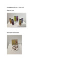
The Mart of 8th Ave is where satire meets design in a keen exploration of misleading products. In a world overwhelmed with deceptive marketing tactics, The Mart of 8th Ave challenges us to question the authenticity of the products we encounter daily. All the works were created digitally and then either screen printed or printed to craft into packaging design. there are other elements like video advertisement and collateral for a corner store like vinyl and shelving. There are 17 works in this exhibition.
Creative Commons License

This work is licensed under a Creative Commons Attribution-NonCommercial-No Derivative Works 4.0 International License.
Recommended Citation
zhao, jacob, "The Mart of 8th Ave" (2024). B.F.A. Practicum Exhibition (ART 498). 133.
https://digitalcommons.murraystate.edu/art498/133


