Files
Download Thumbnail Sheet (2.0 MB)
Download wave_Artboard.pdf (3.2 MB)
Download dive_Artboard.pdf (2.4 MB)
Download jump_Artboard.pdf (1.3 MB)
Download bsys_displayArtboard 1.pdf (3.2 MB)
Download table_lager_mock copy.png (27.8 MB)
Download lab_edits.pdf (427 KB)
Download raspArtboard 1.pdf (592 KB)
Download hopinArtboard 1.pdf (961 KB)
Download flatpkg_dieline.pdf (582 KB)
Download andysround.pdf (323 KB)
Download smcneil_postcard.pdf (215 KB)
Download vinylprop.png (246 KB)
Academic Level at Time of Creation
Senior
Date of Creation
Spring 2020
Artist Statement
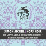
Hops Noir
Simon McNeil
I thrive inside confinement; I have to know the boundaries of the box in order to think outside it, so the formidable task of constructing my own box required a certain amount of self reflection. During a wistful trip down the six-pack aisle, I had an epiphany; in a sea of Millers and Bud Lights, I always ended up choosing drinks with interesting packaging/design, be it heavy illustration, bold color, or at the very least a logo with a ‘handmade’ quality. As a designer, that was how I wanted my work to be consumed, and it was the knowledge that people enjoyed what I made that drives me to not only make, but improve.
I have invented a fictional brewing company, titled Hops Noir, and my show features packaging, 12oz bottles and a cardboard carrier, advertising, large poster-size ads, a wall-vinyl, and collateral for the brewery. My work has moved toward keeping the handmade-qualities and imperfections that come from designing and sketching manually as the work transitions to a digital space. My recent work has incorporated spray paint and textured digital brushes; I work to keep the unique texture this provides when I scan/digitize elements for a design. When using photography in my work, it is important that people are present, the presence of the human figure, even if in just arm or hand, adds a sympathetic element, humanity, to the feeling of the brand. The human quality is an important visual cue to conveying the feeling I want to bring to the brand, and the people who would consume the product. In an era where industry has taken the human element away from the things we consume, imperfection and the human touch breathe a kind of life into the brand and product; even something mundane and disposable as a beer doesn’t have to be cold and distant. Brewing is an art, and I want to respect this art with my packaging.
Since having done a research project about Keith Haring, I’ve become enthralled by the Pop Art style; challenging me with the freedom to work looser with less complex forms, contrasting with my own preferred tightness and intensity. The crowded compositions of Haring’s work speaks to my own tight, puzzle-esque sense of design, but in practice this has challenged me to communicate without being busy, and in my own work I fight to learn restraint. This design sense compliments bolder typography, ensuring that the message is clear and apparent, while still allowing ample compositional room for the more visually-engaging elements such as illustration or photography. My exposure to Pop Art has also pushed me to work with a brighter color palette, though not quite as dramatic or saturated as historic examples. The lighter colors facilitate better communication, where darker palettes bring technical challenges in printing and clarity, working brighter has encouraged compositions giving the viewer’s vision a place to rest. Playing off my younger interest in historical type, I was fascinated by the way vintage advertisement utilized their economy of space, something again akin to my own busy senses. Now that I work on restraint, I’ve begun to appreciate the poignancy of fewer words, of clearer thoughts. A joke is best requiring no explanation, and a design is best with some moderation, moderation I work to reign in without losing the human touch of Hops Noir’s visual identity.
Advisor/Mentor
Jim Bryant; Feifei Pang; ZB Smetana; Mike Martin
Description
Yonder, Digital illustration for proposed wall vinyl, 2020 1246px x 1125px
Hops Noir batch 2 dielines, Digital Print of package dielines, 2020 12 x 19 in
Hops Noir batch 1 dielines, Digital Print of package dielines, 2020 12 x 19 in
Hops Noir American Lager carrier dielines, Digital Print of package dielines, 2020 33.1 x 46.8 in
American Lager table mock, Mockup image of constructed carrier, 2020 4413px x 6620px
Jump, advertisement poster, 2020 24 x 32 in
Amber Waves, advertisement poster, 2020 24 x 32 in
Dive, advertisement poster, 2020 24” x 32”
Hop In for local beer, poster, 2020 24” x 32”
Andy’s round, poster, 2019 18 x 24 in
Business system spread, digital print, 2020 18 x 24 in
Hops Noir Showcard Postcard design for physical BFA exhibition 4 x 6 in
Creative Commons License

This work is licensed under a Creative Commons Attribution 4.0 International License.
Recommended Citation
McNeil, Simon, "Hops Noir" (2020). B.F.A. Practicum Exhibition (ART 498). 62.
https://digitalcommons.murraystate.edu/art498/62


