Files
Download Thumbnail Sheet (7.7 MB)
Download Sequoia (left); 2021; 24”x18”; Digital illustration (848 KB)
Download Sequoia (right); 2021; 24”x18”; Digital illustration (703 KB)
Download Everglades (left); 2021; 24”x18”; Digital illustration (836 KB)
Download Everglades (right); 2021; 24”x18”; Digital illustration (1.7 MB)
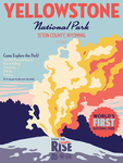
Download Yellowstone (left); 2021; 24”x18”; Digital illustration (658 KB)
Download Yellowstone (right); 2021; 24”x18”; Digital illustration (572 KB)
Download Glacier Bay (left); 2021; 24”x18”; Digital illustration (807 KB)
Download Glacier Bay (right); 2021; 24”x18”; Digital illustration (720 KB)
Download Saguaro (left); 2021; 24”x18”; Digital illustration (797 KB)
Download Saguaro (right); 2021; 24”x18”; Digital illustration (565 KB)
Download 5 Tshirts: 12'x9" (68 KB)
Download Fight the Rise commercial; 2021; 56 sec, 1080px x 1920px; Video (52.5 MB)
Download gallery (1.7 MB)
Download postergallery1.jpg (1.6 MB)
Download postergallery2.jpg (1.9 MB)
Download shirts.jpg (2.6 MB)
Download postcard (653 KB)
Academic Level at Time of Creation
Senior
Date of Creation
Spring 2021
Artist Statement
I have always been fascinated with the vastness of nature. It comes with this feeling of importance and magnitude that I want to capture. My show draws attention to the wonders of nature that are being lost to climate change. One the one hand, I want to give the viewer an appreciation and sense of wonder for these pockets of nature; I focus on the sublimity of these places, designing for five national parks that are being greatly affected by climate change. On the other, I want the viewer to understand that these spaces are being lost. I feel that illustration is the best form of communication to talk about climate change because, while these ideas and themes can be spread with text, it is easier for the viewer to visually understand the changes happening to nature through illustrations rather than large bodies of text.
In the Fight the Rise project, I have created an awareness campaign that uses a poster series because posters are an easily accessible form of spreading information, ideas, and imagery. I use vector drawing to create clean and concise shapes that form the illustrations, as well as a limited color palette that provides high contrast to the composition. This draws the viewer’s eye through the work and gives the work visual hierarchy. This hierarchy pulls the viewer’s gaze through the diptychs the posters create and tells the narrative of climate change’s destruction. I am illustrating national parks because they are well known areas that have more of an emotional and cultural impact than other lesser known stretches of land that are also being affected by climate change. I chose Sequoia, Everglades, Glacier Bay, and Saguaro National Parks because this collection of parks shows the range of climate change’s effects in vastly different environments. I am also illustrating Yellowstone National Park because it is the first national park, and one of the most recognizable features of the United States. Each park has two posters that form a diptych. Both halves of the diptychs mirror each other’s typography and palette creating a visual narrative. I use large, bold headers to grab the viewer's attention and smaller, finer fonts to provide the main information of the posters. Each poster also has a twenty-five point star icon that emphasizes an important fact about the park or climate change. The posters are large in order to overwhelm and inspire a sense of awe in the viewer to draw them into the illustration. I am printing the posters on recycled paper to further push the idea of working sustainably. I have also created collateral for my campaign which includes T-shirts and a motion infographic that explains ways to contribute to the fight of climate change. All of the collateral is designed to advertise my awareness campaign using the same typography, color palettes, icons, and hierarchy as my posters.
My campaign connects very different areas in the country, so I looked to campaigns like the National Park Service’s Recreate Responsibly campaign and the Lewis and Clark National Historic Trail poster series which both span multiple parks and states. By looking at these campaigns I was inspired to use the same hierarchy of typography and star icons across all of my posters to tie the compositions together despite their vastly different illustrations.
Advisor/Mentor
Jim Bryant, Dr. Antje Gamble, Todd Herzberg, T. Michael Martin
Description
This show is an awareness campaign mainly featuring digitally illustrated 18"x24" posters printed on recycled paper that are designed to educate the public about climate change's devastating effects on the national parks. I chose the national parks because they are very culturally visible in this country. Each park has two posters; one is the scenic souvenir poster while the other shows how they are being destroyed by climate change, whether that is from rising temperatures or decreased rainfall, or rising sea levels. This forms a diptych the illustrates the narrative of climate change's effects. For example, the first Yellowstone poster shows the famous Old Faithful geyser but the seconds shows how it is drying up due to lack of snowmelt caused by climate change's increased temperatures.
Photo Credit
Photo credit, Elaine Fitzgerald, 2021
Creative Commons License

This work is licensed under a Creative Commons Attribution-NonCommercial-No Derivative Works 4.0 International License.
Recommended Citation
Fitzgerald, Elaine C., "Rising" (2021). B.F.A. Practicum Exhibition (ART 498). 73.
https://digitalcommons.murraystate.edu/art498/73


