Files
Download Thumbnail Sheet (1.5 MB)
Download First Poster 20"x20" (1.5 MB)
Download Second Poster 20"x20" (17.6 MB)
Download Third Poster 20"x20" (1.2 MB)
Download Fourth Poster 20"x20" (28.8 MB)
Download Fifth Poster 20"x20" (32.3 MB)
Download Sixth Poster 20"x20" (933 KB)
Download Exhibition Photo 1 (2.8 MB)
Download Exhibition Photo 2 (16.2 MB)
Download Exhibition Photo 3 (15.2 MB)
Download ex4.pdf (15.4 MB)
Academic Level at Time of Creation
Senior
Date of Creation
Spring 4-23-2021
Artist Statement
I thrive through the creation of minimal and concise designs. To me, I find the beauty not only in the finished design or shape but throughout the process as well. Through my delicate lines and dramatic forms, I am able to create connections with my clients to not only fuel my passion but cultivate their dreams. My love for design is found in illustrations, branding, and typography. These are the skills that I have been honing the past few years. Illustration allows me to combine the commercial use of design while also having creative freedom. Through delicate lines that vary with length, width, and distance apart; I have been able to create a stylized form of imagery that adds to the overall theme of a brand. Being able to understand the rules to design is the foundation to be a designer however, knowing how to manipulate the rules to create not only a dynamic but also a balanced design is what produce a more diverse design.
Due to it’s organic element with endless possibilities and functions, clay has been a medium I have enjoyed working with. Currently, I find myself being drawn towards the minimal shapes with sharp lines paired with a black or white glaze. It is the dramatic forms such at the lengthy straight lines or interesting curves that I highlight by only having few design elements to keep the attention on the functional yet modern shape.
The process of branding a coffee shop has been an encouragement to finding the middle point of where both my passions can be seen in the same idea. I have been inspired by Radim Malinic’s work due to his package design and brand identity. His depth in this field and his ability to create eye catching work due to his great sense of color, has been an influence if my current work.
A ceramicist that has inspired my work is Branan Mercer. His work is interesting due to his dramatic shapes that could not only stand-alone but also works beautifully with his thick glazes.
Advisor/Mentor
Jim Bryant; John Utgaard; Nicole Hand-Bryant; Timothy Martin
Description
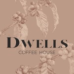
For my senior exhibition and I chose to combined two subject matters that I am very passionate about. I decided to infuse my body of ceramic work with my love for design. Over the past year I have fell in love with illustration and decided to go very heavy in that direction. Overall the concept of The body of work was to brand a coffee shop and I did so by illustrating posters advertisements and collateral pieces such as coffee bean bags to go cups and to go boxes. I thought that the set up of how I percent of my work had a huge part in bring my ideas to life. I presented roughly 30 ceramic pieces that I have made over the course of my senior year and I Believe it shows a cohesive body of work that works well with my illustrations and design side.
Everything you will see is either made on a digital file and print it out on paper or I have thrown it on a wheel.
Creative Commons License

This work is licensed under a Creative Commons Attribution-NonCommercial-Share Alike 4.0 International License.
Recommended Citation
Cecil, Amillia, "DWELLS Coffee House" (2021). B.F.A. Practicum Exhibition (ART 498). 84.
https://digitalcommons.murraystate.edu/art498/84


