Files
Download Thumbnail Sheet (312 KB)
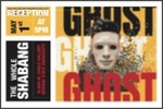
Download an album cover for the music “GHOST” by Ryan Caraveo. The dimensions for this project is 10X10 inches. I used a a grid layout and created a sense of balance using colors and hierarchy. (3.3 MB)
Download This project is related to the album art. I used the same song "GHOST" by Ryan Caraveo and made a music video containing line animation which helped me give the video a visually pleasing element as well as helped me express the words and the theme of the video itself. This is a 3 min music video (180.4 MB)
Download This is a paper sculpture, whose dimensions are approximately 20X10 inches, this artwork is called "Suspended Balance." There is a suspened small paper circle from the ceiling hanging just above the corner of the cube which is balanced on the top of the cone. These basic shapes being balanced in a dynamic position is aesthetically pleasing to look at. The intentional suspended ball crossing over the cube without touching it is done to get a reaction out of viewer. This project is displayed in red blue and green light which merges and gives the artwork a purplish theme and a moving shadow in the background. (55 KB)
Academic Level at Time of Creation
Senior
Date of Creation
Spring 5-1-2020
Artist Statement
Aman Madan
Spring 2020
Artist Statement
My work usually has something to do with balance. Being a Hindu, I have always believed in Karma, which is the sum of a person's actions in this and previous states of existence, viewed as deciding their fate in future existences. The law of Karma ties along with balance in life. Therefore, I’ve been a firm believer in balance. I believe it exists everywhere and is essential for any sort of growth. The key to life is balance. Some of my recent sculptures were completely exploring the term balance in different ways.
As a graphic design major, majority of my artwork is done on the computer, using Photoshop and Illustrator and other design software’s. My designs vary from typographic quotation, illustrations, UI&UX design to 3D installations to video sculptures. I chose graphic design because I seem to do fine with technology and I feel it is a good way to communicate to the audience and yet be creative enough to grab their attention and convey the message. I tend to work with the visual hierarchy, fonts and contrast to make it readable yet aesthetically pleasing, trying to find the balance and keeping up with trends. Graphic design gives me the freedom to incorporate my drawings within my work. My UI mobile application aesthetics are made user experience friendly, easily navigable. I use gradient color in my UI designs after researching about the application. Some artists I look forward to their work and take inspiration from are Craig Frazier, David Carson, Milton Glazer and Saul Bass for Illustrations and Massimo Vignelli, Paula Scher, Louise Fili and Paul Rand for the typography.
I lean towards working with a limited color palate, mostly black/white or complimentary colors because for me it adds up a timeless quality and makes the work cleaner and helps add contrast to my work. Sometimes using just one color against the black and white helps me to add an emotional appeal to the artwork or emphasize on something (keeping up with the meaning). I have a corporeal drawing in which I only added hints of red, to convey that the figure is hurt, which heightened the emotional value of the drawing. Most of my graphic design work uses combination of two complementary or contrasting colors. Illustrations is where is where I chose to work with a wider color palate, as it depends what I’m trying to express and what the client requires and then try to find the balance between that.
As Danielle Orner said, “Life is a balance between what we control and what we cannot. I’m learning to live between effort and surrender.”
Advisor/Mentor
Sarah Martin
Description
Aman Madan
Spring 2020
Exhibition Narrative
I’m planning to showcase 3 artworks. One of them will be a graphic design piece. For which I’m planning to design an album cover for the music “GHOST” by Ryan Caraveo. It will be mounted on the wall. It will be 10X10 inches. I will be using a grid layout and create a sense of balance using colors and hierarchy.
The other piece will be a video artwork. It will be related to the album art. It will be a music video for the same song. I’m planning to project it on the wall. The video will have line animation along with some dance moves. It will be a 3-minute video and the aim of the piece is to express the music itself using my creativity and give the user a “wow” experience.
For my third artwork, I will be putting a small 3D geometric paper sculpture on it revolving around the idea of balance and it will be called “suspended balance.” I will be suspending a small paper circle from the ceiling using a fishing net at a point where it barely touches the tip of the cube. I would display this in red, blue and green light that will cast a shadow on the wall and create a harmonious effect for the viewer.
Photo Credit
Aman Madan
Recommended Citation
Madan, Aman, "Whole Shabang" (2020). B.A./B.S. Practicum Group Exhibit (ART 499). 38.
https://digitalcommons.murraystate.edu/art499/38


