Files
Academic Level at Time of Creation
Senior
Date of Creation
Spring 4-28-2024
Artist Statement
As an artist, my design is heavily inspired by a lifelong passion for creativity and desire to effectively communicate with an audience. My work tends to lean into the realm of swiss design, characterized by simplistic layout and bold san-serif typography. The use of neutral tones and bold hierarchy contribute in building an effective but unique way of communication to the viewer. Oftentimes, my work conveys complex ideas that provoke the viewer to deeper understanding behind a seemingly superficial piece of work. I enjoy exploring the concepts of reliance on technology, false imitation and abstraction within a composition.
I find outside influence in several designers such as Saul Bass and Paul Rand. Bass possessed the ability to captivate the viewer through the use of non-traditional typography and simplistic but contrasting color pallets. This can be seen in several poster design series throughout his career. Rand however, primarily drew his inspiration from the Dada movement. The use of geometric figures and child-like illustrations promotes an abstracted but modern portrayal of childrens book covers. Although both of these artists use several methods of unique abstraction, they also are excellent at logo design. Similarly, I hope to portray both sides of Bass and Rands abstraction and clean straightforward design within my work.
Along with these well known designers, I also have outside influences that have shaped the composition and concepts within my design. Growing up I feel that my family promoted this constant expectation of perfection and unachievable expectation. Often in my work, this idea of flawed perfection is transparent and highlighted to better convey the message. Additionally, as a High School student I also enjoyed creating and listening to all genres of music. This influenced my work to be more aligned with pop culture and better able to express myself through abstraction.
As a college student, I'm continuing to grow and learn more about the principles of design as well as the balance between abstraction and simplistic composition. In past work, this has been done through the use of geometric shapes paired with a contrasting collage style. I've also found using simple compositional techniques such as repeating elements or a drop shadow can also be effective. I'm looking forward to designing, creating, and implementing these principles in the future.
Advisor/Mentor
T. Michael Martin
Description
Exhibition Summary:
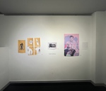
My exhibition will display several works that showcase the effective use of design principles through digital media. Primarily, most of my work uses previously existing brand guidelines and leverages elements such as balance and depth. For example, the MSU Disc Golf team logo and branding, is an on-brand extension of the Murray State University branding guidelines. Overall, I want the exhibition to communicate my ability to effectively design and allow viewers to peer into my creative thought process.
Vision Statement and Exhibition Objectives:
I hope to use my designated gallery space to organize my work in such a way that the viewer can conveniently and seamlessly visually navigate my section of the exhibition. Posters and digital design will be printed and installed with magnets. Lighting needs to be bright, but not glaring off of the semi-gloss poster material. Work within the same collection will be grouped together visually and evenly distributed. Magnets can be borrowed from the gallery spaced and returned after the exhibition.
Photo Credit
Grant Hoffman, 2024
Creative Commons License

This work is licensed under a Creative Commons Attribution 4.0 International License.
Recommended Citation
Hoffman, Grant, "A Showcase of Digital Design" (2024). B.A./B.S. Practicum Group Exhibit (ART 499). 70.
https://digitalcommons.murraystate.edu/art499/70


