Files
Download Thumbnail Sheet (1.2 MB)
Download CastlenMaria_artiststatement&vinyl.jpeg (2.0 MB)
Download CastlenMaria_brandguide1.jpeg (768 KB)
Download CastlenMaria_brandguide2.jpeg (1.2 MB)
Download CastlenMaria_n&k_exhibition1.jpeg (1.4 MB)
Download CastlenMaria_n&k_exhibition2.jpeg (1.9 MB)
Download CastlenMaria_n&kBox.jpeg (1.7 MB)
Download CastlenMaria_vinyl.jpeg (3.4 MB)
Download websitemockup.jpg (864 KB)
Download CastlenMaria_vinylLogo.jpeg (290 KB)
Download CastlenMaria_pattern_mockup.jpg (14.7 MB)
Download CastlenMaria_ShowPoster3.jpg (914 KB)
Academic Level at Time of Creation
Senior
Date of Creation
Spring 5-8-2025
Artist Statement
Growing up surrounded by tales of the “olden days”, embroidery was a thrilling discovery. It was a beautiful and unique way to create, while also learning a skill my mother praised. As I’ve grown, I’ve discovered ways to combine graphic design with the embroidery through branding. needles&knots prides itself for the beginner-friendly and practical embroidery kits. Whether you’re a seasoned stitcher or just learning your lazy daisies, our kits take care of the supplies so you can focus on what really matters: crafting something with you love.
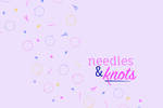
At the beginning of its creation, I began to create needles&knots’ visual identity, starting with my favorite embroidery stitch, the lazy daisy. The visual identity is supported by a bright mix of pinks, purples, navy, and yellow. These are accented by a motif of embroidery related illustrations, as well as, you guessed it, lazy daisies. Composed of a mixture of a san-serif font and flowing handwritten, the needles&knots logo is inspired by embroidery stitches. Both flowing and rigid stitches are often combined to create a harmonious embroidery piece, balancing each other out. I chose a san-serif font to balance out the handwritten portion and provide more structure. All the elements, in different combinations, create needles&knots’ visual identity and are applied throughout the brand. Most noticeably, the packaging is where these all come together. The brown kraft paper, for the packaging, was chosen for its rustic and minimalist aesthetic
There are many artists and designers that inspire me. However, for this project, in particular, there were a specific few. The Not Your Mother’s brand was a big source of inspiration. The typography, color palette, and decorative elements work so well together, and the overall aesthetic is a particular favorite of mine. Spoonful of comfort is another inspiring brand, specifically their packaging. It’s simple yet strong with a wide range of elements, while staying cohesive. Although a newer inspiration, Shivani Toshniwal’s work for Amika, designing their website, is an additional favorite. Her design for their website blends perfectly with their packaging as well as being easy to navigate, simple, and eyecatching.
Advisor/Mentor
Gregory Scott Cook, Jim Bryant, Mike Martin
Description
Boxes: 80 weight kraft paper, 6 in x 8.6875. Colored Vinyl Logo: vinyl, 22 in x 36 in.
Photo Credit
Photo Credit, Mike Martin, 2025
Creative Commons License

This work is licensed under a Creative Commons Attribution-NonCommercial-No Derivative Works 4.0 International License.
Recommended Citation
Castlen, Maria, "needles&knots" (2025). B.A./B.S. Practicum Group Exhibit (ART 499). 77.
https://digitalcommons.murraystate.edu/art499/77


