Files
Download Thumbnail Sheet (485.5 MB)
Download powderlybfa1.png (9.9 MB)
Download powderlybfa2.png (19.8 MB)
Download powderlybfa3.pdf (851.6 MB)
Download powderlybfa4.png (2.6 MB)
Download powderlybfa5.png (2.6 MB)
Download powderlybfa6.png (2.3 MB)
Download powderlybfa7.png (3.3 MB)
Download powderlybfa8.png (2.2 MB)
Download powderlybfa9.jpg (56 KB)
Download powderlybfa10.jpg (98 KB)
Download powderlybfa11.jpg (96 KB)
Download powderlybfa12.jpg (103 KB)
Download powderlybfa13.jpg (108 KB)
Download powderlybfa14.jpg (3.1 MB)
Download powderlybfa15.jpg (3.7 MB)
Download powderlybfa16.png (1.0 MB)
Download powderlybfa17.jpg (4.6 MB)
Download powderlybfa18.jpg (4.2 MB)
Download powderlybfa19.png (1.8 MB)
Download powderlybfa20.png (1.7 MB)
Download powderlybfa21.jpg (1.1 MB)
Download powderlybfa22.png (1.9 MB)
Download powderlybfa23.png (1.4 MB)
Download powderlybfa24.jpeg (311 KB)
Download powderlybfa25.jpg (5.5 MB)
Download powderlybfa26.jpg (4.2 MB)
Download powderlybfa27.jpg (3.6 MB)
Download powderlybfa28.jpg (5.1 MB)
Academic Level at Time of Creation
Senior
Date of Creation
Spring 4-29-2022
Artist Statement
Sports design is marked by the ability to unite people behind a communal message. Growing up, athletics and art became anchors in my family. Most of my time was spent playing outside with my dad and brothers, while my mom taught me how to stretch my creativity and make art, seeing things for the end result and finding the beauty in the process of creating. Later on, I witnessed sports and art build community and cultivate creativity, functioning as something more than just entertainment, but a key part in bringing people together. This project entwines the energy and unity of sports culture with the essence of clean design.
Britt Davis’s work and my own experience as a St. Louis Blues intern serve as the inspiration for this portfolio. As an intern, implementing new brand guides highlighted the paramount role branding plays in the sports industry and within a community. Through design, teams create personality and cohesion, a story that fans can rally behind. This project series combines these formative experiences with Britt Davis’ use of creative strategy in drawing inspiration from a city’s people, culture, and history to create a unifying and cohesive brand.
The Kansas City Beasts brand is built on the foundation of intentional design–utilizing typography, texture, photography, and a strong color palette to create a cohesive identity system. The construction of the team’s culture and fan experience inspired a design that would connect the essence of the team to the community. The brand features unified yet bold, modern typography, which sometimes interacts with the layout or photo itself to create an illusion of depth or abstraction within a design, invoking the city’s trueness and grit. The brand maintains a balance between clean and complex relationships, relying on textures and patterns to break up space within a composition. These formal elements result in work that is both functional and communicative. The designs present information in a comprehensible way regardless of fans’ knowledge of sports, highlighting the city’s collective people rather than individuals.
The digital and print project series communicates the identity of the Kansas City Beasts through manipulating contrasts within the foundation of the design. The poster series in particular centers on cut-out photography on top of vivid, textured backgrounds, combined with bold typography to form an engaging composition. These eye-catching projects brim with impactful visuals, intentional movement, and a lively yet subtly gritty tone.
Advisor/Mentor
Jim Bryant, Gregory Scott Cook, Antje Gamble, Jeanne Beaver, Mike Martin
Description
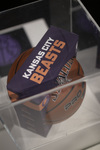
This exhibition showcases a unitive brand system for an NBA team for Kansas City, Missouri which consists of various different projects across different media. I exhibited a series of five posters, game calendars, physical game tickets, t-shirt and hat merchandise, a basketball package design, social media graphics, a plexiglass cutout, and a team website. Through its design, I created a cohesive and energetic way to pull any viewer in. With bold typography, energetic photography, and textural solutions, this series feels gritty, modern, exciting, and engaging.
Photo Credit
Photos #25-28 by Claudia Kern, all others by Lauren Powderly
Creative Commons License

This work is licensed under a Creative Commons Attribution-NonCommercial-No Derivative Works 4.0 International License.
Recommended Citation
Powderly, Lauren, "Kansas City Beasts" (2022). B.F.A. Practicum Exhibition (ART 498). 102.
https://digitalcommons.murraystate.edu/art498/102


