Files
Download Thumbnail Sheet (7.8 MB)
Download RebeccaPotts_Reflection_1.jpg (700 KB)
Download RebeccaPotts_Freedom.jpg (726 KB)
Download RebeccaPotts_Silenced_1.jpg (798 KB)
Download RebeccaPotts_Grounded_1.jpg (991 KB)
Download RebeccaPotts_Unseen.jpg (813 KB)
Download RebeccaPotts_Trust_1.jpg (811 KB)
Download RebeccaPotts_MotherandChild.jpg (866 KB)
Download RebeccaPotts_Brochure_1.jpg (470 KB)
Download RebeccaPotts_Brochure_2.jpg (543 KB)
Download RebeccaPotts_Safety.jpg (256 KB)
Download RebeccaPotts_TrailSigns.jpg (595 KB)
Download RebeccaPotts_WomenintheWild.jpg (293 KB)
Download RebeccaPotts_AdCampaign.jpg (442 KB)
Download RebeccaPotts_FamilyDay.jpg (252 KB)
Download RebeccaPotts_#NatureisforAll.jpg (30.6 MB)
Download RebeccaPotts_Gallery_1.jpg (823 KB)
Download RebeccaPotts_Gallery_2.jpg (936 KB)
Download RebeccaPotts_Gallery_3.jpg (682 KB)
Download RebeccaPotts_Gallery_4.jpg (764 KB)
Download PottsRebecca_Gallery_5.JPG (563 KB)
Download PottsRebecca_Gallery_6.JPG (505 KB)
Download RebeccaPotts_Gallery_7.jpg (750 KB)
Download RebeccaPotts_Gallery_8.jpg (809 KB)
Download RebeccaPotts_Postcard.jpg (2.0 MB)
Download RebeccaPotts_ExhibitionPoster.jpg (18.4 MB)
Academic Level at Time of Creation
Senior
Date of Creation
Spring 5-12-2022
Artist Statement
Throughout my childhood, my parents often took me out into nature to go hiking, camping, and just explore. Now when I am in nature, I am reminded of my childhood and reflect on the memories of safety and comfort that I experienced, but through the lens of the person that I am today. As I have learned about and engaged with people in my community, I realized that their experiences and views of being outdoors and in the environments that I grew up feeling comfortable in are much different than mine. These different experiences are based on factors such as family or community, external factors, social location, and their personal experiences.
My work is a way for me to reflect on and convey my own experiences as a child as opposed to how I feel today, and also to be an advocate for others who feel unsafe in outdoor environments. I reflect on the complex relationship between people and their surrounding environment in two different media - painting and graphic design. In my paintings, I explore my personal and experiential relationship with the natural environment, as well as how my relationships with family have affected my experiences. I think about what it means to be a woman in nature alone, and how I can sense that with the comfort I feel, there are also feelings of uncertainty and a lurking danger. Through graphic design, I create influential advertising campaigns and posters about inclusion and safety, and visual identities and branding that present a welcoming and inclusive environment.
To show the tension between the comfort I feel in nature in relation to danger that exists, I place myself in paintings as a child and as an adult in situations where the feeling of lurking danger is present, or where the figures are vulnerable in some way. The images that I paint feel precarious and unsettling, but comforting at the same time as I often appear happy in nature with my family. The figures in my paintings interact with recurring symbols and elements such as fog, water, or roots. I use elevated, dark colors and gestural mark making to show opposition and emphasize an unsettling mood. A few of my contemporary painting influences include Shannon Cartier Lucy and Teresa Dunn. Shannon Lucy paints unsettling or uncomfortable scenes that can also be intimate or inviting, as a lot of these scenes are in familiar, everyday spaces, and this is a balance that I also strive for in my own work. In Teresa Dunn’s work, I am mainly inspired by her mark making, use of color, and level of resolve that she achieves in different areas of her paintings, as well as the ways that she uses figures. Her mark making is very gestural, and she also brings in a lot of non-local colors in order to create more conflicting scenes.
The colors that I use in my graphic design work are warm, natural, and tonal colors that visually communicate feelings of familiarity and comfort. I use bold serif typefaces such as Gastromond and Freehouse that appear adventurous and lighthearted, paired with wide sans serif typefaces such as Avenir and Effra because these typefaces appear approachable, friendly, and dependable. I am influenced by the ways that the designer Jessica Hische creates importance and draws attention through her bold and elegant typography. The flat and minimalistic illustrations and icons that I use in my infographics and advertising designs also make them easily digestible and welcoming for the viewer. In the design of the logo for my national park system, I used a shape that resembles an arrow as well as a minimal illustration of a mountainscape. In this logo and in my illustrations, I am influenced by the designer Chester Don Powell. Specifically, I am inspired by the flat and intricate illustrations and bold typography that Chester Don Powell used in his designs of Works Progress Administration posters for national parks.
Advisor/Mentor
Danielle Muzina; Jim Bryant; Gregory Scott Cook; John Utgaard; Mike Martin
Description
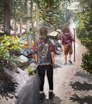
This exhibition consists of a series of seven paintings and various graphic design work including printed and digital media. The theme that I address in my paintings is my personal and experiential relationship with nature, and in my graphic design work I advocate for safety and inclusion for women and people of color in national parks.
I want the audience of this exhibition to experience a sense of danger while also feeling welcomed and comforted, and I also want them to question their own relationship with nature. In the painting, Reflection, I suggest vulnerability and danger to the viewer through the shadow at the bottom of the painting and areas of bright orange and gestural mark making. Through my national park event posters, I use warm colors and joyful illustrations to encourage women and people of color to visit the national park.
All seven paintings are oil on canvas, and my graphic design work consists of a brochure on presentation paper, digital media, and posters mounted onto foam core.
Photo Credit
Photo credit, Rebecca Potts, 2022
Creative Commons License

This work is licensed under a Creative Commons Attribution-Noncommercial-No Derivative Works 3.0 License.
Recommended Citation
Potts, Rebecca, "Proceed with Caution" (2022). B.F.A. Practicum Exhibition (ART 498). 98.
https://digitalcommons.murraystate.edu/art498/98


