Files
Download Thumbnail Sheet (547 KB)
Download Exhibition Poster (786 KB)
Download Exhibition view from below (487 KB)
Download Exhibition view from above and to the right (503 KB)
Download Exhibition view from above and to the left (530 KB)
Download Exhibition center view (513 KB)
Download Main plexiglas logo (499 KB)
Download POP Display (4.7 MB)
Download Logo design sheet (509 KB)
Download Character art sheet (869 KB)
Download Cadet Pen Holder (646 KB)
Download Cadet Pen Holder (5.2 MB)
Download New Guard Poster (741 KB)
Download Space Cadet Poster (654 KB)
Download New Guard Figure in Box (565 KB)
Download Space Cadet Figure in Box (584 KB)
Download Friday Figure in Box (508 KB)
Download Mike and Ike Figures in Box (562 KB)
Download Friday Poster (710 KB)
Download Mike and Ike Poster (736 KB)
Download Toy Display (595 KB)
Download Toy Display Detail Left (602 KB)
Download Toy Display Detail Right (553 KB)
Download New Guard Figure (499 KB)
Download Friday Figure (516 KB)
Download Space Cadet Figure (534 KB)
Download Space Cadet Figure, Detail (542 KB)
Download Mike and Ike Figures (507 KB)
Download POP Display Side (539 KB)
Download Motion Graphics and Television (567 KB)
Academic Level at Time of Creation
Senior
Date of Creation
Fall 11-19-2021
Artist Statement
Born too late for the space age, too poor for space tourism, and too early to explore the galaxy, I’ve turned my obsession with sci-fi pop culture into a design career. A steady diet of bad films and cheesy sci-fi left me feeling like the world lacked something. It lacked pageantry and fun. We all share pop culture, and it gives us a sense of a world that’s more fun than the one we live in now. The movies, toys, and games of my youth helped shape my sense of what the world could be, a world that could be something more. That sense of wanting to make the world more than just the day to day is what made me go back to school at 37 and pursue an art degree.
Too often design is merely functional; despite being intended to tell a brand’s story those stories can be flat. Instead I like to use bright colors, simplified forms, and nods to other works to make even an annual report into something of an experience. Even a logo can become a character in and of itself, turning a brand into a story. I also use images and tropes of sci-fi and fantasy to bring a sense of fun to life. There’s something rewarding about creating an ad that makes the world seem more adventurous and full of possibility.
This is what my show, Life Isn’t Fare, is about. I wanted to show off my layout skills and packaging design skills, as well as my logo designs, but in a realm that allowed me to build a sense of fun, too. The astronaut is something I’ve always sort of identified with, exploring spaces that are strange while isolated from his environment. The astronaut with his taxi image was a recurring piece from my past works, and so I decided to build a toy line about that sense of fun I wish reality had. A bit of adventure, a bit of silliness, and a world and show defined by logos and icons, similar to our own daily life. It’s a show about exploration into new spaces, a work a bit about myself, and a way to show that design can be fun.
The comic and animation work of Vaughn Bodē and Ralph Bakshi are heavy influences on my work, especially their off-beat questioning of society. The wild colors and cartoonishness of Frank Koziks’s poster work was what first made me consider becoming a graphic designer. Discovering Lester Beall’s use of vivid color and master of using and breaking the grid was a pivotal moment in my development as well, and countered my fascination with Romek Marber’s near-scientific cover designs. Mieke Gerritzen’s typography has also been a big influence and helped me rethink my own use of typography and how to make it stand on its own. My show’s work was also very much in the footsteps of Larry Hama and Ron Rudat’s work in toy package design and illustration; their world building on GI Joe is one of the biggest reasons my show even came to be.
Please enjoy the little slice of the toy aisle I’ve presented, and the figures and characters in it, and hopefully leave feeling a little happier, and a little more weird, than you came in.
Advisor/Mentor
Jim Bryant, Sarah Martin, Chris Lavery, Mike Martin
Description
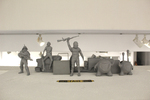
This is a multimedia exhibit focused around graphic design. The main focus is a foamcore POP display like would be in a store, painted with latex paint and with vinyl graphics. Inside the display are cardstock boxes for each figure in my toy line, printed on two sheets of 80# cardstock laminated together.
Each figure box is also on display on a shelf with a 3d resin printed figure and accessories inside, showing off the figure-specific logo, catchphrase and font, and color that each figure has. Additionally, each figure has a splash poster on 30x22 paper mounted above it, and above the entire display is the toy line's logo in black vinyl applied to plexiglas. There is also a larger version of each toy arrayed on a stand behind, with each figure posed to create a toy display like would be at a toy fair. Lastly off to one side is a vintage 1980's television, running 2 bumpers and an animated ad for my toy line and show on a loop.
Creative Commons License

This work is licensed under a Creative Commons Attribution-NonCommercial-Share Alike 4.0 International License.
Recommended Citation
Abarbanell, Eric, "Life Isn't Fare" (2021). B.F.A. Practicum Exhibition (ART 498). 87.
https://digitalcommons.murraystate.edu/art498/87


