

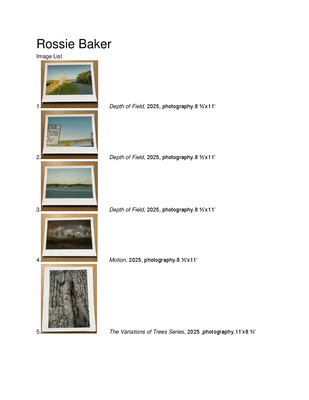
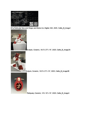
-

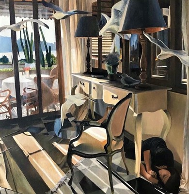
Art 399 Portfolio
Olivia Swaidner
Olivia Swaidner
Artist Statement
Most of my inspiration for my art comes from one of two things: Impression of nature or personal struggles. Biology isn’t something that particularly shows up in my work in an obvious way, but my fascination and impression with science and nature inspires what I create. The mediums that I typically work in the most are painting and photography. My more recent series of film photographs featured multiple images of twisted, exposed roots on the bank of a creek bed. The intention of many of my photographs is to show hidden aspects of nature that I find most impressive and wild. One reason why photography is one of my mediums of choice is because it allows me to go out into the world and find the unique and under appreciated aspects of nature that I feel need to be shared. Another recent piece was a painting of mountains done in palette knife with slightly skewed pastel colors. My intention was to show the viewers a landscape that isn’t your normal mountain scene with colors just different enough to show the image in a new way. One artist that inspires me goes by the name Materium. He is a German illustrator who creates surreal digital images of dreamy landscapes. I like to consider the ways he alters reality by taking common landscapes and rearranging things in unnatural ways to create something new and extraordinary that hasn’t been seen before.
Another commonly recurring theme in my work is any mental struggle I may be dealing with. My most recent painting was of a small pink balloon in the midst of a dark empty room. This was representing my hardly successful attempt at celebrating small positive things in the midst of deep struggles. I have made a couple of other pieces about feeling small, low, and unable to get any higher up. While this is a theme that has shown up in my work from time to time, the majority of my work is still centered around my impression of nature. Margrieta Jeltema is a photographer that inspires my photography work. She photographs beautiful images of delicate flowers that capitalize on their loss of relevance over time but their unending timeless beauty. Her use of a commonly seen flower photographed in a way that offers another perspective is very inspiring for my ideas in my work because my ultimate goal in my work is to offer the viewers a new perspective on nature that makes them feel the same awe that I feel when I see it.
-

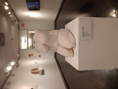
Professional Blend XII
Miranda Tynes
Artist Statement
My name is Miranda Tynes and I am a multiple medium artist. I have enjoyed painting, ceramics, and woodworking so far. These disciplines are very different from each other, but it is nice to work a different part of the brain, eye, or hands to create in these different mediums. With painting I work my brain and eyes for color and composition, with ceramics my hands and eyes for form and movement, and with woodworking my brain and hands for the process, physical work and attention to detail. I also like experimenting with adding separate materials to each process. Some contemporary artists who inspire me include Jessica Stoller, Malcolm Smith, and Angela Wang . As for Stoller, we do not share visuals, but I do share concepts with her and the way she speaks about feminist issues in her interviews really hits home. As for Smith, I am inspired by the movement and combination of line and curve in Smith’s works, and how he can tell a really important story. As for Wang, she is an illustrator whose religious imagery inspires me greatly, and the delicate, yet intricate, detail is beautiful and something I wish to add to my work. While I wish for my work to be beautiful, I also use my work as a way to express things that I would usually have difficulty expressing to people verbally. My work is a form of expression and communication about my views. Outside of the art world, I have always been a very spiritual person, have loved learning about religions, and been fascinated by divine beings. Other influences can be seen in the loose representations of florals in the Art Nouveau period, the intricate delicate beauty of the Victorian period, the rich heaviness of the design of many old cathedrals, the vague slightly mysterious and strange beauty of cubism, and the absurdity hidden in surrealism. These things may not all seem to connect immediately, but I like that they all have some sort of fascinating aspect. They all have that thing about them that just makes you have to keep looking, and keep exploring it, and it stays with you. You never forget it because it has touched your soul in some way. I have so many influences from a time when people could devote their entire lives to creating beautiful works. They had a way to make things intricate with ethereal beauty and did their best to perfect each piece. I hope someday I will be able to do the same, I hope to create something intensely beautiful, so wonderful it can surprise the viewer and they forget the world around them and are fascinated by something's beauty even if for only a few moments of their life. I hope to bring a few moments of wonder to someone, and make a memory they will cherish, and can remember as one of the reasons to keep going. This world is very hard to live in, so I hope to one day have at least one work that, like the many great artists of the past, can bring someone peaceful wonder for a few moments, and let them remember there are some things that make life worth living.
-

Kay Yount Art399 Portfolio
Kay Yount and Kay Yount
Eden is a show based around the concept of love. Love can be clean, messy, warm, cold, good, bad,it can be conditional or unrequited. Love is enigmatic— no one understands or experiences it exactly the same. I wanted to find a way to capture a part of this thing that I crave, something that is so close and yet so far out of reach. This exhibition is my way of giving to others my conception of Love in my own way.
Eden is a garden occupied by the two lovers, a cyclops and a blind prince. In secret, the two lovers meet in this garden of Eden, have tea, and read. Although their love has been forbidden, they are here at this moment, and as a participant in the space, you have been given an opportunity to share in that..
In this show, you will see cut vinyl and paper come together to create an immersive environment for you as the viewer to step into and be a part of. Having this space allows me to bring you into my world and showcase my interest in creating a narrative environment.. The use of illustrator and photoshop along with the meticulous process of plotting and weeding, allowed me to create these vignettes, showing you what it is like to be a part of this world. Atop pedestals, there are a set of five zines, three of which tell you the story of these lovers together, and one for each lover by themselves. Each have been hand stitched and carefully displayed for you to peruse.
The inspiration for Eden comes from many places; one example beingLouise Fili. Inspired by her gorgeous typography and limited color palettes, she is what inspired me to first make a handwritten title. Something one of a kind, just like my other two inspirations. Luba Lukova and Kacey Slone. Inspired by her use of negative space, Luba Lukova stands as a perfect example for the technical concepts in the work on display; The use of line, color, and space and how it interacts with the world. Kacey dives fearlessly and deeply into some of the emotional development and expression I am also hoping to convey.
-

Art399 Portfolio
Eric Abarbanell
My two dimensional art has a lot of sharply contrasting values and a sense of humor (and dark humor) to it. My three dimensional work follows the same lines but I also incorporate as much light and shadow as I possibly can.
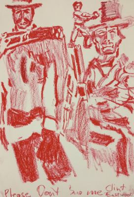
My influences are mostly based in my childhood and pop culture. Early cyberpunk works like William Gibson and Max Headroom; lowbrow and outsider art like Frank Kozick, the artists of Heavy Metal Magazine, and independent comics; and dark surreal art such as HR Giger, Masahiro Ito, and Heronimous Bosch.
I try to first find art and references that both fit the style of the project and that excite me. Even if it doesn’t quite fit the project, I’ve found that exciting work in various media can fire my imagination. Then I start to sketch, often trying to recreate the parts of my references that got me interested, before getting a rough design for my final work. At that point I just gather my materials and dive in, often like a whirlwind, trying to adjust my final work to fit my changing concepts and the progress of the work. More and more I find that the concept I started with is not the one I end on, and the one I end on is far more complex and leads to a more satisfying work.
I want viewers of my art to feel something beyond just thinking it is well done. I enjoy making a viewer feel a level of discomfort or feel unsettled. My own work springs from growing up with Tourette’s Syndrome and often feeling disconnected or uncomfortable in “normal” situations and I like to try to evoke those same feelings but without being explicit. I also enjoy making a viewer laugh at the absurd, or to be transformative of their space to create an entirely different environment than the one they were just in.
I want my work to express how I feel, but in a way that is applicable to the point of view of others. Instead of making work so personal that it’s impossible to relate to, I want to express my struggles, my interests, and my angers through art and make others feel the same, or at least question how they feel. Even in pieces that are more conceptual, or figurative, I want the viewer to not just know the basic emotion that spurred the piece but to instead feel it themselves.
When I look at another work it interests me if it’s well crafted, but not hyper realistic. I like work that is outside the norm, strange or off-putting. Work that shows the hand of the artist is fascinating because I like being able to see the artist’s process made life, and pieces that make me feel uncomfortable draws me in. In essence, I don’t want to look at work that is just like mine, but I enjoy work that is to the other artist what I want mine to be to myself.
My work has a constant thread of my pop culture obsession. Max Headroom shows up, monster movies, etc. Even when making plaster casts of condoms I viewed the final forms as if they were vintage space ships. Masks also figure prominently in my works, due to growing up with severe facial tics. My favorite heroes and costumes always had face coverings, since they would have helped hide my own personal discomfort.
I’m drawn to trying to illustrate just how bad things can be for others, and my frustration at it. I want to help elevate the person stepped on, but also make the stepper feel discomforted. I want to utilize horror and fetishistic elements more in my pieces both to make viewers feel uncomfortable but also because I feel that sexuality beyond either simple pinup art and LGBT is under-represented other than when it’s the Main Focus. I want to make people feel sad, feel angry, and also make them laugh at the absurd. All at once if possible.
Having been born with Tourette’s Syndrome, and not having it fade away as most do, I’ve lived a life of constantly feeling uncomfortable with daily life. As a result I’ve found that I want my art expresses how I’ve felt my entire life. I want to make viewers feel uncomfortable and like something is very “off”, either as if regular life is somehow wrong or that they’re viewing something that is very much not right. Alternately I want to use the absurd to make them laugh, or to transport them from where they were before they saw my piece. The latter comes from a search for escape, usually through pop culture.
My work has a constant thread of my pop culture obsession. Max Headroom shows up, monster movies, etc. Even when making plaster casts of condoms I viewed the final forms as if they were vintage space ships. When those pop culture references fit, I almost imagine my work to be an amalgam of my days watching old TV shows and reading video game magazines, with breaks only for Nintendo. Masks also figure prominently in my works, due to growing up with severe facial tics. My favorite heroes and costumes always had face coverings, since they would have helped hide my own personal discomfort. I’m drawn to trying to illustrate just how bad things can be for others, and my frustration at it.
My most admired lowbrow artists are Frank Kozick and Vaugn Bode. Both were fearless in their experimentation of form and color and created images that stick with the viewer. Kozik’s work in poster design mixes the popular with the macabre and he could turn even a simple rabbit into a form that is less character and more icon. Bode’s work is more illustrative, but distinct and in a way that mixed comic art with painterly forms. His fearlessness with making jokes about society and sexuality, and explorations of the self are inspiring to me.
“The Ascension of Ernie” was an intersection of all of my interests. I created the sculpture of Ernie and the knife out of EVA foam. I then reinacted an aboriginal rite of ascension to shamanism, using Ernie and cotton candy. “Mr Anxiety Head” was a performance piece where I was tasked with creating something out of cardboard, and so I chose to create a mask to hide myself. Using the interchangeable parts, I got into people’s spaces, studying them and swapping pieces to try to “fit”.
I use black and white whenever possible, and try to rely on bright contrasting colors to draw attention to specifics, such as in my print “Musicians”. I feel that the more morose subjects I tend to work in are best represented in greyscale. I try to show as much of the artist’s hand as possible since the works I most enjoy show that as well, but am working to make sure that roughness has intentionality to it rather than just poor craft. When I work in three dimensions I keep to the same styles, but incorporate light and shadow as much as possible. The feeling of neon, dark streets with bright lights, and cities draw me and I like to recreate those in three dimensions where I can, such as in the signage and projections in “Walled City”.
Though I’m struggling to really express it, I also like to layer discomfort with sexuality. Despite the ever-present threat of the Male Gaze, my social circles after high school were alternative sexuality groups in the fetish community and I want to add flavors of the good and the bad into my work. HR Giger’s work in taking male and female sexuality and creating surreal and horrifying mindscapes were an early influence, and while I don’t wish to copy his style I admire the end results. Masahiro Ito’s fetishized monsters and horror is a more recent influence. Though it can stray into more character design I want to create forms that while not explicitly seeming “fetishized” still carry those subconscious tones. I am eternally fascinated with the intersection of discomfort and sexuality, and of power and powerlessness, plus the undercurrent of the absurd and the sometimes horrific, tugs at something I haven’t quite been able to define in myself but want to, and to help others perhaps feel as well.
My work has an eclectic mix of images, methods, and styles, but I think all of it is definable as “me” since it’s both a way to express my own flaws as well as try to discover a part of myself that I’ve never really been able to look at squarely and see.
-

GraciLou Ackerman Undergrad Photography Collection
GraciLou Ackerman and GraciLou Ackerman
Days go by, rain comes and goes; buildings are built, occupied and abandoned. Walls that were once so vibrant with life are eventually silent. Generations upon generations witness the same subject with different eyes, perspective, and time. Minds are stimulated with excitement through the curiosity of our senses. Restoration and revitalization are a necessity to honor the enchantment that has once taken place. Constructing an infinite memory out of a perennial location is the goal to be achieved throughout the artwork.
I use photography, collage, and audio recordings to remember the industrial infrastructures that once held such importance. The now unoccupied spaces are brought into a contemporary context through my process of photographing the texture, linear pattern, and geometric depth still alive in these abandoned buildings, then collaging and abstracting the fragments. Audio recordings of industrial sounds familiar to my childhood home life add a third dimension. My work brings new life, in a new era, to these mostly overlooked shapes and forms.
Personal influences were cultivated within the small, blue-collar county of Carmi, Illinois; a town full of fleeting dreams. The remote town forced creativity and appreciation to be pushed beyond the stereotypical. One child might find peace, beauty, and comfort in the subway, or surfing in the ocean; however, for me, it was found in my own back yard. Watching my father work in his collapsing metal shop with his worn-out equipment. Waking up to the sound of a diesel engine running, a chain rustling, or an air pump accelerating might displease a stranger but to me, it is a lullaby and alarm clock. This is what I call home.
-

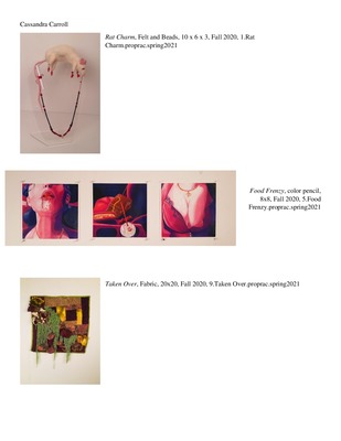
Portfolio
Cassandra H. Carroll
There is something beautiful in the broken wings of a dying butterfly. Embedded within our scars are symbols of hardships and victories. Throughout life there are hardships, but there is often a beauty to the changes that occur as a result. These beautiful adaptations and transformations inspire a childlike curiosity in me that drives my work. My imagination likes to wander through the forest and the depths of the sea and use the curiosities I find there to explore pain and pleasure, growth and decay, and the visceral reaction they provoke.
I want to share the comfort that the truth brings me, and to inspire curiosity in the minds of those that don’t often question the world around them. I want to show people my human experience, and an artist I look up to, Kathe Kollwitz, does something similar in her own work. Her work focuses on figure drawing and addresses pain and death, yet empathy and comfort are still evident. My mediums are often seen as a women's craft and I purposefully include feminine aspects to it both aesthetically and literally. I also touch on subjects including birth and life and equally represent death and decay. In Ebony Patterson’s artist statement, another artist I look up to, she mentions her use of tampons in her work when alluding to femininity and how it has entered popular masculine Jamaican Culture. Some of my work has to do with the sexualization of the woman’s body.
My current focus’ are Drawing and Textiles. My latest textile work is based on the passing of time which encompasses the feeling of nostalgia. Whether the memory evoked brings the audience into a place of hardship or comfort. In my piece Taken Over, this can be seen. The premise of this piece was to make the audience feel the need to touch and learn. The moss and mushrooms are taking over the log cabin style quilting, which is abstracted as overgrowth on bricks. The use of oddly cut fabric forms and softly yet chaotically textured yarns used together sparks my curiosity. This is an example of how I want to make my work to interact with the audience. While it’s not currently possible, I would like my work to be literally interactive; to give the audience a chance to leave behind societal rules and explore the unconventional.
-

Kayla Chinn 399 Port.
Kayla Chinn
I am someone who struggles to let go of the past, something I did not fully understand until studying another artist who struggles with the same thing. Being an individual who latches on to my childhood and past experiences is difficult as I continue to age. My work tells the stories that come from my lifetime and how they have affected me as I grow older. My approach to my soft sculptures helps drive those overarching feelings home as it is an homage to my late family members who were huge inspirations to me and my work, these women often worked in textiles around me from a young age. Working with these materials also has encouraged me to work larger and create pieces that are more demanding of the spaces they occupy as transforming a space is a goal I am working towards in my current body of work.
WIthin my work the objects that represent me are based on the visual appearance of a bunny, bunnies have a deep rooted symbolism of renewal and fruitfulness. While in comparison, I use a bear shape for the representation of the harmful or difficult experiences or people from my stories, bears can represent an relentless source of anger and that was exactly what I wanted to depict in my own way. Moving forward there are plans to incorporate a third character type as well as investigate installations and how to transform a space to be a utility towards the art rather than art sitting in a room or on a wall. Turning private experiences into art that just feels personal but still digestible is the main goal in this new chapter.
Ceramic artist Brett Kern has been a huge inspiration to my work, even though he does not inspire me visually, his concepts and how he talks about his work is something I admire. He has the same issue with letting go of his childhood, finding someone who was able to put this feeling into words was extremely beneficial to me.
-

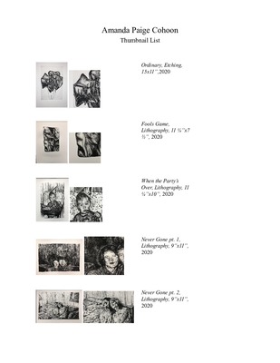
Amanda Cohoon ART399 Portfolio
Amanda Cohoon
“That's why sometimes I feel nostalgic over something I haven't lost yet, because I see its transience.” This quote comes from a conversation between Sigmund Freud and the poet Rilke. It was said in a conversation about the inevitability of how one day everything will dissolve into meaningless and the fact that impermanence is a very real thing. Growing up I encountered a lot of loss within my family, so centering my art around my family is my way of never letting them go. My whole life I have been surrounded by such gifted storytellers, always going on about days past, the good ole times, and occasionally the bad. Personally, I have never been good at articulating these things or even writing them down but bringing the story to life again through my art is my way of not letting impermanence become a reality. In my art, I am immortalizing the people/moments/items I have or have lost in order to preserve the attachment I have formed with all of these elements.
Painting and printmaking often require multiple layers during the art making process. These layers of making parallel to the layers of memories and emotions I am compiling together in my art. As I build my layers of the images it allows me to deepen my relationship with the photograph I am interpreting. During this process I create purposeful interruptions to the composition. For example, I will leave out parts of the figure based on how well I knew the person or if I was there for the memory I am recreating. I also manipulate colors within my work primarily for an aesthetic purpose but it is also driven by colors I find to be nostalgic or colors that connect to an emotion tied to the figure. Part of my process revolves around researching stories from my family’s past and then retelling them. My work is often created from multiple images montaged together. I choose photos that aid my narratives while also being aesthetically pleasing. The process of realistic rendering feels nostalgic and sacred to me, like trying to recapture a lost memory with intense focus. I hope that my work reminds viewers both how short life is and how important it is to be present with those we surround ourselves with. The process I go through may not give my viewer a title or even names, but I hope they gain an understanding of how I felt when learning the stories, or how I felt trying to remember them.
My work is influenced by things in and out of the art world. The outside influences are mainly music and nature. I have always been inspired by the idea that all you need to tell a story is three chords and the truth. The genre that that saying has always been tied to is country music which has influenced my entire life. It is an art that is grounded in simplistic storytelling and breathes life into the truth that once was. I strive to be able to tell my own stories in such a successful and visually poetic manner that I grew up hearing through the radio. I am also influenced by nature and how if you look close enough nature will show you what once was. This connects to me because that is what looking at the photographs I use within my work does. Within the art world, two artists that influence my work are Justin Duffus and Mercedes Helnwein. Duffus is also a painter who works with found photos to create his work. He is one of my major influences because we hold a similar dialogue in that we both depict family events and try to make them easy to relate to while also being strange and unknowable. Helnwein is another one of my influences because the disrupted realism she portrays in her work is something I am currently trying to incorporate into the style of my own work.
-

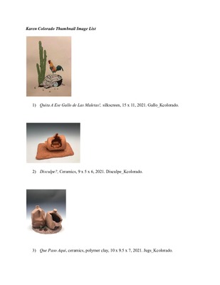
Karen Colorado Art399 Portfolio
Karen Colorado
In my work I strive to communicate my relationship with my ethnicity and the role that Latine people are playing in our current social and political climate. Most of my art thus far has dealt with different themes and hardships that come with being Hispanic/Latino in America.
The current body of work that I’m developing talks primarily about how people move from one place to another, with a focus on the US-Mexico border crisis. The pieces often portray the landscapes people move through, the things they take with them for survival, and what the homes of these bodies look like before and after relocating. A common symbol in my current work is the plastic milk jug. I work with this symbol because loved ones of those crossing will leave jugs full of water in the desert for them to survive the harsh climate. I’m very attracted to the idea of taking a common household item everyone recognizes and taking it completely out of context to fit the narrative I’m trying to create. In recontextualizing common items the viewer is able to approach my art more easily even if they don’t know much about immigration. Portraying such a difficult topic with a heavy presence in our current political climate can be difficult and I hope that accessibility leads to interest in my artwork.
My work is heavily influenced by my own experiences and testimonies from millions of other immigrants. I constantly read stories online and attempt to highlight the differences in where these people are from and where they’re going next. A lot of my work is influenced by Mexican-American artist J. Leigh Garcia. Garcia’s work deals with the ‘residual racial discord’ of major historical events between the U.S and Mexico, particularly Texas. Her work is closely related to mine in subject matter and shared symbolisms and I'm inspired by her use of color and eye for composition.
-

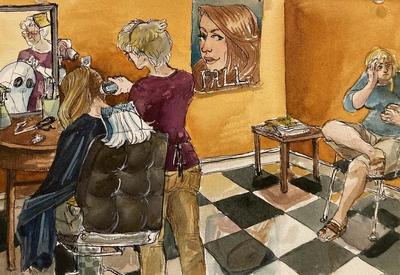
John Gee Art399 Portfolio
John Gee
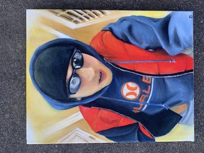
My art practice is grounded in photography, specifically fashion photography. I shoot digital mostly and sometimes shoot film to get the natural colors that aren’t achievable through digital without post processing. I have grown to love portraiture because working with people, capturing their current state, and styling them in ways that are appealing is what I have found the most joy in since starting photography. I’m a very detail-oriented person and perfectionism is a trait that has carried over to my photography. Styling my subject, picking out interesting color combinations and color palettes not just in the outfit but in the environment, and matching a look with the perfect scene to make something that is visually stimulating and appealing to look at is what I look forward to when shooting. I think backgrounds are just as important as the subject in portraiture so I find it important to put just as much thought into both aspects.
I’m inspired by the intimacy and style that Nan Goldin is able to capture in her work. Her “point-and-shoot” style is something I work into my photography as much as possible. I often use harsh flash creating stark shadows combined with rich colors to exude a nostalgic feeling for the 90s and 2000s that appears frozen in time. This feeling of sentimentality is something that I hold on to in my personal life and this carries over into projects. I intend to create visually appealing fashion portraits but sometimes also delve deeper. Photos are a great way to tell stories, whether they are my own or others. Some of my work has dealt with emotions, relationships, and identity of myself and my subjects. Overall, I want my photographs to be something enjoyable to look at in as many ways possible through color, composition, etc.
-

Kathryn Huttunen Art399 Portfolio
Kathryn Huttunen
Kate Huttunen
Artist Statement.
The overall themes and concepts of my work are my personal self-reflection and memories of black and white culture as an adopted woman of color as well as how society views me and how I view society. When I just began pursuing art I started with using digital media such as video and digital photography. Recently switching to spending more time painting I feel I can portray certain emotions better with that medium than with digital. With digital media, I’m focused on showing the failures, triumphs, and struggles that come with adoption as compared to painting I show more inclusive problems and themes such as the constant struggle black woman face with mass media and how they are portrayed through it. Many question’s I relive and ask myself are “Am I black enough to question this?” “Am I valid, are my opinions valid?” “Do I really sound or look like that?” “If I date someone will they like me for me and not for an exotic kink?”. My photography is more straightforward compared to my paintings in which many of them use surreal imagery and convey loss, yearning, and confusion. I like to make different textures with paint, thick mark making clashing with more smooth and thin mark-making as if two different worlds are coming together and trying to make unity out of all the chaos. A few artists from online media and shows have inspired me and have influenced my use of color, light, and shadow. I’ve looked at Rashid Johnson, Jenny Saville, Mickalene Thomas, and Francis Bacon for influence as well as Yinka Shonibare. Yink Shonibare is a big influence for me when I’m painting for texture and color and light and shadow as well as composition planning. I hope my thoughts, stories, and struggles show well through my artwork so people like me know that it’s okay to feel lost in a world that tells you to be in one group. Doing these personal themes in artwork is like a coping mechanism and a diary where I can put my energy onto the canvas and hope some can relate to these struggles and start a conversation about it so they can feel like they belong to a group or community.
-

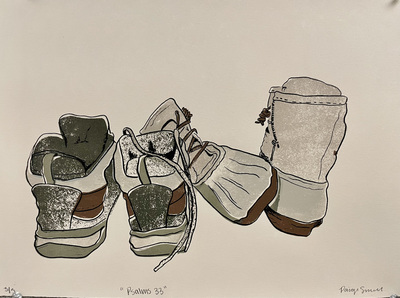
Macy Kendall Art 399 Portfolio
Macy Kendall
Since a young age, I was interested in art; I remember drawing with my older cousin and being inspired by her because I thought her simple doodles were amazing, while she was drawing nothing more than doodles, I saw something that looked like hyper realism to me. Furthermore, my free time as a child was spent either drawing or coloring and I was obsessed with cartoons and movies, which led me to know more movies and reference these same movies to which others haven’t even heard of by the time I was in high school. Consequently, the saying, Practice makes perfect,” came into play for me and I vividly remember being in fourth grade drawing three-dimensional block letters on my poster about photosynthesis while others would come up and ask in amazement, “Woah! How’d you do that?” The simple answer was, I saw a drawing my cousin did and replicated what I saw. It was in the same year I that I drew Uranus which I mixed my colored pencils to create a certain color and started drawing shooting stars. By the next year, I was invited to be a part of art club in which I created a “Man in the Moon” that surprised even my art teacher.
Throughout my life, art has given me a push and a pull. Sometimes art has unmotivated me and made me feel like a terrible artist when I thought I was being an amazing one, even leading me to consider quitting art, while other times, it has given me so much hope I could explode from the inside out. Through these ups and downs, my subject matter usually differentiates, sometimes being as random as anything I could think of and others having a deep meaning behind them, as a result, describing all my artwork to someone often becomes very difficult. In fact, while I usually draw and paint, I also work and have worked with a lot of different mediums as well like sculpture and ceramics, printmaking, and jewelry and metalsmithing. I find myself very fascinated by the ability
There are two contemporary artists who influence me to be an artist in general: Georgia O’Keeffe and Jesse Lane. Other than the fact that Georgia O’Keeffe lived to be 99 years old, the way that Georgia O’Keeffe painted flowers and her use of color astonishes me, altogether she has become an inspiration to me since I was in middle school. I could go on and on about how amazed I am at how she manages to paint her flowers so beautifully and delicately. Moreover, the artist, Jesse Lane is a very talented artist that draws hyper realistic color pencil drawings. The amount of detail and attention to detail that Jesse puts into his drawings is eye-catching to me. I also find it interesting how someone can be so talented they are able to trick the mind into seeing something three-dimensional on a two-dimensional surface. Additionally, while I do in fact have artistic influences, I do not copy them, instead I might like the way they did something and use their technique in my own way.
While I have learned a lot about art and the different ways it has changed throughout time, I am more than aware there is more for me to learn, not to mention, my skills can be perfected more as no one is never exactly a true master with something. I hope that my artistic skills can be more perfected than they are in today’s time, and I want to one day be able to draw or paint hyper realistically. Other than this, I would like to someday be able to accurately as well as easily be able to convey feelings and a story through my art.
-

Kendra Lobb Art399 Portfolio
Kendra Lobb
My work is about control and freedom brought on by options. Growing up in a broken home, I felt like all the decisions were made for me. The little freedoms I had through choices were limited, and many of them seemed trivial. The feeling of being trapped in situations that I did not choose pushed me to make a place to vent. The process of creating art allowed me to make a world that had order and power. I could go into autopilot, becoming absorbed in the process and forget reality. I got to make the rules and decided what to do, and reveal them to people. While I keep myself in control over myself, I don’t want to have that power over other people. I want to give others the freedom I felt I was denied by creating works that give the audience choices.
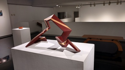
My work currently consists of large-scale linear wood sculptures and geometric handheld metal objects. Each piece relies heavily on the process and the difficulty of completing a piece. Putting on the display of control and compulsive in the way I work. The large difference in scale and medium gives separation to my work. My large-scale wood sculptures reflect the internal struggle that I have, while my metalwork is created with the intent of the audience interacting with them. Putting the audience in the decision-making chair, as they are the ones that get to decide on a works use. Furthering the idea of giving viewers choices I use geometric shapes. They allow for an open interpretation of its purpose because are fewer perceived conceptions associated with the forms. They bring comfort because of the set rules and predictability that are assigned to them.
The artists that I’m currently looking to are Brendan Jamison, Jill Townsley, and Giampaolo Babetto. I feel like I relate to Jamison’s work in the sense that I also find myself using repetitive processes. I relate to Townsley’s method, but unlike her, I still want that end product to be tangible for viewer interaction. The process is equally as crucial to the end product. Babetto uses geometric shapes in his work because he finds the forms pure. While I don’t see them as pure, I believe they are comforting because of their set rules.
-

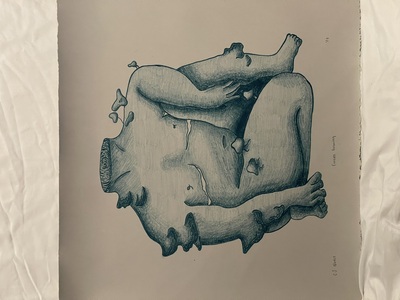
Keleigh Mabry ART 399 Portfolio
Keleigh Mabry
I have always wondered what it’s like in other people’s minds. Sonder - the realization that each random passerby is living a life as vivid and complex as your own. The comfort I find in realizing everyone’s lives are as terrible and beautiful as my own has been an inspiration for my artwork. I began journaling in 2019 and taking psychology courses my Sophomore year. I've learned that these things naturally go together for me.
Our beautiful and complex lives can also be laced with mental health issues. Depicting mental health in visually intriguing images drives my current body of work. I first took my printmaking class in 2018, and once I discovered silkscreen, I found a home. In my art, I specifically alter identity with human figures, except the figure’s head is often replaced with something: a goldfish, a pair of scissors, a mushroom cap, leaves, etc. The idea of amalgamating things together that don’t belong is accompanied by free, organic flowing lines that are unrestrained and reminiscent of a blind contour. These objects as the head are often items that I think of fondly and find many meanings to. I first became interested in psychology around 2018. I have always struggled with my mental health and creating these surreal artworks allows me to talk about that.
Screenprint is a medium that allows me to create fine lines and color combinations that enhance my surreal narratives. In addition to the formal qualities the ability to produce multiples allows me to make work that I can promote, distribute, and keep for my portfolio. Accessibility to art has always felt pertinent to me. I’ve always wanted multiple people with my artworks in their homes, a sight they see daily.
-

Kirsten Moore Art 399 Portfolio
Kirsten Moore
My work questions our perceptions of space and time. I am interested in the way my personal experiences and choices are both shaped by time and are constantly changing. This ranges from broader struggles with health and identity to everyday decisions about fashion or conversations with friends. Our perceptions of our individual lives change over time, and past versions of ourselves can intermix and influence our present selves. There is nothing more intriguing to me than blending multiple dimensions by overlapping realistic figures with a two-dimensional pattern and allowing them to merge into a single landscape. This transports the viewer into a different version of reality and allows them to be open to new ideas or ways of thinking. I also incorporate non-naturalistic colors, which can change the meaning of a piece, allowing there to be questions about whether the piece is set in the same reality as ours or not.
Recently, I have been drawn to my personal perfection of Christianity and how I, along with fellow Christians and non-Christians, view it. I challenge what the world and other Christians define as “Christian” or “Christ-like.” I find unique and often challenging ways to introduce the God I share my heart and soul with, while also still taking into consideration the views of others. Through this exploration of the world's view of Christ and Christianity is a fairly new one, I know that these paintings encourage people to view a religion that I hold very near and dear to my heart in a new light; one that may challenge the preconceived notions God and the Church for both Christians and non-Christians alike.
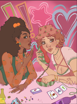
My artwork often takes into consideration my interests, experiences, and emotions, such as my PTSD, insomnia, childhood memories, religion, and individual choices about fashion or sexuality. When looking at my pieces, we can see a common visual theme of using patterns. In my piece “CHANGES,” there is a pattern of repeating exclamation points on one part of the diptych and repeating question marks on the other half. Within my pieces “Fashion: In Squares,” “Tip Toe,” and “Checkmate”, you can see a repeating pattern of black and white squares, reminiscent of a chessboard. There is also a pattern of stylistic, minimalist eyes in my “Insomnia” works, spreading across painting, ceramics, and digital media. Finally, you can see the pattern in my “Sisters” piece, with X’s and O’s filling the background, reminiscent of a tic-tac-toe game. All of these patterns, the same repeated images, are meant to show patterns in life--simple, repeated cycles, and habits we form over time. These patterns and habits can change our worldview, how we simply see and interact with others, time, and even ourselves. These cyclical patterns merge with our perceptions of reality, fading in and out of memory, overlapping our conscious and subconscious, creating a new mind space.
I am drawn to artists who make us question reality in some way. Ideas imagined by renowned surrealists intrigue me, much like Devan Shimoyama and his use of blending two dimensions of reality or consciousness. Though he isn’t a traditional surrealist, the way he uses patterns to flatten out the design of his figures and their environment creates such a surrealist atmosphere; an atmosphere where reality and other planes of dimensions merge into one space. Dawn Mellor creates a very similar space of diverting from a pure sense of reality by placing bold, eccentric patterns over the faces of her figures, distorting their features and their place in that world. This manipulation allows you to question why they are in that space, if they are the only ones like that, or if everyone shares that similar style and look. This mimics the color choice of my “Nonchalant” and “Sisters” piece, making you wonder if they are the only ones with such color in the realm they exist in. Yayoi Kusama’s use of repetitive circles in two-toned environments influences how I decide to implement color and pattern. For Kusama, the repetition of consistent circles playing throughout each of her pieces provokes me to dive deeper into the realm of repetition throughout my pieces. This allows for the same pattern to be seen throughout each of my pieces that carries the same concept, like the stylistic eyes in my insomnia-related work. I want my work to open new ways of thinking for my viewers, either about their own life or the lives of others. For my religious pieces, though these atmospheres do not directly mimic the style of this artist, I look to Chris Woods as a role model in the arch of modern Christian art. The way he puts Christ in very modern and public social settings is fascinating, and it makes you wonder what His role is in this earth today versus when He was alive and how relevant, close or distanced we are to Christ as a society today.
I hope to make room for more content from our internal conversations with ourselves to make their way into our daily external conversations with others. Hopefully, in this way, my work can open a gateway to a new and more open reality.
-

Kerrie Pullen ART 399 Digital Commons
Kerrie Pullen
Paper is a material that is all around us and has been telling stories for centuries, blurring the line between dimensional planes. I began using paper for its obvious function – to draw upon and express thoughts and ideas. Communicating is a vital part of the art process, and the more I drew the more the images and ideas created took on a new function, a new language. I’ve come to realize that drawing is a highly fluid process that resists categorization. I cut and layer paper, drawings, mixed media materials, and 3D elements within my large-scale works, maneuvering multiple drawing techniques and approaches to discover parts of my identity.
When thinking about my identity, I realized an aspect of myself I never felt allowed to be connected with was my Filipino heritage. I am bicultural, being half white and half Filipino. Initially I was disinterested in making work about my culture as I felt like I was participating in the exotification of the Philippines, especially as someone who has no experiences being there. However, it now has become important for me to make work about being Filipino-American because I never knew how to define it and I thought the best way to do so was through creating images I could relate to. The questions of, “Am I Filipino enough to be this? Who am I to know anything about what it means to be Filipino?” constantly arises. Therefore, I’m currently exploring Filipino culture through researching and speaking to those within my family and out who are born Filipino American. Through this, I am able to begin to understand my own identity. I do not want to seem like I am trying to speak for all Filipinos and say, ‘This is what it means to be Filipino!’ I’m only speaking from my experiences and drawing out personal and Philippines/Fil Am history that I find interesting when thinking about bicultural identities. With my drawings and installations I want to both validate who I am to myself, while also creating a form of representation for other FilAms who have trouble with molding into one strict category.
I incorporate references to details and symbols familiar to Filipinos such as food, fashion, family, and folklore. I incorporate aspects like textiles, assemblage, real food, and using found objects to further push the conceptual ideas in my body of work. Depending on the conceptual idea behind a piece, I use colors to represent specific ideas or historical and cultural aspects. For instance, in one of my recent pieces I reference the border from a manuscript called Boxer Codex that was made by the Spanish in the late sixteenth century in the Philippines. This manuscript was made during the late eighteenth century when the Spanish colonized the Philippines, so I reference the flat, bright colors they used in combination with the way I draw and collage contemporarily to give back that power to the Filipina posed within. When it comes to composition, I try to arrange objects and forms in a way that is complex but still accessible to the viewer; so, if I include real food for the viewer to consume or an object to physically take from the work, I position it in a way that they have to get closer to what I want emphasized or they have to look up to a figure while they bend down to pick something up. I also arrange figures and elements so my work has visual movement and a lot of details to look for, as if the viewers must follow along to a map of Filipino culture and discover it as I am doing at the same time. I use a lot of implied lines with where figures I incorporate gaze towards, or with the direct lines and paint marks I apply for the viewer to follow along to. I gravitate to creating large-scale drawings and I do this to focus on the effect that line, color, and negative space have on an idea and how this can be manipulated and directed to successfully relate to the figurative subject matter.
The figures I draw are representational and often include members of my family or myself who pose and interact narratively. I have begun to use myself as a main “Filipina American” character, and ended up developing a bit of a mythology around who the Filipina American is. I’m interested in the idea of including different womanly bodies who personify my American side and my Filipino side, and referencing old photographs to flesh out new meanings. I also use my mother often presented as a woman with a carabao (water-buffalo) head, who represents the positive characteristics of Filipinos as hardworking, strong, and graceful. Additionally I investigate my ancestry through my assemblage drawings and have this belief that the more work I make about family members I never met, the more I can piece together the kind of person they might’ve been. Being aware of my relationships or lack of, with certain family members, definitely impacts the way I view my identity as someone who holds responsibility towards sustaining culture and tradition.
Interaction with the viewer is imperative, as, especially when thinking about my audience where I live in rural America, I want others who are unfamiliar with this culture to feel a connection as well. An artist that influences my work is Leonard Suryajaya who creates installations and large scale scenes that he records and takes photos of. He often puts himself in these pieces as he is also Asian American. I take inspiration from how he sets up his installations to have multiple symbols that relate to both his cultural dichotomy and his sexuality. Another artist I take inspiration from is Maia Cruz Palileo. She is a Filipina American artist who makes large scale interactive installations and paintings. Her installations are often scenes from her childhood or scenes based on stories she heard from her family about migration, and viewers can sit and experience the memories she illustrates. These artists both push me to think about making drawings that incorporate more 3D elements in a way that is accessible to my audience, which I am experimenting with now.
-

The Lens of Suicide
Chad Reeder
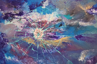
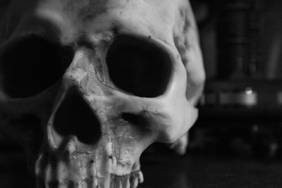
I have been shaped by loss. My art is deeply personal and is directly informed by the effects of suicide. I make art as a way to confront the reality of losing many loved ones and as a way to reconnect to the world by seeking friendships through conversations about suicide. Through photography and video my work challenges the stigma of suicide in order to save lives. I do this formally through different perspectives of light, pattern, shape and form. Additionally I print on larger format so that the viewer is overwhelmed as I have been with dealing with so much loss. My work uses symbolic representation through fire, doors and light fixtures to cast a different light onto suicide. I am interested on representing moments/scenes that can be interpreted as rebirth or the moment of death. For if suicide is not constantly talked about society will continue to lose beloved souls to their own unseen struggles.
-

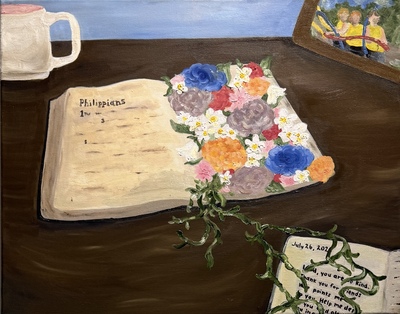
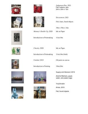
Gretchen Ruth Art399 Portfolio
Gretchen Ruth
My work comes from a place of tension between trying to understand the world and being understood. My current focus is making work that has more centralized and serious concepts. Despite some naturalistic elements that are often seen throughout my works,
I intentionally combine these elements along with imagery that brings the viewer to a made-up or dream-like reality . One of the most important aspects to these types of works, especially more recently, is my use of color. Throughout a lot of my work, I utilize form and proportion as well as color to emphasize the ambience of the scene or object. This comes from the idea of art itself being a visual language and being able to have a silent, one way conversation with the image or object you are viewing. However, a lot of my artistic process is pushed by improvisation.
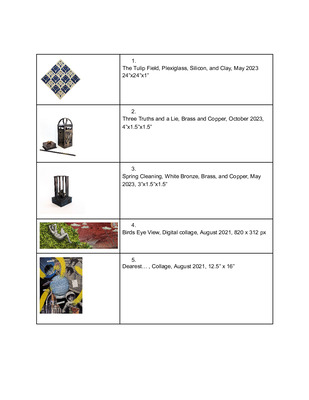
During my artistic process, I write down thoughts I have as much as possible throughout the day. I used to spend time figuring out exactly what I wanted a piece to say. However, I have discovered that it becomes mentally draining to try to plan out every intricacy of a piece, so recently I have started projects without a clear end goal. I like to experiment and see how processes and elements work afterwards. Some examples of this method are evident in most of my metalsmithing works ( Image 1&3). If I am not satisfied with the results of his intuitive process, I keep reworking and problem solving a piece until it works. It can be a mental rollercoaster, but I enjoy that aspect of it so I try to keep challenging myself to make something different and more interesting than the last piece I made. The steps taken to develop a piece usually lead me to discover new conceptual ideas throughout the process. For example, my final piece could have no meaning when I start out but during the process of making that piece I come to a realization of what I am wanting to convey and how to articulate that. Recently, I’ve been interested in exploring the dynamics of interpersonal relationships, especially the maternal relationship between my mother and I (Image 2). Although I’ve never put much thought into what family is and how it affects me personally, I’m now realizing that my family is one of my biggest influences.
Everyone in my household is creative either artistically or musically, so there was always something being made or played. Remembering this fact, it seems quite natural for me to have started making drawings as a form of expression and communication because that was always my main purpose. However, it was more difficult to find contemporary artists that I can relate to and be truly influenced by until I discovered Dan Miller. He is an active member at the Creative Growth Art Center in Oakland,California. His work focuses on understanding and processing the world and communicating with it (Image 4). His message really resonated with me because I’m finding that's also what I want to convey in my own work.
(Image 1: Gretchen Ruth; Image 2: Gretchen Ruth; Image 3: Gretchen Ruth; Image 4 : Dan Miller)
-

Kaley Shackelford ART 399 Portfolio
Kaley Shackelford
Ideas are like fish. You don't make the fish. You catch the fish. You have to convince them to come to you. You can catch ideas from daydreaming, or you can catch ideas from places. ~ David Lynch
We all participate in escapism in some form, and ever since I was a child, my vice was starring off into nothingness, dreaming of romanticized scenes, often landscapes loosely based on the familiar curving fields and dense, luxuriant woods of rural West Tennessee. This pastime has been a prime source for the ideas explored within my paintings, particularly the human relationship with our natural environment and both the positive and negative aspects of that interaction.
The stories told by the work are often autobiographical in some regard, unwilling — and perhaps unable — to disconnect my experiences, body, and feelings from the paint. Artists such as Elly Smallwood and Jennifer Presant who center around subjects such as the female form and elements of the natural world have influenced the paintings immensely. The works sometimes bend the traditional representation of space, rather using varying degrees of detail and paint thickness to draw emphasis to specific parts. These areas of thickness are sometimes built up with experimental materials, such as hair, dried paint scraps, and salt. The juxtaposition of these textured, sometimes grimy areas and the vibrant, rendered wilderness reinforce the strange, daydream-like quality of the work.
The paintings are always asking the viewer to insert themselves, to envision their dreams or reflect on their experiences within the landscape. There is often a quiet action in the midst of taking place – perhaps a flower being lain down or a dance amongst the trees – but the paint captures only one second in time, one still glance. Yet, you finish the action, you watch hands move and wind whistle through trees as the rest unfolds in your own imagination. A stark contrast presents itself between pure, blooming pieces of Nature and the filth or dull sterility both so accurately associated with modernity. These cold corners of reality come flooding in, if only as a reminder that, for now, this is where we are, and the rest is just paint.
-

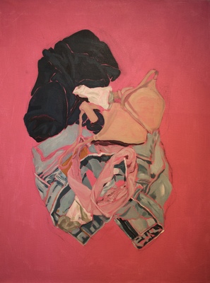
Daisy Slucher Art399 Portfolio
Daisy Slucher
I am primarily a painter but use other mediums, such as videography, to further explore themes and flesh out my ideas. I make work about the over-sexualization of the female body that asks, “how can I give power back to the woman?” I defy the notion that women are sexual objects by portraying female figures in my paintings holding a confident gaze with the viewer almost challenging them to keep looking. Most of the figures are partially undressed to communicate the idea that a naked woman does not mean she is performing a sexual act or wanting to. I use bold, cautionary colors meant to catch attention and force the viewer to draw closer to the subject matter. Discarded clothes are a common piece of imagery that comes up across mediums and serves as a representation of this small boundary between a woman's body and the outside world. In my work, these objects are often placed on the ground to question whether the disposal of it is cause for alarm or part of sexual courtship. Part of my practice is community-based, through conversations about the female experience. These conversations inform my work and give me the courage to explore subject matter that can feel daunting to address.
I am deeply inspired by the painters Jenna Gribbon and Scott Avett. Jenna Gribbon is also depicting female forms that confront the male gaze and normalize the female nude to be something more than just sexual. The way she intentionally chooses to highly render some parts of the painting, like the subject’s butt to acknowledge that she knows you’re looking at it, to the way that she is able to simplify and suggest other parts in just a few strokes to better carry out her narrative is an inspiring technique to me. Scott Avett shows relationship dynamics and how vulnerable they are in the way he organizes his paintings. He plays with composition and scale in an interesting way that combines different settings and creates his own world, something I’ve tried doing in my own work. His subject matter is often mundane, but it draws you in because there seems to be a level of relatability. His brushwork is loose and he exaggerates colors to the point where the imagery feels slightly fantastical. I think brightly saturated subject matter paired with monotony is a common theme in my own work and something I would like to keep pushing.
-

Makayla Tapp ART399 Portfolio
Makayla Tapp
My artwork is spurred from past experiences and memories, ocean life, and family, often combining several different influences into one work. I am drawn to concepts such as childhood/nostalgia, memories, misplacement, and the unknown, in both my own works and others’. I have a deep connection to the ocean and like to incorporate it into my work as well. My process usually includes looking at other peoples’ work in order to spur my thinking. This means looking at their processes and techniques, which often gives me ideas and encourages my own thinking for a piece. I then begin looking at various reference images to get an exact idea for how I want my composition to look, and finally sketch. I generally want my art to evoke curiosity in the viewer. I want the viewer to question what it is exactly that they’re looking at or why it’s something I decided to focus on. I don’t always want my chosen concept to be clear.
At this point in time I don’t have a specific subject that I want to focus on in my work. There isn’t one single concept that speaks to me more than the others, and I am enjoying making art about what I like or am interested in at that moment in time. I usually enjoy working with drawing, painting, and most recently printmaking. I am currently interested in many different mediums. I tend to make work in a more stylized fashion, leaning away from realism most often. I enjoy a stylized approach more in my own artwork because I don’t like feeling the specific constraints of making a work that is naturalistic. Instead of having to focus on making a piece look recognizable, I can focus on my own processes and make it look how I believe it should. I find that the more realistic I try to make a work, the less enjoyable it becomes. The work begins to lose meaning because I focus too much on trying to perfect it. My work often takes on a more cartoon-like effect, with bolder outlines and playful qualities.
I don’t draw inspiration from very many outside artists, as I’m still trying to figure out what I want to create art about. However, one artist that I draw influence from is Margaret Wertheim, who creates crocheted coral reefs. Although her medium is far different from my own, I draw inspiration from her concepts as her work has a deep connection to the ocean. Another artist I look to is Cindy Sherman, or more particularly her series of self portraits where she portrays herself as various family members. This concept is interesting to me because I enjoy making art about my own family as well.
-

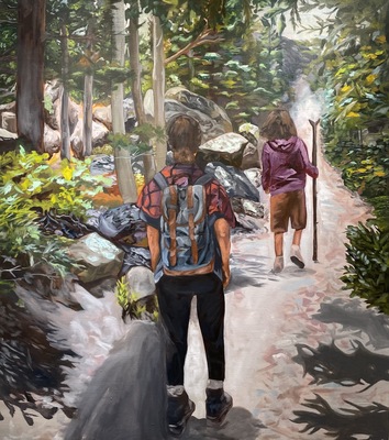
Autumn Brown Art399 Portfolio
Autumn Brown
It is easier to approach a difficult topic if it isn’t immediately posed as threatening or sacred. The viewer’s ability to enjoy my pieces, regardless of their prior experience with the subject matter, is my priority. My primary means of creating my work is through drawing, with the end products taking the form of animations and zines. Sequential art provides a unique opportunity to form a relationship with the viewer during the short time they interact with the piece, which many drawings can’t accomplish in the same way. Zines and animations are highly shareable and exist as an experience as much as they do a “piece.”
I was raised in a community that was socialized to not empathize with LGBTQ+ people or the subsequent mental health issues that can come with that experience. As a member of both communities, it was natural to be hyper-aware of my differences growing up and thus spent a lot of time thinking about identity and how people perceive one another. As an artist, the subject matter I am drawn to is the result of that introspection; especially surrounding gender and sexuality, and the way that this inevitably ties in with mental health. I find power in making these themes relatable to people that wouldn’t typically share, or even resent, my experiences. By doing this I hope to remove some of the stigma associated with “otherness.”
-

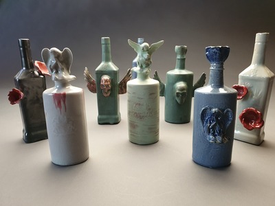
Healing
Hsuan Hsiu Cheng
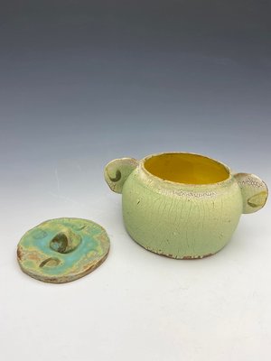
I am from Taiwan, and I transferred from Ming Dao University (MDU) in Taiwan. When I was in Taiwan, most of my artworks were metalworking. After I came to Murray State, my artworks are mostly ceramics and sculpture. For my ceramics, I’m attracted to do hand-building, casting, and molding.
Some of my artworks ideas are influenced by my Christian faith. For example, one of my sculptures is an ocean wave. I used the movement of waves to represent God’s power. Also, there is a series of bottles I made; I used that series to describe my life with different stages in how the Lord has changed me. Some of my artwork ideas also are influenced by my emotional feelings, like depression, struggles, peace, and joy. I want the viewer to feel touched when they see my work. When people see artwork, they might comment on how it looks at first, but I care more about the meanings and ideas behind the art pieces.
I like abstract art styles, and I want to combine my three dimensional art pieces with abstract style. For example, I am interested in Hunter Stamps’ abstract ceramic vase because his vase is not just a vase standing there; its abstract style gives you inspiration and different feelings.
I like emotion-provoking and dynamic movement pieces. For example, I am interested in Canova’s sculptures. His sculptures have many different movements on it, and the sculpture looks like it is really moving. Also, you can see the emotions in his pieces. Especially the emotion in his pieces, they give me ideas for my artwork.
All in all, I like to do ceramics and sculptures. Three dimensional, it makes me feel happy. I'm interested in abstract styles and emotion-provoking pieces. My artworks are usually influenced by my Christian faith, emotional feelings, people’s struggle, and the story of my life.
-

Kiley Cox ART 399 Digital Commons
Kiley Cox
My artwork uses the organic forms found in nature as metaphors to express human emotions. The incorporation of nature is used as a tool to evoke a sense of community as it is something that we all appreciate collectively. My drawings are made to be relatable in that way so that different viewers can have different interpretations. For some people, they can evoke a sense of happiness or nostalgia, while for others it can create a feeling of sadness or being overwhelmed.
My drawing process is improvisational in nature. I discover the emotion that I want to explore through the observation of people around me, whether that be people close to me or complete strangers. I then create iconographic images from the flora or fauna to portray that emotion. Inspirations come from directly observing my environment, including the behavior of those around me. For example, by paying attention to the music people listen to, the things they are passionate about, and their expressions and body language, I can often discover the emotion I’m looking for to explore in my work. I approach these emotions in my work through a range of linework in charcoal and pen that draw attention through intensity and boldness.
Christina Mrozik is my biggest role model and influence. Her work is often accompanied by a poem or monologue themed around the internal battles we all share. These struggles are then represented in her drawings which consist often of a hybrid of both organic and inorganic forms. She is able to accomplish manipulating these hybrids into something that looks like it could be anatomically correct, which is something I’ve tried adopting within my work. Her work is what got me to start developing myself as an artist and the kind of art I wanted to make. Ali Norman is a printmaker who has influenced my art more recently. A lot of her art relies heavily on linework, which is something I’ve been improving on lately.Another artist who has been a great influence is Erica Williams, an illustrator who specializes in flora and fauna. Her use of composition is what influences me the most, as she uses her entire space and will even go off the page creating an overwhelming and all-consuming atmosphere within her work.
-

Fife, Malcolm Art 399 Portfolio
Malcolm Fife and Malcolm Fife
My life would make a perfect decadent novel. Nothing happens, but it happens with style. The time we live in now is an exceedingly decadent one, and I am interested in making connections and comparisons to periods of historical decadence. Aesthetically and thematically I am interested in the art and literature of the 1890s and 1920s, especially the Aesthetic, Decadent, and Art Nouveau movements. Art that is ornate and intricate attracts me. Superfluous ornament is something that makes life more bearable. One way this shows up is a consistent use of historical settings in my work. The people in my art are usually dressed in the fashion of one hundred years ago or earlier.
My painting style draws on Sir William Orpen, John Singer Sargent, and Anders Zorn (for instance, I painted two self portraits inspired by self portraits painted by Orpen) and my drawings and prints are influenced by the style of Aubrey Beardsley, Harry Clarke, and Edward Gorey. I am frequently inspired by decadent authors and literature, especially the Welsh author Arthur Machen. Machen has inspired me so much that I am working on a series of illustrations for his novel the Three Impostors. Films, especially the silent films of Louis Feuillade and Fritz Lang, inform the architecture and settings in which I place the people I draw as well as the clothes they wear.
My art should look as if it had been created in the late nineteenth or early twentieth centuries. Viewers ought to feel transported to an earlier era. The content of the art should be able to speak for itself and the message should be relatively easy for the viewer to interpret instead of being highly ambiguous and cryptic. I want my art to work on multiple levels. The visual aspect should be aesthetically pleasing even if the viewer is not contemplating the message.
The media I work in the most are drawing, printmaking, and painting. For different media, I use different styles. I think the medium should call attention to itself and should not be self-effacing. My pen and ink drawings and prints are very linear; the mark making is very precise and controlled. I use little to no smooth shading (i.e. graphite or charcoal) in my drawings. If I do employ shading, I use stippling to render more three dimensional forms with light and shadow. Usually, I fill in darker areas using a series of parallel diagonal or horizontal lines that extend the entire length of the interior of the form. This is a highly artificial style of drawing and thus very decadent, for the Decadent movement was preoccupied with artifice. In general, I try to use a similar style to that of my drawings in my prints; however, the only form of my printmaking with a very different style from my drawings is mezzotint. My style for mezzotint is necessarily much more naturalistic and I focus on depicting the play of light. When I paint, I also use a much more naturalistic, albeit more looser and painterly, style. And as with my mezzotints, something important to the feel of my paintings is the depiction of light.
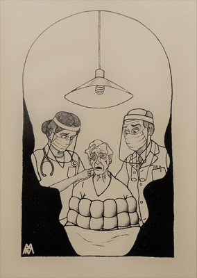
Since the start of the pandemic I have become interested in comparing historic diseases and pandemics, such as the plague and the 1918 flu, with what is happening today. For example, I have done a mezzotint of plague bacteria and I am working on several paintings that deal with the Great Plague of 1665 in London. Viewing today’s problems through the lens of similar historic events can add interesting insights. Because of these historical interests, research and reading about historical images and texts is an important part of my artistic process.
Printing is not supported at the primary Gallery Thumbnail page. Please first navigate to a specific Image before printing.