

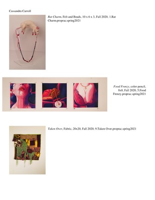
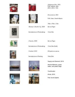
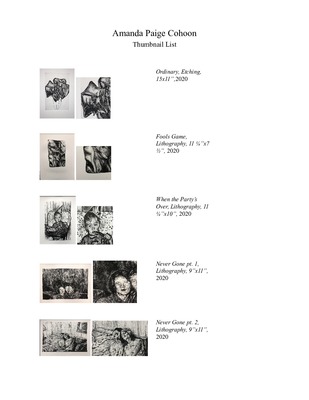
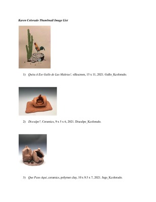
-

Art 399 Portfolio
Bailey D. Provine
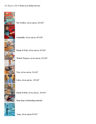
The United States foundation is built on laborers and the importance of sacrifice. My Dad and my Grandaddy provided for our family by working construction and building custom cars for many years. Their hard work provides a prosperous and fulfilling life, but it takes a toll on their bodies. My work explores the softer side of manual labor. Through watching and working beside them, I have learned the value of hard work. Through depictions of trade work in my paintings, I connect to the shared experience of living in the rural United States and cultivate an appreciation for these labors of love.
By painting and putting long hours of work into my paintings, I feel as though I am fully connecting to my work. All these paintings are photo-based and focus on naturalism, some of which I took myself and others are from years back. Like Honoré Sharrer’s, Tribute to the American Working People, my paintings elevate these contributions. I am inspired by her work and other artists that shed light on similar topics. I am also inspired by local artist, Jennifer Fairbanks and her use of naturalism and portrayal of still lifes.
Through my application of the paint, I convey the feeling of ruggedness through texture. This can be seen on the top of the toolbox shelf and is related through the paintings that are on physical pieces of metal. I have spent many hours in the shop with my dad and him the same with his dad, and that is what makes this series so personal to me. These paintings commemorate moments spent with family, foundation of American people, and aspects of rural life.
-

Grace Rittenhouse Art399 Portfolio
Grace L. Rittenhouse
With my work, I focus on the beauty of humans and nature through painting and digital illustration. It emphasizes small moments and details like intricate patterns and subtle expressions with soft, blended art in a wide range of vibrant colors. This exploration is mainly through portraiture and original characters.
By using oil paint and digital illustrations, I focus on creating unique characters; drawing inspiration from mythology, folklore, and cultures from across the globe. Some works take inspiration from traditional Chinese fashion or the symbolism of marigold flowers within Mexican culture. These characters have been with me since I was in middle school and have evolved with my skill and knowledge. The simple brush strokes speak for themselves when highlighting bright reflections of light, or in hair strands and very glossy fabric while the variety of brushes create unique textures. My works also heavily layer with various colors in order to create a sense of depth found in real colors and how they interact with each other.
My goal is to create engaging characters that reflect the fantastical worlds they inhabit; whether in a single work or a stream of new sketches. They represent my interest in fairy tales, mythology, fashion and worldbuilding by taking inspiration from different cultures. A strong influence in these works is manga in the shape, line, and colors for the characters, especially artists like Hirohiko Araki and Yana Toboso. Araki’s eccentric characters and unique fashion design are incredibly inspiring and add a new layer to his visual storytelling. Yana Toboso takes immense time and effort in researching both historical context and visual references in order to bring a grounded accuracy in her fantastical narratives. Finally, the works of Alphonse Mucha have dynamic, bold outlines that highlight the forms of his subjects to contrast the subtle blending of his colors that I wish to emulate.
-

Elisabeth Roach ART399 Portfolio
Elisabeth L. Roach
Artist Statement
Elisabeth Roach
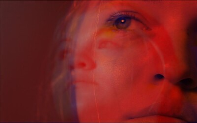
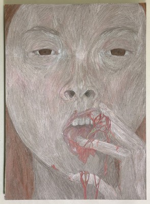
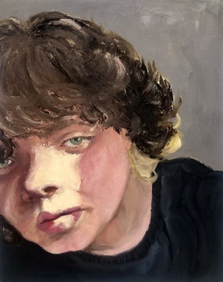
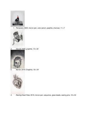
I want to make people uncomfortable with my art. Using drawing, photography, and audio to make striking pieces that blend disciplines, the art is often gross or distorted and is meant to unsettle while conveying a feeling. A large amount of my work is self-portraits, where I distort my own image to convey personal themes: from medical issues to emotions like agony. Using myself as the subject of my work allows me to express myself very directly; and I am greatly inspired by Maria Lassnig’s self-portraits that abstract the form to convey meaning.
In my drawing work, I use colored pencil, often over watercolor. Texture is a big focus in my work, both the tactile texture of my drawing mediums or implied in my photos. Many pieces are focused on texture, alongside lighting. My art has limited intentional color palettes that draw inspiration from color meanings and how that relates to each work’s meaning. Approaching drawing like more like painting, I have started looking towards painters like Francisco Goya as inspiration. Having long had a fascination with process and imperfection, my work often has evidence of the process in it, with sketch lines or intentional flaws like warped paper and blurry photos. Audio art is another medium I have explored. For example, in my piece Sinew, the audio of chewing sounds makes it more uncomfortable as the drawing uses cannibalism as symbolism.
Beauty and horror are not as opposite as many people believe, and horror art does not always equate to negative emotions. A theme I am interested in exploring in my work is the overlap and how horror art can be used as a tool for comfort and self-reflection. Recently, I have started using more body horror inspired by artists like Junji Ito, whose masterful use of body horror has impacted my own imagery, and Mokumokuren, who distorts human figures to vaguer shapes in order to emphasize their work’s themes of humanity and what defines it.
-

Jamie Rogers Art399 Portfolio
Jamie Rogers
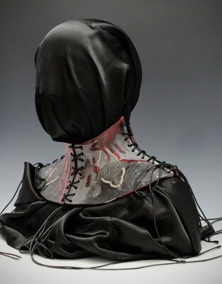
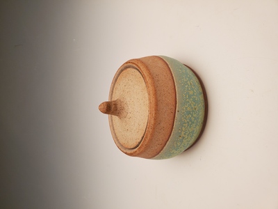
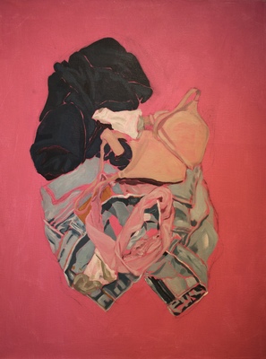
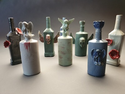
Sex is political. Here, I view kink as a non-authoritarian resistance to conservative sexual values. This subculture has a long tradition of opposition to mainstream conservative values, particularly those of sexual and political correctness. While the association of pain with sexuality can be dated back to ancient rituals, such as those in favor of the Goddess Inanna in 3000 B.C., the post-World War II era witnessed an exponential growth of sexual fetishism, particularly in BDSM. This period also saw the emergence of fetish material like rubber, latex, and military or medical gear, with leather fetishism evolving into a subculture. Leather and latex were employed as vehicles to challenge the perceived innocence that is symbolized by cotton and lace. Using these materials, I have created wearable ceramic sculptures inspired by the kink community's opposition to authority grounded in history, sociology, and psychology.
Inspired by artists such as Nicole Moan, with her highly detailed corsetry, and Wolfe Von Lenkiewicz, with his dark and surreally challenging paintings that confront traditional aesthetics, I want my pieces to be visually appealing and simultaneously quietly disturbing. The central theme for my work is the idea of restriction. My work delves into the ways in which the body can be constrained and controlled using hard, ceramic components in conjunction with different forms of binding seen in the kink community. Ceramics, as they are hard, cold, and unpleasant, are the ideal medium to counteract the softer, though highly exoticized, textures of leather and latex. This juxtaposition reflects the strong yet balanced power dynamics required in a healthy BDSM relationship. Along with employing materials that evoke the foundations of kink, I use colors like black, red, and gold in my artwork to arouse ideas of femininity, sexuality, and personal power.
This emphasis has pushed me to be creative in combining disparate textures and materials in cohesive pieces, while simultaneously stretching my technical skills in ceramics. Through this focus, I have pushed the boundaries of what is possible with clay: Producing work with the intention of being visually appealing while provoking a personal conversation with the viewers personal biases associated with sex and sexuality.
written: 3.22.2025
-
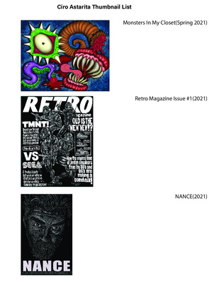
 by Ciro Astarita")
Professional Practices(ART 399)
Ciro Astarita
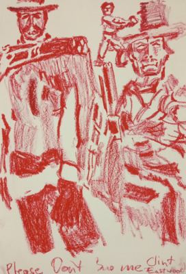
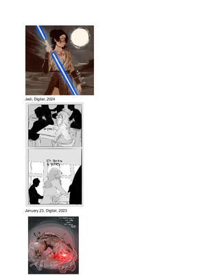
The blending of cultures and the fusion of art mediums are both integral components of contemporary art culture. High art, low art, sculpture, fashion, graphic design, animation, traditional drawing and digital illustration are all coming together in today’s world in interesting and unique ways. This parallels my life growing up as an Italian American, one side of my family being from Italy and the other half from America. Growing up, I was inspired by my love of comics and cartoons as well as my frequent trips to Italy and visiting my nonno and nonna. Italy is considered ‘old’ and America is considered ‘new’ in the greater context of history and both pull inspiration from each other in our current day. My work aims to combine the best of both worlds by blending traditional methods of creating art, primarily illustration in the form of comics, with the ease and convenience of technology and digital tools while incorporating influences from American popular culture and Italian art. This can be seen in ‘Thank The Heaven’s Issue 1: Plate of Bones’ where I have created an issue of a comic inspired by the older style of weekly publications such as that of Casper The Friendly Ghost or Archie while having it set in Europe in a vaguely distant time period . Some of the artists that inspired this work include italian comic artists Angela and Luciana Giussani, the creators of the italian black comic ‘Diabolik’, and comic book artists and writers Frank Miller and Dave Gibbons, creators of the comics 300 and Watchmen respectively.
-

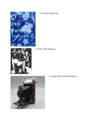
Beth Bailey ART399 Portfilio
Beth Bailey
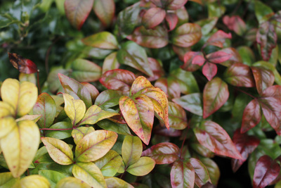
My photographic work documents the landscape and plants in rural Western Kentucky and Tennessee. Through botanical specimens, such as flowers, I show the beauty of this area. I contemplate the influence of humans and the transformation of previously untouched land. Through landscape photography, in color with black and white film and alternative processes, I seek natural places that provide a calm and stable feeling.
Exploring the relationships between objects, considering the lines they create or the interplay of soft shadows, reveals a play of rough and soft textures, accentuated by mid-tones—a shared element with the three chosen artists. Many of the works render a flower that grows wild or a seasonal one, bodies of water, a forest or a rural landscape. A focal point in many of my works shows a symmetrical composition, emphasizing stability. In my cyanotypes and photograms, I rely on instinct and intuition, reflecting the manual skills ingrained in me growing up and my background as a former biology major. The inclusion of Buttercups (Daffodils) seamlessly honors my grandfather, fondly known as "poppa," symbolizing beauty and life's possibilities. His teachings, emphasizing step-by-step problem-solving, resonated with me, while my biology background informed my exploration of nature through landscape photography.
The influence of photographers like Terry Evans, particularly her body of work "Prairie Specimens" is one that I emulate because of our shared affinity for botany to document the ever-changing landscape. Dana Fritz creates photographic monographs of natural and constructed landscapes, both of our works, mostly use black-and-white imagery. Imogen Cunningham's bold use of plants, characterized by striking mid-tones, center composition, and a filling of the frame, serves as inspiration. Whether employing cameraless processes or capturing landscapes each subject is approached with curiosity and respect, leading to a profound exploration of digital and analog photography.
-

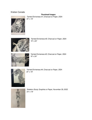
Art399 Portfolio
Kristian Canada
I value a synergistic use of color or value. Additionally, using details that can be seen working conjointly to further the level of my art. The mediums I enjoy working with are charcoal, oil paint, graphite, and clay. Most of my work is illustrated in black and white with my main medium being charcoal due to its ability to form and cast by using layers. I use this element to add expressive additions, shading, and line work to my art.
The ideas that I want to focus my work on are freedom of expression and creation where I can simply create in-the-moment work that a viewer of the piece might personally relate to or simply admire. Concepts that I feel drawn to from inside and outside of art are bold and dynamic pieces that portray movement or expression while also taking up space. I have always been drawn to contrasting elements such as lighting and shading because of their ability to add a tone to the piece that wasn’t there before.
An element I tend to focus on in art is organic pieces because of the immersive aspect of the movement an organic shape or line can bring to create the desired movement in a piece. Other elements in combination are value and composition. It also utilizes organic shapes and lines tied with a value of contrast and form that feels unique to each character to create diversity.
Kristian Canada
-

Maria Castlen Art 399 Portfolio
Maria Castlen
Often, I find myself following the mindset of “go, go, go”. I get caught up in the rush and chaos of the world. The bold, stimulating designs that are prevalent today further feed into the need to constantly to keep busy. To counter this, I like to bring a little bit of the past into my designs. I see it as a throwback to a time when things were simpler. Whether it be through the font, color palette, or illustration style, I embrace the chance to use a blast from the past.
I create designs that find the medium between modern enough for the high-paced world we live in yet still incorporating vintage charm that many designs of today lack. Serifs and monospace typefaces are favorites of mine as well as using a subdued color palette to recapture the quaint aesthetic. When used in the right way, these elements can harken back to the past. Digital illustration has also been a method I use to fuse the old and new. This is shown in my social media advertisement using antonyms for the ice skate brand, Edea. I illustrated the skates and structured the type to mimic a vintage advertisement of the 1930s. Branding allows me to utilize the styles I admire and combine graphic design and embroidery. Joining these allows me to create a brand which honors the roots of embroidery and draw in the modern viewer. For example, the “lazy daisies” used in the motif for my brand, Needles & Knots, are one of the first embroidery stitches learned when learning embroidery. They convey a simple style that embroidery can be done in that is not usually seen in by the mainstream audience.
Everything about Louise Fili’s designs are the direction I want to take my design work in. She and her team create elegant and simple, yet eye-catching designs. Upon stumbling into Ella Phillips Embroidery on Instagram, I knew that this was a brand to follow. She has a range of designs while still staying true to her overall aesthetic. Helen Green’s illustration style is something I continue to admire. The simplicity in which she draws her subjects is something I wish to achieve.
-

Irian Christie's ART399 Portfolio
Irian Christie
My art weaves together personal experiences and cultural heritage through drawings, paintings, and sculptures. Each piece tells a story about family, identity, and Indonesian roots, inviting viewers to engage with moments of joy, growth, and reflection. I draw inspiration from childhood memories, family traditions, and cultural symbolism, using bright colors and playful imagery to evoke emotions ranging from happiness to introspection. By sharing these personal narratives, I hope to encourage others to reflect on their own stories and connections.
Texture and pattern are essential to my work. I incorporate traditional Indonesian techniques, such as Batik—a wax-resist dyeing process—and woodworking, to create detailed surfaces that add depth and movement. These tactile elements allow me to merge cultural practices with modern artistic approaches, bringing both visual and emotional richness to each piece. Artists like Iwan Effendi influence my focus on storytelling by inspiring me to see each work as a visual narrative unfolding through form, color, and material. Similarly, Marina Elphick’s intricate craftsmanship encourages me to explore fine details and textures in my work, pushing the boundaries of my artistic practice.
At its core, my art is about connection—between identity, culture, and creative expression. Growing up with a mother who pursued art, I was motivated to embrace creativity as a way to find meaning and inspire others. As the eldest sibling, I strive to show my family and others that it is possible to build a meaningful life through art. I believe that art is a universal language—one that fosters understanding by connecting people through shared experiences, emotions, and stories.
-

Art 399
Jayson Coley
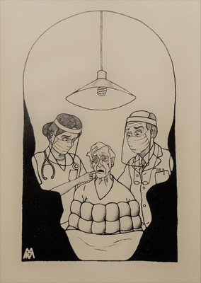
In my exploration of abstract and portrait photography, I aim to transcend the confines of traditional visual representation, delving into the realm of the intangible and the unseen. Through a careful interplay of light, shadow, form, and color, I strive to capture the essence of emotions, concepts, and fleeting moments that elude direct description. Abstract photography allows me to break free from the constraints of literal interpretation, inviting viewers to embark on a journey of subjective interpretation and personal connection. By distilling the familiar into the unfamiliar, I create compositions that challenge preconceived notions and encourage a contemplative engagement with the visual experience. Through the lens, I seek to capture the hidden beauty within the ordinary, transforming the mundane into the extraordinary. Each photograph becomes a visual poem, inviting viewers to embrace ambiguity and find their own narratives within the abstract forms and textures. In embracing abstraction, I aim to evoke a sense of curiosity, inviting viewers to explore beyond the surface and engage with the layers of meaning embedded in each image. Through this dialogue between the concrete and the abstract, my work becomes a celebration of the infinite possibilities that lie within the language of form, inviting viewers to perceive the world through a new lens and discover the beauty in the ever-shifting patterns of light and shadow. Some of my influence comes from a photographer on Instagram “moniqueyvonn”. A lot of her photos consist of vibrant lighting and abstraction. What inspires me most about her work is the creative work and ideas behind it. I find it truly amazing how she separates the lighting, if she uses more than 2, and the textures it brings within the photos. Ways I try to implement that into my photography is by way of location in the light source or the position of focus on the subject
(photo with suit and tie). I feed on content from creators scrolling through social media. One in particular has a good sense of video quality, different framework, lighting, and audio selection. His name is Deveja Webb, known as _djuice on instagram. The inspiration from him is use of a strong focus. You’ll see this in most of my black and white abstract photography. One to look at is the last photo. Ways I want to utilize his skills in the future is by using the background to complement the foreground as you see below. .https://www.instagram.com/reel/CmKNt7RPxUy/
-

Faith Conner Art399 Portfolio
Faith Conner
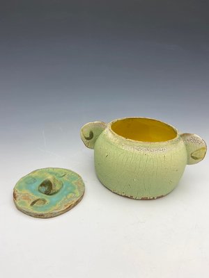
My work consists of various explorations across different media and prompts. At Murray State University, numerous opportunities have been provided to experiment with media such as painting, ceramics, woodworking, and more.
Inspired by artists like Ian Basset, known for creating clay forms that explore diverse glaze patterns, my work often incorporates exaggerated details and intricate forms. A recent example includes a series I made that experimented with different clay forms and combinations of different glazes to create unique bowls that serve as a functional piece as well as a sculptural piece.
Ultimately, the goal is to encourage viewers to embrace new possibilities within their own lives. The work serves as a reminder that experimentation with unfamiliar materials can lead to discoveries about both oneself and the surrounding world.
-

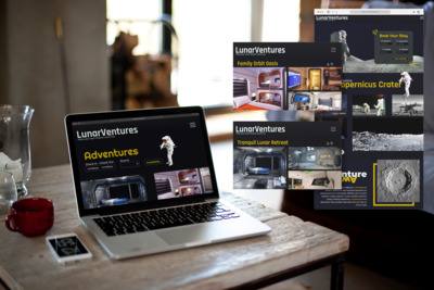
Caitlyn Cooper - ART 399 Portfolio
Caitlyn Cooper
My body of work combines Graphic Design and UI/UX design to investigate and problem solve how to make well-designed products that are interesting and accessible to the broader public. UI/UX work has allowed me to design with intention, finding purpose in my choices and making the experience easy to navigate for the end-user.
Accessibility is not an afterthought but a cornerstone of the creative process. Whether crafting a website, a mobile app, or a digital interface, each project must be approached with a deep understanding of its context, audience, and objectives, ensuring that every design choice aligns seamlessly with overarching goals. My design process includes using tools such as Figma, Adobe Illustrator, and Adobe Photoshop. Inspired by the study of Sociology, a fascination with the human experience and the patterns of human behavior within design has emerged as a primary theme within my practice. Language, behavioral patterns, and social norms are shaped by our culture. Learning how to apply sociological knowledge to design allows one to work with human behavior rather than against it.
“Alpha-Gal Pal” is a UI/UX mobile design mockup centering around Alpha Gal, an allergy causing intolerance to red meat and other mammalian products. The app that I conceptualized and designed would allow users to scan grocery items while shopping, checking the ingredient list and product for known allergens. The app’s visual design and functionality would ideally allow users to feel safer when shopping, as the FDA is not required to alert consumers about red meat by-products in ingredient lists. By making the design accessible and helpful, allergens become easier to navigate for users.
Massimo Vignelli is an influential Graphic Designer and his work has shaped my approach to design and typography. Studying Vignelli's work, including his New York subway signage, has taught techniques for creating visually engaging typography and accessible design solutions. For a Web Design course at Murray State University, students were tasked with redesigning an Art Museums exhibitions website only using typography. Vignelli’s bold typography work inspired my work for the project and allowed for the creation of aggressive typography that reflected the Tate Museum and the contemporary art they exhibit. Although the typography is visually aggressive, navigation and accessibility were still important factors when constructing this design.
Through the convergence of graphic design and UI/UX, I strive to redefine the boundaries of digital creativity, forging new paths that prioritize accessibility, intentionality, and above all, empathy.
-

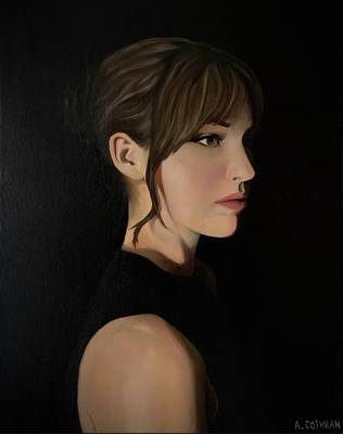
Abigayle Cothran ART 399 Portfolio
Abigayle Cothran
After my mother passed away, my interest in her old photos grew, and I became intrigued by changes throughout time. With everything in my own life changing so much, I began searching for consistencies in the photos. Through my grief, I needed there to be things that hadn’t changed and would not change. There had to be something that had remained unchanging. Anything that hadn’t been touched by time could be something that connected me to her. The people in the collection of photos stayed the same, but their appearances were ever changing. The rooms and the homes were always different. The places and cities never stayed the same. But, soon I noticed a dining room table. It showed up in many photos. Everytime in a different room. Everytime one of my parents, or both, were sitting at it. And now that very same table sits in my own dining room so many years later. A table that’s been a constant for nearly 5 decades. An old table is not something I ever would have considered special, but now it is something I can find comfort and peace in.
My paintings are naturalistic; I strive to honor the details and accuracy of the moment I am painting. The scenes I choose are significant, so the time put into studying and recreating every detail is important. I am inspired by Jeremy Lipking’s ability to use refined levels of definition and detail, while leaving other areas vague and loose, and how he uses subtle color shifts to achieve a more naturalistic look. I also look to Ekua Holmes as inspiration for her use of vibrant colors and seemingly unimportant moments to explore ideas of childhood and family bonds.
This series of paintings maps the inevitable transformation of lives, environments, and relationships across 5 decades from the steadfast perspective of a dining room table. Through my work, I encourage my audience to consider the enduring constants within their own lives.
-

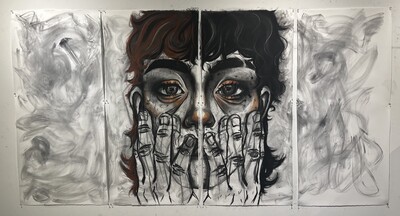
Professional Practices Portfolio
Krizianna Groves
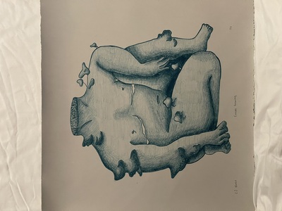
My artwork consists of large self portraiture drawings and paintings. Exploring the amount of distortion I can create with my face and hands. The distortion of my body stems from the sexual assault I’ve experienced in my life. How their hands on me made me feel disconnected from my body and self. Living with that trauma that will continue to follow me, caused myself to not see me correctly or even feel like me. Maybe if I looked different it wouldn’t have happened. I also create work that has my partner as the subject instead of myself. He’s drawn to be sort of a safe place for me since he’s the only one that hasn’t hurt me and instead is helping me grow. I feel as if he’s the only one I can draw in the closeness of distortion that I take on because he also bears my pain with me. He’s the first partner I’ve ever wanted to draw, I feel as if that makes him permanent in my life.
I wasn’t listened to when I said no, stop, or don’t touch me in the past. I want to regain that power back, where I can give permission. I want people to touch my work. When people see a painting or a charcoal drawing they assume you can’t touch it because it will change the artwork. I want people to interact with my work even though it will change the outcome, it’s taking back what was taken from me, my word, my permission.
Color used to not play such a big part in my work. It was a scary experience first trying out color and how it would react with the charcoal. But now that I’ve gotten to know color, it’s everywhere on my drawings. It’s now playing a big part in my work with how my self portraits are focused on the warm tones. Red, orange and yellow are really intimidating colors for me because they are bright and out there, but that’s what I want people to be attracted to with my work, you have to look at the bright colors to focus on what’s going on in the drawings. The works with my partner being the figure are using cool tones where they aren’t as attention grabbing, which it’s to show that I view him as safety and comfort, where I feel most at peace.
Artists that I’ve grown my inspiration from are artists like Jenny Saville, Marlene Dumas, Junji Ito, Maria Lassnig, and Chloe Piene. All of these artists have helped me figure out my own style when it comes to creating how I see myself and how I create the pain and distortion of my body.
-

Jordan Harrell ART399 Portfolio
jordan harrell
Life is an intricate tapestry of emotions, aspirations, and profound interactions. My artistic journey is dedicated to capturing the essence of these moments and offering viewers a glimpse into my unique perspective. Whether through the rich textures of oil painting or the raw expressiveness of ink and graphite, my aim is to transport viewers into immersive narratives that resonate deeply.
Drawing inspiration from masters like Vincent Van Gogh and Sarah Dean, I integrate vibrant colors and dynamic lines into my work. The swirling patterns reminiscent of Van Gogh's night skies and Dean's masterful equine portrayals serve as guiding influences, enriching my artistic vocabulary.
Each stroke of my brush or pen is infused with personal experiences and observations, inviting viewers to connect with scenes they may never have encountered firsthand. By harnessing the power of visual storytelling, I strive to evoke emotions and provoke contemplation, fostering meaningful connections between art and audience.
-

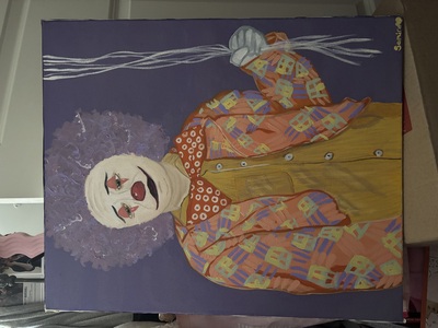
Samira Art399 Portfolio
Samira Johnson
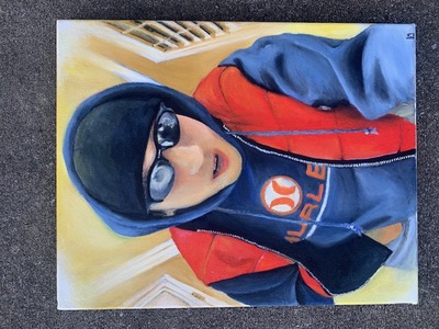
When you are first seeing my artwork, wanting it to bring some type of Joy. The main reason I make art is because it reminds me of when I was young, I’ve always had a creative mind. I loved creating things and my favorite classes to always go to was art. The initial reaction when seeing my art is it wouldn’t be what you would expect. Most people looking at it would see some similarities but at the same time sometimes my concepts don’t flow. The main similarity you see when you look at my art is how I use color and when I discuss color it’s mostly bold colors. I love how color can transfer your work into your own, especially pallet choices and how you tend to use color. My work tends to be based around things I enjoy or that would make the audience think about why I’m making art about it. I like for my artwork to be unique and so I try to do things that I know I specifically like so I can see other people's reaction to those things as well. Concepts for me are very broad, my main thing I would want to solve is getting into the flow of how I can connect all these things together. For the most part, I want the audience to just enjoy and think about what they’re seeing. I wouldn’t say it’s too complicated to pinpoint what the concept is, more so why I chose subject matters and how I chose to use them. Color for me is my most obvious in my artwork, I really enjoy blending colors together and getting different tones for different vibes I want to go for. Most of the time with my work I like to add pink if possible, overtime it’s just been my signature and it’s shown up in a lot of my work, so it kind of becomes a thing where it becomes my own. I think in the future I would like to do more with that color and explore it more. When I create art, I enjoy painting the most, I would say that’s my preferred medium because you can do lots of color mixing. I also liked the process of painting because you sketch it on so you get that drawing aspect but instead of shading you go in with paint. I have enjoyed oil paint because that’s what I’ve used since coming to Murray and taking an art class. I have tried other paints in the past but oil has definitely been my favorite. It’s been my favorite because of how blendable it is and also how long it takes to dry because then you can go back over certain things. Artist I take influence from is Khinde Wiley, what draws me to his work is the background he chooses to put his subjects in making his own. I enjoyed Takashi Murakami’s work as well for the bold colors, and the repeated symbols that he continues throughout his works. I also really enjoy Odilon Redon even though we don’t work in the same medium, I enjoy the unique concepts and characters that he uses throughout his work it makes you take second glances when looking at it. With my art as a whole, I’m still finding myself and finding what I want to make art about. I’m not a very open person, so I think it’s hard to dig deep and put the other layers of myself into my work. For now I can say that what I make is things that I enjoy, and sometimes that’s what you need in a world of chaos.
-

Ash McIntyre Art399 Portfolio
Ashlynn Eve McIntyre
Artist Statement
Ash Eve McIntyre
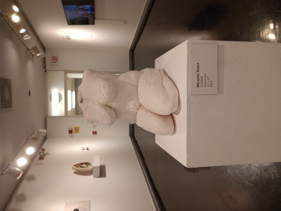
I create figural work exploring themes of object-human relationships in the context of childhood trauma and its aftermath. The works are made using a variety of media, including wood, ceramic, paint, and even found objects such as stuffed animals. The same craft techniques that are used to create comfort within domestic settings, I utilize to give care to the figures.
In the work, there is an emphasis on comfort and platonic love in my work. Stuffed animals are used in my sculptures to relate back to both domesticity and physical comfort. While the works represent the traumatized individual, the tone of the pieces are generally of emotional recovery and resilience. In this context, elements of ideal domesticity such as stuffed animals and hand-made clothing express realistic and achievable forms of happiness.
Many of my works reference the Greek mythological stories, like those from Ovid’s Metamorphosis, in which characters often undergo a transformation into an object or animal after experiencing a traumatic event. This transformation creates a paradox in which the character both survives and dies. In Ovid’s recounting of Greek myths, their new form is often supposed to protect them from further harm, but ultimately this objectification only further takes away their agency. These references to mythology allows the work to make obvious that traumatic loss of identity is a long-established but often unspoken human reality.
The relationship between psychological death and physical comfort in my work ultimately yields itself to these artworks acting as their own alternative to heaven. Despite surviving, their object bodies have been taxidermied into the state of eternal comfort.
-

399 Portfolio
Addison Miller
The overall goal of my works is to tell the stories of the characters I have created and give my audience a glimpse into who the characters are and why they are the way that they are. I make pieces and characters based on the environment around me, specifically the plants and animals in my own backyard. My process starts in my current sketchbook. Sometimes characters get reused from a previous time in my life that I feel I could improve upon, characters designs will more likely than not change over the course of time. When I am satisfied with the design of the character, they are ready to be incorporated into the story, whilst designing the character I probably already have a good idea of what their personality is based on appearance or if they are based on a specific person.
I work mainly with COPIC or Huhu markers on Bristol paper, this is my chosen medium because the smooth and easy blending of the materials make it possible for me to achieve the look I'm going for, although recently I have been incorporating colored pencils into my work after it was recommended to me. They are mainly used to color the background; this helps the characters stand out as opposed to the marker on marker look.
When it comes to my style of drawing, I am heavily inspired by the works of E.H. Shepard (the illustrator of the Winnie the Pooh books) and Beatrix Potter (the writer and illustrator of Peter Rabbit) with both of these artists' works focusing on giving anthropomorphic traits to animals or other various objects.
-

Professional Blends
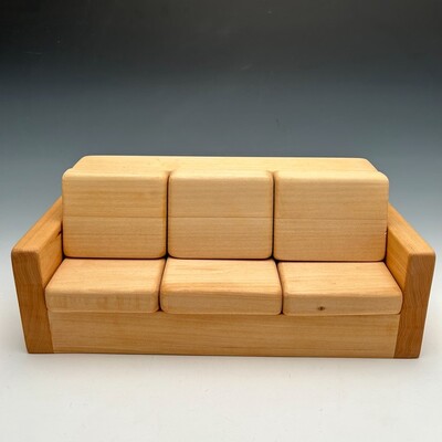
Cameron Neal
My works explore personal ties to my living environment and need for comfort. Comfort is something that I often think about because I spent so much of my life feeling uncomfortable in my mind and body. My works consist of many materials, but I mainly work in metals and wood, and my process relies heavily on hands-on experimentation. I’ve had experience crafting, but I have never been so meticulous with my work before now.
One of the works I included is a domed ring that mocks the shape of a pillowy or cushioned object even though it is made of metal. Another work is a jewelry box that looks like a couch, made to keep personal items. There is humor that can be found in this piece due to it being a place to keep personal items, but a couch is typically where you would lose such items.
While I take being an artist seriously, I do not think all of your artwork has to be serious. These works represent my personality and show the absurdist and ironic side of me. There is humor that can be found throughout all of these pieces. The nostalgic aspect of the pieces also helps convey a sense of contentedness and comfort throughout these works.
My influences within the design world have impacted how I view making art. Wharton Essherick stated “If it isn’t fun, it isn’t worth doing,” and those are words that I stand by wholeheartedly. I don’t think that being an artist should be seen as a job you have to perform, you should be having fun and making things that speak to you as a person. Angela Delarmente created works with metals and speaks on how she enjoys being able to take such a hard material and bend and shape it to soft, intricate designs. That outlook on metalsmithing has shaped the way I look at metalsmithing.
-

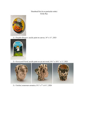
Art399 Portfolio
Emily Ray
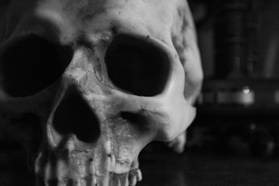
I mainly work with paint, using it to captivate texture and feeling on a much deeper level than just its color and flow. Paint is the perfect form of expression I find easiest to express. Themes such as emotion, vulnerability, and personal reflection are topics I like to touch on using human anatomy or skeletal systems.
When it comes to general imagery, the use of dark/light and body language, my work is inspired by Caravaggio and his use of intense lighting to showcase darker feelings that include a narrative. In connection to Caravaggio, Van Goh as a person also inspires me to think deeper about the parts of myself that I can harness in order to convey emotion and texture. Both of the artists dive deeper into the sense of feeling on a deeper level.
-

Art399 Portfolio
Sydney Robinson
At some time, all people struggle either mentally, physically or emotionally. Most have some form of struggle that we carry around with us. Some show their struggle while others hide it very deep down. I create illustrations to show people that they are not alone in their struggles.
I build illustrations that incorporate heavy outlines, with a tone of cartoonishness and I also incorporate type. I want the illustrations to have heavier strokes to help provide a sense of unrealisticness to very serious concepts. I incorporate text as a way of giving the piece a direct meaning. I want to create the illustration's anatomy that is genderless as a way of allowing everyone in the audience to connect more with the piece itself.
I also build typography that incorporates a hint of color with a simple layout. I want the typography to express and highlight the overall importance of a quote in which it is referencing. I think the right use of color can help enhance a point and be more eye-catching to the audience. When I create a typography I want to use phrasing in which it sounds as though the words that are being displayed are being said to the viewer themselves as a way of connecting the pieces to the viewer.
The design process for the layouts of these posters was influenced by illustrators such as Max Erwin and Carles O’Dowd. Their use of line work in their pieces is not over realistic. I find unrealistic artwork to be very comforting and somewhat cartoony. I find that cartoony artwork is a nice way of taking harsh reality and softening it down to make viewers more comfortable with the subject. I want the art I display to stimulate both the viewer’s mind and emotion. While leaving the viewer wanting more.
Sydney Robinson
-

Hayley Runyon Art 399 Portfolio
Hayley Runyon
I often think about the meanings behind my artwork. Why do I create what I create? I’ve realized more recently that the answer is simple. I make art about the things I love. More often than not it can be simplified to the people I love. They seem to be the subject of at least seventy-five percent of my artwork. Not to exclude those we think of as “Children”, or simply our pets. I also love to draw and paint nature scenery. Painting is the medium I mainly use. I use a wide arrange of acrylics, oils and watercolors. I specifically love to paint flowers due to their vibrant colors and different varieties. Most of my artwork is happy, however, it often reflects on my personal life at that time.
The subject of my work has recently shifted to mental health awareness. This is do to a tragedy that occurred in my family. It has caused me to reflect on my own mental health, and others around me who I know have struggled. When working on landscapes, floral centerpieces, or incorporating pets into my work, I often look to Peach McComb. She combines realism with abstraction. Another inspiration for me is Guy Denning. I gravitate towards the sketchy lines he incorporates into his finished pieces, as this is something I see throughout my works. I use my artwork to send a message about myself, others, or simply the world around me.
-

Eve Sexton
Eve Sexton
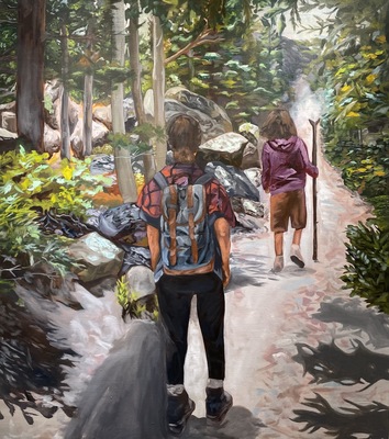
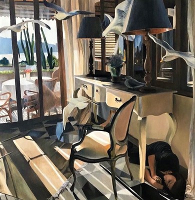
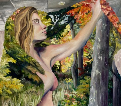
In my personal landscape art, there is a focus on nature, family and nostalgia. Combining those elements usually allows thoughts to percolate of times in life where people feel most akin with nature. I feel there is peacefulness in nature, as well as the fact that it is something that has been around for eons, provokes thoughts of mankind’s place and progression in the world. There is an order and a system that things just instinctively follow in nature, life and death is so common and unavoided. Things grow, they die back, they come up again when the time is right. That connection winds itself into the lives of people as well. When one person or connection fades, there are several others that are still there, and many more to come. By exploring natural elements that people find familiar, but with figures interacting with them, I explore a continued narrative of human connection with natural elements.
Memories can connect places with people and even objects. My memories imbue life into those spaces people remember, both permanent and temporary. There is something about inviting the viewer into the space that is being remembered that offers a personal insight into those past memories. Inviting viewers into the memories of one specific person-myself- prompts them to think of their own memories, especially those that concern the same subject matter- nature and people. Memories take up a lot of space in the brain, and are used to inform everyday decisions and feelings. These memories interact with each other through layers upon layers. Time spent over and over again in familiar places builds the layers of connection between memories of people and places. Oil paint helps exemplify those layers in a literal sense. By actually painting a figure over a landscape, the two are more coherently visually connected.
The figural element plays an important role in my memories, for the most part. People’s faces, actions, expressions, and interaction with ourselves and others helps form those memories of them, as well as places they inhabit. The use of unconventional colors in portraiture- the same greens or yellows or browns that are found in natural or homely environments- add the context of the influence of that natural setting, while still allowing these people who are important to me to be rendered with full values. I am influenced by Heather Horton when I render faces. The brushwork she uses, as well as the earthtone color palette are big inspirations. There is an emphasis on the placement of the face in a place. Considering how a portrait interacts with all the other elements surrounding it, one can gain a better understanding of how exactly that person may behave in an actual setting besides a 2-d representation. In surrealist portraiture, like what Jennifer Coates seems to have done, having a face detached from its body can offer a haunting aura. I am inspired by her incorporation of the face, especially making the features and placement ambiguous. Still, I hope, with the right lighting and background and attention to detail, the more mindful meaning of seeing these faces in these impactful places will still come through.
Contemporary influences:
Heather Horton:
Heather Horton has sophisticated rendering of line and texture in objects and has a painterly, blended style I’d like to emulate.
Jennifer Coates:
I’m drawn to Coates because of her thematic work. She includes figural elements in a vaguely similar way to what I have been doing. I am interested in how she uses non-local color, and has so much contrast in her work.
Erin Hanson:
Erin Hanson's work has a compelling use of strong light sources as well as saturated color. I am drawn to the way that she blocks in colors as shapes, and how she doesn’t shy away from texture.
-

Art399 Portfolio
Sadie Smith
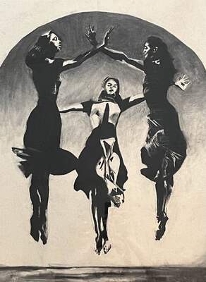
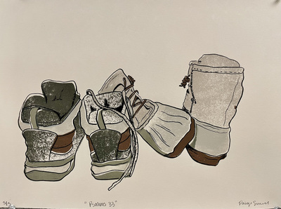
My work mainly consists of drawing, using charcoal, ink, and pastels to create pieces that emphasize stark contrasts and surreal, dreamlike atmospheres. The contrast between rendered forms and flat backgrounds creates a sense of timelessness, as if the subjects exist in a space removed from reality. This quality is evident in pieces like “Three Birds,” where three women appear to float in an undefined, eerie environment. The implausibility of the forms and their ethereal nature contribute to the dreamlike quality of the imagery, making it clear that these scenes could not exist in the real world. The themes I explore generally fall into two categories: personal experiences, or larger societal issues. In “Guilt,” I delve into the inner struggles of a woman suffering from anxiety and shame following an abortion. The stark contrasts and monochromatic tones convey the weight of her emotions. Conversely, “Tsar” critiques the power and influence of the wealthy elite, using dark, imposing imagery to challenge the viewer’s perceptions of authority. These themes allow me to connect personal experiences with broader social and political contexts, making my work both intimate and universally relevant. While drawing is my primary medium, I also incorporate 3D elements such as ceramics, metalsmithing, and mixed media sculpture. These additional mediums challenge me to think differently about form and space, enhancing my technical proficiency. This progression is evident in “Tsar,” where the body is depicted with a high level of detail and realism, contrasting with the flatter, less anatomically accurate figures in “Three Birds.” Artists like Mark Rothko, Kathe Kollwitz, and David Cerny have significantly influenced my approach. Rothko’s use of color to evoke mood is something I strive to incorporate in my work because I believe that color is very important in evoking feelings. In addition to this, Kollwitz’s high-contrast drawings influence my rendering of light and shadow, and Cerny’s bold political statements inspire my use of symbolism as a confrontational response to a variety of political and social issues. Through my art, I aim to create visually striking and thought-provoking pieces that encourage viewers to engage with the underlying themes and emotions of the works. My goal is to create art that resonates on a deeper level, challenging perceptions and provoking meaningful conversations.
-

Kaylee Vanlue ART399 Portfolio
Kaylee Vanlue
Serving as vessels through which one is able to navigate notions of identity, belonging, and passages of change, honoring intersections of cultural heritage alongside influence of the diasporic community, my work is established. Central to my body of work is exploration of lived experiences alongside the development of materials over time. Emphasizing the interactions of an item with the environment it has been placed in. How do these reactions of environment evolve into something relatable to lived experiences of humans, and how does it tie everyone together?
Consisting of ancestral impact, close at hand with modern comforts, an intertwine of multicultural perspectives is established. I include motifs of Vietnamese history into my work through traditional practices or forms juxtaposed with contemporary content, combing through heavy and light topics of race concerning more than the Asian community alone, tying in any and all issues of identity or a communal identity that one can identify strongly with.
Exploration of the metamorphosis of something that will be created and the interactivity of a piece with its environment or an audience have recently become essential in my planning or indented finishing of a piece. Acknowledgement of what will become of someone or yourself in the future is essential, as is what something will become once you have left it to continue within its natural process. Just as materials undergo transformations in response to their environmental factors, we as individuals adapt in our own ways. Similar to how weathering can shape the form or texture of an object, life factors such as experiences and cultural upbringing shape a person’s perspectives, beliefs, and personality. Moreover, the “decay” of an object acts as a metaphor for the wearing processes an individual would undergo throughout their lifespan. Relationship between material change and human change serves as a distinct reminder of the interconnectedness of the natural world; all the while, roping in universal themes of impermanence, resilience, and adaptation.
Conducted through metals, fibers, and wood, recently my work has held inspiration from an Asian American artist, Georgina Leung who specializes in cultural motifs in both two-dimensional and three-dimensional fabrications and Chie Shimizu, whose work focuses on significance of human existence while also tracing back into his ancestral past. Leung tends to air on the lighter side of things using comfort imagery to bring a more ataractic sense to her work while Shimizu evokes a more intense use of similar imagery to portray individualistic energy and “immensity of nature”.
Ultimately, the navigation of self and others mirrored by the continuation of evolution are what drive the intention of this body of work. The relationships and reciprocal nature of an object with an environment produce messages of everyday experiences that can relate all people together despite the personal significance of a piece. Interconnection of human life and the life of a tangible object is what I find best transcends cultural boundaries and bridges individual gaps of understanding between all people.
Printing is not supported at the primary Gallery Thumbnail page. Please first navigate to a specific Image before printing.