

-

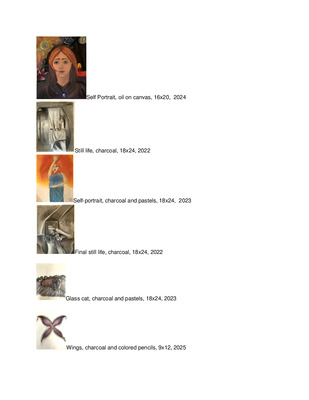
Art 399 Portfolio
Virginia Walsh
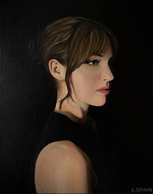
My work is deeply rooted in my upbringing and the environments I grew up surrounded by. Most of my inspiration comes from revisiting childhood memories and translating them into themes relevant to my adulthood, primarily through painting. The majority of my body of work consists of portraits, specifically those of people I love dearly and whose faces are most familiar to me. I am fascinated by the way light interacts with skin, how sunlight at a particular angle can allow the flesh to appear translucent, and the myriad of color within the shadows of the face.
I strive to tell a story through the eyes of my subject, which is an aspect of my portraiture I put special attention into rendering. Eyes can transform the insipid to something deeply poignant, and unveil meaning behind mundane. Though my work is incredibly personal, eyes are my connection to the audience; there is no need to ‘understand’ portraiture, but the ‘windows to the soul’ translate the semblance of the piece for my viewers to empathize with.
Being raised in rural western Kentucky has also had a profound impact on my art making, as well as the environments my subjects are seen existing within. My landscapes are inspired by the nineteen acres of woods I once lived in, and exploring the creek with my younger sister in the summer. Spending many late July afternoons hiking through sun-lit foliage and collecting geodes in the sparkling stream of the brook has heavily influenced my painting, where I long to recreate the feeling I experienced during those many summers within my work.
My artistic influences are an assemblage of individual works I was introduced to in development that shaped certain aspects of my portraiture currently. My hometown of Paducah, Kentucky houses the Lower Town Arts District and Yeiser Art Center, where I was fortunate enough to both witness and be a part of many exhibitions growing up. Local artists such as EJ Abell, who taught art classes out of her home that my sister and I attended in elementary school, and Bill Ford, a long-time family friend and icon of Paducah, have shaped me into the painter I am today. I have drawn inspiration from popular artists such as Georgia O’Keeffe for their color palettes and brush work in addition to my influences closer to home.
My art is a reflection of myself and all I have loved, the experiences that have molded the reality I currently exist within, and a sincere admiration for the natural beauty of all God’s creations. Striving for exploration and the desire to stay curious.
-

Jonathan Wong ART 399 Portfolio
Jonathan Wong
Jonathan Wong’s artistic journey revolves around the profound connection between emotion and expression, finding solace in the realms of illustration and film. This transformative medium serves as a vessel for encapsulating the nuances of personal mental health struggles, offering a timeless reflection of emotional states.
Central to Wong's creative exploration is a focus on mental health, exploring the complexities of the human psyche and societal influences. Through pieces like "Social Media Kills," Wong delves into the pervasive impact of technology on modern society, utilizing vivid imagery and symbolism to evoke a response from viewers. Color palettes, facial expressions, and spatial composition are meticulously crafted to convey the overwhelming influence of digital media.
In Wong’s creative process, collaboration and introspection intertwine, culminating in works that speak to both personal experiences and universal truths. Drawing inspiration from luminaries like Massimo Vignelli and Paula Scherr, Wong navigates the intricacies of design with a keen eye for detail and narrative clarity.
Driven by a desire to provoke introspection and empathy, Wong’s art catalyzes dialogue and understanding. Through the medium of video, he confronts the detrimental effects of online content on mental well-being, offering a beacon of hope amongst the digital noise. Each piece invites viewers to engage with their own emotions, fostering a sense of connection and shared humanity.
Ultimately, his artistic vision transcends individual expression, advocating for the power of creativity to instigate change and promote healing. By fearlessly embracing vulnerability and authenticity, he invites others to join him on a journey of self-discovery and growth.
-

Art 399 Portfolio
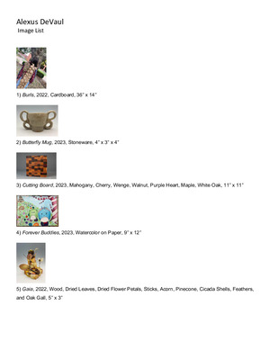
Alexus DeVaul
Seeing how humans pollute nature by leaving their trash behind has been an ongoing question. Why are humans contaminating our environment? As an artist, I am passionate about the environment and its preservation. Drawing and making art from found materials has always been a part of my life. When I was young, I would draw in the dirt or stack objects into structures; and in my first year of college, I realized the connection between my lingering question and my childhood art-making.
In my freshman year, I started to explore art-making from recycled materials. Since we live in a throw-away society, junk is an abundant resource. Most of the junk I use is sourced from the natural environment left behind by humans. I use these found objects in my work to create a sense of connection between the viewer and nature. By working with trash, I aim to promote the preservation of our environment or questioning of consumption and I will continue to conserve materials by reusing waste. My work is thought-provoking. I want viewers to become more aware of their surroundings and our Earth.
-

ART399 Portfolio
Wesley Hammer
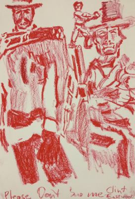
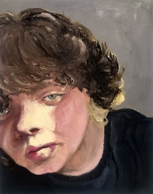
Since a young age, my art has been a proper channel in which it allows me to express my own lived experiences by visually processing the thoughts and emotions that are made through everyday living. The process in which art is made deepens the understanding of oneself. Why I bring into existence art is why I exist. One of the most important influences to the creation of my works is the fact that I am transgender. The way in which I exist in the world as well as the relationships created are also influenced by this aspect. As I continue to transition, I continue to change. Through this change. I have to learn to accept the differences. Learning and flowing with these changes has led to oil painting becoming my main medium. Oil painting takes a long time to dry, this allows for a constant manipulation of the work. Working wet paint into wet creates fluid moments that change the piece. Even working wet into dry, such as glazing, changes the work. Creating the works that I do allows me to accept these changes and process my feelings. These feelings can be seen in the way I paint the flesh. I often use vivid colors, to exaggerate the way flesh looks. The most distinct colors I find myself coming back to is orange, red, and purple. These colors get mixed into the skin in order to create depth that is interesting to look at. With these colors, I hope to express the warmth of kindness and love that I have for these changes. Another influence to my art making is often Christianity and other religious themes. I do not consider myself to be Christian, but I was raised in a Catholic family, so those beliefs have been ones that stuck with me and still influence me today. One theme that I specifically come back to is that of what makes someone holy, and how change through suffering is what creates holiness. I use this theme to relate Christianity to being transgender. Like Christian forms of suffering aimed at sanctification , the actions I take in order to transition are aimed at changing myself to be the best version of myself, or my highest form. I find it important for me to use these themes of Christianity to explore my gender in order for others to be able to connect with my works. This is because many of us experience christianity in our day to day life, or have grown up with some aspects of it. Exploring the way others create art helps me with my own works. Two artists who have influenced what my art looks like are Egon Schiele and Jenny Saville. These two have an extreme understanding of the human body that allows for abstraction to occur. While I deepen my understanding of the figure, seeing Schiele and Saville’s works helps create that understanding. In regards to Schiele, I find myself drawn to the works where he depicts skinny figures with exaggerated bones. Along with his textured application of color, he is able to create borderline grotesque works that explore human nature as well as sexuality. In a similar way, Saville’s works also come across as graphic. Specifically, her influence in my work comes from the way she paints skin. She is able to create an accurate depiction of flesh while also abstracting it to create an overwhelming presence in her works. Exploring these influences, as well as how I approach my art making, allows me to understand myself to a deeper extent. This understanding also allows me to understand my own artwork better. Allowing myself to explore uncomfortable and often raw topics also creates the appreciation of softer aspects of life. Art helps me find myself, as well as allowing others to find me, or even find themselves.
-

TERESA HILL ART 399 PORTFOLIO
Teresa Hill
Aside from the aesthetics of cartoons and video games that I was attracted to in childhood; other influences that often guide where works would go are personal experiences, our connection with nature and others, the development of the imagination, and the human eye. The pieces made from that influence contain something tied back to others, whether it is the use of various warm/cool hues, the use of nature and flowers, colorful clothing on figures, or hands and legs being slightly longer than the rest of a figure’s proportions. Artists like Yayoi Kusama, Bonnie Seeman, and Hayao Miyazaki have also impacted my creation process in unexpected yet exciting ways; especially in recent years as I continue to refine my skills.
Kusama, creating disorienting bright and patterned installations in her Mirror Room pieces, allows for the viewer to become physically lost in those worlds whilst interacting with them. The use of color, lighting, and pattern in her works transforms the once ordinary rooms into a visual stimulation of a world that she sees often. Ceramicist Bonnie Seeman creates her ceramics via meshing animalistic and plant-like elements into one surreal and bizarre piece, despite there being clear elements of flesh, sinew, leaves, and seeds. The bizarre mixing and squishing of elements leave an oddly satisfying yet strange adaptation of everyday items, from cups to teapots. All the while making it seem like a single entity that is a perfect symbiosis and synthetization of both flora and fauna. Hayao Miyazaki has influenced my personal works more significantly due to his use of detailed linework, shading, and his studying of real-life people you would in everyday life. His refusal to warp the human figure outside of normal proportions whilst breaking that rule with his supernatural figures makes every character in his animations and films unique and individual in the sea of characters that are in the plot. The meticulous development of creation for figures allows for the viewers to have a much more personal connection to specific characters without other with significant importance being too close to one another in design work.
With traditional drawing media, the resulting pieces often evoke the somber nostalgia of childhood through the unglossed lens of maturity. I use the grain of paper and uneven blending to mimic the aesthetic of a vintage photograph, selecting colors of varying hues calling attention to specific aspects of pieces to describe the narrative to the viewer. Some with heavier use of color abandon this common theme for a more reactionary and expressive tone in regard to heavily debated topics such as preservation of nature and euthanasia. My personal works, on the other hand, focus on character and world creation, posing, shading, and conceptual development from idea to paper. As I work on my traditional drawings, it often results in separating the focuses of personal works and public works unless I find parallels between themes and sketches.
My ceramic pieces, however, focus on the shape and placement of forms that often result in resembling the scenes from childhood storybooks, warping of common elements such as eyes and plant structures, or simply call attention to themselves via color and/or patterning. Leading to much more experimentation in what looks good and what doesn’t, but also leads to more critical evaluation and more pickiness toward detail and coloration. Ceramic works consistently have a sort of plant element to them, especially with recent works due to me viewing that humanity and nature go hand-in-hand, a relationship where both affect the other in the dance of life.
-

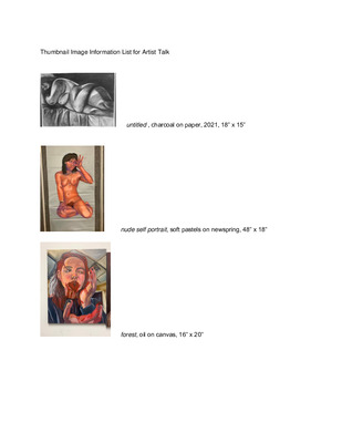
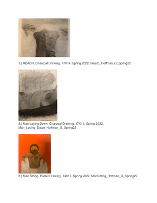
Grant Hoffman Professional Practices ART399
Grant Hoffman
As an artist, my design is heavily inspired by a lifelong passion for creativity and desire to effectively communicate with an audience. My work tends to lean into the realm of swiss design, characterized by simplistic layout and bold san-serif typography. The use of neutral tones and bold hierarchy contribute in building an effective but unique way of communication to the viewer. Oftentimes, my work conveys complex ideas that provoke the viewer to deeper understanding behind a seemingly superficial piece of work. I enjoy exploring the concepts of reliance on technology, false imitation and abstraction within a composition.
I find outside influence in several designers such as Saul Bass and Paul Rand. Bass possessed the ability to captivate the viewer through the use of non-traditional typography and simplistic but contrasting color pallets. This can be seen in several poster design series throughout his career. Rand however, primarily drew his inspiration from the Dada movement. The use of geometric figures and child-like illustrations promotes an abstracted but modern portrayal of childrens book covers. Although both of these artists use several methods of unique abstraction, they also are excellent at logo design. Similarly, I hope to portray both sides of Bass and Rands abstraction and clean straightforward design within my work.
Along with these well known designers, I also have outside influences that have shaped the composition and concepts within my design. Growing up I feel that my family promoted this constant expectation of perfection and unachievable expectation. Often in my work, this idea of flawed perfection is transparent and highlighted to better convey the message. Additionally, as a High School student I also enjoyed creating and listening to all genres of music. This influenced my work to be more aligned with pop culture and better able to express myself through abstraction.
As a college student, I'm continuing to grow and learn more about principles of design as well as the balance between abstraction and simplistic composition. In past work, this has been done through the use of geometric shapes paired with a contrasting collage style. I've also found using simple compositional techniques such as a rule or a drop shadow can also be effective. I'm looking forward to designing, creating, and implementing these principles in the future. Throughout school, I hope to continue designing work that allows the viewer to experience joy and communicates a message clearly to everyone who views my work.
-

Hope
Catrena Kovaloski
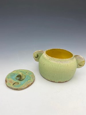
The majority of my work is still very fresh and new. The pieces that get made are typically for college assignments presented in class, more specifically ceramic pieces. For most of my artwork I grab inspiration from my family and pets. I find the most joy in creating pieces through clay on the throwing wheel. The pieces that have been created are a variety of ceramic pieces such as mugs, jars, pitchers, as well as a two-foot cat shaped vase. It is very difficult for me to be able to sit down with a pencil and paper and be able to illustrate a piece to the liking of my ability. What brings me the most joy is creating 3D artwork, because it allows me to utilize my hands more so than with a pen and paper. One artist that inspires my work is Logan Chyla. Logan is a Ceramicist whose work is very simplistic and is very clean cut. I take inspiration from him, because I enjoy the sleek and sophisticated look of my ceramic pieces I make as well. Another artist I take inspiration from is my very own ceramics professor John Utgaard. John’s pieces are very slick and clean and have a uniformity about them. John has also experimented with an array of glazes to create different looks on his pieces. I want to experiment with different color combinations when it comes to my pieces as well.
-

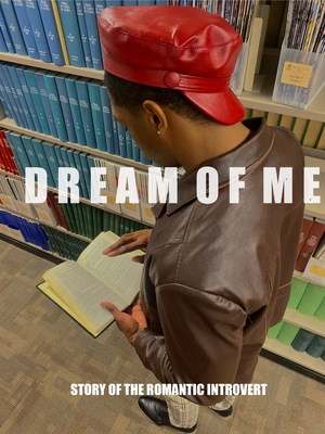
Jamie Myres ART399 Portfolio
Jamie Myres
Jamie Myres Artist Statement
When I set out to create something, I have one main goal in mind: to make the creative process as fun as possible for everyone involved, at every step of the way. I use saturated colors, nostalgic imagery, clever concepts, and most importantly, humor to invoke a positive feeling in my audience. I want them to walk away with a memorable experience, so memorable they tell their friends and laugh together as a result of something I made. My practice is mainly based in graphic design and fiber objects, but is expanding to include other media and found objects.
In the brutal jungle that is girlhood in public schooling, you have to fight for survival everyday or else you are cut from the watering hole. In the words of Cady Heron, “I can’t even watch… and I saw a snake eat a cow!” For me, I found safety in humor. Everyone loves to laugh, and they love people that can make them laugh consistently. It was a trait that came naturally to me, and one I didn't realize I had until much later. It is a part of me, just how it is a part of everything I make no matter how hard I try to be serious. My brain is constantly a chaotic battlefield, with so much going on it often feels like there is nothing going on at all. It feels like there is always a new diagnosis, a new medication, and a new problem to fix. With my art I want other people like me to be able to take off their armor, lace up their clown shoes, and just have fun.
I taught myself a number of techniques and mediums when I was very young so that my dolls could have a pimped out lifestyle. Being an 8 year old single mother of several American Girl dolls was very labor intensive. Learning to crochet and use the sewing machine opened up a whole new world for me, and I never looked back. Crochet remains my favorite process. There is something special about looking at a crocheted piece and knowing the time and effort that went into it. Knowing that with my hands and a simple tool I can be connected with thousands of women throughout history because of the same hobby is extraordinary.
My love for graphic design came later with a class I signed up for my senior year of high school. I was told by my peers that it was an easy A with no work. That was in fact not true, as the class had gotten a new teacher. Mr. Allison had a blue mohawk, an impressive portfolio, and a class full of kids that wanted a free period. I ended up loving it, so much so I made graphic design my major. I like how graphic design presents a puzzle to be solved; here is the information, follow these rules, and be successful in the end product. Even the driest of pamphlets can be made interesting through my perspective. Recently I created a set of Instagram ads, featuring any product. I chose Gloworm, a toy from the 80s that is just plain silly. With this choice in combination with my design style, it was inherently humorous while still coming across as a successful advertisement.
As I approach my upcoming BFA thesis, my goal is to allow my audience to have fun in the gallery setting. I aim to create an memorable interactive experience. Hale Ekinci’s piece titled Pinky Promise showcases a blend of mediums in a humorous way, with a deeper meaning in mind. I love the way she effortlessly crosses these two ideas. Digital artists like Sam Lyon utilize an insane art style to make the weirdest renderings possible to draw in a specific crowd. I wish to someday draw in my own crowd. Yayoi Kusama creates an intricate, immersive experience simply by covering the whole space with polka dots. The idea of transforming an entire atmosphere is incredibly intriguing to me. These artists inspire me to push the boundaries of what I know, and create to the best of my ability. The future is my very own oyster, and I can’t wait to see where my art career takes me.
-

Michael Ridenour 399 Art Portfolio
Michael Ridenour
A plethora of my artwork is based on imaginary animals and their role in reality or fantasy. I utilize pencil and charcoal to add depth and feeling to the piece whether it is colored or monochromatic. To make the drawings, I first gather some ideas from creatures from mythology or the virtual landscape and add some features of my own design. This passion for capturing creatures, real or fictional, can utilize their unusual adaptations from a scientific point of view as a way to merge two of my interests. I have always been fascinated by animals, especially mythical ones or the ones created in Japanese animae . They have a unique array of powers and traits that are so awe inspiring. I have a handful of animals that are my favorite but top of them are dragons. They come in a myriad of shapes and sizes all over the world, and they have different powers to boot.
My work is about taking something imaginary and making it feel real through an analytical point of view. By providing a mythical perspective on real world objects through a methodical and meticulous point of view that may seem foreign to be used in such a context. For example, by allowing a fictitious creature with a particular characteristic that does not seem plausible initially. However, the characteristic has an unforeseen purpose much like the adaptation that animals acquire over time.
-

HANNAH ROBARDS Art399 Portfolio
Hannah Robards
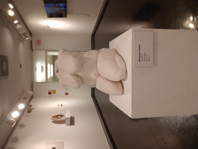
I am primarily a ceramicist that creates sculptural work with terracotta clay. Additionally, fibers play a role in my art and I have been working towards combining these two in an interesting way. Ceramics as a whole interests me because it is a very tactile and malleable art form that has endless opportunities of what can be created with it. I am a person that thoroughly enjoys working with my hands and manipulating the material being used, so clay is an art medium that allows me to explore and experiment with my ideas. In terms of my artistic ideas, I enjoy exploring how imagination affects reality and the possibilities of what would be brought forth if the bridge between the two was blurred. Anatomical human features and environmental elements and textures are very influential to me, in addition to the natural world and our relationship with it. I try to connect my art pieces by incorporating similar textures and imagery, such as human lips, eyes, and patterns. Other than the natural world, fiber practices such as crochet and needle felt are other heavy influences that inspire artworks I create. Ceramic glazes can be very experimental, which is something I have begun to explore in order to observe how different glazes react when put on different ceramic surfaces, whether sculptural or smooth.
There are several artists whose works are very influential to my own, a couple of which are Cynthia Consentino and Mark Ryden. Cynthia is primarily a ceramicist that focuses on manipulating familiar objects in life and molds them into a completely new idea. Her work is inspired by mythology, religious imagery, and fairy tales along with similar ideals to these; she essentially makes collages of various forms in order to create her artwork. Mark works with a variety of mediums ranging from ceramics, sculpture, digital art, and traditional mark-making. His works consist of kitschy and mysterious figures that have a deeper psychic underlying meaning to them. The figures and imagery he creates are both realistic and unrealistic simultaneously, creating an interesting juxtaposition to his art. Both of these artists are very influential to me because they are both creating imagery that causes a strong, almost uncomfortable reaction from the viewers; this is something that I try to achieve when creating work of my own. In addition to this, both artists are influenced by ideas and themes similar to ones that I am drawn to, which causes their works to be beneficial inspiration for me in my artistic creations. They demonstrate the extent of how one could manipulate the medium being used to their advantage and discover new ways to do so.
-

Amber Ryan Final Portfolio
Amber E. Ryan
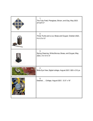
My personal journey and the lived experience of women in society inspire my work. I speak to my own experiences and thoughts as a woman. I force people into a place of discomfort, causing them to think deeply about how society speaks to women and what is taught to us from birth, leaving them with thoughts that linger long after they have walked away. This gives them a window into my intrusive thoughts, traumas, and emotions. The Tulip Field speaks to the manner in which society deals with the sex industry and sex workers today as opposed to how they have in the past. I ask my viewers to confront the unrealistic expectation of uniformity and perfection, along with the commodification of women that has developed from the emergence of the sex industry from the Rosse Buurt (red-light areas) of Amsterdam, into mainstream culture.
Judy Chicago’s work, The Dinner Party, has inspired the use of floral motifs and suggestive imagery in my work as an embodiment of the sexually liberated, empowered woman - namely, Three Truths and A Lie. Exploration of Hannah Wilke and Kiki Smith’s works has allowed me the ability to explore the prescribed constructs of femininity, and sense of identity while also considering the human condition, and themes of sex, birth, and regeneration. More recently my work has trended towards the theme of identity and what it means not only to be a woman but to be a South African woman living abroad, because of that Yoko Ono and her work around identity has become a new influence on my process.
I cultivate an intimate conversation between the viewer and my work by creating on both small and large scales. On a smaller scale, the viewer should approach the work to view and physically interact with it to truly see it for what it is intended to be. On a much larger scale, the viewer joins me, as both the artist and subject, in a moment of uneasy intimacy. I create more natural or intuitively feminine forms and lines, in a selection of media, implying the presence of traditional femininity before looking deeper, unearthing a darker reality beneath. Telling tales of truth, broken trust, and deceit.
-

Art399 Portfolio
Laurie Snellen
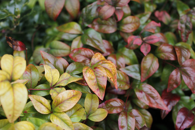
Since beginning my journey as an artist, my muse has been found in nature and environmentalism. Natural imagery and symbolism can be used to invoke a viewer's interest and curiosity. Mine focuses on invasive and native plant species as a lens for both environmental and social concerns. Through observation and extensive research my content and imagery take form in lithographs and screenprints.
Most recently, I explored the relationship between the biodiversity crisis and songbirds, focusing on rural areas and attitudes toward this issue. Using plant imagery that are integral parts of the issue combined with manufactured effects such as glitching overlays on the birds the concept takes form. This implies an artificial "glitch" in the environment, such as when you take information out of a digital image's code during the databending process. I am using common, relatively well-known birds such as Meadowlarks or Bobwhites that are usually identifiable to someone living in a rural community and allude to environmental issues already affecting those communities more than they realize.
Similarly to artist Marilee Salvator, my work is very heavily influenced by extensive research and fact checking. Art like mine should be backed by factual evidence to strengthen its message and prevent the spread of false information. Of course that doesn’t mean it should read like an encyclopedia. Intense value shifts with pops of vibrant hues of color can create very breathtaking imagery. My linework and composition could be comparable to artist Jenny McCabe’s, although I do prefer to add more vibrant, less natural hues to shine line on human intervention in nature. Compositionally, it should be clear when two elements of a piece oppose each other as often is the case in my work.
-

Art399 Portfolio
Thomas Townsend Jr
When I was young I wasn't much into art. I liked doing my owns thing and looking at cool images and colors that grabbed my attention, now really understanding that I actually liked art. The way I really knew how to communicate my feelings was to draw them out since I struggled verbally expressing them. I really didn't know exactly what I was doing but I was drawing or doing other creative ways to express the way I was feeling at the moment to others. Sometimes to this day I still do that but I'm at lot better at expressing my emotions on paper through graphite or charcoal and painting.
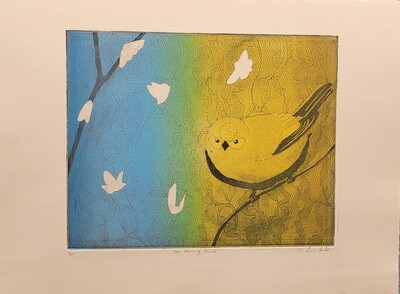
My art is about feelings, thoughts that can’t be expressed aloud. I wanna make art so that my audience can understand the way I come up with my pieces. The places in the art are significant to me, they are somewhere I’ve been, and to me felt right to create a piece of art from. In my piece Through My Lense, the background is a place that I’ve been to and it has been a special memory and place that I had to make a piece out of. The value of contrast helps elevate the understanding of depth, space, giving it a more authentic look. Listening to music, being in my own space with my thoughts is the main drive for me to do art. Having the right music and beat that I can get in the zone with helps me focus, giving the artwork the accuracy I wanted. Most of the artwork I make doesn’t have color because to me it seems more real, also shows my improvement with tones of contrast along with my attention to detail. Some of the artworks that have color to show my range of color value and blends, making the art piece pop and capture the eye of the audience. Toyin Ojih’s portraits capture people in the middle of an activity or about to finish that action. Toyin captures the image of black people and tries to fight against the bad depictions that other people wanna see. I practice art in my own space while experimenting with some different techniques I’ve learned or noticed while observing others' artwork and listening to how they went about doing, trying new things. Like painting, I picked some new methods and techniques on how to start and where to execute the process of going about making a portrait or landscape painting.
-

Cross Berry Art399 Portfolio
Cross Berry
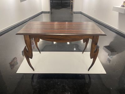
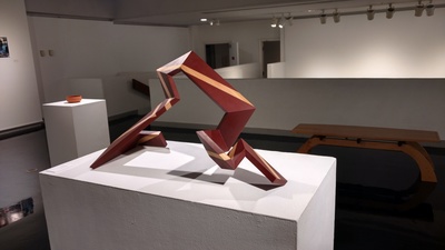
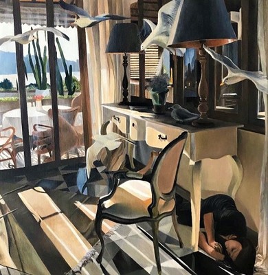
Fear is something that every person experiences in their life. Ever since I was younger, this has been something that I’ve wanted to explore further. Since beginning studying at Murray State I have made this my main focus throughout mediums. When working in my primary medium, Woodworking, I aim to imbue zoomorphic aspects into the furniture that I build. With this, I am wanting to blur the line between what is real and what is unreal. I want my furniture to have an uncanny feeling when you look at it. In my 2D work, I am more drawn to narrative. I strive to have my 2D work have a cinematic quality. I often use myself as the subject, imagining myself in outlandish situations.
One of the primary aspects of my art is the complexity behind it. I aim to challenge myself and my limits, this is because I feel like I need to prove myself with my art, and I feel like complexity is the way to do so. Joseph Bueys is really what sparked my interest in horror as an art form. Bueys has numerous art pieces that really show the connection between humans and animals, and this is really what formed my draw towards animal forms in my furniture.
-

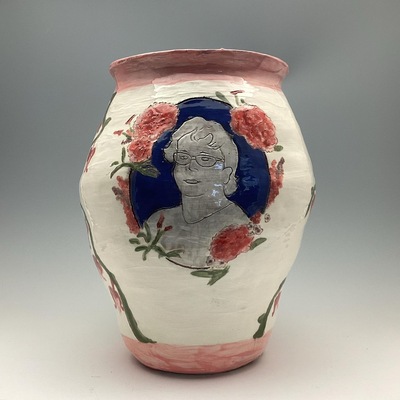
Kylie Conaway ART 399 Portfolio
Kylie Conaway
Through my work I strive to create a sense of completeness and contentment. I make my art for others so that they can have something meaningful in this chaotic world. Ceramics is one of my main focuses because I enjoy the amount of control I feel when I throw something on a wheel. The tranquility and peacefulness I feel from it can't match anything else. In day to day life I am a very unorganized, scattered brain student; but as soon as I start working on ceramics or photography I can become the most serious person you have ever met.
The process for my pieces revolves around others. I very much enjoy giving but I prefer to create from a vague idea than a solid one. I believe in a sense that clay has a mind of its own. The more you try to force it to look like one thing you can end up getting a completely different outcome. I start with a simple idea of an object such as a vase. As I start to begin the process of deciding how big and what theme I want to go with, I slowly sink into a rhythm of building the clay up and working on the thickness. While creating a piece of work I do not focus much on what I want but on what others would enjoy. My artwork is almost always functional. I make a lot of vases and bowls, but I enjoy making tea pots, cups, or mugs. Anything anyone could use on a daily basis. Recently I have started experimenting with photography and the different ways to tell a story and express emotions through it. With photography, I enjoy having the ability to look at things from a different angle. To move in close and show the little details that aren’t always seen at first glance. There's a sense of mystery, clarity and stillness with each photograph the closer I get to an object.
My artwork is mostly inspired by the people and objects around me. In particular I would have to say I have been influenced by Tara Wilson's functional ceramics. Her pieces have a lot of movement and are often very figurative. A lot of the time I get caught up in the basic form of a mug or bowl and I forget that the soft skin of the pot could be altered and manipulated. These different styles I feel are very satisfying and calming and something I would like to experiment more with in the near future. In photography I have explored different views and styles and have developed an interest in up close photography and will be experimenting with it as well.
-

Christine Cox Art399 Portfolio
Christine Cox
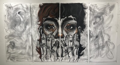
I work with multiple medias to achieve the desired effect of the artwork; however, the majority of my pieces consist of charcoal, both loose and pencils. I find that my concepts are most accurately represented in muted, grayscale coloring with the occasional bold singular color to add juxtaposition. I regularly find myself pushing my scale of artwork and creating pieces that are largescale and often become 3D installations or experiences. The content of my artwork is most frequently surrealist depictions of myself or other human figures, distorted in a way that emphasizes how a mental struggle may manifest itself physically; and this often results in realistic depictions of gore or other uncomfortable concepts related to the subject matter.
Although my artistic style may vary heavily from that typically associated with the Dada period within art history, I draw a great deal of inspiration from the movement, and the idea that art limitations should be stretched. This creates an excitement to really push the boundaries of the definition of “art”. This idea has been a passion of mine since freshman year of college, and I use this philosophy to avoid placing myself in a box while continuing to challenge my own personal artists limits and depictions. I often push for ways to engage my audience in thought by pushing the scopes of my “canvas” into their space. I also am deeply moved by the works of August Friedrich Schenck, as well as some of Van Gogh’s later works and their ties to mental health. The dark, dreary environment they are able to create evokes a deeply guttural emotional response I strive to achieve in my own artwork. These artists, in this twisted way, inspired me to depict mental health struggles with very physical and gut-wrenching depictions of gruesome scenarios, while allowing the craftsmanship of my pieces render them “beautiful”, thus creating an interesting juxtaposition for the audience. I am also captivated by more modern artists such as Caroline Harrison and Tom Huck, whose influences can be more recognizable in my own work. Both artists have an immaculate attention to detail, and a style that demands it at every point on the canvas. I regularly try to replicate this level of craftsmanship as well as the amount of information presented on one artwork at a time.
I find that drawing in aspects from nature helps me to convey my vision for the piece, it is also often a more direct way to incorporate “beauty” into any one of my pieces. The human experience is what is really at the heart of all my work, I attempt to convey my personal experience in the hopes of not only relieving a deep desire within myself to express these scenarios, but also to connect myself with an audience that can tie their own thoughts and experiences to mine. As someone who dealt with a lot of traumatic periods through almost all major points in my developing life, I feel that I have always seen the world in a different way. My artwork is my own personal expression of this reality. I believe the ability to share knowledge, compassion, empathy, and understanding regarding experiencing painful circumstances and creating a shared level of consciousness is the paramount principle within the agonizingly beautiful human experience.
-

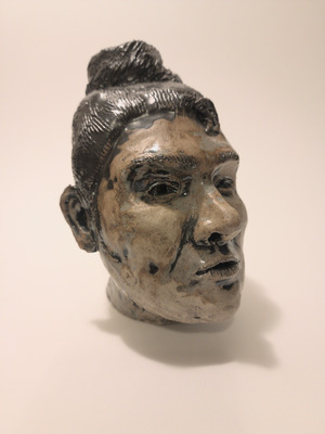
Michael Crabtree Art399 Portfolio
Michael Crabtree
Storytelling inspires much of my art, whether from personal experience or from literature. I have always loved illustration and creating scenes where there is an implied narrative. I often try to make mysterious settings and strange structures or figures, but many of them are based on my memories of places or things that I have seen. My wife and daughter and our dog pop up again and again in my work but typically in unusual scenarios. I have painted our dog guiding a ship with a lantern and I have placed my wife and daughter in the background of a Mardi Gras illustration. I want to be an art teacher, and many of the lessons I have learned in school and through my experiences working with young people have influenced my work and how I think about art. One of the most important things I have learned about being an effective art teacher, which has changed the way I make art, is that students should make work that is meaningful to them. I try to remember this when I am making my own work. Book illustrations continue to be an inspiration to me and I feel that my love for narrative art has led me to really enjoy learning about art history. I am especially amazed by relief sculptures from the Romanesque period. The artists of this time used perspective and hierarchical proportions in unique ways to translate their messages into a visual form, often defying conventions of pictorial space to further their storytelling. I try to include some of these techniques in my own work. The illustrator Edward Gorey is a major influence on my work. He is an artist that I keep coming back to for inspiration again and again. His work has a timeless quality to it and he finds humor in the macabre. His unique style and characters are drawn using pen and ink with precise cross hatching and fine lines. I have been lucky enough to see a few of his works in person; they are surprisingly small and delicate. Esther Pearl Watson is another artist who inspires my work. She paints in a naive style that is humorous, but also expresses a sense of wonder and joyfulness. I love her series of paintings depicting her fathers homemade spaceships. She has a unique approach to painting that has a simple charm that I strive to find in my own imaginative paintings. When someone looks at my work I would like them to feel curious about the story I am trying to tell. This is why I like to work from my memories and experiences. I think that many people share similar experiences or feelings about the world. Maybe my work will remind someone of a place they have been, a person they have met, or an interesting experience they have had.
-

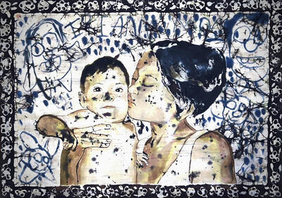
Art 399 Portfolio
Rebecca Curtis
Growing up, I was surrounded by fantasy themes appearing in Dungeons and Dragons, figurines, and Amy Brown fairy school folders. As I grew, I doodled those fairies and copied beautiful women from magazines to improve my skills. It makes sense that after all of my experiences; including sexual abuse, divorce, coming out, and my son’s Autism diagnosis, that I made a metamorphosis from fairies to feelings. In my current work, I focus on mending the traumas of my past and celebrating the triumphs of my present.
Because my art helps me to cope and heal, many pieces are quite personal. Most of the figures in them are in quiet, contemplative poses with complimentary colors appropriate for the mood of the piece, often utilizing color symbolism for conveying warmth, growth, etc. The figures are generally lifesize as they are lifesize memories. Scale is important in my work because I am interested in rendering as much detail as my skill permits. My compositions are usually drawn from literal photos of my daily life, sometimes imagining or overlapping elements from other images in my camera roll.
Taking notes from contemporary painter Jenna Gribbon, a fellow queer artist and mother, I often include intimate scenes from daily life with my family and incorporating LGBTQ content as well as refer to my sons issues and his victories. Similarly to Hugh Steers, I intend to portray these figures to be regarded with empathy in tender scenes of interaction. I embrace representational art as well, as it is universal to all viewers. Executed with elements of realism, the viewer can enter the scene and relate to the figures represented. The figures in these compositions are often candidly captured and painted or drawn in the same way. My art is the prime mode in which I can express the love and grief and empowerment and anxiety I feel in my daily life.
-

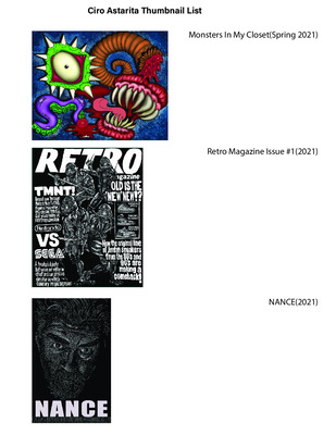
CJ Nance Art399 Portfolio
CJ Nance
Mental illness and being transgender is not only my story to share, but others as well. My art is just one version of this life that thousands of people go through. Even if my art reaches just one person and makes them feel seen, then I know my art is doing something good, not just for me, but for others too. I enjoy depicting my journey with social transitioning in different ways, some may be beautiful, others might be gory or make others uncomfortable. I was once told by an art history professor that you want your art to make people feel something, whether it be a good or bad feeling. No matter what I make I always keep that in mind, “make this piece so that people will feel something.” I understand that with most of my work focusing on transness most people will feel uncomfortable, or some even disgusted with my work and that makes me smile knowing that I did what I set out to do.
-

Mahaila Pinchot-Rickman Portfolio
Mahaila Pinchot
The work I create is experimental, and stylized. I like to use certain art making processes such as photography or ceramics to work through different events or emotions that are currently going on in my day to day activities.The concept of taking something common and turning it into tangible art is a topic I am passionate about and continuously exploring.
Images help document the ordinary moments that go on in life that oftentimes humans forget, unless they are photographed or revisited at another time. Throughout my work I am constantly finding myself dealing with the surface area of an object and problem solving on how to add the right amount of texture and variation of mark making to it. Being able to manipulate an object brings a sense of awareness to it which plays a role in the concept of turning something boring into appealing. One contemporary artist that has been a heavy influence in my work past and present is Virgil Abloh, who was famous for his collaborative work with Louis Vuitton, as well as his sole label ‘Off White’. His way of taking mundane objects and creating art with them is something I can relate and look up too. I see my work reflecting ideas similar to his. In addition to Virgil, another artist that has a great impact on me is Karl Baden who’s a contemporary photographer, known for documenting and shaping perspectives with his images. This concept is something that I carry with me through my own work by constantly trying to convey thoughts or ideas that the viewer/audience can also relate to. Moving forward, I hope to continue to push the idea of turning everyday objects or moments into art that I can share with others.
-

Skyler Pointer Art 399 Portfolio
Skyler Pointer
In my work, I lean towards the idea that my art could make people think about others around them. I was mainly inspired to do this by a video I was shown in high school that basically encouraged people to try and put themselves in other peoples’ shoes. I tend to lean towards a cartoony art style because I would like to go into the animation industry and I also like to give my art a comedic tone to it. As a graphic designer, I like to utilize all the tools that I have learned throughout college. In terms of layout design, I tend to play with hierarchy by choosing a lot of sans serif typefaces in my work. By doing this, it makes the text of my work one of the main focus points and it draws the viewer’s attention. I tend to use a color palette of two or three colors because I feel as though it does not take any attention away from the main focus of my work. I tend to make art that heavily relies on text mixing in with an illustration of some sort.
In terms of inspiration, I was mainly inspired by animator John Dilworth who created the Courage the Cowardly Dog cartoon. I like how John is able to give characters in his cartoons a lot of depth and meaning while also making the viewer think and care about the characters. In terms of graphic design, I am inspired by works by graphic designers Luba Lukova and Stefan Sagmeister. I love Luba’s choice in making silhouettes of figures along with often a bright or dark color to go with it. I find that her works get straight to the point and that is what I hope to accomplish in my work. I like how Sagmeister experiments with the typefaces in his work and often hand letters his text. I hope to accomplish a minimalistic approach while also experimenting with type in my work.
-

Proceed with Caution - Rebecca Potts
Rebecca Potts
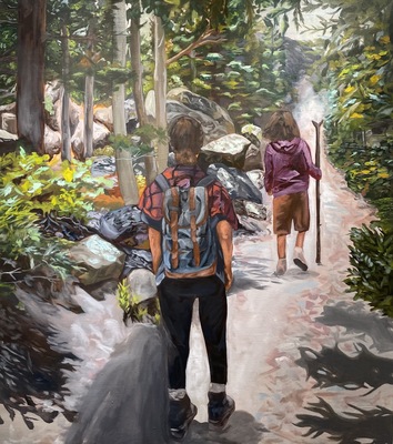
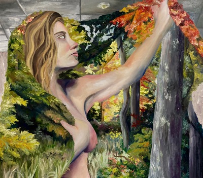
Throughout my childhood, my parents often took me out into nature to go hiking, camping, and just explore. Now when I am in nature, I am reminded of my childhood and reflect on the memories of safety and comfort that I experienced, but through the lens of the person that I am today. As I have learned about and engaged with people in my community, I realized that their experiences and views of being outdoors and in the environments that I grew up feeling comfortable in are much different than mine. These different experiences are based on factors such as family or community, external factors, social location, and their personal experiences.
My work is a way for me to reflect on and convey my own experiences as a child as opposed to how I feel today, and also to be an advocate for others who feel unsafe in outdoor environments. I reflect on the complex relationship between people and their surrounding environment in two different media - painting and graphic design. In my paintings, I explore my personal and experiential relationship with the natural environment, as well as how my relationships with family have affected my experiences. I think about what it means to be a woman in nature alone, and how I can sense that with the comfort I feel, there are also feelings of uncertainty and a lurking danger. Through graphic design, I create influential advertising campaigns and posters about inclusion and safety, and visual identities and branding that present a welcoming and inclusive environment.
To show the tension between the comfort I feel in nature in relation to danger that exists, I place myself in paintings as a child and as an adult in situations where the feeling of lurking danger is present, or where the figures are vulnerable in some way. The images that I paint feel precarious and unsettling, but comforting at the same time as I often appear happy in nature with my family. The figures in my paintings interact with recurring symbols and elements such as fog, water, or roots. I use elevated, dark colors and gestural mark making to show opposition and emphasize an unsettling mood. A few of my contemporary painting influences include Shannon Cartier Lucy and Teresa Dunn. Shannon Lucy paints unsettling or uncomfortable scenes that can also be intimate or inviting, as a lot of these scenes are in familiar, everyday spaces, and this is a balance that I also strive for in my own work. In Teresa Dunn’s work, I am mainly inspired by her mark making, use of color, and level of resolve that she achieves in different areas of her paintings, as well as the ways that she uses figures. Her mark making is very gestural, and she also brings in a lot of non-local colors in order to create more conflicting scenes.
The colors that I use in my graphic design work are warm, natural, and tonal colors that visually communicate feelings of familiarity and comfort. I use bold serif typefaces such as Gastromond and Freehouse that appear adventurous and lighthearted, paired with wide sans serif typefaces such as Avenir and Effra because these typefaces appear approachable, friendly, and dependable. I am influenced by the ways that the designer Jessica Hische creates importance and draws attention through her bold and elegant typography. The flat and minimalistic illustrations and icons that I use in my infographics and advertising designs also make them easily digestible and welcoming for the viewer. In the design of the logo for my national park system, I used a shape that resembles an arrow as well as a minimal illustration of a mountainscape. In this logo and in my illustrations, I am influenced by the designer Chester Don Powell. Specifically, I am inspired by the flat and intricate illustrations and bold typography that Chester Don Powell used in his designs of Works Progress Administration posters for national parks.
-

Molly Ramsey Art399 Portfolio
Molly Ramsey
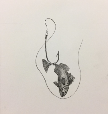
As I have grown as an artist and learned increasingly more difficult technical skills I have been able to continue to find what inspires me to create. My main focus as a medium has been split between metalsmithing and printmaking through the last few months of my academic career. I enjoy the contrast between what each material can convey to the viewing audience. The theme of my work specifically has been heavily focused on aquatic life, more specifically aquatic life that seems to be in a difficult situation. With much reflection I've come to the conclusion that in most situations the form represented in my work signifies myself as an individual progressing through hardships.
While I have been experimenting with my chosen mediums, specific attributes from both have interested and inspired me to create different things based on what i'm working with. With my metals projects I have been more interested in creating moveable, almost playful, pieces. I enjoy being able to pick up a tangible piece of art and experiment with the form and layout of it. I have worked on creating connected items that still have a story of their own if they were separated. My most recent work was a decorative and hangable fish made with nickel, copper, and casted bronze items. I'm looking forward to seeing how the environment it's placed in will impact its life.
Printmaking overall has been a more specific focus recently. I like to create a narrative within a piece of work that can change depending on how the person viewing relates to it. I have repeatedly taken inspiration from some of my past works to further enhance how they can be seen and create a more interesting composition.
An overarching theme with my work depends drastically on having someone to view the work. I love the added addition and the near impossibility of predicting someone's reaction to the work.
-

ESalger_Art399_Portfolio
Emma Salger
In artwork, there is much joy to be found in using patterns, figures, and contrast. A lot of the subject matter is related to the female body, whether that be the entire feminine form, or just parts of the female body. Presenting the feminine figure in many different ways is an inclusive way of showing young females that every body is beautiful. A lot of young girls (myself included) have to rely on their education to learn about their own body and have a hard time accepting and understanding the complexities of their body. Art may not deeply teach the science behind it, but presenting diverse visuals is a good place to start. The feminist movement and recent body positve movement have been a major influence offering women confidence in embracing topics that others find uncomfortable. Typically, pattern is a primary principle to experiment with, but it is important to push oneself to use different techniques as well. For example, using contrast and movement to grasp the audience’s attention. The contrast in the presented art is focused on bright colors and neutrals or different metals. Metalsmithing is a difficult medium to use, especially when presenting parts of the body, but beautifully crafted images can be created nonetheless.
Jeanne Beaver and Terri Sauer have become huge inspirations in pursuing metal work. Jeanne is a talented metalsmithing professor, and working with her and learning from her has been an amazing experience, not only because of her talent, but because of her ability to run a successful metalsmithing department. This makes Jeanne an amazing role model for future art teachers. Terri Sauer is a teacher from Paducah Middle School. Terri was also taught by Jeanne, and is a metalsmith herself who is easy to get along with and stresses the importance of staying connected. In my male dominated, Christan childhood, powerful and divine femininity was hard to come by, but Terri and Jeanne have quickly filled that position.
-

Paige Small Art399 Portfolio
Paige Small
As an artist I work by taking things from my personal life that hold a deep meaning to myself. Recently I have been working a lot with the idea of community and human interaction and what that looks like to me. Community is a place that helps one grow and feel supported and those interactions are vital as a human being. As a printmaker being able to create multiples of the work I am doing is also really important. As each piece may have a slight variation, making it unique, I am able to give back to those who support me the most and create a community around the work made. Drawing inspiration from my faith and the Bible imagery is also something that I like to play around with. Trying to take a unique and abstract approach to what is normally seen is something that I am growing in and am exploring. The community aspect also plays a huge role in this, as what my community and myself believe is the foundation of our relationships.
One of the artists I love and look up to is Kait Bryan. She is someone that takes her faith and makes it into something really special. She paints and draws what is around her all for the glory of the Lord. I also love Katie Max who is a painter. She is very abstract in the work, but I love her color usage and the way she expresses herself through mark making.
Playing around with mark making is something that I enjoy in printmaking. Playing around with color choices too is something that makes a big difference in what a piece may feel like, which plays along with the imagery being made. I personally like using very happy colors, because my work is generally very happy or positive.
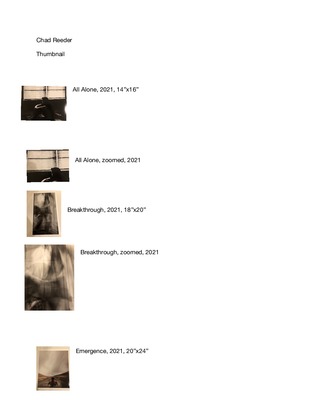
Printing is not supported at the primary Gallery Thumbnail page. Please first navigate to a specific Image before printing.