

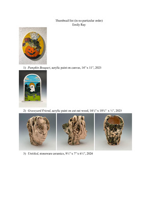
-

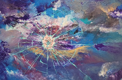
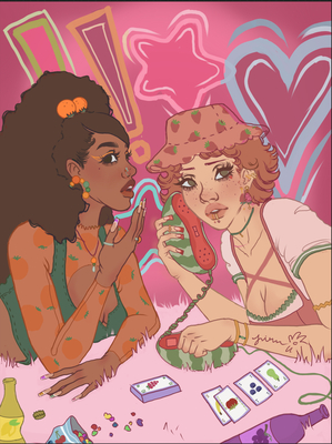
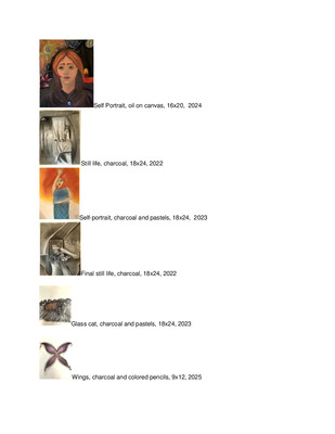
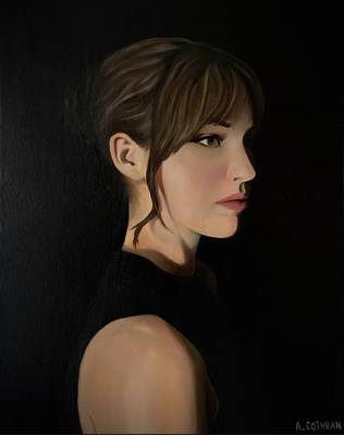
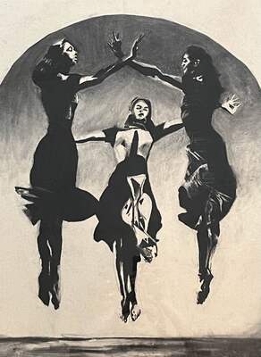
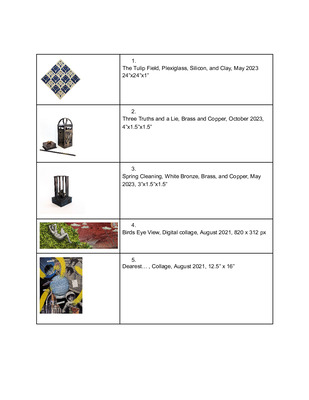
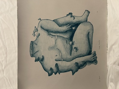
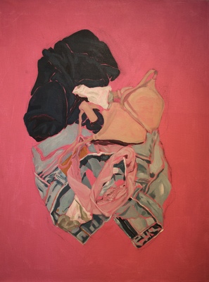
Koryn Hatfield
Koryn Hatfield
Creating art allows me to delve into my mind and acknowledge specific memories and associations I have made with people, places, and events in my life. My works are created in a stream of conscious state and involve me recording my thoughts in a visual dialogue. The process itself then, becomes important because it is during this time, I uncover these parts of myself and my life.
My goal is for the viewer to make connections within the work but still be left in a sense of wonder. One of the most recognizable aspects of my work is my use of continuous line. This, in addition to, layering and color create a dynamic piece. Layering is key because to me it is the direct reflection of my mind. It builds the piece and allows me to obscure certain recordings. Colors are often direct reflections of the subject matter or the colors I have associated with the subject. My line work is evident through each layer of the piece.
In addition, at this point in my life I feel very compelled to talk about femininity. I want to convey what it is like to be a woman in this time period and culture. Also, how body objectification impacts women and society. Creating work dealing with femininity is important to me and in a historical context because it reveals the patterns and social norms woman have dealt with in the past and continue to deal with today.
I have been greatly influenced by Cecliy Brown and Ghada Amer. I am drawn to these artists for the way they depict the female figure in their works. Both, portray the female body in a erotic sense. The use of line and layering also drew me to these artists. Lastly, I admire the bravery these women take for creating art about a vulnerable subject and am inspired to create work that makes me feel vulnerable.
Koryn Hatfield
-

I love dick
Gerik Kubik
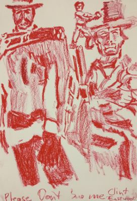
With my new set of work, I am exploring my experiences as a gay man through painting. What it means to truly be myself, and the way I viewed myself since coming out. Religious cues are hinted throughout my piece, much of it inspired by baroque art and it’s cotton candy like visuals that hold grotesque subject matter.
As an artist, I’ve never been attracted to the idea of displaying my art as something extremely serious, and so I want to embrace my humor and sass in my paintings. The topics I choose are of course very intense, serious, and not always as humorous as my viewers would assume. I can confront serious matters such as society’s resistance to accepting the full spectrum of human sexuality and still find ways to laugh about it within my painting practice. This really pushes my thought process and motivates me to work and to love what I do, and is also an insidious way of influencing a change in the mindsets of my viewers. In some sense I guess I’m trying to de-escalate the intensity of my subject matter by making it over-the-top and humorous. Perhaps this will encourage my audience to lighten up and find ways to still laugh despite the hardships in life.
Some of my influences for this body of work include Daniel Jaen, Kehinde Wiley, and Lisa McCleary. Daniel’s openness to explore and display male nudity in the gay community with graphic figures was an immediate attraction. WIley’s portrayal of the male gaze on the male body, references to religious imagery, and use of decorative floral patterns are inspiring for me. Lisa McCleary’s work contrasts the ridiculousness of sexting with pieces hyper-realistic images of the body to talk about the disconnects in contemporary sexuality and exchanges of intimacy. Both of these artists encourage me to pursue these formal methods and this content without restraint as I develop my BFA work.
-
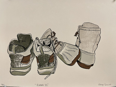
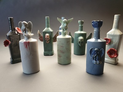
Pro-Prac Digital Commons Assignment
Simon McNeil
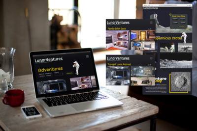
As a person, I thrive inside confinement; I have to know I was in a box in order to think outside it, so the formidable task of constructing my own box required a certain amount of self reflection. Sure, I would always produce, but what really pushed me to make Art? During a wistful trip down the six-pack aisle, I had an epiphany; in a sea of Millers and Bud Lights, I always ended up picking drinks with interesting packaging/design, be it heavy illustration, bold color, or at the very least a logo with that ‘handmade’ quality. As a designer, that was how I wanted my work to be consumed, and it was the knowledge that people enjoyed what I made that drives me to not only make, but improve.
For my BFA show, I want to share that interest. I have conjured a fictional brewing company, Hops Noir, and my show will feature Packages, such as 12oz bottles, a 4-pack cardboard carrier, Advertising, such as beer posters and magazine ads, and a Branding guide and collateral for the Brewery. My work has moved toward keeping the hand-qualities and imperfections that come from designing and sketching manually as the work transitions to a digital space. My recent work in screen printing have enforced my desire to blend the best of both worlds in my work. There is something incredibly human about this quality that I want to bring to the lives of the people who see and consume my work, as our capitalist future stretches nightmarishly onward.
Since having done a research project about Keith Haring, I’ve found a new interest in Pop Art. Haring’s illustration style has given me inspiration, especially in working with a more loose, messier style, and simpler forms, which still communicate without being busy. The crowded compositions of his work speak to my own tight, puzzle-esque sense of design, and in my work I have become fond of balancing this illustration style with layers, either of gradients and patterns, or with other illustrations of varying opacity. This contrasts to bolder, often darker, typography, ensuring that vital information is still easy to find and read, but the bottle, sat alongside it’s competition, still catches the eye of a consumer. Vintage advertising has also played a role, in conjunction with my new screen printing work, in inspiring my show work. Playing off my earlier interest in historical type, the way vintage advertisement, especially posters, utilise their economy of space is fascinating; type is large but not too intricate, and illustrations are just visually stimulating enough to get their point across. This clear and effective communication is something I want to translate to my own work.
-

19_Nalley, Michael_Portfolio
michael nalley
Michael Nalley
Through thought we can explore the meanings in life and the My prints focus on the suffering and escapism through the absurd hero’s journey, taking the thoughts and feelings of existential introspection and giving it physical form though screen print. They focus on snapshots of a life lived without pre-derived meaning in search of purpose through a narrative set that paints a life of filled with opulence and escapism from a dark and uncaring world. I look at the flawed nature of faith and how one deals with a world once witnessed to the absurde, how we as humans escape those feelings, and the feelings of outsiderism and loneliness felt in such a world.
Formally, my pieces use a balancing act of bright and pastel colours in contrast with harsh and intense reds, browns, and blacks to push a scene from something grounded and real, into something more surreal and fantastic. I use appropriated images from Victorian etchings and Renaissance iconography intermingled with hand drawn imagery to show the journey of a man's life surrounded by reminders of his meaningless and insignificance in the nihilist’s reality. All the while, my absurde hero marches on filling his life with anything that can fill the void. I use the breakdown of religious imagery in direct contrast to the horrors of war or broken landscapes as the breakdown of faith and the derived meaning in life that accompanies it. I place such images in the background as a reminder of how such feelings, even when covered and subverted, are always in the back of the mind, always dragging at the soul with a reminder of one’s place in the eyes of an uncaring universe filled with pain and death under the guise of a moral cause.
I pull formal inspiration from artists like Matt Hopson-Walker, balancing heavy subject matter with bright and popping colours. Carrie Lingscheit has also influences my work formally with how she plays with heavily stylized and naturalized forms juxtaposed together. Conceptually my pieces pull mostly from philosophical literature in the form of writers like Albert Camus and Friedrich Nietzsche, as I explore the same vein of thought but instead use images rather than words to convey such introspection.
With a life without meaning, we are left to find and make such meaning ourselves. I use the arts to explore that existential journey and to give physical form to such introspective moments through a nihilistic lense. I use art to tell a story of another trying desperately to find purpose, all the while dealing with the anger that comes with the question of evil, the substances that give momentary reprieve from unending feelings of dread and loneliness, and an escape into the social world in hopes of drowning out the voice of pain through endless social contact.
-

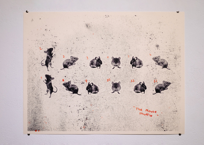
No Real Memories
Emily Netherton
Memory is a complicated thing. We often long to hold unto the past, but struggle to actually remember it accurately. We place such importance on memories that we continually collect artifacts to remember things by. We take pictures to remember moments. We hold onto personal items to remember people. We often display these artifacts and spend so much time with them that we place more importance on the objects than the memories associated with them. Hang photos and display momentos, and constantly live in the past. In my work, I focus on reconnecting those objects to the memories, and addressing the attachment we have to them. I break down the process of memory, and depict the lack of clarity we have around memory. I tend to use simplified shapes and connected patterns to obscure memories, in the same way our memories are distorted over time. I often use more muted and desaturated colors to further the narrative of our memories being different from our reality. I paint on frames and other storage items in order to communicate our tendency to store and sort our memories in a safe place to be accessed later.
-
APitt_ProPrac
Allison Pitt
I have always been an “outside-the-box” kind of person. I feel like I don’t fit into the mold of an “artist”. However, I’ve used this aspect about myself to use it to create my art. Unlike the others in my classes, I haven’t found myself fascinated by one idea or material. As a future art educator, I feel like this change is something I can use to my benefit to adapt and relate to each student and their unique backgrounds that come through with their art. I hope to inspire my students to be their true self, and let their art reflect that, instead of trying to fulfill an assignment or compete with their peers.
My medium is choice is paint. This is part of why I am drawn to painting; because the material is pure color, and I can impose my ideas on it without feeling like I’m fighting the material, like in other medius. I use primarily oil point to convey my ever-changing concepts and really appreciate the way that the color allows me to communicate on a canvas. I use color very intentionally. This varies from using bright and happy colors to choosing more neutral tones to convey specific things.
-

Professional Blend VII
Drey Reed
Often times it appears as though people forget that art does not have to have some deep, internal meaning. While the amount of traditional media art I make is greatly slowing down, those that I do make tend to have either an obvious meaning or none at all. I’ve always been more into making and viewing art that is more aesthetically pleasing than those you have to find the meaning of. Now, however, my time is primarily spent on graphic design. While there isn’t anything that necessarily ties my graphic design work together, I feel this is a better fit for me since, while you have the chance to make a design with a deeper meaning behind it, graphic design is often focused primarily on how it looks visually.
-

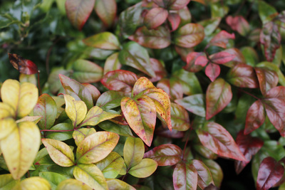
Natural Aspects
Kaylie Riley
Kaylie Riley
I can never seem to get away from the natural world. Almost everything I do whether intentional or not I always seem to make my art about nature in some way, shape, or form. I have always felt a connection with nature and it is where I am the happiest and I am afraid of losing it.
In my body of work from past to present the formal elements are earthy and organic and even in my graphics work I incorporate rounded shapes and corners. My color palette is usually neutral colors or softer colors more like pastels and I rarely use vibrant colors. My work is also more detailed in its mark making and usually has a message to go along with it. Since being afraid of losing the gorgeous environment we live in; I Make my work about the harsh truths of what is happening in our world.
Every time I go to make a piece of art, I cannot help but to think about the earth and how beautiful it is so my art reflects my feelings about. It captures my excitement and my sadness moving on in this world.
-

Cameron Savage Fall 2019
Cameron Savage
Cameron Savage
BFA: Printmaker
Scientists can trace the modern human’s beginnings to western Africa and map out migrations that moved hominids into the rest of the world. Mankind traversed a vast and unknown wilderness for the pursuit of food and resources. We have always been explorers, desperately searching for anything new. I’m interested in mankind’s thirst for knowledge of the unknown, and the possibilities that exist outside our little blue rock. Will Earth’s resources eventually be exhausted? Are other planets suitable for the continuation of humanity? Can civilization exist outside our solar system?
Contemplating these questions and being influenced by science fiction pop-culture, I explore color and imagined landscapes. Fictional landscapes and geometric forms contrast and engage one another in my work. The work displays a constant tension between “man-made” structures and their impact on naturally formed structures. Since my forms are fictional, they are untethered from reality, allowing a nearly endless amount of freedom. I’m heavily inspired by album cover art and poster designs by artists like Dan Mumford, Luke Preece, and Rickey Beckett.
My medium of choice is screen printing, which allows me to access vivid colors and stylized mark-making, resembling the graphic nature of posters. Like Cecily Brown, I too use a vibrant color palette and an extensive amount of forms to engage a composition. The prints present exotic contrasting colors and deep landscapes that allow the viewer to travel to strange, alien lands.
-

Professional Practices Final Portfolio
Ashley Schell
There is a bittersweet beauty in the nature of average everyday life and simply existing with those around you. I use this mindset to explore my own past and present growing experiences in a tight knit, conservative southern region of the United States, I create artworks that help me better understand my relationship with myself and the individuals that surround me. By forming connections between my personal life and my relationships, my artwork has allowed me to explore where I physically exist in the world and who I am as an individual. My artwork embodies the specific experiences and external influences that have gotten me into the position I am in today.
In my artwork I tend to use subject matter that pertains to my personal life and experiences. By using symbolic objects and environments that are directly connected to, or sometimes suggestive of southern culture, I hope to convey the sense of confusion, containment, and bitter-sweetness that a person can experience whilst living in such a place. When using these themes of confusion I create drawings that are fragmented with reality. I will place figures into an environment and merge them into abstracted environments that exist upon contrasting linear planes and don’t necessarily make sense. A rule that I like to follow as a human being is that not everything needs to make complete and total sense.
In terms of medium, my go to is graphite and watercolor. As I’ve mentioned before, there is beauty in simplicity and I feel that graphite speaks eloquently for my work. My main goal with my artwork is to maintain an introspective artistic lifestyle, as I feel in order to mentally develop, one must unlock the next level of understanding themselves.
-

Jay Schroeder pro-practice
jennifer schroeder
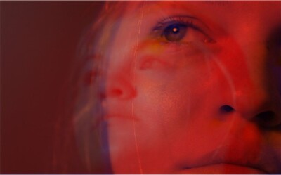
My Art is mainly reality based, focusing on social commentary or narrative. Often covering themes of depression, disorders, disability, dilapidation, inequality, and struggles. I provide art that people can connect to on a personal and emotional level. Experience with bigotry and struggles with disorders and learning disabilities has influenced me to explore art that is unapologetically honest. With the goal of reaching out to people so they can see the good and the bad in the world, creating something they can relate to and connect with, so we can all stand together in solidarity.
I have experience with 2D and 3D media, focusing on photography because it helps me capture the level of honesty I like in my work. However, more recently I have been experimenting with Print, video, and sound. Exploring the same themes and addressing new ones, introducing theology more recently in some of my current work. As a practicing pagan who was raised catholic, I can find where things overlap and separate. I’m able to hold an open mind about faith, question, be curious, and look at theological stories from different angles.
My current project, “Dependency” is a print, etching on zinc, printed on Cream Stonehenge using blue-black mixed with white ink. Cream paper and blue-black ink have a medical feel, like the writing of a doctor’s pen on a prescription slip.
“Dependency” addresses behavioral disorders and the need for, or dependency on medication for these individuals to function. This specific work focusing mainly on ADHD, Learning disorders, and anxiety disorders. Referencing pills commonly prescribed for these conditions (Vyvanse for ADHD and Lexapro for Generalized anxiety disorders). Using these pills, I etched in the Words, “Pills Think” and hid them amongst a scatter of the same pills. Driving in the dependency on medication to function, that to some taking medication is the equivalent of being able to think.
-

Professional Blend VII
jade simpson
I create graphic design pieces with the goal of inciting a feeling in the viewers. I have found through the years that creating a well developed color pallet is a major part of my process as an artist. This is because color can help enhance the specific emotion or idea that I am pushing for. I enjoy designing a variety of posters over subjects from music to commentary on social issues. The reason I choose the topics of mental health awareness, suicide awareness, gender roles, domestic violence, drug abuse, and other similar topics is because I want people to stop avoiding them. I want to inspire a change in the world and get people to start talking about them on a larger scale. I want to put the very real problems of society in their face and make them want to change their behaviors and attitudes. If not I hope to at least compel them to bring awareness to others. The less heavy pieces that I creat I want to awaken the fun that is sparked in Children. A feeling where the stresses of life are the farthest thing from the veiwers mind. Just breathe and have have. Be happy. This work is generally inspired by graphic artists that use vibrant and wild color theories, funky patterns, and interesting methods of creation. Artists such as Jessica Walsh, Stefan Sagmeister, and Milton Glaser.
-
Professional Practices: Cumulation of Work
Sara Talwalkar
I juxtapose sharp and organic shapes, which are inspired by ideas of plants, landscape and architectural design because of the clean lines and minimalistic forms. Line quality is used to show space, and enhance a minimalistic aesthetic, while the use of line and value in architectural drawings changes perspective and manipulates the viewer’s eye. As well as plants, landscape, architectural design, my work is about containers, containing space, and the manipulation of a man-made space. The geometric motif running through the body of work is primarily boxes and can be seen as a reduced form mimicking shapes one interacts with on a day-to-day basis. I am interested in the relationship between the viewer, the form, and the space in between them. The combination of these formal qualities determine the composition of the work and whether or not it is set in an atmosphere.
Loneliness, space, and minimalism inform my work. As a printmaker who works in etching primarily, I am influenced by Ann Kavanagh and her use of line and composition in her photo-etchings, photographs, and Japanese woodcuts. Loneliness is the lack of something, and I use minimalism to show that through sharp, uncluttered lines, rich values, and unconventional spacing of the plates. By composing the space of the page with line and value, loneliness is depicted through an altered perspective, whether that be from the outside looking in or a dramatically skewed angle. I am interested in the evolution of a space within the confinement of a man-made space, mostly the size of the plate or page.
-
Terra Incognita
Savannah Jane Walton
To seduce one’s mind is about the thrill of the desire itself. Through the strange marks, there is desire to invent something out of the unknown. The thrill of the sensation of energy. You can’t articulate what is happening... but you feel it. Consumed by reading this euphoric language, you desire to depict the code of the rhythm to challenge your mind’s environment. This is the language that is translating as sound moves through space, daring you to disturb the silence.
I am the architect of my own wonderland, allowing me to compose my acoustic map with expressive mark making to enhance the experience of movement. Using music theory to create controlled nonsense, I develop an overwhelming environment. I want to pull from society’s vulnerabilities of the confusion that this space is ‘off the grid.’ Expanding outside the realm of reality into a space of uncontrolled time where the sound becomes your enlightenment—state of no mindness. The act of visualizing this sound through space is shown through altering organic forms within industrial structures to really play out the rhythm for the people. The line work creates its own lyrical language stemming from design elements and algorithms. Communicating vibrations through the repetition of busy shapes combined with the act of reduction and addition to create depth through the negative space. Using layers of transparencies, geometric shapes and line is how I deconstruct the perception of my large scale composition. I manipulate the intuitive flow of lines to illuminate my abstraction.
Contemporary German artist, Jorinde Voigt, creates large scale drawings incorporating text and collaged elements with energetic yet cryptically ordered compositions. “My work is like music,” Voigt says. “You can enjoy it without being able to read the score.” And honestly, I couldn’t have said it better myself. Graphic designer David Carson, advises artists “Don’t mistake legibility for communication.” These words pushed me to explore how to communicate the visualization of sound. After all, you can’t read my pieces—but they do tell a story. These stories with no location, enticing you to get lost.
-

Professional Blend VII
Emma Wilson
I have always been an artist ever since I was a child. My mom was one of my influences to become an artist because she always made arts and crafts with me. My aunt, Janet Wilson, is a very skilled self-taught painter and was also a large influence on my artistic life. I thoroughly enjoy the art of photography.
Tara Chisholm once quoted, “Photography is the beauty of life captured.” My photography is very sentimental because it’s mostly about family. Family is so important in life and so is being able to snap shoot memorable times. I explore the concept of the happiness that family brings. With photography, a moment can be captured that you might not ever get back again in your lifetime.
I often use high contrast in my black and white photos in digital and film. An American photographer who also enjoys photographing people in black and white is Richard Avedon. I believe that contrast creates a dramatic feeling while viewing a photo, which I find interesting. I often focus on the composition of a photograph.
Although I shoot black and white photography, I also love color. My artwork outside of photography focuses on the use of color, which is what attracts me to a piece of art. I find joy in making art with color because of a dark part of my childhood. Now that my life is much happier, I often create happy art. To me, color represents happiness. I want my viewer to feel happy when looking at my happy work, unless I intended to give the viewer a different feeling. Art is very important in my life. I love being an artist.
-
HoneySeekers
Aurora Zwyghuizen
As a graphic designer I get into a different mind set. As a designer, project parameters and visual satisfaction are paramount. I choose more appropriate colors for what is assigned. I try to get out of my head and into the real world. I attempt to create viewer interest by organizing typography with hierarchy and arranging images in a compositionally pleasing manner.
Some of this will be seen in my most recent project, Honey Seekers. This is a nonprofit organization to help save the bees. Bees are very important to me because they are the ones that give us life. I am choosing a variety of bright colors to attract the viewer in the logo and in the posters that I am creating. I have chosen colors that are realistic to flowers and nature. I am trying to use these colors in every poster to keep a consistency, but make sure that they are also different at the same time to keep them visually appealing. For the posters I use different fonts to describe importance and to give the layout a more pleasing look. The posters will also be on an average to large scale. I will also use these colors and fonts for the website that I will design, so that the viewer can know more information and see more visually appealing criteria.
With this project I am trying to get out of the box and make an area that will “wow” people by walking through it. I hope that the colors will attract people and make them want to make a difference. I will also be making a website to have donations and more information about bees for people to read. I am also making an informational book and keeping on the color scheme of the posters that I have created.
Stefan Sagmeister is one graphic designer that I look to. He is very modern and I love how he will put himself into a piece of his work, as if it were a performance piece. His use of typography is always eye catching, which is what I would like to accomplish. Every piece of his art is different, so you don’t know what to expect, but you know that it is his. Two other artists that I look to are Matthew Willey and Ladislav Hanka. Other than being artists they are also bee activists. Matthew Willey travels the world and makes bee murals to raise awareness about what is happening. Every mural is different and it shows how he can make every mural match by being different. Ladislav Hanka makes etchings out of decomposed hives. He won art prize this year in Grand Rapids, Michigan, and he talked about the circle of life with bees but knows how important they are to us.
-

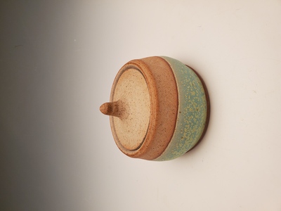
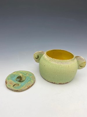
Professional Practices
Shelby Adams
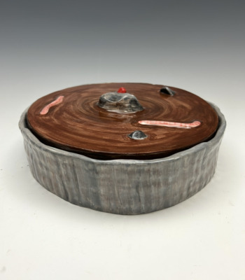
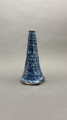
Currently, I am focusing on the aesthetic nature of my artwork and how its appearance aids the use of it. My work tends to lean towards the more organic/imperfect side of crafting: whether it be in my ceramic work or metalsmithing, I enjoy the small variations in form that create a true sense of the handmade. I further this sense of hand-craftedness by exposing the materials themselves, such as leaving metal to patina over time or leaving the clay exposed while glazing. The strong sense of materiality within my work, along with their organic sense of form, creates very naturalistic objects that emphasizes the materials themselves. I’m interested in the minimalism that these choices can evoke and how these aesthetic leanings affect the functionality of each piece.
-

Catherine Alexander
Catherine Alexander
Have you ever created a whole entire story in your head? Or been looking at an old photograph and imagine how you would fit into it? My imagination constantly runs wild with all kinds of stories. My work deals with narratives rather they be fantasies or personal, represented through series of photographs and prints.
My screen prints focus on a particular story that’s a twist on ancient mythology, with subtle narrative I have created and mixed within it. The print gives the viewer just a small glimpse into the story’s narrative. I want the viewer to be able to identify the myth the print is referencing and understand the story. I’m influenced stylistically by illustrator Victo Ngai and her prints in the book Chinese Fairy Tale and Fantasies by Yiyun Li.
With photography I take a different approach, rather than a fantasy narrative, my photos are a more personal narrative. The series is focused around my family history, and merging the past and present through family photographs centered around important locations and new photographs of what those locations look like today. The series was inspired by with website Dear Photograph started by Taylor Jones.
I also take a mixture of prints and photos to create stop motion animations as well as GIFs. The idea of turning my prints into animations came from artist Andrew DeCaen. The animations are used to create a sense of time using multiples, giving the viewer more than just a glimpse into the story. With the use of animations and GIFs I am allowed to further the concepts and ideas of both my photos and prints.
-

Professional Practices
Jalynn Ashford
Artist Statement
As a viewer looks at my work, it should serve to intrigue the viewer and instill curiosity upon them. I am creating work with clean and consistent line quality throughout the pieces and through this line quality, contour lines sometimes reoccur. Color palettes are being used that are bright colors paired with neutrals, which catches the viewer’s eye. Implementing pattern into my pieces is an element that I am striving to use more often to create more visual interest. A shape based illustration style is a process that is exciting for me to implement and therefore, it is beginning to become more consistent to create bold, playful images that inform the viewer pleasantly.
The main form of medium that I prefer to work in is graphic design in a variety of scales. This is the center of my focus while I explore graphic areas such as digital illustration, branding, layout, and alignment. The ability to allow my artistic abilities to communicate information in the world in an interesting and appealing way is a focus and eventually creating designs with the purpose of serving external customers is a career goal.
Musical instruments are currently an area of focus in my designs. Music is a personal interest of mine that I have invested in for the majority of my life; therefore, they are an exciting and intriguing subject for me to explore in my design. Music is a bright, beautiful, and dynamic way of creating. I believe this needs to be reiterated through the design in order to make playing an instrument seem modern and inviting. I pair illustrations that literally depict the instrument with bright colors that differ from the instrument’s origin color to create unique visualizations.
The art and design world is very influential. Luba Lukova is inspiring with her thoughtful and minimalistic compositions that are consistent throughout all her work, alongside her line quality. Her ability to match vibrant colors with neutral black and whites to create visually pleasing pieces is influential. Hand-letterers such as Jessica Hische and Marla Moore incorporate elegant, unique hand-lettered typography into a majority of their work. This design element is personally admirable and implementation into future work is in thought. Jessica Hische’s design process and workflow influences how I work through design problems.
-

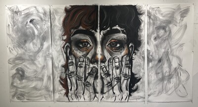
RECONSIDER THEN INFORM AFTER BREAKING DOWN
Kora Carlson
The process of art is meticulous, becoming richer in layers as time passes. When art and the body come together, they immediately magnify an existence long before assemblage. I want to question predetermined existence through the use of found material. How the use of appropriation in art-making challenges patterns and creates a moment of change.
Objects exist only from years of meditation, but we can quickly reconsider their function through intentionality. I’m specifically focusing on relearning form, shape, and color after crossing the gender divide. How the ability to assert inclusion in time and space is symbolized by the transformation of objects.
My materials are collected through this lens and everyday collaboration between environment & self. How can design create a celebration of liberal individuality.
-
Growing
Hailey Church
Tending to work with oil paint and loving its fluidity, the work I produce is about confidence in body image not only seeks to normalize but also glorify differences in body types. My work is inspired by a value that has been instilled in me since a very young age - I can do anything, want anything, or like anyone or anything I want to regardless of my gender. I produce my artwork to make others feel that they are capable of the same things and I use my art to promote self-love and an appreciation of the uniqueness of one’s self or others. Stylistically, I approach these feminist themes by using soft lines and textures, smooth, silky, and careful value shifts to accurately depict form, mass and space. Color is an important tool of mine, and using oil paint allows me to use that to the full potential.
-

Rosalyn Churchman ProPrac
Rosalyn Churchman
Rosalyn Churchman | Artist Statement
My work is an examination of the process of decontextualizing everyday objects and manipulating perception through juxtaposition and the use of freeform line. I find that by juxtaposing order and chaos I am able to create energetic and visually engaging compositions.
I have synthesized the techniques of Julie Mehretu’s layered line and Jackson Pollock’s abstract paintings to develop a style of my own. The static nature of ordered line juxtaposed with loose line creates dynamic and dramatic movement throughout the piece. I think of each of these drawings as a maelstrom of line, pattern, and ink clouds that come together to create ambiguous and abstracted compositions.
I am interested in incorporating recognizable images of the human figure within more abstract compositions to evoke a universal feeling of distress. These pieces use parts of the human figure as reference points within an abstract and dynamic scene. This juxtaposing allows me to blur the line between figuration and abstraction. In these drawings, I incorporate colored pencil and watercolor with pen and ink. I find that along with pattern and line, the addition of color enhances the piece and aids to the overall complexity of the drawing. The appearance of bold black lines and patterns beside bright blocks of color gives an aggressive and graphic quality to these drawings.
In my current drawing series, Gears, I render human faces and figures, but incorporate mechanical aspects. I am exploring this method of juxtaposing the artificial with the human as a new means of depicting ironic and unnatural subjects.
I would like to transfer my ideas of juxtaposing order and chaos to my graphic design work. I enjoy typography and the manipulation of letter forms through font variations, color, and pattern to develop eye-catching and aesthetic visual hierarchy. I am also drawn to page design and enjoy organizing imagery and type into effective and visually interesting compositions. Paula Scher’s use of color, shape, pattern, and type to create engaging compositions inspires me to do the same in my own designs. Like Luba Lukova, I would also like to scan in my drawings and then manipulate them on the computer. I am interested in how my method of contrasting order with chaos and the recognizable with the unrecognizable can play out in my future designs.
-

Professional Practices Fall 2018
Lu Colby
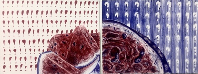
Complications with infertility and the states of despondency that come with it are themes that I personally connect with. When reflecting on what it means, personally, to be a woman I have always associated these thoughts with motherhood and home. I attempt to reflect on these thoughts and explore them through my work.
I dissect and experiment with these concepts through the use and symbolism of apples. The apple has many layers of symbolism and even biblical references as the forbidden fruit. The apple is said to be a symbol of knowledge, immortality, temptation, and the fall of man. It also is seen as wholesome and comforting, much like my own mother’s apple pies and making cider from our family apple trees as a child. I believe these symbols parallel and represent many elements of being female. Using apples at different states of decay, being eaten, or even bobbing for them, are speaking to my personal stories of being a woman and the greatness and hardships that parallel that identity.
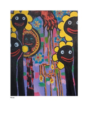
Inspired by Judy Chicago, my pieces have varied in mediums of art such as sculpture, printmaking, installations, and performance pieces but all have common characteristics such as multiplicity, repetition, and use of the color red to represent menstrual blood. The use of repetition and multiplicity throughout my work speaks to these individual moments and experiences as a whole while also thinking formally and fundamentally through the work. I want to use my art as a platform to speak out to the issues surrounding my culture and more specifically towards women.
-

Nance Craven_ProPracSP18
Nancy Craven
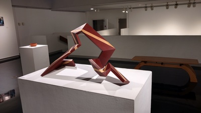
Figurative work is what drives my art to convey and evoke emotion. The figures become derivatives of nature using organic lines, whether they are a naturalistic depiction or an abstraction of an original form.
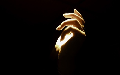
My areas of interest include woodworking and drawing. As an individual geared towards math, problem solving, drawing and craft, woodworking requires me to use these and other skills to create a successful work of art. The processes in which I create something starts with an idea of what I want a specific piece of art to be about, what I want it to look like, and what its function might be if it has one. After this, I make multiple sketches, choose the one that I think will be the most successful, and refine it multiple times. Many of my wood projects focus on form and are constructed of smooth, flowing lines with open spaces. My form-focused works are often modeled after things such as nature, the figure or music, and are meant to evoke some type of emotion from within the viewer. Some of my works incorporate drawing and work in conjunction with a wood piece so that a specific concept can be conveyed by both formal and linear properties. The subject matters I most often use in my drawings are hands and the figure. The concept behind this is that hands and body language are strong indicators of feeling, whether it be calm, tense, open, closed, etcetera. Since gestural interpretations are nearly universal, most viewers can relate to the feeling that each gesture is meant to evoke in the viewer.
My inspirations for drawing and woodworking come from contemporary art artists such as Duarte Vitoria, who draws and paints tense depictions of human figures rendered within the strict confines of the picture plane, and Sylvie Rosenthal, who creates functional wooden objects that reflect animals and other components in nature. Elements and properties that draw me into other works of art are the use of line, figure, design, and detail. To come up with new ideas and designs, I like to observe my surroundings, whether it be in my room, a classroom or studio, or nature.
Printing is not supported at the primary Gallery Thumbnail page. Please first navigate to a specific Image before printing.