

-

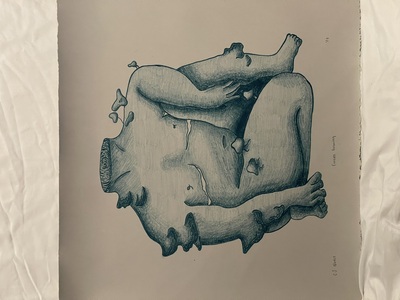
Art 399 Portfolio
Christopher Gill
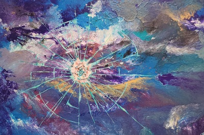
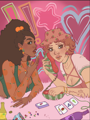
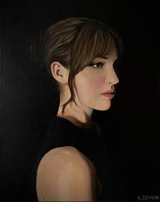
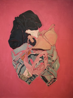
Moving to Kentucky from a small Central American country has definitely shaken a lot about what I thought I knew of the world and painting is a sort of way to express what things are ‘shaking’ currently for me and how it continuously shakes me. My artwork reveals certain key points in a childhood experience unique to Belize. Imagery used and settings are strongly influenced by local art styles from the country. Strong themes of discrimination, marginalization, inner and outer dialogues about interpersonal ideas and society’s violently inflicted and delicately or sloppily treated wounds, all these ideas are set in tropical, real life day to day scenes of the Caribbean region are to speak on them from a native’s queer point of view.
Oil & Acrylic on wood panels and canvas are preferred materials for my personal process. A digital collection of references that may not include figures, patterns, textures and prints as well as Belizean history books and records inspire a lot of my art as I can draw a lot from more relatable experiences of my own life and translate it into a universally recognizable moment. As reference and inspiration artists like Francois Boucher from the Rococo period influence my pieces heavily. The themes of Freedom, love and opulence call me to bathe Belizean queers in the love and attention they deserve with my art. More contemporary artists such as Milt Koboyashi, Cheyenne Jackson, and Kehinde Wiley are artists who have certain skills and styles that my work aligns with and can learn from theirs.
Certain things are important for the work such as a strong reference to my country of origin (a personal fight against assimilation), as well as a representation of those not seen. I not only want to give voices to my fellow queer peers that I grew up with, but I also want to create an oppurtunity to talk about these things together at the middleground. Figures and bright, saturated colors, not only mimic the style of Belizean artists but as well fakes a dream-like internal surreal scenery that is to insinuate the conversation is happening somewhat within reality.
-

Ian Gresham ART 399 Portfolio
Ian Gresham
I am an artist who primarily, medium-wise, works digitally in Photoshop, using a Wacom Cintiq 16 so that I may draw directly on the screen - allowing me to be especially precise when creating my work. Working digitally is mess-free, and allows me more flexibility than traditional oils and acrylics - so that I can either get rid of mistakes hassle free, or experiment without having to worry about the paint drying or the experiment turning out to not work in the end. I also just find it plain fun to use, the software is always changing and being updated, and there are a variety of different brushes to find online and experiment with (some of which can’t even exist traditionally) so that I may improve my workflow. In addition, the ability to change colors on the fly, and use the eyedropper tool to select specific colors from you piece, makes mixing colors and finding new ones simple and easy. I make the work that I want to make, and a lot of times I want to make work that’s off-the-wall, a little humorous, and (at times) just a little erotic without it becoming pornographic. Growing up as a queer man in the heart of the bible belt meant that I had to supress my views and my own sense of self - and creating this work allows to finally be, in the purest sense of the word, myself. In addition, working at a place known for it’s problematic views on queer people (Chick-Fil-A) gave me a new set of ideas and new perspectives to pull from for my work - using the sort of hunger (both literal and mental) that food and the cult of personality created by certain brands of food have, I’ve made work about me personally, the restaurant itself, and the effects it’s had on me and others (mainly customers.) A large chunk of my inspiration comes from music - as I’ll listen to it while working, and it’ll inadvertently influence what the final piece ends up as. More often than not, this ends up being Tyler, The Creator - as his often outspoken, synth laden beats end up influencing how my pieces end up, when I listen to him. Artistically, I’ve found myself drawn more towards queer artists like Ali Franco and Hugh Steers - Franco’s more erotic work has served as a good point of inspiration for some of my work that involves more erotic subject matter (humorous as they may or may not be) while Steers’ more heartfelt, heart-wrenching pieces resonate with me as a queer man.
-

Jasmine Groves ART 399 Portfolio
Jasmine Groves
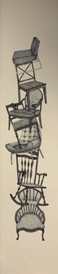
For most of us, the first space we identify ourselves with is the domestic sphere. This is where the objects and people that we have chosen (or had chosen for us) live, grow, and move about. We interact with everything differently in our domestic spaces, especially in private.
Both directly and indirectly, I have thought about this in my artwork, especially in my sculptural pieces. I am attracted to furniture, clothes, and jewelry that have been used or made to look used. I like to arrange these objects in a way that seems natural, or in a way that creates a narrative about personal space. This interest stems from a strong connection I have to my heritage.
In my 2018 installation Years Have Passed, I focus on the kinds of toys that a young boy might have. As these toys make contact with the wooden shelf, they begin to lose their color, signifying an ended childhood. Located within the installation was a small music box that was to be played during viewings, emphasizing a nostalgic quality. A more recent work is a small upright jewelry case that I produced this semester, also a domestic object. For this specifically, I avoided making the container a simple box, and went with a more organic pea-pod shape. I found that the unusual shape brought attention to how the object might stand in relation to other pieces.
My inspiration comes from artists Mickalene Thomas and Nick Cave. I first saw Thomas’ work in 2017 in an exhibition titled Mentors, Muses, and Celebrities. In the main room, there were four televisions playing videos of women singing Angelitos Negros, a song about the lack of brown-skinned angels in religious paintings. Centered in front of this was a large lounge area, complete with a multicolored 70s style rug, ottomans, small houseplants, and books written by black authors. This domestic space became a curated environment for the video installation to be considered in. Nick Cave, similarly, works with found objects and fabric. He is a fan of “bells and whistles” so to speak, but many of his works refer to or utilize household objects.The art objects, while not utilitarian, reference the duality between texture and sound. He also refers to African heritage and the black struggle in America through the use of Dutch wax fabric. Using specific African fabrics and domestic objects is something I would like to experiment with in the future. As an art history nerd, I often try to integrate well-known motifs or other elements from other artists. In my Psychological Self Portrait, I borrowed a pose from Alexandre Cabanel’s 1847 painting Fallen Angel. My passion for art history influences the themes that I choose to highlight in my work.
When I graduate, I would like to go to graduate school and pursue a degree in museum or curatorial studies. The practice and diligence I have acquired through being an artist will always help me in any career I may pursue.
-

Archie Hardesty Art 399 Portfolio
Archie Hardesty
The queer lifestyle fascinates me because of all the different facets that the queer community has within it. The ideas of love, intimacy, safety, feelings, confusion, pride, sex etc. are so pervasive within this community that all of it swirls into one big melting pot. My work reflects the confusion that is seen with the two juxtaposing sides of the queer community but also the stereotypes and lifestyle choices the straight community throws at me.
When thinking of my work the first word that comes to mind should be “gender binary.” Where do I fall into this binary as a male presenting person that holds feminine characteristics? How does the binary work in other relationships whether same sex or opposite sex? How is sex and gender perceived to me whether it be straight or queer? Through the use of photo, video, and other 2D works, inviting the viewer in for a closer look or even forcing them to look through either full frontal imagery or forcing them to listen and become emotional is what is important. It is important for people to question where they fall in the binary and what they can do to break it. Showing the viewer how the world is ran by masculine views and ideologies and how the artist and everyday person can break it is one of the goals. I want people to question how they present and is that the way they want to present or is it how the world wants them to present? Are we breaking free from these stereotypes or are we reinforcing them unknowingly?
The world is not a kind place for the queer community, and I am willing to show how, as a queer person, I view the world. Being abrasive is not a bad thing when it comes to presenting these ideas, but also creating this kind appreciative and loving environment is also possible in my work because this community does have these moments. By using photos and videos of real queer people, it enhances that these people exist.
The need for gender inclusivity and sex positivity is quite dire in this country and the main goal is to be inclusive and make sure every single side of the story is heard. Since the queer community’s voice is meek at the moment. Then I want my art to scream for them.
-

The Journey of Storytelling
Keimya Harris
Whenever we think of stories most of us can visualize what the setting and the characters look like. Within my work I strive to take storylines from my imagination and bring them to life. For my work I aspire to bring important aspects of stories to life by creating illustrations that deal with fantasy worlds that deal with creatures and people that inspire viewers to embrace their inner child or feel as if they're a part of the story. To achieve my goal of bringing different and unique storylines alive I use different mediums such as ink, marker, and colored pencil to help give life to these stories by capturing the viewer with vibrant or subtle colors and detailed line marking. The different medium contributes to my vision because it can give the characters and landscapes a stylized but life-like feel or make the audience feel as if they're in a storybook. Things that have helped me towards this journey are Bella Rachlin, Tony Jackson, Bobby Chiu, and many more. Each of the artists that are a big influence to me allow me to take a step back and see the worlds I visualize in ways I may never have considered. When I make each piece of work I always think of what kind of story I want to tell and what emotions that I want to make my audience feel. On this continuing journey I am taking as a storyteller I hope that I continue to bring out the child within my audience and make them want to use their imagination.
-

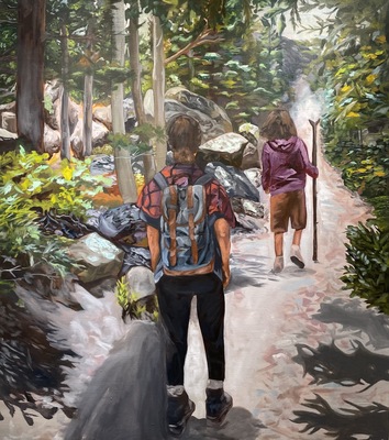
James Inmon Art399 Portfolio
James Inmon
My work has its roots in structures; the regularity of structural components feel right to me and serves as a counterpoint to the visual noise of the natural world. My most recent work has focused on houses and home structures. Most contemporary houses are only a slight variation on one another, and there doesn’t seem to be too many models to choose from. The suburbs are full of sameness which can become pattern. This observation sparked my interest, so with my latest pieces I’ve been exploring this idea of multiplicity in a suburban setting, whether it be with a watercolor painting or a wooden sculpture of a house.
I’m a person who likes puzzles; I’m in love with the process of finding a solution to a problem. Similarly I enjoy exploring the things around me to try and better understand their nature and how they exist and function. I treat my art as a practice of exploring and comprehending the world around me. This method of understanding is why I find woodworking so enjoyable; it is a medium filled with processes that require you intimately understand your material. It’s constantly checking your knowledge and testing you, and if you happen to make a mistake you’ll know immediately.
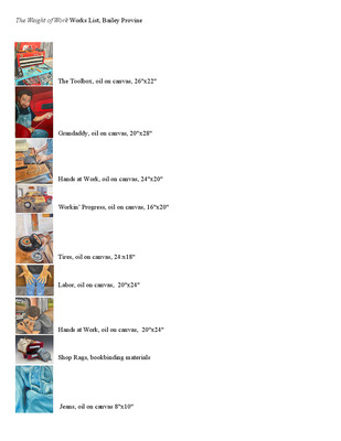
I’ve been looking at how Jerry Bedor Phillips utilizes the interaction of shadows to help emphasize the forms of his bookbinding covers and I have embraced this in my recent house sculptures as a way to maintain a simple but pronounced shape. These concepts of suburbia become apparent when looking at my work; for example in my most recent piece Who’s Helen Beck, you see the form of a house that you could see a hundred times driving through any american suburb. It’s painted a light pastel color reminiscent of pastries to imply this is a cookie cutter form that has been dressed up just enough to be pleasing to the eye. There is also a lighting element that allows the windows to emit a soft warm glow to further assist this idea of visual comfort. I am currently working on four more similar houses to bring the topic of multiplicity deeper into the conversation my art poses.
-

Emma Mitchell
Emma Mitchell
The purest form of pleasure is found in simplicity; holding something meant to be held, touching a surface meant to be touched. My sculptural ceramic work focuses on embracing the childlike desire to reach out and touch. The textures visible on the sculptures heighten the viewer’s inclination to feel what they are seeing. Just as mugs are created to meet the lips of the drinker, my sculptures are built to meet the contours of the holder’s hands. This mirrors the effect of holding a child or caressing a loved one.
Many of my sculptures begin as a flat surface, created to meet the ground or table in such a way that implies growth, flourishing into a form resembling a figure with an enormous amount of life and energy. Although the form doesn’t necessarily mirror the figure exactly, it mimics elements found in the figure; curves, bumps, concaving surfaces, etc.
My chosen medium is clay because clay is natural, found on this earth, manipulated by hand. Clay is a living organism, growing and collapsing with the elements. The clay has memory, it remembers how it was formed, built. It can embrace the hand of the potter, or choose to reject it. I find beauty in the fact that ceramic failures can be recycled into something greater. The majority of my early sculptural endeavors collapsed or cracked in relation to the speed at which I was building and, as a result, were recycled. Now, I embrace impurities, honesty.
As I continue learning, I experiment more with different surfaces as well as the meanings behind them. The cracks, glaze drips, streaks, and imperfect surfaces remind me of the human body and the many imperfections associated with it; birth marks, scars, stretch marks, etc. No one is without imperfections; flaws provide character, personality. My work is meant to empower those who interact with it and give them a sense of safety and security by encouraging them to embrace impurities and less-than-perfect.
-

UtariusArt399Portfolio
Murray State University
My art is a visual representation of my emotions and the things I cannot say through the use of portraits and flowers. When you take a flower in your hand and really look at it, this flower will have a different meaning to every person who holds it. The living beings and things I am painting are my outward expression of my experiences and the people in my life, but they can be understood in infinite ways by viewers. Art to me is a free space; a place with no rules, no restrictions, and no wrong way of doing anything, which can be a space of growth. My art depicts my emotions. These emotions are scattered, but honest. The work is mostly inspired by the outward struggles and problems of my everyday life, but hidden in a more abstract viewpoint that results in a more vague narrative. My pieces are figurative and surreal, and mostly depict flowers and portraits of close friends and family. With these living subjects, even the slightest difference in brushwork or color can change the identity of that person or plant. I love the different emotions you can press into a piece with organic forms and facial expressions. I want my art to show not only emotion but a sequence of different viewpoints that inspire a vivid form of communication, given to them through the way I combine these viewpoints in my art. My medium of choice is something that I can't confirm because there are so many to choose from, but that's the fun part of expressing myself because I can choose so many to improve my form of outward expression. I can still use the styles learned to bring forth the deeper emotion and communication. Some of the artists whose work I am in conversation with are Kehinde Wiley, Kara Walker, and Faith Rinngold. These artists all have separate components that give influence to my work. Kehinde’s work gives me the aspiration to add more narrative to my work complete with vivid color styles, Kara for her use of form to project scenes with her work, and Faith because the deeper narrative presented in her art work.
-

Conner Murt ART399 Portfolio
Conner Murt
Conner Murt
Artist/Design Statement
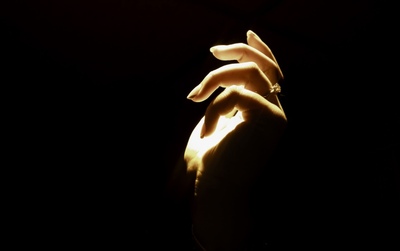
These photographs capture raw moments of people’s lives, without artistic fabrication, communicating a sense of candor and ingenuity in each photograph.There is an absence of a figure, yet obvious fingerprints have been left on the space due to its unique nature. Most easily explained, taking pictures of things that stand out mentally in a personal sense, have unique characteristics, and can illustrate only portions of a destination, without giving away all of the specifics of that said place are what is photographed within this work. The search that is involved in finding the spaces for the photograph is of greater importance than the editing and after process that follows photo taking. The images are framed in a way that provides balance and context to the subject of the photograph, thus allowing its story to be ascertained. The story of the consistent presence of the individuals responsible for the space, but the absence of their being within the photographs propels the continuation of this conundrum.
The photographs depict spaces and subjects/items that are worn and have clearly developed over time, providing a conclusion in a still frame, while allowing the onlooker to imagine the story that may have led up to that point. Photos of hands have also been incorporated into this work throughout the years. The inspiration and focus of these photos is the presentation of hands being a working part of an individual, heading somewhere, doing something, or pursuing daily activities. These snapshots of everyday life allow the eye of the beholder to fill in the blanks and allow his or her mind to wander and allow the photo to play out in a variety of ways that are dependent upon mood, life experience, and personal interests.
Inspiration for this work is drawn from two artists in particular: Ted Geshue and Nan Goldin. Ted Geshue is an independent photographer and digital media specialist living presently in London, England. His work primarily consists of classic cars and hazy landscapes. Ted Geshue’s photos produce a creamy, hazy lighting similar to what is broadcasted within this work. Inspiration is drawn from his lighting in particular when choosing destinations to photograph and during the editing process. In addition, Nan Goldin’s photography is a bit more chaotic, having collaborations with the likes of Supreme and large scale gallery representation such as MoMA. She resides and works in New York City, Berlin, and Paris. Nan Goldin inspires this work by means of capturing oddities, by implementing new objects of focus, and by never viewing everyday things plainly while undoubtedly stepping out of zones of comfort.
Studying everyday spaces and activities of daily living that are often overlooked is the focus of this work. The individual is not the focus, rather the space or environment enriched by that individual. Natural, un-fixed daily activities and scenerios provide insight to an individual and the life which they lead. Oftentimes, big highlights of people’s livelihood are the only memories captured by photographs; however, photographing everyday activities and natural events that are unrefined give people a realistic viewpoint of life to reflect upon and view in a different light. Revealing the identity of the figures behind the photographed spaces would divulge the mysterious nature of the work. The intent behind this specific work process is to invite the viewer to take an active role in the work by means of reflection, personal interpretation, or memory through life experience.
-

Ashley Reagan Portfolio Art399
Ashley Reagan
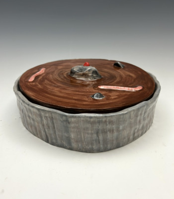
Nature is filled with delicate yet very resilient organisms capable of withstanding immense adversity. I utilize imagery of particular plants that flourish after natural disasters such as wildfires, floods, drought, etc., as a means of representing themes of growth and progress of the self within an environment that is inherently detrimental. Through the adornment of handbuilt ceramic boxes with imagery of these plants I am to allude to the notion that one is able to grow through even the most devastating of circumstance. I allow this metaphor to speak to not only my own personal narrative of struggle, but also the narratives of others who have faced hardship. The use of organisms that are only found growing after disaster cements the idea that the struggles people have to face are what create the people they are. Flowing organic forms, soft line, clean imagery, and semi-muted color show up often in my work through well-touched, soft edges and watercolor-esque underglaze paintings. I plan to tie together both my metals and ceramics work through the related imagery as well as using the ceramic boxes as displays for each metals piece.
The tactile nature of ceramics and the wearable implications of metalsmithing are things I am very interested in. How a piece is touched and observed by the viewer informs many of the decisions I make. My personal concept of a wearable is that it is to be worn and fidgeted with as an idle movement or way of quelling anxiety. I often create work that is mobile or shifting, has hanging pieces, or contains something to be opened and closed; including hidden elements. The sense of tactility is also related herein to the boxes I create. The idea of them opening and closing either by the viewer or creator is important. I often work in copper, using earthen tones and imagery when making colored enamel pieces to maintain a softer muted palette. My use of an earthen palette also prevails in my ceramics. I work in a red, terra cotta clay body which allows the colors after firing to retain an organic quality. Retaining this type of color palate is important within both my metals and ceramics work because it maintains the focus on the natural and despite the implications of the imagery used, it still allows the viewer to approach the subject more gently.
I find myself very inspired by artists such as Jennifer Kaplan, Joan Bruneau, Jessica Calderwood, and Victoria Walker. Calderwood’s work influences mine through her use of botanical imagery to portray concepts as well as her limited paletes. Jennifer Kaplan’s work lends itself to mine especially in her use of greenery as a pattern and wrapping decoration which is something I plan to explore in future ceramic work. Finally, I find Victoria Walker to be a large influence because her kinetic wearables are relative to similar kinetic attributes I hope to further pursue in my metals work.
-

Art399 Portfolio
karli steinbruegge
Artist statement
My work is based around my personal beliefs, feelings, and experiences. This means that my work often displays a feminine perspective. It also means that I consider women’s issues when creating. I often dig into my roots for inspiration, this causes me to incorporate midwestern imagery into my pieces like nature and agriculture. My preferred medium is oil painting. I am drawn to the repetitive nature of layering. However, I also enjoy working with charcoal and sculpture.
Art has the ability to be expressive and create an experience for the viewer as well as the artist. By utilizing this I intend to help viewers relate to my work, or at least understand a perspective that may not be their own. My collections are intended to start a dialog, raise a question, or evoke an emotion in the audience. Art also provides me with a platform for my concerns and opinions.
Most of my paintings are figurative. While not all of the figures I create are clearly defined into male or female, I often draw into the feminine aesthetics. I also tend to dramatize my pieces by utilizing color in order to create a dynamic work. By using highly saturated colors it allows me to incorporate a great deal of contrast and depth as well.
My sculptures tend to be connected to the viewer’s sense of touch. I find that texture is something that really affects the small choices I make everyday. Therefore, this became a concept that constantly appears in my three dimensional pieces. Part of the observation of my works require you to think about what they are created from, how they feel, and who created them. Like my sculptures my abstract pieces are often inspired by my own sense of touch. Compared to the rest of my work My abstractions tend to incorporate heavy linear patterns.
Another commonality amongst my work is that I usually stick to forgiving media, (oil paint, charcoal, and handbuilding). This is because I am not perfect and sometimes there are accidents (whether they be negative or positive) and art is about problem solving. I think that my art is not always going to be perfect just like life and both things should be subject to change. This also ties into why I want my audience to touch my sculptures. Over time they will be subject to the change that goes on in the world around it just like we are.
-
Nova Tabor Professional Practices Portfolio
Nova Tabor
Nova Tabor
Artist Statement
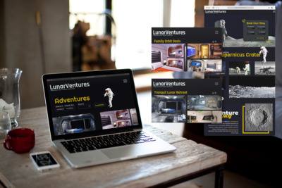
I see my artwork as an outward extension of myself. I am a highly passionate and emotional person, and I prefer to let that come through in my artwork. In my artwork I tend to us a lot of bold and bright colors, and thick dark outlines. I’m highly inspired by cartoons and animation, and I love trying to create the same wild, energetic, and off the wall energy for my graphic design work. My work is outpouring and expression of myself. I attempt to unload my thoughts and emotions in as palpable and genuine manner as possible. When people view my artwork, I hope it evokes strong emotions within them as well. I think channeling energy and strong reactions can be extremely helpful when thinking about Graphic design and advertising.
My focus in art is on graphic design, but I have a strong background in drawing. I try to utilize this background when working on the computer to give some of my work a more natural and relaxed feel. One of the aspects of graphic design that I most enjoy, is logo design. One piece of mine was a logo for a fictional science and research lab. I created the logo by picking two random concepts and fusing them together, umbrellas and spaces. The body of the umbrella functions as a window to space and the stars, but the disconnected umbrella handle helps to keep the image readable.
-
 by Samantha Tudor")
Final Portfolio (Tudor)
Samantha Tudor
My desire to teach has been apparent since elementary school when I used to dress up as a teacher for career day. As I grew, my desire to teach art specifically became clear, and I enrolled at Murray State in order to get my Art Education Degree and Teaching Certification.
As an artist, my greatest motivation is the exploration and discovery of the processes related to different media. I am most satisfied when I am learning a new skill or material that will become part of my teaching tool kit. I feel lucky that this fits with my goal of being an art teacher, where I will need knowledge of many things. I have an appreciation for work that displays high degrees of skill, and where craftsmanship is obvious. I like to create larger works of art because they can be viewed more easily and every small detail can be seen in the work.
While my goal over the past two years has been primarily focused on skills, I am also very interested in form and space and how I can use them in my work. I am intrigued by the way I can create interesting objects within three-dimensional space, but also how I can create the illusion of form within a two-dimensional plane. Also, my work is typically representational because it helps me to perfect my craftsmanship. Henry the Humpback is a five-foot-long, paper mache sculpture that I created to learn about paper sculpting. I chose to make the form a humpback whale, so I could tell when I had mastered the technique. With the larger scale of this piece, I decided to play with space by hanging it in the middle of a hallway, creating a disruption to this regularly used place. I manipulate space to resolve my creations.
I find myself interested in artists whose work I consider “intelligent”, meaning that a piece operates beyond simple beauty, but shows real intention and planning for its success. One such artist is Banksy. He approaches graffiti in a manner different from other artists by using stencils as opposed to free-handed spray painting. He chooses a specific environment that he can respond to, and he subverts social and political “norms” as well as the standards of graffiti culture. Artists that plan their work inspire me. Another artist is Guy Laramee. He makes beautiful landscapes carved from books, and the technical level of skill in some of his work is absolutely stunning. It makes me wonder about his process and techniques, and I understand that a lot of thought goes into his work.
Since I am pursuing my Teaching Certification, art is more about community building to me, and I need a strong skill set to build my community. I strive to perfect my craftsmanship in many processes, so I may show my students how to create art that they are proud of. I wish to inspire my students to make art with media that excites them and to pursue a career in the arts.
-

Through My Eyes
Tia Whitaker
As a young artist growing up, I was very influenced by my small dominantly African American town in Southern Illinois. My family has always made sure that I was aware of where I came from and what I represent. This would include not only my family, but also my culture and the way that society has historically viewed people of my skin color. My community, my family, and my culture were the first things that I had to look to for inspiration and remains my biggest inspiration in my work to this day.
When considering different ideas for a piece I tend to think about how this composition will welcome the viewer into the world of the artwork at hand: Is this piece meant to be more visually pleasing or do I want my audience to feel like they have just had a full conversation? For example, my “Blue Women” piece was meant to be simply visually pleasing while also celebrating my identity as a black woman using a color that is commonly used in portraying black/brown people in art. As shown in this piece I enjoy creating in a realistic style accompanied by balanced compositions and a full range of values and textures.
Among the artists that inspire me would include the amazing Kehinde Wiley, Kara Walker, and Ernie Barnes. Kara Walker really stands out to me because along with the fact that she is another woman of color, her work discusses issues dealing with inequality and violence in this country; something that I am greatly inspired by. Much like these artists I aim to get my audience to walk away with a better sense of who I am, my work, and my pride in my cultural background.
-

Twinkle Bhojwani
Twinkle Bhojwani
Being a young designer, it is sometimes inevitable to not have a fickle mind as I try to grow. I want to create aesthetically pleasing work by pushing my brain to move beyond my first idea in order to develop original approaches to the challenges that arise, and that is why I design. I see poor design that evokes an emotion in me to want to fix it.
The way things are designed, whether good or bad, communicates just as boldly as the message or the idea. I use my designs to evoke an emotion by pushing ideas, manipulating line, experimenting with shapes and colors, and observing detail. I have made it more interesting by having a relationship with my design. My work ranges from the use of thin and heavy typography, sleek imagery, and bold, solid colors. My design stems more towards designing business systems, package design, advertisements, and layout designs. All of my work has a lot in common, for example in most of my designs I lean more towards serif fonts, lots of white space, and the use of typography more than imagery.
Jennifer Morla, a contemporary designer, once said, “asking questions generates more ideas.” I am definitely an external processor, so I tend to think out loud in order to generate ideas. Design heavily influences contemporary society and is influenced by society. When I create work, I do not only think about solving the problem, I also think about changing the contemporary world around me, because being a designer, gives me power. Design gets me one step closer to others seeing the world through my lens.
My work is visually influenced by Herb Lubalin. He would manipulate type in such a creative way, that it would look like an image rather than typography. I like to experiment with fonts more than with imagery, and he is an advocate for this. I am most inspired by his design of the font “Avant Garde.”
-
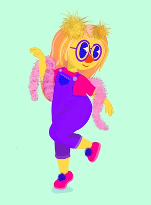
Roby Joe Dream Boat
Roby Blackwell
Love is everywhere, we see it all the time. It is something that I myself have even become obsessed with. Showing love through a surreal childlike eye with a twist of tongue-in-cheek, I desire to evoke the sense of complication through maximalism. My generation really inspires their endless influx of media; how Instagram profiles have turned into perfectly planned out color schemes, with set saturations and grain levels. I make work about millennials, the love within us. Exploring how we portray ourselves on social media, and the fantasy of how we portray this curated life, combined with pop culture is the visual aesthetic I want to maintain.
Color and shape are two things that define my work. I like to use relatable motifs that are child-like, and playful. Using flat shapes gives the imagery a graphic quality to them. Using my love for printmaking, I am now pushing the convention of its possibilities to use it in non-traditional ways. Silkscreen ink is printed on fabric and plexiglass to make wearable print pieces. Using print in an installation way, I want to animate the space— imagine hanging hearts and clouds printed on colored plexiglass to create an over-whelming feeling of innocent yet spunky love.
A huge artist influence to me is Mike Perry. Perry, is based in Brooklyn, NY and is a printmaker, graphic designer, painter, and an installation artist. His use of color, hue, and color pattern combination is genius and inspires me to want make art. Another artist that inspires me is Yayoi Kusama, the famous Japanese surrealist artist, whom has been known for her installation exhibits, and bold patterns. “I, Kusama, am the modern Alice in Wonderland” I sort of want the same thing as Kusama, I want to create a space full of imagination, and full of happiness.
-
PROFESSIONAL PRACTICES (ART 399)
Courtney Bowman
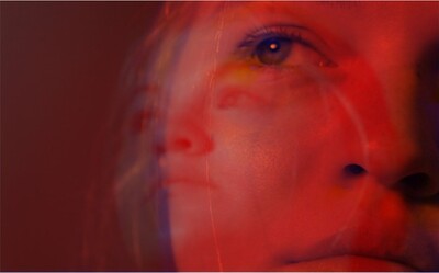
My photography and videography give light to dark lapses in my memory. Or perhaps my practice is a love letter to all the memories I have forgotten, whether on purpose or not. I am inspired to create works that fuse aspects of horror and beauty alongside the never-ending desire to partake in capturing stories of those around me and the characteristics of nostalgia that such events hold. The exploration of these concepts allows me to engage with the communities around me, while instilling them with a visual interpretation of my own heightened, internal experience of the situations. to aggrandize the situations, unknown to the viewer. With a background in theatre, I also tend to dip my toes into performance art whenever I get the chance.
Nostalgia is a big part of what is included in my work, as I am unable to properly recall most situations I find myself in, due to depression and anxiety affecting my memory. The soft highlights and shadows alongside heightened saturation are my attempt to bring a dream-like quality memories seem to possess into both my video and photography pieces. Modern photographers that I take inspiration from include Chloe Sheppard, and Nguan. Both artists have a focus in film photography, and create serene works that include subjects and situations that they have either happened upon, or set up to be seemingly familiar, like long lost childhood friends or places that a viewer has a vague memory of. Also featured in both artists photography is a sense of beauty within the mundane, such as Nguan’s images of sides of buildings during sunset.Horror makes its appearance mostly in my videography work, ranging from bodily horror, tension building/suspense, and various subjects from the occult. My work in horror has given a chance for me to focus on more eerie subjects while deciding to make it either something beautiful or as disgusting as I see fit. The director I have been inspired by since before I can remember is Takashi Shimizu, creator of short films Katasumi and 4444444444, alongside the Ju-On series. His work is more reliant on suggesting the horrors he is showing, while focusing on both sound/the lack of and each specific location and its relation to the overall theme in regards to color or elements placed in the set.
The goal for my BFA show would be to create a sort of separate world within the gallery itself. Within limits I would like to create sectioned areas to allow the viewer to stop and be fully immersed inside my constructed world. Within those sections would be photography/videography works alongside such objects that I have created that are featured inside to blur the lines of reality. Alongside these sectioned areas I would like to have both photography/videography be shown as if they were found artifacts in the world. I would like the works in the show to feature an array of students from our own art department due to this being the community I am always surrounded by, and to shine a light on the diversity in the art world in a creative way. I am also considering bringing my love for performance art into play by performing as a character from the world during the opening, and then perhaps asking the viewers to participate if they are willing.
-

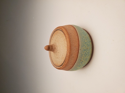
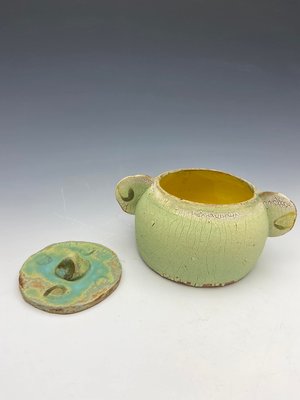
Amillia Cecil
Amillia Cecil
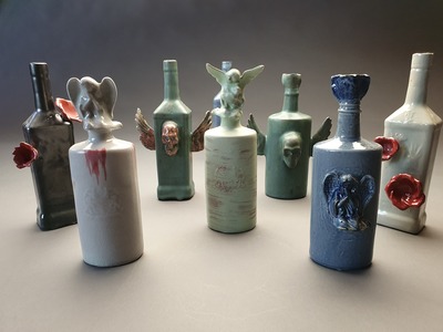
A porcelain kitten with an opening in the back to place my most valuable things. This is what I cherished the most as a child. The vessel to everything I cared for is what I held most dear. The reason to why I create can simply be stated that I am sentimental.
Through the investigation with manipulating glazes and clay, my ceramic work suggests a playful representation of sentimental values. I want to make a connection between myself and the viewer as I create functional pieces that have been individually treated with the utmost care and a fine attention to every detail. I want the viewer observing my work to find their own personal value in my pieces. While not having a full understanding of how glazes affect each other I want to continue to search to find a new way to manipulate the material and push the boundaries with the clay. No matter what I do I want to find a deeper understanding of clay and have new ways that I can find a connection to the form.
As I learn more about graphic design, I am acquiring the technical skills I need to begin finding my voice through experimentation within the medium. I am attracted to typography and the way you can manipulate the letters through different typefaces, variations and colors. Through my college experience I hope to improve on my typography skills, page design, and illustration by stretching my knowledge of the rules and experimenting to find a style that represents me.
In my time in Printmaking I have grown so much with my subject matter. I can see a distinction between the progress each semester. I enjoy screen and linoleum prints because of the efficiency of printing multiple works in a short amount of time. I think what draws me into printing is the attraction towards combining drawings with graphic design. I think that the intricate process of exposing a screen, mixing ink, and rolling a relief makes the time put in more rewarding when the work is finished.
Artists that inspire me are David Carson and Scott McClellan. Both of their formal quality’s catch the eye of their viewers and invites you to look deeper. I find the work of both of these artists attractive because of their unconventional and experimental styles. David Carson creates rule-breaking layouts through his graphic design that challenge the conventions of design. Scott McClellan creates rough surfaces that have irregularities in the clay and glazes to reference back to the architecture of the rock and the materials that make up the form.
-
Professional Practices Portfolio
Sarah Cox
As human beings, we want to look away from something that makes us uncomfortable, but we can be enthralled by it. I am currently creating work about the idea of restriction and confinement, specifically addressing body image. There is an underlying theme of the attraction-repulsion concept. Confronting audiences with less than desirable imagery creates a tension between my work and viewers. Creating that relationship fuels my work and allows me to cross uncomfortable boundaries and discuss our bodies in a contemporary way.
I use charcoal and graphite to create work, occasionally with a limited but vivid color palette with soft pastels to emphasize a specific aspect of the drawing. I also have experimented with fabrics and branched into three-dimensional work. The use of watercolors creates very intense images. Utilizing color generates an even more disconcerting effect than plain graphite or charcoal, depending on the subject matter. Value shifts also evoke various emotions, allowing for strong contrast, or chiaroscuro, that creates visually pleasing pieces. My work includes both figures and human-like forms, and I also incorporate animals and meat as a way to communicate the same concept with different subject matter. Compositions vary in scale, and the imagery is often close to life size or larger. Because the human figure is often depicted, very organic forms are used to create a more accurate representation of a figure.
Figurative artists such as Jenny Saville, Lucian Freud, and collaborative artists Cara Thayer and Louie Van Patten are an inspiration to my work. I connect with contemporary artists but still admire those in the past, especially Greek artists that projected ideal, natural beauty into sculptures. Their work draws me in with the beauty and softness it possesses from a distance then finding intricate details that give the piece liveliness. I am very inspired by the human figure and the exploration of individual components of our anatomy; there is joy in exploring how to render flesh with two-dimensional medium. Obsessive-Compulsive Disorder also lends a role in how I am process-driven by choosing to depict meticulous and detailed imagery that may include repetition, which comes from obsessiveness. This has also inspired an admiration for intimate details of works such as eyelashes or the shine on a fingernail. Using these small details allows viewers to get personal with my work as they delve into the piece. The obsessiveness also lends to consistent worries about health and our instinctual need to rid the body of our ailments.
Establishing a tense connection between unsettling imagery and viewers is how I discuss my obsessions with health and the small things we do not typically ponder upon. Joining the obsessive nature with the human figure starts a conversation between not only viewers and the work but also within myself as I explore various aspects of the human figure and how to present it in a way that attracts yet repulses.
-

Cara Crowley Selected Works
Cara Crowley
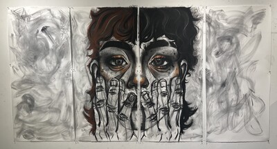
When someone presents nothing about themselves to anyone other people rush in to fill the gaps in this person’s behavior. In my work I like to explore inevitable duplicity of living, such as the mind versus the body and saying versus thinking. When I create an image, I try to think about what I can hide and what I can reveal in the picture plane and how that impacts the meaning of the work. Layering imagery allows me to cover up and reveal different things in the composition, through this method, I can push certain things backwards and accentuate others by pulling them forward. I am drawn to high contrast and value because of its dual nature and as a reference to “black and white thinking”, which is prevalent in anxiety and stress.
When I look at other peoples’ work, I am most drawn to expressive line work and color in terms of their process. Artists like Ernst Kirchner, Francis Picabia, and Danielle Klebes interest me because of their use of highly saturated pigment and compositions that make the viewer feel unsettled. For me their works show how uncomfortable certain social interactions or spaces can become.
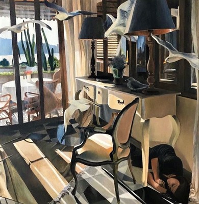
The subject matter of my work most often applies to my own life, but I use silhouetted figures and objects to create spaces, or situations that become universal. These spaces and figures become confusing and alarming with the addition of skewed perspective and unreadable details. The unavailability of the figure makes the viewer feel these people are unapproachable, or dangerous in some way. Unavailability in spaces without the figure is created by making the spaces flat with intrusive shapes, emptying picture frames, and making the space outside of windows and doors vague. All of this makes the audience feel trapped and alarmed by domestic spaces which are typically viewed as safe havens.
-

Talitha Cunningham
Talitha Cunningham
I have explored a number of ideas and media since starting my journey toward becoming an art educator. One that I seem to find myself returning to regularly is my interest in exploring mental illness. This derives from my experience with people in my life that have dealt with and continue to deal with mental illness, myself included. I want to raise awareness about mental health and the impact it has on the sufferer through my art.
I have touched on this idea in some of my past works, including a photo diptych that depicts the highs and lows of someone who is dealing with bipolar disorder, represented through the use of black and white. For this work I drew inspiration from Christian Sampson, a 24 year old photographer who made photos that depict the “invisible” impact mental health has on the sufferers. It shows a visible representation of what different mental illnesses would look like if we could actually see them. I also made a necklace using different metals and patinas to create textures and contrasting colors that represent depression and anxiety in a way where each one is making the other more prominent.
I plan to continue my exploration of mental illness in future works through the use of wood and the different techniques that I am learning. I also plan to make larger works that draw inspiration from Patrick Dougherty, who makes structures mainly made of twigs. These structures have entrances and exits in various different places along the vast expanses of the individual works. I plan to combine the large structures of Dougherty and representation of mental illness of Sampson’s photos to make a work that draws not only on the growing amount of people who are dealing with mental illness with the large sculptures but also how each mental illness affects the sufferer in different ways through multiple different structures. To this end I have decided to focus in woodworking for my BFA.
-

Student Group Exhibition
Larry Eakels
I have always liked to create things and make interesting pieces of artwork. Making work in the design field has been very delightful and engaging for me. Learning about how people react to imagery even when its digital or print has been one of the biggest things, I have learned from becoming an artist and focusing in graphic design. I chose to do graphic design because of my experiences with past classes and pieces that bring joy to me. As well as, the aesthetic you can achieve doing design work. Being able to create sleek, clean, and simple designs to fit the modern style is very pleasing and catches my attention and others. Seeing or knowing that my viewers of my work can understand it and also get a vibe of interest into the pieces gives me a satisfactory feeling which I enjoy.
Most of the work is made digitally, but always starts from sketches with a pencil and paper. Easiest way to make many different ideas for a topic is starting from paper and pencil then you can scan your desired pieces to the computer and go from there. Being able to make multiple revisions digitally is one of my favorite things about design and also the use of technology is amazing of all the beautiful things you could create digitally. Along with digital design I can also do print design as well which is another reason why being a designer you can do many things that can do physically and digitally.
Currently, my work has been inspired by advertisement and my poster design class. Experimenting with layers and colors to create diverse and complex posters that are also very clean and concise. Being able to continue this aesthetic in my current work brings me joy and hopefully viewers of my work can appreciate and see what I see with my work.
-

Exploration
Jessica Free
My art explores the realm of beauty using form, shape, line, and color. I am interested in using geometric and organic elements to visually balance the artwork in the eyes of the viewer. As an artist, I want my art to communicate balance to the people viewing it. I often apply asymmetry in my artwork. Asymmetry grabs the viewers’ attention and connects all of the elements in the pieces by drawing attention towards the subject of the art piece. I also like to emphasize texture in my art, as a subject matter. I love the visual texture and the diverse range of shades you get from darkroom photography as well as the experimentation process you go through. In addition to texture, I am also drawn to the use of warm colors and the natural movement of shape and form (when using 3-D materials). In other artists artwork, I am attracted to organic, shapes as well because it gives a fantastical and abstract feeling as well as comfort. Wassily Kandinsky is one of my artist influences. Kandinsky is an expressionist painter who used line, primary colors, and shapes in such a way that he created almost-patterns. I am attracted to the asymmetry and open-ended interpretation of his artwork. I am also attracted to the abstract and surreal landscapes of Marc Adamus. In his photographs, he uses nature as a tool to create beautiful and complex landscapes. The exquisite views used in his landscapes almost look too good to be real and include light and dark contrast. Similar to Kandinsky’s and Adamus’s artworks, I often use abstract elements to create art that is not of one specific meaning and create surreal experiences.
In my photography, I combine the rustic and the new. In other artists’ artwork, as well as mine, I am drawn to the use of rustic objects to repurpose them creatively and to reflect them in a newer or more surreal perspective. The juxtaposition of rustic and new objects gives a fantastical, almost unrealistic, surreal setting for the viewers’ imagination. Ansel Adam’s photography also does just that. His artwork gives a fantastical setting by using nature, such as geysers and landscapes, to create a setting for a story unique to the viewers. I am influenced by Ansel Adam’s work because of his passion for embracing nature and using it as his subject matter to positively bring awareness of the its beauty to his viewers. I combine nature with rustic and new elements to create and communicate beauty in a familiar but new context, creating a surreal landscape. My subject matter is old barns, buildings, bodies of water, wood, and natural landscapes, amongst other things. Architectural forms inspire me as an artist, like buildings, frames, and structural lines. For example, one of my most recent pieces called double exposure is a piece created through double exposure in the darkroom which includes, as its subject matter, a boat dock on the bottom of the photograph with a multitude of horizontal and vertical structural lines. Connecting the dock to the top of the piece, which is a shore filled with leaves, are 2 parallel lines going diagonally from the bottom left of the page to the top right. Beauty to me is old, rustic things and places that are often forgotten or overlooked. I want to promote the appreciation of this rustic beauty.
Although some of my work is structural, I do not plan out the subject matter of my artwork. My creative process is unplanned and impulsive in how I create art. I create artwork based on feeling and emotion. When I create my photographs, I walk or drive around, stopping to take pictures when I am inspired while using unique perspectives that beautify the subject. I have ideas of and visualize what I desire my photographs to look like, although sometimes uncertain on how they will be, and then make it happen by using a set and experimental process in the darkroom. The impulsive characteristic of my artwork excites me, and I often find myself in a timeless daze where I am not thinking but doing.
Untitled (First Abstract Watercolor) 1910 Kandinsky
Ansel Adams Emerald Peak in San Joaquin Sierra, 1939
Marc Adamus Heart of the Tree, 2016
-

Professional Practices Portfolio
Emily Glowicki
My interest in multiplicity and repetition has influenced the investigation of movement and form in much of my work in sculpture. This idea of taking one simple form and growing it into a colony of many has interested me for many years, showing itself in much of my sculptural ceramic vessels and multimedia installation. This focus on multiplicity has inspired an investigation of light and shadow in relation to the various media I have worked in: paper, wood, found object, etc. and the environments these objects interact with.
Along with sculptural installation and ceramics, I have developed an interest in functional ceramics and how the pot interacts with the hand of the artist, viewer, and user. My functional pottery addresses the differences between the artist’s experience with a vessel and the person who engages with the pot in everyday life. The relationship between my hand, the artist’s, and that of the person who uses my pot is inherently different. and I continue to explore this idea across the functional wares I am currently making, while also developing further skill in creating a variety of vessels.
-

Hall's Art
Katlyn Hall
Artist Statement
Katlyn Hall
January 20, 2019
Communicating through illustration and graphic design sums up most of my work. Using drawing as my main medium to concept ideas ranging from a story that needs to be told to a client’s desire to make their message in a design applicable to their audience. Storytelling is universal. I don’t consider myself a fine artist in the terms of communicating in the traditional sense through oil painting, sculpting, etc. (some expertise in those) Art is becoming more digitized and commercialized through the digital area. Styles in animation, graphic arts, and conceptual are moving past the traditional way of expression. Because of this, my art is turning towards digital painting and graphic illustration with the use of Photoshop and Illustrator. Watercolor and drawing in are the traditional aspects I’m looking to blend in with the digital side of illustration.
My traditional influences are John Constable, a realist artist with a romantic impulse towards landscape painting and Thomas Girtin, a gifted watercolorist that takes plein air painting to a different level. My modern influences are James Gurney, an oil painter that uses character for storytelling and Lois Baarle also known as Loisvb on Instagram is a recognized artist that takes full advantage of what the digital medium has to offer while her works look traditional.
Printing is not supported at the primary Gallery Thumbnail page. Please first navigate to a specific Image before printing.