

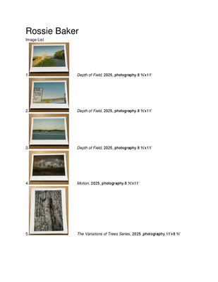
-

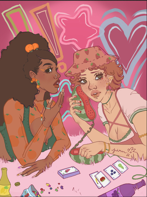
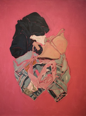
Professional Blend 3
Kelsey Crawford
The importance of people and their roles in society are of great interest to me. Within our society the idea that certain individuals are held higher than others is the most interesting of others, usually based off of the privileges they have such as money, class, respect from others that not everyone gets. The ideas of our current societal norms paired with expectations are fascinating to me and how we as humans begin to react to them is something I enjoy including in my work. I am a designer, an innovator, artist and creator of things. I focus on the digital world of creating but 3 dimensional beings have always been something that will grab my eye. Using these ideas with geometry and dynamism is what I find when looking to create.
I use photography to start the creations of my digital illustrations. This imagery, creating a focal point and then accompanying it with geometric shapes is something that feels natural to me. Along with these ideas, I like to create pattern with textures and shapes, this helping the central theme. The use of positive and negative space shows through as well when it comes to my work. The shapes geometrically are simplistic but the composition is not as it could be said to be busy and chaotic. For example my work consists of a central figure or focus such as a person that is surrounded by varieties of shapes and movement.
Influences of the world are present. For me specifically, I draw inspiration from the Art Deco movement, specifically the architect William Van Allan who is best known for his work in the Chrysler Building in Manhattan, NY. The detail, pattern and line curvature as well the pattern and consistency of the design all are something that I find interesting and aesthetically pleasing. Other influence from that time are graphic designers Leo Marfurt and AM Cassandre. Constructivism and it’s use of shapes is also something I find highly intriguing such as the artist El Lissitzsky. As well as drawing inspiration from the past, I also find it in the present of the works by street artist turned graphic designer Shepard Fairey who came to fame by doing the Obama Hope poster as well as painter Kehinde Wiley and his use of color and pattern. These visual inspirations connect to me by their use of color, shapes and pattern. Kehinde Wiley is a painter that visually, the work isn’t compatible in style to the other examples but the use of pattern can be aligned to be similar as the use of pattern in the Art Deco examples. Naturally I am drawn to primary colors, their monochromatic difference within their color and how the colors work when put against one another. How these colors play off each other as well as how strongly they can stand alone is something I think lends itself to the theme of the people I am so interested it in the bigger picture; strong and individual but when put together intense and powerful.
-

Tiffany Day
Tiffany Day
I draw inspiration from parts of the visual world that strike me as strange and unique. I love to work with the concept of the extraterrestrial. So much of the universe is unknown to us that it is easy to imagine whatever you desire could be out there existing in it’s own world. Printmaking led me to the examination of the idea that there is more to be learned outside of our limited knowledge of space prompting me to make prints about exploring a new world. I used three separate plates to create a narrative using natural forms to create a rocky, foreign landscape that felt full of the possibility of mystery and surprise in uncharted territory. The narrative is of this unexplored, rocky, mountainous region with an astronaut making his way through the terrain and an alien creature peeking over a large rocky hideout. This was the beginnings of the idea of otherworldly exploration.
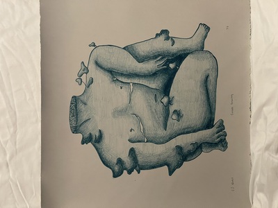
I love to utilize curving, fluid lines, and natural forms within nature and the body. I incorporate the human body in a lot of my work. In ceramics, the strangeness of holding molds of human body parts inspired me to create an arm and hand holding a head. This piece was meant to explore the juxtaposing ideas of beauty. An exploration of how beauty is in the eye of the beholder. Beauty cannot be judged objectively, what one person finds beautiful may not appeal to another. The face of beauty for everyone is different, for some it may be the beauty of nature ( ie. the flowers covering the arm and one side of the face) and for another it may be the beauty of the natural (ie. The plain/natural side of the face). Sometimes ideal beauty can overtake your own perception of beauty. In photography I utilize natural forms such as trees and rocks, which are works of art in themselves because of the way time shapes them into unexpected formations. Yet, through photography, can be framed in a way that enhances its natural conversation with the surreal. For example, natural, rocky formations seen with the naked eye can be framed with a camera to look otherworldly and unnatural. I explored a favorite hiking area, Garden of the gods, and took inspiration of its natural surrealist qualities to capture a photograph of two rocky mountains. While reviewing the photos I seen the surrealist quality of the photo that looked as if two mountains were really two humans kissing. This leads the viewer to wonder if it is meant to be two humans kissing, two mountains, mountains that were once human lovers, or anything the viewer wishes to interpret the image as.
Salvador Dali has been a great emotional and creative influence on my work. I relate to Dali’s exploration of the unconscious and the strange, alien imagery that results from it. A more contemporary artist such as Carrie Lingscheit who explores human behavior and remembrance in her printmaking, inspires me to look deeper into what roles the human figure can play in an artwork in terms of narrative and emotion. .
My artwork comes from a side of me that I don’t readily share with others. My goal for my artwork is for it to be about myself and the way I interact with the world, yet generalized enough for viewers to look at my work, reflect on it, and interpret the art in their own way. Through exploring ideas of strangeness, the extraterrestrial, and the surreal, I hope my viewers’ outlook on life and their experience shape their interpretations. I hope these readings of the work surpass my own interpretations in a way that expands the conversation the work is in and further enhances the alien nature of my subject matter.
-

cdothsuk_proprac_SP2018
Carly Dothsuk
Carly Dothsuk
Spring 2018
Artist Statement
My art questions what home means to me in relation to my family and myself. I have recently begun exploring why home is home, and what that may entail and why we may rebel against it. I want to figure out why I love my family,and or even why I rebelled from my home. My work functions as a sort of apology in a sense; apologizing for taking people and my home for granted.
Through my paintings and drawings, I explore this with the use of different planes, lines, abstract symbolism and even a series of self portraits to help me explore this. I do this by using colors, line, and perspective to bring things forward, and some back. Playing with the different planes, lines and abstract symbolism gives the artwork depth and space for the viewer to observe and ponder the work. I want to explore memories, go back in time and search for reasons, explanations, and comfort in the ordinary.
Daniel Pitin’s work best exemplifies where I would like to go with lines and his use of space that helps him tell the story or experience he is trying to portray. (An example would be his work Watchtower.) I want to take my memories and mix them with abstract scenes to make them more like memories than reality. I guess in a sense you could say that I want to bring you into my world. In my work Fond Memories, you can see my try at this; and in my painting Many Explanations you will see a continuation of this as well. In the drawing Fond Memories I cut out pieces of the drawing to show the fragments our memories may leave out. With lines and perspective I create a new world to explore, a peek inside of my head and experience the memories with me. In my painting A Map I play with space by using color to give it a “another dimension” feel to it. I make it seem spacious by using flat paint versus layered paint, which pushes and pulls the subjects of the painting.
The main difference between my paintings and drawings (although they speak of the same things) is that in my drawings I prefer cleaner lines and less color, and in my paintings I prefer color and abstraction with less lines. However, my goal is to eventually combine the two mediums. I have already begun experimenting with pastels and conte pencil to push myself in drawing, and to desensitize myself with color. In all of my work you will see a basic symbol for a house. This symbol means home in many forms, and is universally understood to be just that.
My goal with my artwork is to be understanding and inquisitive of myself and what the viewer may think. I want to figure out myself and others, while focusing on home and what that may mean to me and even other people. I want to provoke consciousness and reflective thinking in my viewers and myself.
-

Professional Practices by Kayleigh Doyle
Kayleigh Doyle
Artist Statement
Kayleigh Doyle
Moments captured by old photographs are intriguing and mysterious.
I was gifted boxes of old family photos from my grandmother and was inspired by these moments in my family from the past that I was unable to participate in.These photos were taken before my time and connects me back to my genealogy, Recreating these photographs in the form of prints and paintings allows me to inject my own experiences into that moment. My work , inspired by these photograph is also addressing the ideas of memory and nostalgia.
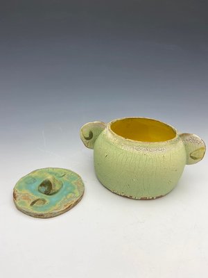
I use both screen printing and oil painting to compose this body of work. Screen printing has a graphic nature I am drawn to, that complements the narratives I create. It also has a correlation to the photography because they both can exist in multiples.. On the other hand, I paint because paintings are often deemed precious and one of a kind. That cherished mentality is how one can relate to the mementos of their family memories.
My work includes using a photo from my collection and abstracting the figure with objects from the image. I often replace vital body parts such as the face or torso with the most prominent object in the photo. These figures are placed in a surreal, abstract backgrounds using a colors pallet that is inspired by the time the photographs were taken.
I am strongly influenced by my rural roots and family ties. I often use bluegrass or old country music in order to get me into the head space of the people in these photographs. I am inspired by the collage work of Genevieve Gaignard and her ability to alter these normal interiors with symbols of different time periods and locations. My intention is that the viewer can step into my shoes and experience these lovely moments in time and live through these nostalgic moments.
-

Professional Practice Class
Alaina Goodlett
Human beings are creatures of habit and familiarity. Automatic movements, speech patterns, and daily activities often develop to a point where they can go unnoticed by the person performing them. Habitual patterns can develop and change as subtly or drastically as we can; they can be as freeing or as obstructive as we allow. Habitual activity can become an important comfort, but can also lead to a reality full of restrictions and anxieties that can halt growth, rather than inspiring it.
My work focuses on the study of how habit and comfort through habitual pattern can affect daily life. I use imagery and materials associated with comfort and flexibility – largely handmade fabrics – and juxtapose them with metal forms to create pieces that challenge the expected nature of these materials. The surface qualities of the pieces reflect the act of automatic movement through the act of making. A swath of handmade fabric is a visual representation of the time put in to learn how to hold the material and manipulate it continuously into something greater than it was before, not unlike the act of shaping and sanding the surface of metal to make it perfectly smooth, or the act of engraving with a chisel and hundreds of hammer strokes. The making becomes a recognizable pattern of movement that is at once therapeutic and comfortable, but also runs the risk of becoming monotonous or even painful if done long enough without a change of position or a break. The tedious nature of the process then informs the concept of the therapeutic nature of habit while also pointing out the potential risks of holding oneself to an inflexible schedule with no potential change.
Insect and nature imagery occasionally take place in my work, as the cyclic metamorphosis seen in animals and our environment can serve as an interesting dialogue for the similar changes noticed in human behavior. Growing out of certain norms as one moves through life allows for reflection of who we once were as we are reminded of the habits we might have once had. This examination of one’s own past can be used to piece together a timeline of daily living patterns that became phased out or inconvenient, shaping an individual through the abandonment of actions that may have been hindering personal growth. As such, we can find that who we once were is as different from our present selves as a caterpillar is to a butterfly. Should we try to recreate our old selves, those restrictions would be significantly more noticeable than they once were.
Extended introspection that comes with transitioning into adult life allowed me to see how my own habitual nature was hindering personal growth. While I still struggle with my self-imposed obstructions, being aware of them has allowed for exploration of myself and how to become more well-informed of what is needed to be successful while still having manageable living patterns. I want my work to inspire viewers to consider their own habits and how those may inhibit their ability to interact with new experiences and opportunities, and potentially begin the process of overcoming those should they deem it necessary.
-

Professional Practices
Sarah Guinn
When people look at the work that I’ve done at Murray State so far, I want them to notice my passion for the field. In the works that I have done so far, a few of my favorite things to instill are alignment, typography and color. In graphic design, these elements are important attributes to create a successful piece.
I typically try to imitate what attracts me to another person’s work. My art and design use a lot of contour lines, symmetrical balance, shape, and negative and positive space. Usually my mental process of starts with getting ideas in my head and I write them down. If I don’t get an idea right away it usually takes some time for me to finally come up with a project to do. If I do have an idea though, it usually starts as one thing and as I start to work on it, it begins morphing into many different ideas and my entire project becomes a much bigger concept. I have instilled some of these elements and principles of design, specifically into a logo project and travel ad layout project.
The things that influence my work vary from my family to music to desserts to traveling. They are the things that excite me the most and I always have endless ideas of items to make when it comes to them. I also love making logos and the concept of brand naming. I am very interested in working on my hand lettering. This is a very big reason why I love Louise Fili and Marla Moore’s work so much. Fili does both branding and hand lettering and I recently have started to look at her work more often. Moore does everything that I aspire to do as well. Her aesthetic and her hand lettering inspire me to really give it my all. Overall, what I think I do the best in are the projects that interest me and go along with what I want to be successful at in life.
-

Casey Johnson: Professional Practices
Casey Johnson
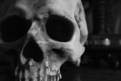
My art comprises one unifying idea: my own life experiences, specifically those relating to my family and friends. By depicting highly specific visual cues—such as clothing, crows, and the color blue—I combine multiple facets and memories in an attempt to communicate my feelings and experiences. Sometimes these symbols are universal; a yellow raincoat, for example, calls to mind childhood. Others are encoded within my own memories—a bird skull relates to a dream my friend had one night. My art is about more than myself; it is about finding common ground between me and my audience and exploring that overlap.
Through symbols, color, and texture, I reach out to the viewer. These symbols and colors appeal specifically to my own aesthetic and emotional sensibilities; it is for this reason that I am so interested in what the viewer can gain from my art. In order to interact with both my memories and the viewer, I use bold, dark lines, bright colors, and clearly visible—if not always decipherable—symbols. The interaction between these elements paves the way for the connection between myself, the piece, and the viewer.
Among my contemporary influences are certain niche illustrators such as Greer Stothers, whose bold use of color to depict creatures—both extinct and imagined—has left an impression on me. Her colorful compositions are straightforward and full of character, and I strive for a similar impression within my own work.
My experience with figure drawings, especially those done with pen and ink, was a major catalyst for my artistic choices thus far. In my figure drawings, I was able to explore unconventional color combinations. This exploration of color continues even in my more recent abstract drawings, in which I have depicted white bottles and other objects in hues of red and blue.
Photography has proven to be an unexpected catalyst for the further development of my art. A photo is an instantaneous moment in time; in a way, it is the purest way for me to present a pure reflection of my own perception. In an inverse way, photography has honed my sense of my immediate, daily surroundings. There are countless moments in any given day where I wish I could have my camera to capture the beautiful subtleties of my world. The photos that I have taken so far are largely the result of chance: I saw something lovely and photographed it, such as sunlight filtered through window blinds or an animal carcass. Others are staged and in a way are more like my symbolic work of other media than my other photos.
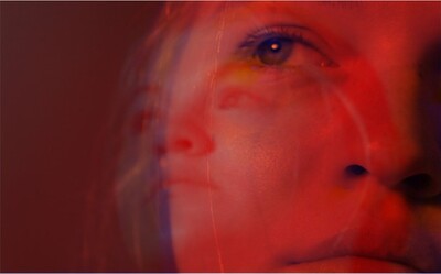
In my art I explore the psychological meaning of color; specifically, I use the colors red and blue as symbols for life. Both red and blue feel familiar and lively to me. At first, I subconsciously used these colors when producing life-based work. As time went on, I began to use the colors intentionally as a kind of code for organic life. In many cases, I also used green in much the same way, but the shade of green was frequently more of a teal color and was thus essentially another shade of blue. It is elements like color that my audience will connect to in their own way, and maybe this connection will be similar to the connections that I have with my own work.
Casey Johnson
2018
-

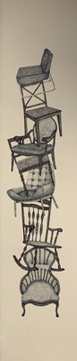
Hanna Kesty
Hanna Kesty
I am not one to make myself the center of attention, therefore self-portraits or any aspect of myself were never an obvious choice. My work is developed from a personal narrative through drawing and printmaking, and is an opportunity to have an open conversation about mental health as a complex form that has multiple parts and pieces. Innocent, metaphorical objects help illustrate a variety of internal disruptions of that form. During the production process of a drawing or print there is a conversation of acknowledgement and honesty happening between these objects and myself.
These objects are depicted in minimalistic settings dominated by negative space forcing the viewer’s attention on the object. Due to the minimalistic settings there is a somber and desolate disposition that dominates the objects, such as a wooden chair, vintage TV, a hare and tree trunk mask. The pieces/objects are typically depicted distressed and covered with two-dimensional string to emphasize internal distress and chaos. Visual cues help the viewer in navigating the composition.
Artistic influences stem from lithographer Kathryn Polk with her use of a realistic and imagined figure, as well as her muted color pallet, and from mixed-media artist Toba Khedoori and the solitary spaces she creates with minimal imagery. Other influences are words. Words are powerful; from poems such as milk and honey by Rupi Kaur, to music, or simply everyday conversations, words shape our day to day lives.
Mental health is different from person to person, yet every person can relate to other people’s stories to a certain extent. It is something that should be openly discussed and not dismissed or suppressed. With this discussion I am connecting to others universally and possibly helping them figure out their own parts and pieces.
-

Graphic
Xinyi Liu
When I was young, I was attracted by Animate and Comics, started drawing childish colorful lines on blanket paper. I can easily draw those cartoon characters vividly, which has plant an art seed deeply inside of my heart. As I get older, I was being trained in school to draw much more professional ways. I work hard to invest in as many kinds of media as I can, but still focus on graphic design and digital drawing, especially for video games and movies, which brought me to art area.
I want to do concept design mostly in the future, like design characters and environment. In the past several years, I tried a lot to practice my physical skills on digital drawings, but I noticed that, compared with brilliant concept designers like Martin Deschambault, I still lack ability on the “design” part, that I don’t have good enough feeling of “two-dimensional shape”, and creating atmosphere. However, I was trying to increase my weakness a little bit. In my recent editorial illustration work, I use blue-tone to create a peaceful atmosphere. There’s a skeleton sitting in a computer station, on the middle of the water surface inside of a cave. It’s indicates myself when I was a child, sitting in front of my computer during mid-night to do digital drawings. That’s my most productive time, and I’m always trying to find the feeling about that time. What’s more, for my final project in illustration class, I used two different shapes – triangle and circle, to design two different kinds of amour sets for male warrior. Because of the difference of shapes, they gave the audience totally different feelings. It was also a challenge for me to draw an elder man, since I drew young woman all the time while practice skills in the past.
If “concept design” is my dream, then graphic design is my choice of reality. To get better sense of “shape”, I concentrated on graphic design a lot in college study as well. When I was in China, even though I was not an art major student, I was asked to help organizations in school to make posters or PowerPoint stuff all the time, which had practiced me a lot in the past few years. When I attended to Murray State University, during the study in graphic design class, I learnt many new, especially more professional skills about design. One of the most obvious change is, my taste of design became better. My final project of graphic design II class is a zoo poster, but the first version was ugly, just like what non-art student did in Chinese college. My last version is very graphic and neat, which I like a lot. Now, most of my graphic design project need me to make it several versions to get a relatively satisfying one, nevertheless, I believe this is the tough but necessary step to develop my skill and taste to create professional art work, and I’m on the right way to change my style.
I’ll keep learning and practicing for my design and illustration skills, and the taste of my design style in the future, in order to make stuff that also amuse myself.
-

Range
Aman Madan
Artist Statement
My work explores a range of subject matter and themes, but I try to make all of it with a simplistic approach so people could relate and understand it better. I usually produce two types of artworks, i.e., drawings and graphically designed stuff like posters, illustrations, covers, reports, etc. I frequently use pencil and charcoal for drawings and adobe photoshop, adobe illustrator for illustrations and logos and InDesign for designing posters, flyers, brochures, magazines, newspapers, presentations, books.
I choose graphic design because I feel it is a is a good way to communicate to public and be creative enough to grab their attention. It allows me to manipulate my drawing work and incorporate it in my Graphic design stuff. Graphic design helps me learn problem solving as I must work in certain parameters sometimes. I enjoy drawing because it gives me more freedom to express my ideas as well as I enjoy looking at things and replicate them on paper with my interpretation. I like the way charcoal can be manipulated to create a great range of values and mark making. I combine graphic design and drawing together for making certain artworks.
I try to give an emotional touch to all of my drawings, and try to keep it subtle and simple in my Graphic design stuff.
-

Welcome to My World
Sarah McCann
My work revolves around two dimensional drawings on small 9”x12” smooth Bristol Paper. In a sense I’m more of a traditional artist; I prefer to use Prismacolor Pencils, Watercolors, Copic Markers, Micron Pens, and White Gel Pens in my art. Not only have I created lots of drawings, but I have also painted a bit; about a year ago I had a piece put up on display at an Art Center in my hometown called the Glema Mahr Center for the Arts. Quite recently I have been into Digital art; I like to use the free software known as GIMP to color over drawings I have scanned onto my computer. My thought process before I put my pencil to paper usually revolves around what I’ve recently watched, it’s pretty weird but when I watch a show my inspiration to draw starts to shine.
I really want people to recognize my work, by noticing my style and knowing that I like to draw a lot of Fan Art. My personal Art Philosophy is to draw whatever you want, don’t let people tell you what to draw during this day in age. Art is Art, and with a lot of hard work it’s beautiful no matter what it is, because it’s yours. A couple of people who have inspired me are Katy Lipscomb, Aaron Blaise, and an artist on the Website DeviantArt known as WildSpiritWolf.
WildSpiritWolf was the first artist who got me interested into drawing animals, and mainly wolves. Her FAQ (frequently asked questions) came in handy when I didn’t know where to start with my art, I was introduced to shading, micron pens, and prismacolor pencils from her. Katy Lipscomb was another artist on DeviantArt that I met a while back and is a friend of mine, her art is so vibrant and colorful, she introduced to me the idea of using watercolors as a base before coloring an entire drawing with Prismacolor Pencils. And Aaron Blaise gave me the push to draw more human figures and to add cartoon characteristics to them along with animals, and also to start drawing digitally.
-

Siany Riegger
Siany Riegger
What viewers should be able to see in my artwork revolves around the concepts of the sublime and of nature in general. I am inspired by wildlife and encountering new birds on trips and am curious about the idea of nature in my work. For example, a painting that was done for an art history class in Baroque, depicts a robin on a branch, which is supposed to represent humility and how humans can look to nature as something of reverence. In terms of sublime, I create artwork about monsters and use compositions with unsettling conceptual themes or aesthetics. As far as a specific medium goes, I work mostly with oil paint on canvas.
My work Inner Demons was a response to The Sleep of Reason Produces Monsters by Francisco Goya. It emulates the sublime and the idea that certain thoughts, or lack of, can create personal monsters within. Another work like this is a painting that incorporates the use of complex color schemes by having intense red and green artificial light with clashing same colored objects. The colors in the composition are what convey the idea of the sublime due to the eerie nature that is typically associated with red and green.
Some of the paintings made more recently have been utilizing the sublime in nature by using the theme of predator and prey. One of these works in particular, depicts a display where 2-D painted versions of origami birds are placed in a naturalistic setting. Some of the prey birds are seen floating in the water, while others are hanging by strings to mimic flight. Meanwhile, a naturalistic representation of a hawk is in the process of swooping down to tear apart one of the inanimate birds in the water. By using the theme of “survival of the fittest” in my artwork, it bridges the gap between horror and nature to create the sublime, a more complex theme.
-

Pro Prac Bailey Roman
Bailey Roman
My preferred media is oil paint on varying objects and ink drawings. The subject matter is drawn from life or studied then imagined later in the studio to add a creative and unnatural feeling. Through the use of vibrant fractal shapes dissipating from the subject to captivate the viewer’s eye. I also take the liberty of using influences of pop artist, American Realists and Golden Age comic book art, I use the two periods and synthesize them into a more contemporary anatomy study. I really enjoy the dynamic and thick lines in both comic book illustrators and pop artists but crave to have a naturalistic sense of proportions that give my subject a unique personality. The use of color in my pieces are extremely saturated and draw a lot of inspiration from conceptual artists such as Tyler Lockett, Sun GuoLiang and Emmanuel Malin. In more recent works I have pushed myself to be more experimental with my use of media i.e. using coffee as a substitute for paint thinner or painting on the back side of a panel to force more layers and dimensions throughout the works. The messages in my work varies but are not limited to; social critiques on the view of intelligence, a discussion of domestic violence in relationships, the visual effects of stress and how one views the world, and an exploration of glyphs and how they can apply meaning in relatively mundane objects (such as billboards) and their catalytic nature in self evaluations.
-
 by Anna Sohl")
Dialogue (Bridged)
Anna Sohl
Human beings thrive on communication and strive to connect with others in many ways. In spite of our desires or best efforts, communication and connection sometimes falls short of perfect clarity. Our interpretation of a person’s nonverbal cues may fail to match what they are saying, and words left unspoken can create voids and barriers. I find significance in our miscommunications, misinterpretations, and our difficulty connecting with one another. This work explores how domestic objects can influence the dynamics of a conversation and are witness to our communication with one another.
My current body of work explores interpersonal communication and relationships represented through domestic objects. I seek to illustrate the way communication can change as it is transmitted from one person to another, and the voids created through the absence of words. This occurs most poignantly in our home lives, where clear communication is often most critical to our happiness.
Furniture also directs us to interact with others in a certain manner. The spatial arrangement of furniture may determine the flow of a conversation. When a conversation between two people shifts, the individuals either gravitate closer together or stay at a reasonable distance. These objects are stand-ins for ourselves. We are individuals with unique characteristics, just as any handmade object. No piece is exactly alike and has its own personality.
-

Mind Collage
Rebekah Nichole Thuline
I illustrate images that dive into different ideas but roughly stay around a few basic themes i'm drawn to. These themes link to either play with color theory, phycology, or images that take on a certain topics such as food, animals, nature, that mix together to create either an unusual narrative or a simple image. I prefer to create illustrations with ink pens, but I will also work with other materials such as pastels, charcoal, graphic and even digital mediums.
Some of the inspirations for these works go back to artists Salvador dali and Rene Magritte. Both surrealists that painted strange images that narrate a story or emotion or an idea from their mind with interesting color pallet choices. This alone has always interested me for years. When an image pops into my head I want to do my best to draw it out for everyone to see. I'm not ashamed by my imagination but proud to express the creative thinking process I go through and adding my own personal meanings to them. Just goes to show how the mind wanders.
-

Ana's Exhibition
Ana Wahlers
Artist Statement
I make fantasy inspired scenes that are naturalistic. This means the scene itself isn’t realistic, just the bodies or individual forms. Everything else is just various things put together that you wouldn’t normally see together. That way the scene is comprehensible, but you also can’t say, “That’s not accurate”. Real everyday scenes are kind of boring because there’s nothing to invoke an emotion in me, so I like to bring things that can only exist from the human mind into the picture. For example, I’ve done a few scenes of monsters or figures in a house or room. The only thing out of place is the monster, but by adding a recognizable background it gives it context. And by using fantasy I’m able to not only convey a certain emotion, but also make it unmistakable by having it be somewhat of an extreme scene. These scenes are usually dark and desaturated, and while I try to stay true to the image in my head, I also make sure the image is balanced and has emphasis on the source of the emotion.
Most of my drawings originated as passing images in my head with certain emotions tied to them. Overall, I'm just trying to enhance my ability to create atmospheric images. I try to be sure everything looks like they’re in the same place and aim for the work to make it easy for the viewer to imagine themselves in the picture. Another place I find inspiration is my dreams. I tend to feel things more strongly in them, so I try to see if it was just a feeling during the dream or the situation in the dream that gave me the emotion. I’ll recreate the scene on paper and see if it gives off the same reaction.
I’ve been trying to figure out how to improve my style and found an artist named Bobby Chiu. I liked his style conceptually and visually. Especially how, despite the creature obviously not being real, the lighting and background makes it easy for you to imagine them in front of you. The only thing that stopped me from achieving something similar was the fact that I relied on outlines. I finally stopped focusing on them recently and photoshop helps a lot in this regard. It achieves visual affects you normally struggle to get with traditional media such as fog or blurs. I don’t really use all the tools in the program, I use it like a pencil or paintbrush, but more convenient and less messy. I do everything from scratch; it all starts as messy lines that progressively become a picture.
-
Glimpses
Eriko Whittaker
As a painter, I have always been intrigued by the relationship of color, shape, and composition. While my work mostly consists of oil paint on canvas, I also use acrylic paint, gesso, and wood stain. My work evolves with that of my immediate surroundings, taking daily, ordinary scenes of life and how light and color can affect the visual reading of a scene. My work shifts between a continuum of abstract and realistic work, a painting being either non-objective, abstract, or representational. I find great inspiration in ordinary, everyday scenes and objects, ranging from interiors, nature, social, and urban scenes. I often shift between abstract and representational work because while I greatly enjoy the freedom and spontaneity of abstract work, I equally enjoy the structure and study of representational work.
-

Fall 2018 Professional Practices
Claire Wilson
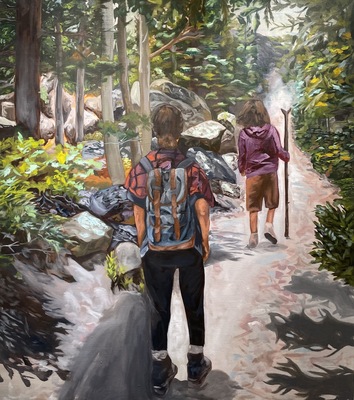
While still being a college student, I have used many different practices to create artwork, differing from woodworking to metalsmithing and my emphasis, graphic design. However; the voice of my work always calls back to the theme which I feel the most connected to not only in my art making process, but also throughout my life as well. I believe nature and being outdoors is one of the keys to creating a happy life for ourselves – and is the place I feel most heard, comforted, and accepted. A hike through the woods or a day paddle boarding across the lake always brings solace and is able to still and refocus my mind. The calming effect of nature then is what translates to all of my favorite works and reappears no matter the media I am employing.
Some of my works that deal with this recurring theme include an embroidery series of photographs that include my favorite places I have travelled heat transferred and then stitched over to emphasize individual elements of the landscape. When presented, its ideal location would be hanging from tree branches so that the viewer must take a step into a serene, outdoor location to view them. Another piece that demonstrates this is one of my most recent works, a band saw box created in the shape of a tobacco leaf, which represents the landscape where I spent my entire childhood. This theme not only translates into 3D materials, but into my graphic design projects as well. Here I often use simple patterning that include natural elements such as hand drawn leaves and flowers.
My overall vision for my work would be for viewers to see my pieces and it draw them back to their favorite moments they have had travelling, or where they played outside as a child. That the small moment they spend viewing my work would take them back to a time they felt they were less stressed and carefree – and hopefully demonstrate that I believe these feelings can be brought back by spending time quietly enjoying nature.
I believe my work fits in with contemporary art by relating to the current crisis to stop global warming. While not directly speaking to this issue, my work showcases the beauty of the natural world and could encourage others to do their part in keeping it clean for the sake of humans and animals alike. My work also reflects on that of art throughout history. Ancient people believed parts of nature to be gods and would create entire ceremonies around natural events such as rain or a good crop season. The theme of the importance of nature has been demonstrated since the beginning of art being recorded and we should hold onto that standard to continue.
To conclude, I believe spending nature is one of the most important factors for happiness in our lives and this for me continues into every medium of my work. If I am able to make viewers stop their hectic lives for one moment, and remember a calmer time or time they have enjoyed outdoors then we as a society would be able to come together again and create positive change not only for our environments, but for our own lives as well.
-

Yiyang Xie
yiyang Xie
Artist Statement
Yiyang Xie
In my freshman year, I studied photography, broadcasting, acting, sports and drawing. I discovered what I liked, and what I did not like. When I go to a fiction show. This show is you can use the artwork which made by this artist to create a photo which is not the same in the real. I saw a lot of people were happy at that time. I realized that an artist can bring happiness to people. After that, I decided to be an artist, because an artist is a magical being.
Most of my artwork is made by using a pencil. I can easily use it to draw and using my hands is important in my artwork. I can immediately draw the whatever I want with it. First of all, I create the idea in my mind. And then, I will draw the idea’s draft. After the exploration of my draft drawings. I will choose the best one and start to draw my final piece.
Currently, my art making includes Drawing, Metal, and Design. I use a variety of pencils to complete my drawing work. I learned basic metalsmithing skills this semester and I will continue to use these skills in my artwork. I also started computer based design this semester and can easily incorporate Photoshop and Illustrator into my practice now. I want to use different and cheerful color to create a happy world. I hope my work can show the beautiful world to the people who are unhappy and depressed. I hope they can know how beautiful and wonderful this world is! I this modern city, more and more people we meet. However, we have less and less friends. I feel the happiest time is my childhood. That is a colorful time in my life. Thus, I decided to create a colorful city for people who lose the color in their life.
-

Supernumerary
Ethan Best
For me, art is centered on shifting perspectives, the analysis of communication and the impact of art on our society. It is a reflection of a cultural collective consciousness; manifestations of a collection of beliefs and worldviews that function both as a time capsule and as a direct line into the world of ideas. I create work that is fundamentally founded in personal exploration and interpretation of the artwork at hand. Each piece is, in essence, a catalyst for discovery. For this reason I use a largely minimalist approach in creating objects that have a strong phenomenological presence and have any and all meaning compressed into openly-interpretable visual cues. Narrative is only determinable through heavy investigation of the piece, and even then is largely subjective. There is an emphasis on untranslatability; an inability to fully understand outside of personal experience and interpretation. While some preconceived meaning is inherited through the use of visual metaphor, the intuitive patterning of the metaphor is obscured due to its vagueness or the further layering of conflicting patterns. Furthermore, the context from which the iconography is drawn from varies greatly.
Whether it be literary and philosophical references or from TV and internet culture, all imagery is of equal of importance. They blend together creating a sense of unsure, uncomfortable half-familiarity. While the art itself is confounded and is relative to the viewer, that does not mean that it is meaningless. Meaning is instead inscribed by the context of the work from the spectator's perspective. This oscillation between investigation of predetermined meaning and objective non-meaning is meant to give the work a sense of sublime absurdity. The spectator is fully free to investigate and form their own opinions on what the work is and what it means, and, therefore, are entirely responsible for those beliefs.
-

Thoughts and Rambles
Leslie Buhrmester
My work is rooted in the here and now of my mind. The emotions I am feeling, the shows I am watching and music I am listening to all play a large role in informing my artwork. In my “From Birth to Death” photographs, I thought about how quick a sun sets and in relation how quick our time on earth is. I wanted to put the two together to represent that idea. I enjoy playing out these ideas and whimsies.
-
Reflective Interactions
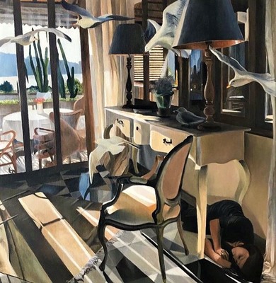
Isabella Cardozo
My paintings are concern the exploration of light and transparency as it interacts with the figure and objects. I am interested in the exploration of reflective surfaces as they interact with the figure and each other.
By recreating the figure as it interfaces with the transparent surfaces and the light, i can examine the idea of breaking up or splitting the body as a way to understand and maybe communicate anxieties that concern the body.
Formally, I am interested in the play of transparency and reflection and recreating the bright colors that these objects form as the light passes through them, and aim to depict them with as much detail as possible, varying my brushstroke thickness and the amount of paint applied.
-
Final Portfolio Assignment
Shelby Clark
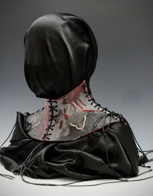
- “Art, should comfort the disturbed and disturb the comfortable” (Banksy.)
I feel the power of art is derived from its ability to allow otherness to be addressed, encouraging the viewer to engage with topics that are ignored or difficult for them. Art is the platform for my critique of society.
My work focuses specifically on my personal experiences relating to the “F” word.
Female.
“1 a (1) : of, relating to, or being the sex that typically has the capacity to bear young or produce eggs
-
In a field of milkweed, I watched a female monarch butterfly deposit a single egg on the underside of a leaf. —Tom Tyning
-
A few months later, she became the highest paid female performer on the Great White Way. —Susannah McCorkle
(2) : having or producing only pistils or pistillate flowers
-
a female holly
-
female inflorescences
b : made up of usually adult members of the female sex : consisting of females
-
the female workforce
c : characteristic of girls, women, or the female sex : exhibiting femaleness
-
composed for female voices
-
a female name
d : designed for or typically used by girls or women
-
a female glove
e : engaged in or exercised by girls or women
-
female suffrage
2 : having some quality (such as small size or delicacy of sound) associated with the female sex
-
female castanets
3 : designed with a hollow or groove into which a corresponding male part fits
-
the female coupling of a hose
— femaleness noun`` (Webster.)
Feeling bound to use the “F” word as my label, is a perfect example of the otherness that drives my work. I create wearable props that exaggerate and imprison my figure, drawing attention to the restrictions I feel placed on me for just being female. External stimuli like advertising images and day-to-day life interactions provide the inspiration for these objects. I look at artists like Nick Cave and how his soundsuits fuel the viewers senses without preconceived judgment, by eliminating identity.
During this journey as a woodworker, I have been trying to push the preconceived notions that I have created about the material. It is my goal to attack the boundaries of wood through the incorporation of varying, unconventional materials, as well as the concept of what wood can be used for.
There are endless possibilities to all things and what an artist may do. It is only now that I have begun to find what I’m passionate about, my mind has been opened to the possibilities of creating work that challenges me.
-
-
Final Portfolio/ Digital Commons Assignment ART 399-01 SP17
Troian Cummings
My body of work is based in nature; it deals with concepts of comfort, discomfort, and in shared human perception and emotion. The malleability and durability of metal reflects my desire for control while its unpredictability aids in my desire to emulate nature. I am drawn toward natural elements because of my upbringing in Yosemite National Park, where nature is life. It is inevitable, when you live in such a natural place, that you see nature as art. Also, I have always been very aware of my thoughts and feelings in comparison to others. I have a tendency to tell myself that everyone must share the same feelings and self criticism that I do, though I know now that it’s not true. Even so, there are some shared internal struggles that we as humans collectively experience go through and the root of my work comes from this locus... I begin with a fairly loose plan and let it evolve and mature as the project proceeds. In it’s own way, it is a natural growth process, almost meditative in nature. Through this method I aim to emulate the perfect imperfection of nature. I also want to create some of the feelings of human life and the struggles that come with it.
Despite being attracted to the tranquility and peacefulness of botanical forms, I am also interested in pain, danger, and discomfort—the darker side of nature. I am interested in the tension between these two elements of experience; beauty and pain. I am drawn to these darker qualities in the Body Art of Vito Acconci and Chris Burden. Acconci’s Following Piece in which he followed a person around until they became uncomfortable as well as Burden’s dangerous and semi-masochistic pieces like Shoot, a performance during which he was shot by a friend in his arm, are two in particular that have influenced me. In my pieces, I want to evoke some of these same primal feelings, like heightened anxiety or the feeling of being overwhelmed. I emphasize these feelings by using colors that while naturally occurring are perceived to be acidic or poisonous.
When people interact with my art, I want them to feel a sense of promnesia, comfort, and slight disturbance- all at once. In some small way I want my work to make people take pause to think about their connection to everyone and everything around them. I want my art to make people question their surroundings and feel the need to become more self and globally aware.
-

Pro-Prac Retrospective
Matthew Hahnes
In my own life, I find myself the most contemplative when surrounded by white noise, when I am in the shower or doing laundry; that constant audio static acts like a barrier and allows me to more easily recede into my mind. I imagine the inner mind like a cave, no two are similar, as caves twist and break through the underground landscape they secret away more than we can discover for ourselves, caves are naturally occurring yet are largely unexplored. I investigate this metaphor by generating my own cave openings and spaces to try and impose a feeling of contemplation and isolation on the viewer through visual clues, usually vestiges of human occupation.
In my printmaking process, I create a composition that gives a sense of vastness or spaciousness within seemingly smaller objects to represent this mindscape and placing the figure or a symbol for it within to add to the sense of scale. I’m fascinated with combining a visual interpretation of the brain’s environment and activity within the context of daily activities or environments filled with background noise, the static moments of life. I want to invite the view to contemplate the small periods of dissociation where we cease to be ourselves doing the activity, be it laundry or waiting in the elevator, and exist solely within our minds, thinking, conversing, imagining but ultimately denying the social factor of our own humanity. In those small moments we all exist on the island inside our mind, alone.
In my sculpture work I use the anonymity of constructive materials like sheet steel and treated lumber to pull away the visual noise of logos, design, and color to imbue objects with a brooding quiet. Through sculpture I want to focus on “lonely objects” that are representative of our globalized market and growing speed of international exchange, objects that exist “everywhere” in replicated form and what that means for our interactions with these objects. I think of “lonely objects” as objects that are tucked away in corners or left alone and vacant more of the time than not, such as a vending machine: it stays on always, available always to be interacted with whether that be a positive interaction or not yet that interaction is over in minutes and especially at night there are long hours of electricity and availability seemingly wasted for lack of people.
Focusing on how our relationship to the internet and media affects our consumption of art is key to my process and relating to a larger audience of non-art makers and communicating more effectively. I use saturated flat colors to create a visually interesting composition that will draw the viewer into my piece anticipating something immediately happy or pleasant only to feel a creeping sense of foreboding from the cave or object. I think pushing these aspects of these two main structures can invite the viewer to think about how we interact with appliances and how we demand the constant availability of the internet and social media yet interactions are small and isolated over texts, posts and memes.
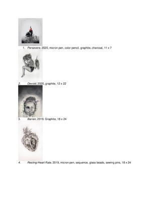
Printing is not supported at the primary Gallery Thumbnail page. Please first navigate to a specific Image before printing.