-

Control Freak
Rosalyn Churchman
My work is driven by an emotional conflict between a need for unrestricted freedom of expression and my own desire for control. This deeply personal yet universal dichotomy is represented through the competing elements of gesture and Suprematism. By superimposing intuitive and meditated designs, I establish complete control and personal autonomy – constantly defining boundaries in order to break them.
In both analog and digital design, I use technical conventions as guidelines which I then bend or break to challenge the confines of artistic tradition and to manipulate the message received by the viewer. The coherency of the design proves to the viewer that each broken convention is intentional and reaffirms the validity of my own artistic license. I intend to connect to my audience’s own desire for art to be intuitive, original, and expressive while also being recognizable and explicable. I opt not to include recognizable subjects, forcing my viewers to participate as they attempt to apply their own explanations and engage in their own desire to control what they observe.
Through the layering of lines, ink, wax, and opaque vinyl shapes, I create a visible history of mark making, depth, and form. The design develops like a living interaction between the lines and shapes, each fighting for its right to control the other within the bounds I have determined. These competing layers increase in scale from background to foreground to bring the theme of tension and conflict to the surface of each piece.
I experiment with typography intuitively, abstracting designs through unconventional arrangements of type, used as both legible text and abstract form. By placing colored type on sheets of transparent velum, I create separate planes of text and shape that interact with the subsequent layers.
I am inspired by Julie Mehretu’s use of layered line and shapes with architectural undertones to communicate a complex and dynamic sense of used space. I relate to designer David Carson’s emphasis on the distinguishing of communication from legibility. Like Carson, I am much more interested in communicating visually and abstractly rather than through obvious renderings of subject matters.
-
Fine Particles of Solid Matter
Lu Colby
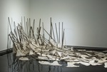
Today, women make up almost half of the labor force in the United States at 46.5%. Yet statistics show that compared to men, women spent more than twice as much time preparing food, and doing interior cleaning, and over three times as much time doing laundry as men did on an average day. Even with these domestic obligations, women are still pressured to pursue a higher education, advance in their careers, and be self sustaining. With these Second Shift expectations, women in American society today feel more pressure than ever to find the balance between domestic roles and progressive philosophy of feminine positions. As I navigate my own roles with domesticity, I find myself falling into these same dynamics much like generations before me.
I dissect and experiment with these gender stereotypes by adding characteristics of traditional woman’s work such as needle work, colors, and household cleaning tools in attempt to question these given roles to women in American society. Using site specific materials such as dust and sweepings from my home with household objects, I create narrative within my work for people to find a correlation between their own experiences with domestic gender roles and my own.
Inspired by the works of artists such as Kate Gilmore and Regina Jose Galindo, my pieces have varied in mediums such as sculpture, printmaking, installations, and performance pieces but all have common characteristics of multiplicity and repetition. The use of repetition and multiplicity throughout my work speaks to these individual moments and experiences as a whole while also reflecting on the methodical and repetitive ways women conduct tasks in their own home such as daily chores and personal hygiene.
-

Melancholia
Carly Dothsuk
Home, as a concept, encompasses the relationships, environments, and situations we come back to over and over, even as they change. Searching through the complex emotions associated with home helps me better understand myself. While exploring memories, I search for reasons, explanations, and comfort in the ordinary. I use different memories and photographs to achieve compositions in which I fracture and distort objects, environments, and the people in them. My goal is to promote reflective thinking for others when discussing the motivations and interactions between the people who live under the same roof. As I have grown I have found myself more drawn to religious ideology and my upbringing within southern culture as a whole.
I break apart and reassemble photographs, elements, moments and memories from my home spaces. I interrupt the sense of space with the use of lines, shapes, symbols, and heightened color environments. I juxtapose blocks of color, clean, abstract planes reminiscent of architectural forms with representational imagery and expressive mark making in to tell a more complete story about the dynamics of family spaces.
I am experimenting with more color and texture, narrative using people, objects, and places, as well as exploring the feeling of melancholy. Simplifying the complexity helps me show uneasiness, vulnerability, or weirdness is important in the structure of my drawings and paintings; it creates a sense of discomfort for the viewer, helping them dissect the artwork. I experiment with different types of fabric and gold leaf on paper and panel to increase tension between flat, restful blocks of color and intense texture.
As humans we make specific spaces homes, whether it be a coffee shop, our bedroom, a studio, or even a small space in the corner of a classroom. Feeling both solace and uneasiness in these places are important to analyze both for me and for others that I see in passing, or in my everyday life. The plan is to move forward with this melancholy feeling, and even more so pick apart myself and others to understand actions, intentions, and interactions within home spaces when it comes to gender, social issues, or human emotions.
-
Rural Roots
Kayleigh Doyle
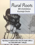
A box of old family photos was gifted to me from my grandmother and I was inspired by these unique moments from the past. While researching I found that a plethora of information on these family ties and rural roots had been forgotten until the photographs had been rediscovered.Through printmaking and painting the themes of preservation and the preciousness of memory are explored. The process of printmaking is important due to its ability to exist in multiples much like the photos from which my imagery is drawn from. Painting, on the other hand, speaks to the singular preciousness that is associated with family keepsakes.
Much like Kirsten Tradowsky’s work, I strive to reanimate these lost memories and create a window into that particular moment of the image. By creating this bridge to the past we can observe some other influences to this work such as; odd knickknacks, rural southern living, and family dynamics throughout american history. This body of work takes imagery from pictures and deconstructs them into their most vital parts. The pieces are then compiled together to deliver an almost cliff-notes version of the information in the image. When the photo is abstracted this allows for the preservation of the small details of shared memory that give momentos their importance. Through the recontextualization of these tokens of the past my audience will gain a similar drive to preserve small moments of history for themselves so that the interesting details are not lost.
-
Sweet Sunshine Bakery
Sarah Guinn
Everyone has memories they hold dear, something from long ago, simpler times. Those memories give us something to go back to, an image, a place or a feeling to brighten our days. For me, those memories take me to my grandmother’s kitchen, where I was introduced to baking. Ever since, I’ve had a passion for desserts and know the best ones are always made with love. Sweet Sunshine Bakery combines my love for desserts and branding. Just like desserts, brands are built with the same passion, the same attention to detail and the same drive to connect with others. Brands are more than a pretty logo. They are defining a company - and everyone who works for it - mixing it together and baking it from scratch.
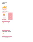
The Sweet Sunshine Bakery brand is filled with inviting and playful colors. These colors can be seen in the repetitive use of the sprinkle pattern across the design and in every in-store, out-of-store and social media advertisement. The bold tones and rounded sans serif allude to the happiness our baked goods offer, bringing up customer’s nostalgic memories where happiness ruled the day. The logo combines radiating sunlight and a donut form to refer to the name, Sweet Sunshine Bakery. This work was inspired by Jones Knowles Richie creative company, the designers of Dunkin, because they have such a strong and recognizable brand. Dunkin has an extremely well known and bright color palette paired with a bold rounded sans serif font that is easily identifiable. It hits all of the marks of a successful brand.
When people see Sweet Sunshine Bakery, they will feel like they are in an inviting space - like my grandmother’s kitchen was for me all those years ago - where they can gather and connect with friends over their love of baked goods and branding.
-

PCKT
Sarah Hall
My design philosophy favors playful and vibrant solutions. If I am having fun, and if my design results in the viewer having fun, then I feel successful. I tend toward bright colors that reveal a more child-like side of myself. This youthfulness is balanced by more mature typography and a rigid layout. My goal as a designer is to reconcile this lighthearted attitude with mature and sophisticated design values.
My own illustrations play a large part in my designs. I frequently utilize icons as an illustrative means. I will break down the visual elements of an object or concept until it is very simple, and then design with the resulting shapes. These small illustrations are often made with friendly, rounded lines or bold flats, and like normal icons, can appear as a set. These icons can then serve any purpose, be they a summary of ideas, placed in a puzzle-like arrangement, or a pattern. Line is another recurring motif, and comes into play frequently in the design for PCKT. Line quality is used to establish attitude and texture. Wavy and straight lines are used to differentiate between a playful piece and a business-like one. In this project, I combine whimsical accent colors with mature neutrals. There is constant play between friendliness and maturity.
The PCKT brand’s intention is to push the notion of independence and inclusivity, and as such, assures two guarantees. The first guarantee is of the inclusion of pockets on every garment provided, and is meant to liberate and mobilize busy women who maintain a digital presence and are required to carry their devices on their person, among other tools and necessities. The second guarantee promises the inclusion of all sizes, and not to limit fashion options for those outside of a predetermined bracket. PCKT advertising pushes both of these concepts, putting plus-size models in the forefront just as often (if not more often) than conventionally sized models.
I look to influences such as Reid Miles for his ability to weave type harmoniously into his layouts, Michael Beirut for his deceptively simple solutions to a client’s needs, Duck Brigade for their web design’s fun interactivity and integration of a brand’s design with a brand’s attitude, and Sagmeister & Walsh for their absolute destruction of norms and boundaries.
-

Wei's Kitchen
wei hu
在设计方面,我注重简洁和清晰,大胆对比。我喜欢海报设计,排版,插图,动画和视频设计。我目前的兴趣是动画,我从Jake Mathew的视频作品中汲取灵感。他使用大型色块结合插图,排版和摄影。我的动画设计工作与我的烹饪爱好的结合激发了我的高级项目“Wei's Kitchen”。大多数烹饪视频都是通过拍摄,编辑和合成制作的。我想创建一个非传统的“操作方法”视频。结合我对中国烹饪的热爱,我将基于烹饪步骤的视频基于视频中。我有很好的手绘,所以对于视频风格我想用插图。最终产品是手绘数字化插图的组合,计算机生成的动画和简单的排版。使用的主要软件是Adobe Photoshop,Adobe Animate和Adobe After Effects。该视频侧重于中国传统食品。视频包括食材,香料以及如何烹饪中餐。我希望通过非传统的教学媒体,我会引起新人们学习中国烹饪的兴趣。
-
admitting
Hanna Kesty
“You’re overreacting” is a phrase that I have been told too many times that it has now become an immediate response to emotional situations. Because of this, most emotions are dismissed. The drawings and prints that I make are developed from a highly personal narrative discussing specific events, interactions and/or thoughts that arouse tension. They are an opportunity to admit damaging internal, uncomfortable conversations and interactions, while depicting tension and mental confinement. During the production process of a drawing or print there is a conversation of acknowledgement happening between these objects and myself, creating an uncomfortable, yet honest conversation.
Innocent, metaphorical objects help illustrate these internal disruptions. A wooden chair, vintage tv and a hare, along with a variety of secondary objects, are depicted in minimalistic settings dominated by negative space forcing the viewer’s attention on these objects, reinforcing mental confinement while adding a somber and tense disposition. Through the use of selective color, I am able to shed light on those tense moments even more. The combination of objects create a small moment within a larger narrative. The chair represents stability, comfortable or not and the vintage tv represents static, mental noise and implied disconnection. The hare is at the bottom of the food chain, and they are hyper-aware along with being naturally vulnerable and their solitary nature. Silkscreen is my printing medium of choice due to its encouragement of transparency and layers, allowing my images to be soft and subtle.
Artistic influences derive from mixed-media artist Toba Khedoori, with solitary spaces she creates through minimal imagery and compositions. I also look to lithographer Kathryn Polk for her use of interactions between figures and objects, as well as her muted color pallet. Other influences are words. Words are powerful; from poems such as milk and honey by Rupi Kaur, to music, or simply everyday conversations and the lack thereof. Words shape our day to day lives.
Overreaction or not, your body is trying to tell you something. Something is causing distress and tension, and the last thing we want to hear is that we are overreacting. My work brings light to interactions and concepts that cause emotional strain and the desire to understand why.
-

LOST LEGENDS
Xinyi Liu
I am a graphic design major student who focuses on branding, typography, package design, and layout design. Under the influence of Japanese anime and video games and started with fan art, digital drawing has gradually been part of my focus as well. To me, design and illustrations often serve each other. As for my BFA show, I chose to design branding for a fictional game company and then conceptually design its product, the game LOST LEGENDS, and devoted to my favorite content of digital drawing, character design, and illustration. I have been trying to maintain my level of drawing through regular practice. After I learned chiaroscuro from Renaissance during art history class in Murray State University, I started involving traditional painting style into my modern digital drawing, and this technique has been practiced in two of my largest pieces Crystal Lake and Final Battle, using warm and cool tone to create an atmosphere that feels calm or antagonistic. I enjoy different media and techniques and tried multiple styles on both character design and illustration. They all look done by the same person, but details incorporate different techniques. I systematically learned the concept of game concept design in China, which focuses on Asian anime style game design, and I end up with one that’s of this style. And the character design is incorporated into branding design techniques that I have perfected during years at Murray State University. Hopefully, I completed a relatively professional game design that can attract young customers. I always want to bring atmosphere and details into my digital art, and I got inspiration from renaissance painting and contained chiaroscuro into most of my digital artworks, especially illustration. I also include Mucha’s style in the piece Althea.
-
See or Be Seen: Kait Steward
Kaitlyn Steward
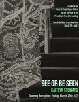
Vulnerability and uneasiness are the undercurrents of my work. Focusing in on the concepts of privacy, safety, and spatial awareness, I explore domestic settings with and without the figure.
My pieces question what it is to be alone, or if alone-ness is possible in the world I live in. As someone who deals with a great deal of anxiety but is also introverted, I find great comfort in solitude. However, the places I find solitude in force me into a position of loneliness, often causing my own detriment, and sending me into a spiral of questions of privacy and personal space. Depicting myself and other figures in familiar domestic environments, the viewer becomes the invader of the space and the source of tension. By painting these figures I reclaim my fear and become the source of power in the relationship of the watcher vs. the watched. The concept of gender issues also plays a role in my thought process as I consider my personal interactions with safety and the world around me as a young woman.
With paintings, I use color as a tool to draw the viewer in with bold saturated tones and contrast, but as the viewer engages within the piece a sense of overall discomfort is found. The content is not automatically off-putting, but rather sneaks up on the audience. My drawings explore the ideas of entries and exits through studies of high contrast lighting. Details become more abstract as the drawings are very much simplified. - Kaitlyn Steward
-
Social Construct
Kayla Brown
Humans are obsessed with categorization of objects and even people. Stereotypes are just one way this manifests itself. Humans are stereotyped into gender, class, race, and sexuality (just to name a few). These categorizations can cause a major disruption to society. Not only do I explore the way stereotypes effect society as a whole, but the way an individual functions as they are placing an receiving these labels.
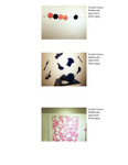
In some of my sculptural pieces are interactive which, allows the viewer to take a larger role in the art piece. My work allow for my viewers to make choices in the art piece that will ultimately stereotype a person or an object. I do this to mirror the choices that happen in our day to day lives. This is in an effort to show that everyone is a part of the problem just as, collectively, we are a part of a solution.
Creating an environment and taking over a space is important to my work. Paula Scher does this with large typography and large fields of hand drawn maps. By taking over the space she strips the gallery of stigma. Therefore, when the viewer enters the space the environment will feel playful due to my use of intense colors and hands on objects. The Memphis Design Group influenced me greatly in this area. They make objects colorful and playful in there design so they would seem more approachable. My sculptures reflect this whether it is by using the intense orange I use on my graphic icons or the lime green used on the gestural hands. I used graphic design as a way to help my viewers investigate the space around them. I use typography and illustration in one sculpture as a way to evoke empathy and draw the viewer in.
In addition, graphic design is something people interact and see every day. Therefore, I am using it as a familiar language to help communicate to the viewers. For instance, I use icons which are familiar the average person. By using objects and symbols people are familiar with the art pieces will seem more familiar as well.
-
Bound by the F* Word
Shelby Clark
Bound by the “F” word;
female:
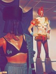
This label of otherness is what consumes my work and has become an outlet for my personal frustrations with the world around me. These sculptures are a manifestation of my feelings as i’m shaped by and seen through “the male gaze.” This term is from Laura mulvey’s theory that proposes that the act of viewing women is as an object to satisfy a heterosexual masculine gaze. exaggerating and imprisoning my form, These objects draw attention to restrictions placed on me for just being female.
Through the visual language of my primary audience, millennials, I reflect on the immense amount of digital media that targets women, specifically telling them that they need to be more attractive. External stimuli like advertising images and my own experiences from day-to-day life provide the inspiration for these objects.
Some reactions I have received since I began to identify as an artist Include: Not enough, too much, white knight syndrome, quotes I hear replay in my mind over and over reminding me that everyone is watching. So I strive to generate awareness and a new perspective about how the objectification of women affects everyone, men included. I believe we can choose the degree to which We participate in systems of oppression. it is through art that a mirror is held up to society for us to see its true reflection in hopes of an awakening. This is the time for artists to be open and radical.
-
Above and Within
Caitlin Cronin
Above and Within
Caitlin Cronin
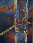
I am composing delicate forms in expansive spaces. These forms are present and responsive, like human figures existing in an atmosphere. The spaces of my paintings are tangible and subjective, almost as if to question whether the subjects in the space are truly alone.
The subjects that I compose in the atmospheres I create conjure memories and feelings based on their color, texture, posture, age, or aesthetic. As the expansive spaces created surround these delicate forms, I seek to convey a feeling of solitude and mystery as the vulnerable beings are embraced by the space around them. Some compositions contain cloth forms, while others depict objects that symbolize mortality or an emotional condition. I sculpt the cloth forms in a way that presents them as having expressions. As a result, they are theatrical in presentation and communicates a state of being, a figure existing in a moment.
The ethereal atmospheres in my works are a commonality in my pieces. Some are inspired from my evening drives; the sunsets and open space begin to inhale a deep breath. Some are darker, like quiet rooms where the presence of light still lingers. This psychological space considers the feeling of being in the care of a creator, a higher power. Like the objects and forms abiding within these painted atmospheres, we long for our imperfect conditions to be accepted and cherished. With my works, I seek to instill a sense of hope and provide a moment of safety and introspection for those who view my work.
My works conceptualize my experiences and weighted emotions. I find hope in the midst of lamentation and rest in moments of chaos. These states of being are an innate aspect of humanity. My work address our shared mortality, from our stories to our fading bodies. With this, I also hope to instill a sense of compassion. I become vulnerable for the sake of the unknown faces viewing my work in hopes that they may link their experiences with my paintings, and in turn have a moment of solitude themselves as they view these expansive spaces adoring the forms within them.
-
Compulsions
Alaina Goodlett
Human beings are creatures of habit. We often go through the same motions and activities day-to-day without even noticing the time spent on them. This behavior is frequently solidified through widely accepted practices as mundane as a daily reward on a mobile app or a discount at a restaurant after multiple purchases. Unfortunately, reoccurrence of this type can be unhealthy, leading to an excess of time spent on trivial things or maybe more spending than a budget might allow all for the sake of routine.
The same can be said of making. Craft is something that requires practice and repetition in order to become skilled. These actions can be done so many times that they become automatic, meditative, and even therapeutic. The hundreds of stitches put into a blanket or the carefully shaped jump rings making up a chain reflect the knowledge and enjoyment gained from the familiarity that comes with practice. However, if one should spend too much time wrapping wire to create those rings or attempt to make a queen sized blanket in one sitting, there would be a significant amount of discomfort at the least, or permanent damage at worst. The calming nature of automatic movement could become a painful compulsion, rather than the pleasant pastime it once was.
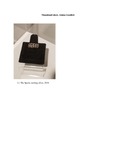
In my studio work I focus on the repetitive nature of craft and the careful balance that must be maintained between enjoyment and discomfort. The typically soft nature of handmade fabric is replicated with metal that appears as such, but with nearly none of the flexible properties it once had. The close-fitting, personal nature of these objects creates a metaphor for self-discovery, in the realization that what was once seen as comfortable and familiar has become something surprisingly restrictive.
-
Internetworked
Matthew Hahnes
In a digital world, things are assumed permanent, because there is no physical body to decay. The information exists as data, not tangible but encrypted and stored in a non-physical, worldwide card catalogue. As a counterpoint, our collective witness to the age of the immediate proves that when reduced to data, deletion or existence is dependent on relevance to the mainstream social sphere. By that sphere I refer to the top percentage of the most viewed and discussed content, the realm where the overlap of viewership creates an almost ubiquity of content across global and cultural divides. In this landscape, even though data may exist, among the swirling maelstrom of The New and The Now it becomes totally lost to anyone not specifically seeking it out. Effectively, it ceases to exist to any other than the ones bearing witness to absorb the information. Humans, then, become the tangible artifact of that information, wholly mortal and susceptible to data corruption over time. Yet, the process of discussion or dissemination of that information then creates a network equally intangible, but interacting with the world that humans experience and existing as several “backup saves” in the minds and conversations of those exposed to that information. People become the access points that persist beyond the life of the data by itself.
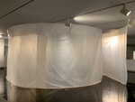
Through my work I parallel this process of storing information within people’s memory and in a way memorializing that which has been lost to the archive, often by drawing on my own feelings of discovery at the moment I began to uncover the information presented in the work. By creating physical objects that engage with the viewer to either consume or dispense information, that viewer becomes an artifact of that information and interaction. In this way I parallel the rhythm of give and take online, where content is consumed, digested and then remixed and re-presented through the unique experience of the individual. I can synthesize information online, form a question or a point of investigation then respond to it through building objects designed for interaction that emulates my own. Through use of readily accessible technology like QR codes or GPS tracking I can store information and manipulate it in the physical world, controlling how that information is experienced to make it more accessible and engaging to a physical viewer. This can exist as manipulating and revealing data within a video or as QR codes revealing the function of the object at hand by storing files to be accessed at will. The experience of discovery of the new or hidden becomes a motivating factor in my work, I want the moment to be a more complete and alive memory within the viewer, thus, a longer lasting save file. The information, then, becomes as much of an artistic decision as color, shape or design, and in equal measure I consider how each can lend itself to a more seamless interaction between the viewer and the content I’ve revealed through the work. Much like information surrendered to the internet, at this point the work leaves my hands, once the interaction is completed the viewer is the guardian of that experience. Within their own mind they make the decision to consume and forget or remember and re interpret, creating even more connections to the network of experiences around that work.
Ultimately that is my goal, to uncover and reveal things too quickly forgotten amidst the hailstorm of that which is most new in a preservation effort. The information that slips through the cracks I seek to pick up, piece back together and place back on the table for consideration. I feel a responsibility to bear active witness to the information that I consume and find important for others to know. My work becomes the medium to transfer this knowledge, to share what I’ve found both directly and indirectly, direct in that my hand shaped the work into its state and indirectly in that viewers are free to interpret that information in whatever way they please. This draws another parallel to the way we interact online, we post photos, videos, thoughts and feelings with the intention of sharing a moment, giving the feeling of being somewhere, experiencing something together, but often that facet of the experience is out of our control. You cannot control how others will react to your political post, your selfie, your essay or your recordings but the need to share drives us towards connection, and even in negative reaction to the information you share, people exist as the only physical remembrance of that moment.
-
Relate
Shelby Horton
Humans have a tendency to be self-absorbed; because of that we’ve evolved our ability to communicate to one another, in many different ways, more advanced than any other animal on the planet. Humans always express themselves to one another through the emotions they feel in a certain situation. One form of communication that seems universal for humans is the way we react emotionally to each other. Through the processes of printmaking, etching and lithography, I am expressing a certain situation I may experience myself but also connecting my own experience with others; making my viewers feel relatable and connected with me and each other through my art. Eva Hesse is an artist who also pulled emotional inspiration from her own life experiences to make her work; even though she was a sculpture, conceptually, she formed her ideas for her work the same as I do.
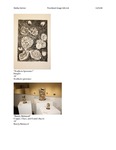
Etching allows me to use expressive mark making which helps me capture movement and emotions. The ability to capture fine details, makes the viewer want to look closer and observe the work longer; giving enough time for them feel a relatable emotion being expressed in the work. As well as, allowing me to transfer my drawings almost directly to the plate I’m using, thus allowing me to keep the drawing quality I like in my work. Etching allows me to use values, which is important with my work since I rarely use color but want to still get raw and juicy textures in my etchings.
Along the side of humans being self-absorbed and affecting one another with our own actions, both physically and emotionally, comes the human influence of Earth. This is where my focus lies in my other emphasis, metalsmithing. I pull my concept from the way humans treat the earth; modifying it to fit our needs while ignoring its needs to stay healthy. I collect both naturally made and human made object I find in natural and modify them with different metals to make an art piece.
-
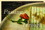
Shinhye Kwon: "Passing Through"
Shinhye Kwon
Artist Statement
Shinhye Kwon
Painting is the most appropriate for expressing the artist 's thoughts and the feelings. While thinking about what I could do with painting, I thought that I wanted to share my view with others through my own painting expression and method. In order to share the world I am looking at, I have wondered what is different between me and the people who are here now and the readers who will look at my work. I wanted to share the two visions I see as an international student because I think that the identity of foreign students who know the emotions and cultures of both Korea and the United States is different from others.
I am a foreign student and I see my view in two ways. One is when I look at my country, Korea and another is when I am a foreigner in the United States. When I look at the same place, what I feel in each country is really different. For example, in case of a bathtub in the bathroom, in Korea, home where I live, bathtub is wide and long enough to spread my legs straight. Bright lighting and clean space help me bathe in a comfortable mood. On the contrary, I am an international student in the United States and cannot live in a perfect house. Since I am living in a dormitory, bathtub in the bathroom is narrow and there is no space to stretch my legs. I can only shower in an old bathroom with dark lighting.
Not only the place, but also things come to me differently according to each country. In the case of fish, for example, when I am in Korea, I can eat fresh fish everywhere because the three sides of Korea are made up of sea. But the situation in the US is different. The United States is very large and I do not live in a state where the sea is next to it, so when I want to eat fish, I have to go to Walmart and eat only frozen fish.
These situations are the people who have not experienced the two countries do not know forever. That's why I started to express the scenes I feel as an international student. Unlike photographs, painting is suitable for expressing my emotions in more detail, so I choose to paint.
-
O - /
Tristan Miller
Tristan B. Miller Artist Statement We
I do not approach art making from a traditional angle. Other artist statements that i have written were constructed at a time where I was a completely different person, therefore, they were actually written by another person, a different me. I construct forms that bring myselves, and the viewer, closer to an understanding of what it means to be conscious and exist in relation to the natural universe. The objects themselves very in every sense of physicality depending on how the audience and I intend to utilise them. The nucleus of the work is how I act, and who I say I am, and the lives that all the other Tristan Miller’s have gone through up to that point in time. Together, my other selves have struggled with systemic entities, who utilise our knowledge of the universe. The purpose of my work is to bring the versions of me to one another, and learn from themselves more about the human experience throughout time and space. By having all of these versions of myself I am able to drastically change my work and my behavior to discuss topics when the desire arises. The experience is strange and alluring at the same time. Eventually human beings will be able to travel through time and space, at which point a person will encounter previous and alternate versions of themselves. I strive to create this world in my art, so that i can discuss existential motifs, surrounded by science and a relationship with the physical world, but in the present, through myself. The future I have described is inevitable, it is only a matter of when, to which my art answers, “now”. By having multiple versions of who i am i can discuss and analyse Tristan Miller as an idea, while my idea of who i am, and what it means to be alive, evolves. As far as addressing the physical art making I prefer to do that in ways that are not traditional, because the other versions of me are not all artists, and this gives me the opportunity to evolve the gallery and viewer experience. To me my work is a show, it's an induction into worlds unknown, a brief membership, one that is relatable, and human. Existence and evolution of consciousness, caused by a relationship with the physical universe, is one half of my work, while the other is performing in public with actual people. The audience learns just as much about themselves after each of my shows, as i do about myself.
-
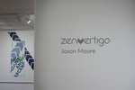
Zenvertigo
Jason Moore
The way I design is visually representative of the way I understand the world. Clean typography and strong layout are accented by texture, line and illustration to become understandable. There is no “because I said so” in my work, it all has a purpose and is meant to be calm, clear, and conscious of the viewer. To me rock climbing and graphic design are similar, both require focus, accuracy and awareness.
The architecture of an artificial wall is geometric and modern unlike the organic age-old beauty of a natural cliff. Zenvertigo is a climbing gym based in Anchorage, Alaska that visually merges the outdoor with the indoor by using modern typography and clean lines with organic textures and images. I used pieces of imagery around Anchorage to build the foundation of the brand; navy blue mimics the midnight sky, light greens reference Chugach State Park, round neon-style type signals the Aurora Borealis and the complex texture comes from the granite that creates Mount Denali. The logo is a response to the feeling of vertigo, moving vertically while being signaled directionally by the chevron symbol. David Carson’s experimental typography, strong dominant type from the late great Massimo Vignelli, and the incorporation of personality by Stefan Sagmeister helped to shape the foundation of the brand.
-

Dialogue
Anna Sohl
Human beings thrive on communication and strive to connect with others in many ways. In spite of our desires or best efforts, communication and connection sometimes falls short of perfect clarity. Our interpretation of a person’s nonverbal cues may fail to match what they are saying, and words left unspoken can create voids and barriers. I find significance in our miscommunications, misinterpretations, and our difficulty connecting with one another. This work explores how domestic objects can influence the dynamics of a conversation and are witness to our communication with one another.
My current body of work explores interpersonal communication and relationships represented through domestic objects. I seek to illustrate the way communication can change as it is transmitted from one person to another, and the voids created through the absence of words. This occurs most poignantly in our home lives, where clear communication is often most critical to our happiness.
Furniture also directs us to interact with others in a certain manner. The spatial arrangement of furniture may determine the flow of a conversation. When a conversation between two people shifts, the individuals either gravitate closer together or stay at a reasonable distance. These objects are stand-ins for ourselves. We are individuals with unique characteristics, just as any handmade object. No piece is exactly alike and has its own personality.
-
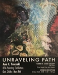
Unraveling Path
Ana Traceski
My art is an expansive pool of contrasting ideas formed by observation of the two cultures that have influenced who I am today. My art is about similarities and differences; of past times and of new experiences, of memories old and new. My art is about past and present surroundings that are cast in a different light, a new scope, by being filtered through personal expression. By spending time painting in my studio and by exploring subjects and characters from my life, near and far in order to artistically convey a moment in time.
Perceptions, receptions and misconceptions occur as my two cultures interact in clashing memories. The warmth of the tropical landscape, a starry night on a cloudless sky and the warm feeling of childhood dreams are complementary to the stillness of the summer days, colorful sunsets and changing seasons of the northern hemisphere. Through color and shape, I seek to narrow the path, the uncomfortable lapse between noise and silence, city and nature, openness and closeness as I express the essence of the whole on my canvas. Tension between figures, composition and color opens the door to my vulnerability, which most of the time aligns with the rewarding joy of a well spend time at the easel.
I took upon myself the old discipline of self portraits and in doing so I have found a new path for my figurative -representational art. Collage has been the catalyst to move my art forward in many positive and fulfilling venues. I am at the moment exploring new surfaces, textures, and techniques. By incorporating wood panels, canvas, silks, found materials, acrylics, dyes and oils in collage it has open new concepts and visual energy to my compositions as silk gives a new transparency that complements textures and enhances the dreamlike, imaginative aspect of my work.
In my work blue unifies human essence and its connection to earth. It is my favorite color in all shades and hues. The viewer will always find a saturated blue sky or a patch of blue in my paintings. Sometimes blue holds a story on its own, and perhaps my story will align with the viewer’s story.
Ana C. Traceski.
2018
-
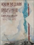
Head in the Clouds
DaKota Vincent
As an anxious kid, everything said or done could be distorted and inflated over time in my mind. Consequences of such small actions grew disproportionately in importance. I would focus my breath downward to avoid adding the resulting force to any destructive winds in the far distance. Pulling from this experience, I direct the viewer's’ attention to the small elements in painting that built up to create tension in a painting; the vague expectations and worries that interrupt the experience of space. The process is mainly working the surface of my paintings to set an explorable stage for the viewer to experience. While not immediately hostile, I integrate certain tensions and disruptors to make the subject matter quietly unsettling.
These paintings present natural subject matter alongside geometry suitable to the form, allowing hard edged forms to upset the flow of the painting’s surface. Each shape communicates with the viewer, telling them a story by setting tone, rather than through a narrative. Peter Doig’s artwork is able to encapsulate what these feelings of tense atmospheric storytelling were to me. Doig has this sense of tension in his paintings that is translated through this work, while still retaining that vague distant turmoil. Conceptual influences are derived from Angelina Gualdoni’s landscape forms. The subject of her work can take many forms, while the imagery of the work is concerned with emotion and atmosphere.
I focus on imagery that includes clouds or complex surfaces. Clouds being a symbol of constant change and uncontrollable movement, their physicality merges with my intent. The undulating, curving and rolling form of clouds provides me with a platform to work through complex visual ideas and refined forms that this subject endorses.
While working on this body of work, I’ve been learning that my anxiety over the potential of negative interpersonal interactions is not rooted in any sort of selflessness, but as a way of fighting change. By expressing these ideas as natural phenomenon, there is an acceptance of the difficult emotional processes these feelings represent in daily life. The idea isn’t so much that the paintings are answer to any big question so much as a discussion to be had.
-
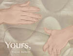
Yours,
Elaina Barnett
As I walk through my every day, for as far back as I can recall, little phrases would repeat inside my head.
THE LEAVES ARE TURNED, IT’S GOING TO RAIN
A SMILE COULD MAKE A DIFFERENCE
DON’T INVITE YOURSELF
Little lessons and facts passed on to me, most often words of my mother.
HOW WOULD THAT MAKE YOU FEEL
YOU DON’T KNOW WHAT THEY COULD BE GOING THROUGH
BAD PEOPLE CAN WEAR BRIGHT COLORS
FORGIVE AND ASK FOR FORGIVENESS
TURN THE LIGHTS OFF WHEN YOU LEAVE A ROOM
Repeating softly,
SHARE
LOVE YOUR ENEMIES
YOU’RE THE OLDER SISTER, HE LOOKS UP TO YOU
THOSE WHO HAVE, SHOULD GIVE
like a mantra printed in the air with edges that softly bleed and fade away.
BE GENTLE
WORDS ARE LIKE SALT SPILT FROM A SHAKER
CAREFUL, WE ARE SPONGES
ONLY FIGHT IN DEFENSE
SHH, LISTEN TO THE FROGS AT NIGHT
These endless lessons, words, have always made me conscious, over-aware. Most especially of others and how I would—I might—affect them. And so I always tried my best to smile, to give, to—as my mother would say—‘be love’. But there’s a space between my young self and my current self. Separated by a gap I can’t quite place in my timeline, can’t quite describe. Maybe one set line doesn’t quite exist, but it seems to have nestled itself somewhere between my hopes and my actuality, to have become part of me while I wasn’t looking so closely.
I grew up in a small town, with a big church, with weekends filled with trips to see family an hour away. A mother raised by a family of police, and a father raised by teachers—something about how all these things mixed has made me often think on how we treat one another, has made empathy an ideal through which I filter most things. That desire for others and myself to know real empathy, sculpted my upbringing, still sculpts my concerns, and feeds my anxieties about myself and the communities of which I am apart.
It seems maybe I—we—all repeat the same harmful habituations. Personally, familially, nationally, globally. When I turn to myself, to those dearest to me, I see the truth of that. Through my drawings, sculpture, and writing, I work to better engage with the relationships I am part of, to look into them and pay them gentle attention. Through this, my work is a push and pull of illustration. A process of creating sculptural memorials to the relationships that I have neglected, paired with mark-making, documenting, the internal monologue that accompanies my doing so. All along I continue to collect little phrases, poetic words, short notes, drawing from them imagery that informs my work, through a growing system of personal symbolism. I bare my own body, my personal history, my internal voice, in hopes others will connect through their own. Poetic writings and readings, give context, and extend on the interaction I ask of others in some of my sculpture. I utilize performative and interactive means to create new communications between people. To highlight our disengaged intimacy, which we seek to supplement, often through limbs not of our own, but of the prosthetic of tele-technology which we like to keep so safely in our back pockets. Maybe my work only furthers this, but I hope it serves as a reminder of what we lack, together, so we can work to amend, as I am trying to amend.
-
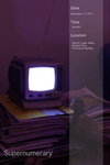
Supernumerary
Ethan Best
For me, art is centered on shifting perspectives, the analysis of communication and the impact of art on our society. It is a reflection of a cultural collective consciousness; manifestations of a collection of beliefs and worldviews that function both as a time capsule and as a direct line into the world of ideas. I create work that is fundamentally founded in personal exploration and interpretation of the artwork at hand. Each piece is, in essence, a catalyst for discovery. For this reason I use a largely minimalist approach in creating objects that have a strong phenomenological presence and have any and all meaning compressed into openly-interpretable visual cues. Narrative is only determinable through heavy investigation of the piece, and even then is largely subjective. There is an emphasis on untranslatability; an inability to fully understand outside of personal experience and interpretation. While some preconceived meaning is inherited through the use of visual metaphor, the intuitive patterning of the metaphor is obscured due to its vagueness or the further layering of conflicting patterns. Furthermore, the context from which the iconography is drawn from varies greatly.
Whether it be literary and philosophical references or from TV and internet culture, all imagery is of equal of importance. They blend together creating a sense of unsure, uncomfortable half-familiarity. While the art itself is confounded and is relative to the viewer, that does not mean that it is meaningless. Meaning is instead inscribed by the context of the work from the spectator's perspective. This oscillation between investigation of predetermined meaning and objective non-meaning is meant to give the work a sense of sublime absurdity. The spectator is fully free to investigate and form their own opinions on what the work is and what it means, and, therefore, are entirely responsible for those beliefs.
Printing is not supported at the primary Gallery Thumbnail page. Please first navigate to a specific Image before printing.


