-
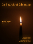
In Search of Meaning
Cole W. Wyatt and Cole Warren Wyatt
All of my work serves; the bowl and box are used to contain and have direct interaction with the hand of the individual, connecting the artist to the user. They are all made by a fallible person but within them is the desire for infallibility. Subtle discrepancies will be found between a brief change of angle in a pot or an unevenness in an otherwise flat surface. We can't attain perfection but that is no reason not to strive for it.
My paintings serve in a different way, expressing life, a scene and a narrative, through vision rather than touch. The strokes are heavily blended and flow between naturalistic and gestural, borrowing much from the works of Chen Yanning. Influenced by the Vanitas painters of the Baroque Period, my paintings point out symbolically that pleasures and works of this earth may be fleeting compared to what awaits in the next life, but that is no reason to forego them. Rather, engage in all the wonders of this world in a spiritually fulfilling manner. Anything may emit holy light or may dampen it depending on how it’s gone about.
There are aspects of symbolism in my ceramics and woodworking as well. Both deal with ideal or satisfying angles and curves derived from natural phenomena such as fractals and Fibonacci spirals. Wood exhibits order via pattern in its grain but simultaneously is never wholly consistent. There is always a bit of chaos that ripples through a board. Those alterations in grain are not to be cast aside however, integrating them into the piece elevates the whole. I find great inspiration from the work of Silas Kopf in this regard, in his intricate yet simple patterns and designs. In ceramics, the most ideal arrangement of angles and curves is achieved, laying down a base of order while allowing the glaze to display chaotic fractals and crystal formations across the form, echoing but never repeating the same on any vessel. Much like Florian Gadsby’s work, the vessels initial production, which is angular and even architectural, is complemented by an organic glaze that is fundamentally representative of nature.
Everything material comes from nature. It's important that my work reflects that, both symbolically in my paintings and in the more abstract ways shared between my ceramics and woodworking. I bring together my ideal in art in that good works are a marriage between the material and the spirit through nature.
I wish for people to experience this in my exhibit by being integrated into a living still life of my works. This installation is a space that reflects where one may put their time, the worldly beauty of the object, the spiritual nature of its meaning, or an appreciation of both. It asks the question: your candle is burning, and it will go out, but what are you going to shine on in the meantime?
-

9th Life Cat Café
Bethany Burbage
The 9th Life Cat Café is a cat-themed café based in Queens, New York. Featuring an app prototype with mobile ordering, four large-scale branding concept illustrations, social media ad campaigns, and a large-scale menu, the 9th Life Cat Café is sure to capture your attention with its attentiveness to detail and delicious treats. The color palette and logo are both inspired by a calico cat, which is a breed that is viewed as “good luck” in many cultures. The 9th Life Cat Café also features examples of cats that would be available in shelters to encourage cat adoption from shelters.
I view design as a feast for the eyes, leaving viewers hungry for more knowledge and inspiration. I enjoy bringing food into my designs and illustrations because everyone can relate in some way. Incorporating elements of food into my illustrations mirrors the joy and satisfaction found in culinary creations, as each bold color, shape, and texture resonates with the same sensory experience as a well-crafted dish. Through my work, I aim to evoke not only visual satisfaction but also deeper emotional connections, tapping into the universal experience of eating. I wanted to find a way to combine my interests in food illustration and cat adoption, so I chose a cat café to seamlessly merge the two ideas together. In my designs, vibrant colors and enticing textures bring to life the atmosphere of a cozy café, while playful cats add a touch of whimsy and charm.
My work centers around branding, illustration, and UI design to create playful and dynamic designs. Drawing upon my past experiences, I've meticulously crafted the café's logo, iconography, and typography to reflect its fun and cozy atmosphere. My illustration technique is drawn from how I create paintings. I start with a sketch, then I begin blocking colors in and painting over top to render each object, using my stylus like a paintbrush with different hand pressures. The process mostly consists of layering and blending until you've reached the layer limit. In paintings, I often use pinks and purples in the shading of objects and figures. I have translated that into my illustrations, using purple on a multiply layer to create more interesting shadows. I favor illustration and user interface design because I love to pay close attention to detail and create immersive experiences. The prototype for 9th Life Cat Café uses elements and techniques that are similar to my other pieces but allow for a more interactive experience with its mobile ordering features.
I draw a lot of inspiration from artists like Ross Tran, Vivienne Medrano, and Studio Ghibli, taking note of their use of color, lighting and shadow, and different drawing styles. Studio Ghibli's immersive realism and lush environments influence my aim for a blend of realism and magic in my illustrations. Vivienne Medrano's dynamic lighting and bold colors, along with Ross Tran's detailed and painterly style, inspire my lighting and composition techniques. My food illustrations are inspired by Alai Ganuza, a contemporary oil painter. The different shades of teal and purple in her works always makes me come back for more, and I love how she uses texture and lighting in things such as berries and glass. The approach of different elements of design and illustration by these artists have helped pave the path for me to find my own style of illustration and design, which I have implemented into the work shown in the 9th Life Cat Café.
-
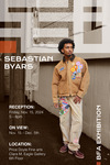
Sebastian
Sebastian Byars
The name "Sebastian" reflects my journey and process throughout my show. Growing up in small-town Paris, TN, my passion for fashion felt out of place. During college, I faced mental health struggles, and thrifting became my escape, sparking a love for clothing history. I now enjoy sewing and reworking both modern and vintage pieces, focusing on creativity and discovery over intention. Often, I ask myself, “What can I create from what I already have or want to discover?”
My work combines model and product photography, sculptural garment displays, and branding rooted in my work. Blending workwear with editorial aesthetics, I aim for a cohesive look that highlights texture and grunge, capturing the feel of small-town Paris, TN. Using orange as my brand color honors the Tennessee Volunteers and the working-class spirit I am surrounded by daily.
Kanye West is a major source of inspiration for me. While he is not a graphic designer or hands-on clothing maker, I admire his vision for Yeezy. His photo-heavy, minimal-typography style, especially seen in the 2017 Calabasas collection, has strongly influenced my design choices for this show.
Virgil Abloh is another designer I admire. Originally a civil engineering and architecture major, he shifted from building structures to shaping fashion, showing that even if you are deep in one field, there are countless ways to blend new media with your current skills. His journey reminds me of the value of stepping out of your comfort zone and combining the familiar with the fresh.
-
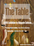
The Table
Abigayle Cothran
After my mother passed away last year, I found myself drawn to old family photos. I became fascinated by how things had changed over time. With everything in my own life changing so much, I began searching for something that had stayed the same, something that could connect me to her. As I looked through the photos, I saw changes everywhere—people, homes, cities—but then I began to notice a dining room table. It appeared in many of the pictures, always in a different room, but often with one or both of my parents sitting at it, and new family members appearing over the years. As a child I learned to paint at that table in the basement of my childhood home, and now the same table sits in my dining room here in Murray, decades later. This table has been a constant symbol of connection in our lives for nearly 5 decades. An old table wouldn’t have seemed special to me before, but now it brings me comfort and peace, a small but meaningful link to the past.
I focus on capturing the details and accuracy of each moment I paint, paying close attention to the subtle nuances that define the scene. My large paintings revolve around candid family moments shared around the table over the years. Each painting reflects a meaningful memory, making the time spent carefully studying and recreating every detail essential. In these oil paintings, I use vibrant colors and subtle shifts in tone to create a scene that feels naturalistic. Like Jeremy Lipking, my work uses refined levels of detail while leaving other areas vague and painterly. I also create small oil paintings that focus on studies of the table, capturing detailed, zoomed-in views of the table and chairs. While each painting is an accurate depiction of the subject, they are approached with an abstract style. The compositions emphasize texture, light, color, and form over strict realism. The textures, especially those of the wood, are inspired by Josephine Halvorson’s ability to capture the nuances of surfaces. The result is a blend of observation and interpretation, where the familiar shapes of the table and chairs invite the viewer to see the everyday in a more abstracted way.
This series of paintings maps the transformation of my family and our environments across 4 decades from the steadfast perspective of a dining room table. My work is inspired by my mother, but is also about my dad and the family they made, starting in 1990 all the way through 2024. Through this series, I encourage my audience to consider the constant symbols of connection within their own lives and to reflect on the objects or places that have quietly witnessed their stories. By focusing on a single, enduring object, I highlight how even the simplest items can carry immense personal meaning, bridging generations and preserving shared memories.
-

Self-ish
Christine Cox
Sonder is the realization that every stranger and passerby has a life and experience that is just as complex and vivid as your own. The elderly person beside you on the bus, the couple in the restaurant, the children on the playgrounds, we are all alive for the first time. A concept that seems obvious, but when the time is taken to truly understand it, you also begin to understand humanity as a whole. Every person desires to see the good in the world, and we often turn to grand gestures of hope and stories of human resilience, but we often forget to observe the blessing of humanity that passes by us every day, on the bus, in the restaurant, and on the playgrounds. Selfish is an homage to this phenomenon, and a thank you note to all of the strangers and passers-by in my own life who have helped me understand the simple beauty of being alive, and an acknowledgement of their effect on myself as an individual by selfishly living their own truth, just as I am with mine.
I find that my concepts are most accurately represented in a muted grayscale with the occasional bold singular color to add contrast, with the majority of my pieces consisting of charcoal, both pencils and loose. I regularly push the size of the work to create three-dimensional installations or experiences of surrealist depictions of myself or other human figures, distorted in a way that emphasizes how a mental struggle may manifest itself physically. This often results in realistic depictions of gore, or other morbid concepts related to the subject matter. My works are self-portraits, not solely because I am drawing my physical body, but rather an expression of my experiences, ones that I hope viewers can place themselves within. Self-ish if you will.
Throughout my time creating these works, I have been captivated by artists such as the illustrator Caroline Harrison and visual artist Catherine Chalmers. Both artists have an immaculate attention to detail, and a style that demands it at every point on the canvas. I replicate this level of craftsmanship as well as the amount of information presented on one artwork at a time. The dark, dreary environment they are able to create evokes a deeply visceral and emotional response I strive to achieve in my own artwork. These artists—in this twisted way—inspired me to depict mental health struggles with very physical and gut-wrenching depictions of gruesome scenarios, while allowing the craftsmanship of my pieces render them “beautiful”, thus creating an interesting juxtaposition for the audience. Most notably, the inclusion of insects as an homage to the natural world is often a more direct way to incorporate “beauty” into any one of my artworks. It allows for an easy connection and understandable motifs to allow my own artistic message to be easily digestible while remaining a supporting role in the overall artwork.
“The human experience is what is really at the heart of all my work.”
My hope is for the viewers of my show to feel seen in not only perhaps the uneasy experiences they have gone through, but also a realization of their effect on others simply by being alive. The works I make are uncomfortable, dark, and perhaps disgusting to some; but I feel they also exude comfort, for there is an innate human desire to express this hurt where others can witness and understand a situation where it is easy to feel alone. Human experience is never performed alone.
I believe the ability to share knowledge, compassion, empathy, and understanding regarding experiencing painful circumstances and creating a shared level of consciousness is the paramount principle within the agonizingly beautiful human experience.
-

Fabula Mea
Lindsey Duncan and Lindsey Duncan
Through digital illustration, I intertwine my personal traumatic experiences with stories from both Greco-Roman and Norse mythology as a means to process and heal. My exhibition, titled Fabula Mea (which is Latin for “my myth”) aims to highlight the effects of abuse, and how I have taken steps to overcome my past experiences.
Myths and folklore have been a special interest of mine for as long as I can remember, specifically of those I have a cultural connection to. These mythologies are laden with tales of struggle with a paternal figure, which is another reason I resonated with these stories. I use these retellings of history as a means of reclaiming my history, to make my own mythology of sorts.
The illustrations featured within my exhibition combine both mythology and my past, in somewhat abstract ways. It may not be inherently clear on what sort of myth the work is based on or how certain works and imagery relate to my past experiences. This abstraction of the concepts and ideas within my work pushes the viewer in my story, making them dig deeper into the narrative in order to piece together the meaning. Considering the topics I focus on are quite intimate and emotional, I find that having my work be more obscure adds to the viewer’s connection, allowing their own emotions and experiences to be brought up and entwined to the work.
Though I work in digital illustration, I draw a lot of my inspiration from painters, such as Hugh Steers. In his works, he uses subject matter and composition in a way I find quite interesting. Though not overly grotesque, the vulnerability and emotion he conveys is something that I do within my own work. His paintings feature heavy subjects such as sorrow and loss, which may or may not be perceived upon first glance. This level of intrigue and interaction is something that I embody within my own works, like in my Narcissus illustration. Though it is more gorey than Steers’s work, the piece is about self-sacrifice, and often having to give myself up in order to maintain perfection. I wanted this piece to have more intense imagery, but still represent the loss of one’s identity in a way that is not blatantly obvious.
I also look at the work of Meredith Marsone. Though her work is very figure-heavy, I find that her use of texture and color are used in a way that compliments her work in a very unique way. She uses it in a way that marries the foreground and background, and sometimes even makes it look as if the figure and background are conjoined in a way. Marsone’s works also tend to lean into more melancholic and pensive imagery, but does it in a way that seems more intimate than Steers’s work. Marsone makes the viewer focus on the subject and its abstract surroundings, and doesn’t give us as much information to base our interpretation on. I find this emphasis on the subject really interesting, and is something I do within my own works to keep the viewer engaged.
While each illustration has its own story behind it, this exhibition is meant to serve as a form of healing and processing. This show has been nearly a lifetime in the making, and has had its moments full of grief, anger, confusion, and sadness. Though these emotions feel all-consuming at some points, I strive to not let its roots take hold. This exhibition is proof of that; proof that I can overcome that which aims to control me.
-
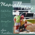
Maxwell Place
Leo Fischer
Leo Fischer
Artist Statement SP24
Last summer, as I was packing my things to move, I found a stack of family photo albums in the attic. I spent hours sitting on the floor of my bedroom going through every single photograph. Many of my memories from the first decade of my life are foggy, as losing a parent at a young age is difficult, and blocking out unpleasant memories is an unconscious, yet common way to cope. There were some things I didn’t recall at all until I was holding pictures of them in my hands. Maxwell Place is a collection of work based on the nostalgia I hold around my childhood. These hazy memories and missing pieces of my childhood inspired me to create a series of prints dedicated to the things I can't quite remember clearly.
I use my screenprints to allow the viewer to see my memories in the same way I do. Screen printing allows me to incorporate my graphic design work as well as photographic and hand drawn elements into my pieces to create a narrative of my memories. To express these concepts in my pieces I play with opacity, layering, and abstract textures. I enjoy color blocking figures or backgrounds in my pieces, overlaying multiple images with varying transparencies, and incorporating handwritten typography into my pieces.
Recently I’ve been finding inspiration from Hollis Brown Thornton, a painter and printmaker who works with concepts of morality by using old photos and personal objects in a pigment transfer process. Another one of my inspirations is Geloy Concepcion, a photographer who works with color blocking and text in his photos. Seeing their works influenced me to use hand written text in my prints and gave me the idea to use puff ink to add more texture to my pieces. Printing in non-traditional ways allows me to explore my concept in ways I hadn’t discovered before. Printing on pillows, lamp shades, and furniture allows me to create an immersive view into my memories by allowing the visitor to experience a recreation of my childhood living room.
This exhibition is not only a narrative of my childhood, but a narrative of who I am now as an adult. Through my prints and installations I aspire to reach an audience that not only identifies with my art but also interprets it in their own unique ways. I hope the memories that I share with others remind them of their own forgotten memories.
-

Springlot, USA
Benson Greenwell
Utilizing digital media, I design work that embraces the humor and playfulness found even in the darkest of situations and environments. The humor expresses liveliness and absurdity — reminiscent of my childhood — but is reinforced by a mature perspective. It is through designing art that I can explore my witty and sensitive side. My artistic purpose is to put a smile on people’s faces.
This exhibition introduces the fictional town of Springlot, USA, The town acts as a central melting pot for many different tourist traps. The exhibition is inspired by a trip to South Dakota I took with friends back in 2020, particularly the iconic Wall Drug billboards along I-90. My friends and I saw so many that we just had to see what all the hype was about. We were definitely tourist trapped looking back on it.
I believe that tourism branding is fundamentally different than commercial branding because tourist traps break all the rules of design so long as it gets people to the door. These brochure layouts adhere to the principles of design while also representing these traps in a amusing light. Each brochure on the rack was approached stylistically different. It is my hope that Springlot, USA cracks a smile on viewers faces and maybe the road will lead them there someday.
My inspirations are David Hockney’s bold use of color and shapes to design multilayered layouts. Illustrator Kazuma Kaneko’s application of rhythm, sharp outlines, and grim aesthetics developed during his time in the video game industry made me consider narrative importance in my work. After reflecting upon this, I treat all of my design work like a pop-up storybook, telling stories with a dimensional and comical perspective.
While my design work is primarily digital, I find that skills I have learned outside the computer have helped my graphic design work. Taking painting classes helped me better understand texture and color theory. Taking marketing courses helped me understand designing for an audience and brand consistency. These skills allow me to visualize work with more depth while also balancing the characteristics that make my work my own.
The nature of my work is taking the ordinary — such as an informative brochure design — and making it extraordinary by playfully altering the layout and typography. When starting my work, I’ll look at the references I work from and take small details such as people and places and develop a comical narrative around them. Thinking of underlying narratives sometimes helps me when developing concepts for a piece. These narratives helped to lay the foundation for Springlot, USA.
-
It's An Honor to be in Your Presence
Wesley Hammer
Art is a language— a form of communication. It is a way of explaining yourself, exploring how you view the world, what you find important, and how you feel about these experiences. For as long as I can remember, art has been an outlet for me to express my own lived experiences. Art allows me to visually process the thoughts and emotions that we experience through everyday living. Creating art is baring the soul, and with art being a visual medium, it allows for an understanding that goes beyond words. We as human beings exist in a complexity. We are all so similar in our behaviors yet we are so uniquely ourselves.The bond human beings share is one like no other within this complexity. We rely on each other, we relate to each other, and we love each other. I reflect this relationship through art. To love art is to relate to it, so then we may rely on it. One of the biggest influences in my work is my transgender identity. As a non-binary person, I am very aware of how others perceive me and my body. I have gotten very good at identifying if others view me as a male or as a female, and how my identity changes based on others’ perceptions of me. Oftentimes I have to play into those perceived genders to keep myself safe. This awareness of my perceptions can be seen through the inclusion of my body in my works. There are two aspects that make up humans, the mind/soul and the body. Oftentimes it is easier to identify others simply as their body. These are not two different things, in fact they are one in the same. You are the body you inhabit. By creating art that portrays the figure, I connect the body and the soul. The works of Egon Schiele and Jenny Saville are also great influences on my works. These two artists have such an extreme understanding of the human body that it allows them to push what the figure looks like into abstraction. In regards to Schiele, I find myself drawn to the works where he depicts skinny figures with exaggerated bones. Along with his textured application of color, he is able to create borderline grotesque works that explore human nature as well as sexuality. In a similar way, Saville’s works also come across as graphic. Specifically, her influence in my work comes from the way she paints skin. She is able to create an accurate depiction of flesh while also abstracting it to create an overwhelming presence in her works. With these two influences, I deepen my understanding of the concepts of human perception as well as individualistic change. Through the use of oil paints, addressing and accepting these changes becomes easy. With the slow drying oil paints, it’s important to understand when a piece no longer requires constant manipulation. I spend long periods of time with each piece, forming a relationship with them. This relationship is formed through the layers of paint that are built up onto fabrics I use as my canvas. Through this process, I give life to my works, allowing them to exist and have a presence. This relationship can be reflected onto the viewer. You are a body who has a presence, you are allowed to take up space and you are allowed to exist. To be is to be perceived. In order to connect with each other, we must be willing to understand each other. We will never be able to completely understand one another because of differing perceptions, but we must keep trying. Through art and communication, I can understand myself, others, the world, and the experiences we share. I do not make art alone, and I do not live alone, for I am the company I keep.
-

Tails of Adventure
Samantha Lam
In the whimsical world of Tails of Adventure, an unlikely trio — a kind-hearted fox, goofy alligator, and angry rat — invites you to embark on an exciting journey with them. Starting the adventure from Meadow Mound, it's an interactive story where many things go awry. Tails of Adventure is a playful, lighthearted brand that invites you to escape into a world where every day is a new adventure.
Through my artwork, I aim to offer a distraction from life's burdens through branding and illustration, focusing on the importance of making people smile. Branding allows me to craft a memorable first impression, while illustration adds personality that words alone can not convey. Combining these elements, I have created mascots that are charmingly simple and cute yet endearingly weird, connecting with the audience through their unique stories and personalities. I believe art does not always need to be complex — it can simply exist to bring joy. Tails of Adventure is built on playful typography, nature-inspired elements, and eye-catching illustrations that bring the adventures to life. I aim to spark joy and connection by inviting people into the world of these beloved characters through immersive, relatable storytelling.
To make the experience more immersive, I designed interactive elements like collectible stamps, allowing people to follow along with each adventure and mark their progress. The characters come to life through large cutouts, making it feel as though the adventure gang is right there, sharing the journey with you. The fun extends beyond the stories themselves, with merchandise like stickers, activity sheets, and art prints that allow fans to take a piece of the adventure home. By designing and offering these items, I have created a little shop that lets the audience further interact and engage with my pieces.
When creating my work, I’m inspired by various animation companies, such as Studio Ghibli, who make magical lush landscape illustrations with dynamic compositions. Like the Pokémon Company, it’s fun to extend characters' charm into branding and merchandise, offering fans the opportunity to take home a piece of the experience. Additionally, Usagyuuun, a Japanese mascot I adore, is a character that has become its own brand identity through its odd yet charming depictions and interactions, something I draw from while making my work stand out with its abundance of personality. These influences drive my vision for Tails of Adventure, as I build a world full of whimsy, joy, and everyday adventures.
-

Breaking Borders
Savannah Leach and Savannah Paige Leach
My exhibition, Breaking Borders, explores identity, belonging, and the complexities of adoption through various artworks. As a Korean adoptee, I seek to share my struggles and offer diverse perspectives that challenge stereotypes in the adoptee community. I hope to connect with others and confront misconceptions about adoption through showcasing my personal stories.
My collection of illustrations reflects my personal journey as a Korean adoptee through an abstract lens. I opted for a minimalistic illustration style to highlight the themes rather than the aesthetics. I developed a set of posters that resemble those used to promote social awareness. These reinforce the two informative booklets by being reminiscent of informational posters even while only posing questions. The wall of adoptees seeking to reconnect with their families aims to replicate the inexpensive and overlooked style of missing person flyers. This element unites the exhibit by mimicking the desire to draw attention and the desperation that adoptees often feel while trying to reconnect with their loved ones. The exhibition's use of South Korea's national colors, red and blue, serves as an eye-catching focal point that represents the country's heritage.
As a Korean adoptee, I draw inspiration from fellow adoptees like Meg O'Shea and Megan Rye. Their work, which explores the complex aspects of adoption and identity, has inspired me to create flyers and collages that convey a similar sense of longing and search for self. Through my writing and exhibitions, I hope to provide a platform for the adoptee community to share their voices and gain a deeper understanding of their inner selves. Despite the challenges, I am determined to forge my own unique identity and resist being reduced to a mere number in the Korean adoption system.
“Your openness to embrace my experience embodies empathy, understanding, and a shared humanity. Your engagement as a viewer affirms the importance of each word, emotion, and revelation in these pages. Together, we can transcend barriers of distance and difference, uniting in the universal pursuit of belonging.”
-

Oh My Stars
Abbi Moore
I am of the opinion that everyone judges a book by its cover. Why else would books have covers? Visuals are the ultimate first impression. This concept has interested me for a long time. In my work, I try to make the viewer pay attention to information that might otherwise be overlooked by building a connection with the audience when words are the only thing to work with. This is where my love and appreciation of graphic design came from. The idea of organizing art is an interesting concept in itself, but seeing how effective it is when it's carried out well sparked passion. This is why I started designing, but seeing how my work has grown and evolved over time is why I keep designing.
The combination of styles across generations with a modern twist is something that I really enjoy not only seeing but implementing into work. Selecting effective elements from the older styles is a fun challenge. This has made me reconsider the process of creating work, as much as the result. While researching the aesthetics of the 1950s the typography of Hanna Barbera in the title sequences of shows such as “Bewitched” has been inspiring. These sequences are very stylized and memorable. It feels as though their letters are dynamic and have personality rather than being static characters. When working on a computer it can be hard to get the effect of their hand drawn cells, but by manually building each word I’ve achieved the look of the style being emulated. Another artist that has been very influential has been William T. Hurtz. His combination of line work and color blocking to create a sort of offset look in his work such as “Gerald McBoing Boing” and especially in “A Unicorn in the Garden” inspired me. It is through both of these artists that the logo for a new coffee shop, Oh My Stars, came to be. This can be seen through the typography reminiscent of a sitcom intro as well as the offset design of the moon.
The aesthetic of the coffee shop is fundamental to the viewer’s experience and creates an opportunity for the audience to be immersed in the environment. Oh My Stars is a coffee shop first and foremost and should therefore have collateral to support this. This includes a uniform for a barista, coffee sleeves, as well as bigger environmental details such as the hours posted and open/closed signage that would typically be seen in a shop. By supporting the design with items such as a booth, reupholstered to match the branding, or something as simple as punch card, Oh My Stars becomes a place the audience can occupy and engage in.
-

Clattergag
Jamie Myres
Clattergag is an immersive, interactive installation that breaks the white-wall gallery confines to explore childhood nostalgia and whimsy. Fun is the goal. Playing dress up with half a mannequin, or laying in a giant burger are activities you wouldn't usually find in a stuffy gallery. As the viewer interacts with each piece, I want them to sit with their nostalgia and wonder why it is that kids pretend to be adults.
Nostalgia and adulthood are so intermingled, yet the mere presence of one means an absence of the other. Children yearn to be adults, yet it's taboo for an adult to keep their childlike wonder and interests. I use saturated colors, nostalgic imagery, clever concepts and, most importantly, humor to invoke a positive feeling in my audience. I want them to walk away with a memorable experience, so memorable they tell their friends and laugh together as a result of something I made.
Clattergag is incredibly immersive. The gallery atmosphere changes when entering the space. The vertical space is filled with draped fabric to feel as though you are entering a fort, and handmade rugs to cover the gallery floor and add a more plush homey feel. Throughout the show, I use a lot of childrens craft supplies – googly eyes, pom poms, pipe cleaners, beads – to create the feel of an elementary art class or school project. The bright, saturated primary colors replicate the decor of a preschool classroom, or a children’s toy. I use a lot of textures within the show that you just can't help but touch, in an attempt to draw in the audience to interact with the show. So go ahead and put your grubby little fingers all over everything, I know you want to!
My inspirations come from a number of places. Claes Oldenburg’s larger than life sculptures allow the viewer to take in the absurdity of everyday items at an impractical scale. The viewer can take this at face value or consider a deeper meaning. Digital artist Sam Lyon puts realistic, creepy human anatomy on everyday items, giving his work an unsettling appearance. The disturbingness is incredibly captivating for weirdos like me. Yayoi Kusama creates an intricate, immersive experience simply by covering a whole space with polka dots. The idea of transforming an entire atmosphere is incredibly intriguing to me. These artists inspire me to push the boundaries of what I know, and create to the best of my ability.
For as long as I can remember, I have found safety in humor. Everyone loves to laugh, and they love people that can make them laugh consistently. It was a quality that came naturally to me, and one I didn't realize I had until much later. It is a part of me, just how it is a part of everything I make no matter how hard I try to be serious. My brain is constantly a chaotic battlefield, with so much going on it often feels like there is nothing going on at all. It feels like there is always a new diagnosis, a new medication, and a new problem to fix. With my art I want other people like me to be able to take off their armor, lace up their clown shoes, and just have fun.
-

Transcendence
CJ Nance
Have you ever experienced hate from those you love the most? From those in the media you admire? Hatred that tells you that your existence should not be allowed? This is my daily experience as a transgender man. Being transgender has given me experiences that I love and experiences that I would never wish upon my worst enemy. Unfortunately, coming out and being out is dangerous for my community, and many transgender people choose to stay hidden. As an artist, I focus on gender identity and transformation that aims to provide courage to other transgender individuals so that they too can become their authentic selves.
Creating prints is a way to process my transformation while advocating for the transgender community. The graphic quality of screen printing works in conjunction with my figure and object-driven images. The prints are realistic and illustrative with line quality that is essential to my work. By using these elements as well as bold, bright colors, I emphasize the shapes and textures of the subject.
Along with screen printing, embroidery is a technique that is implemented in my pieces. The patches of embroidery floss make certain areas of the image more distinctive than the others. It is used to highlight the parts of the body that are changing or being changed deliberately by the transgender person. This is to bring awareness to transgender people and what we go through, so that others can further understand who we are and not jump to conclusions when it comes to our bodies.
Cathrine Opie uses lots of symbolism in their work as a queer person to show what others might be afraid to let those outside the community see. My community frequently uses symbolism as a more appealing way to show the harsh reality that comes with being ourselves. Because of this, I use symbolism as a powerful tool to talk about how being transgender is not all happiness. Being publicly out is harsh and not for the faint of heart. Despite this, those that came before me have inspired and encouraged hundreds of people to accept their identities. I hope my work can do the same.
-

Buried Treasure
Maggie Quertermous
One of my most cherished dreams as a child was to have a dog. This past year I was able to adopt a four legged friend that forever changed my life for the better. When walking into that shelter, I immediately wanted to take her home and away from that sad interior. Being able to rescue a dog that I so deeply connected with was something indescribable, but it was sad for the ones left behind. From that experience sprang the idea of Buried Treasure. A bright, exciting place that is full of possibilities for both dogs and people.
Brand design is creating a voice for a company without having to say a word. It has the ability to bring a community together just by existing. My designs are made to be colorful and unique that stand out in a world of bland advertisements while enhancing a business’ purpose. Organic shapes, unique color pallet, playful typography, and layout help to create a unique identity through branding. This was considered when designing Buried Treasure Shelter and Store. Over all, dogs are happy creatures, full of love and playfulness. But often, shelters are dark and depressing spaces that do not embody the feeling that one can get with a canine companion. Everyone needs an animal in their life to enrich it but choosing the right one can be difficult, especially when the shelter has muted colors, and a depressing interior. By designing a bright and fun business system for Buried Treasure, it brings excitement within the building, helping prospective dog owners envision the joys of adopting a dog.
Buried Treasure Shelter and Store envisions a dog shelter and pet store that stocks everything that a prospective owner would need to bring their new furry friend home. Within the store, the products, posters, and signage are designed to enhance excitement about bringing a dog home while the materials within the shelter provide the information needed to know about their current residents, and what to expect after bringing them home.
While designing the products and packages, Robot Food inspired more vibrant uses of color and unique designs, full of color with loud typography to help create a fun and welcoming environment. William Wegman's use of his own dogs within his photography provides personal touch and the unique ability to capture every canine’s unique personality. Jessica Jones’ designs use bold patterns and a fun, engaging design while bold typography helps to create a sense of urgency to the work. All three designers show excellence in fun, colorful design, something that I incorporate into my work by using clear and unique fonts, a cohesive color palette, and playful shapes that communicate a warm feeling to remind people how life is better by being the guardian of a shelter animal.
-

Phylum Phantasma
Hannah Robards
In my work, I explore how comfort can be found in discomfort and harrowing situations and how we seek shelter in the world around us. My art takes the form of a ceramic world that is devoid of human life and explores the habitats of various unique creatures and species. My work evokes the feeling of searching for a sense of belonging and how this search can be a complicated one, filled with a variety of different relationships, including beneficial, parasitical, and more. These relationships are present in my ceramic creatures and exemplify the complexity of interaction within our species.
I utilize blistered and gooey textures along with biomorphic forms in order to push my idea of eccentric creatures residing in another world. The incorporation of fiber elements evokes moss, mold or ground and helps define and deepen the environments the creatures inhabit. My work allows the viewers to immerse themselves in this other-worldy environment and possibly find themselves relating to the creatures and the relationships they are involved in. I hope the viewers will come away with a feeling of intrigue in the world around them and an appreciation for the people and relationships they find comfort in.
Cynthia Consentino and Kathy Ruttenberg are two contemporary artists whose work is influential to my own. Consentino’s work focuses on manipulating familiar objects in life, molding them into a completely new set of imagery that sheds light on humanity and identity and how these relate to animalistic/natural ideals. Her work is inspired by mythology, religious imagery, and fairy tales.. Ruttenberg is also primarily a ceramicist but works in other media such as painting and animation. Her works focus on telling a story using humanoid mythical creatures that invoke a sense of wariness in the viewer. A lot of her works feature crossovers between human and animals/natural elements, which is a theme I explore in my own art.
-
Growth in Light
Eve Sexton
Nature has always been a source of inspiration; something about an environment which tends to be overlooked. Surrounded by or gazing upon landscapes is a reminder to engage with the present moment and the individuals I share those moments with as well. That practice of observation, of regarding any moment in life as something worth being inspired by, fuels my work. Reflecting about natural cycles can give one a more outward-thinking approach to life and connection. An organic ecosystem is a cycle of dying and rebirthing when the time is right. This applies itself into the lives of people as well. In my work, I explore these relationships and how memory- a very human concept- can enforce and impact these connections. My memories of people in places where they might no longer be able to inhabit are the scenes of these paintings.
I layer oil paint as working in layers helps to portray this immersion of figure and nature, and it is easy to blend oil paint in ways so any brushstrokes look natural themselves when pieced together. By actually painting a figure over a landscape, the two can be coherently connected visually. Pieces like “Rudbeckia” and “Quercus” show how this connection takes moments of casual observation and creates something new. I take formal aspects of contrast to bring out these moments of immersion; the way light casts shadows or the way leaves glow when illuminated from behind, like in much of my studies of landscapes. These moments of observation in my paintings can provide a moment of introspection for the viewer. Artists that use oil paint, like Heather Horton with her subject matter that relates to nature and connectedness between others are big sources of inspiration.
The smaller pieces are studies done in southern France in the summer of 2024. During this time, I challenged the way I previously thought about the way color interacts with light. I was able to hone my abilities of developing rich shadows and bright highlights during these plein air works. These skills of depicting light and shadow and rich colors in a landscape then wove themselves into my more recent work. I was able to more accurately express that introspectiveness through observation that is found so readily available in nature. The themes expressed throughout these works showcase how I view the world around me, and are themes other individuals can find inspiration in.
-
It Builds Character
Harlene Simmons
In the depths of our minds, we carry fragments of our past, pieces of childhood experiences that shape our future selves. Memories, whether warm and joyful, unbearably bad, or insignificant, serve as the building blocks of our character. It is the give and take between these memories and the vices we often keep hidden. My work brings to light the vices that quietly shadow our journey from innocence to adulthood—through methods of printmaking, primarily lithography, I set my childlike self in an empty space to emphasize the idea of memory, however clear or faint it may be. Central to my artistic narrative is the symbolism of the bucket—a vessel ready to receive inspiration, knowledge, and, most profoundly, the core of our youth. This empty vessel represents the receptivity of childhood and our minds' malleability as we absorb the world around us. Through photographs and drawings drawn from my childhood, I develop my artistic narrative. I juxtapose these snapshots of innocence with the presence of the bucket, making a connection between the past and the present. The resulting combination challenges viewers to confront the obscured vices that have quietly guided our evolution. Two significant influences shape my artistic perspective. Karol Pomykala's distinctive approach to printmaking, particularly in his series 'Changes,' diverges from my techniques. Pomykala, a dedicated relief artist, employs dot matrices to construct hyper-realistic compositions, often deviating from traditional compositional norms by extending the edges of his boxes into the margins of his paper. His mastery of space and balance resonates deeply with my artistic aspirations, particularly within the realm of printmaking. Notably, his choice of subject matter, such as rendering an open cardboard box, adds an intriguing dimension to his work. In contrast, Paul Galang's innovative lithographic methods captivate me as a printmaker. Galang's experimental process involves silk-screening gum arabic images onto litho stones and applying asphaltum to the negative spaces. This approach, which incorporates photo references, mirrors many aspects of my work, fostering admiration and inspiration. In “It Builds Character” I invite the viewer to retrace their steps through memories, to recognize the unspoken vices that lie hidden beneath the surface of nostalgia. Through this exploration, we confront the paradox of childhood—the simultaneous embrace of wonder and the inheritance of unseen burdens. I hope that this visual representation sparks interest, illuminating the profound impact of our early experiences on our adult lives.
-
Human Nature
Karl Smith
Building a brand means looking beyond a product or organization and finding an aspirational vision that creates value for the consumer. Through my design work, I want to transform products and other subject matter and transform them into unique, powerful experiences. By using intentional design choices, I can create effective visual communication. My design centers on strong hierarchy, bold color, and clear typography that creates attractive, memorable, and distinct visual identities.
Human Nature represents the positive impact a brand can have on the world by authentically connecting with consumers to provide real benefits. Skincare is the pursuit of beauty and health on a personal basis, and the Human Nature visual identity adds clean design to every step of this worthwhile journey. The clean, simple typography and flat visual treatment on the boxes, paired with energetic imagery and copy, conveys dynamism and honesty. An intentional selection of cohesive, minimal forms for packaging keeps the brand consistent and maintains an aesthetic fitting for personal care and beauty products.
When creating this project and in my general design practice, I am inspired by the work of several designers and studios in the branding and packaging space. The work of Studio MPLS creates simple visual motifs that, when combined with quality finishes and materials, create appealing tactile experiences and emotionally engaging designs. Han Gao of Workbyworks Studio uses clean, straightforward type to create stunning visual effects that facilitate effective, elegant visual communication. I am also inspired by the works of Bruce Mau and bmd, which use space and bold color to create lasting impressions for brands.
Human Nature is simultaneously the culmination of my work as a student and the beginning of my work as a designer. I hope to use design to create a positive impact on the world around me and real value for those that interact with my designs.
-
Camp Create
Lyle Smith
In life, there are certain feelings and emotions that are better conveyed through art than words alone. Using media such as graphic design and photography, I strive to organize information in a unique and thought-provoking way, and convey emotion through the elements of art and design. In art, I draw from my own experiences and create a time and place where I can ask questions without being interrupted. In design, I combine form and function, and organize elements in a way that is simultaneously logical and visually appealing. I am creating cohesion between photography and graphic design. In short, if I can give people a reason to look at my work in the first place, then I can provoke them to think and care about what I’m saying.
Creating my first photo book required dissection of my photography to find the through line across the compositions. What I found, in this reflection, was a visual record of the times where I felt comfortable to frame life through my lens. Through elements such as leading lines, geometric shapes, and the juxtaposition of man-made and natural forms, I organize my compositions. Most of these photographs are created as I walk outdoors, which is a meditative time to reflect on my thoughts and feelings. Time and space are important elements in my work, and my subject matter reflects that. Man-made forms are controlled, and tied to a time and context, whereas nature is timeless and ultimately uncontrollable. Both are grounding in different ways. With the exception of my twin brother, there are no human figures in this photo book. I choose not to photograph human figures because my photographs are created in a private, solitary space. After gaining time and space from my compositions, I can share them with others. My artistic practice serves as a conduit for introspection, inviting viewers to embark on a visual journey where meaning intertwines with form, and emotion finds expression in the language of design and photography. I aspire to not only captivate but also provoke contemplation and resonance in those who engage with it.
In my work, I’m attracted to bright and saturated colors, leading lines, bold use of negative space, creating symmetry and juxtaposing elements, creating balance and movement, finding and creating patterns, and creating texture and depth in digital works. I am fascinated with the way that the treatment of type in particular can affect the meaning of what is being said. In graphic design, drawing the eye of the viewer to the text in a composition is important to me. In my creative process, I’m inspired by the forms, colors, and other elements of design I see around me in everyday life, from the timeless organic forms found in nature, to architecture, interior design, automotive design, consumer electronics, music packaging, product packaging, print ads, and the work of photographers that I have found such as William Eggleston, Uta Barth, and Douglas McCulloh. William Eggleston uses color, type, and automobiles as subjects in a way that resonates with me. Uta Barth uses light and abstraction to create reflective pieces in a way I explore in my work. Douglas McCulloh’s formulaic way of creating chance occurrences to facilitate his work deeply resonates with me. In conclusion, I like to intertwine graphic design and photography to create work that captivates and provokes resonance in those who engage with it.
-
What Lives and What Lingers
Kaylee Vanlue
Like a flash in the night, reality blurs, and colors take shape. Manifestations spark within the form of a dream, allowing us to momentarily connect with those who are and were. This body of work draws inspiration from generational narratives that echo through time, particularly mid-century themes intertwined with Vietnamese and American heritage.
At the heart of this exhibition lies a personal dream that has evolved alongside my journey from childhood to adulthood. Each piece serves as a visual exploration of perspective and identity, rooted in the mid-century miniatures of a dollhouse living room from my youth and cultural themes stemming from the Vietnam War. These pieces reflect and borrow from the aesthetics of that era, characterized by sharp lines, organic forms, repeating patterns, and a blend of function and artistry, but also the cultural significance embedded within both Vietnamese and American design.
Each work in this exhibition encapsulates memories that stem from a personal and generational place, preserving the stories of both my past and broader cultural experiences relating to the way that people tend to cope. As real-life events have unfolded, each joy, struggle, and revelation has subtly shifted this dreamscape. This interplay of memory and imagination is reflected in the materials used: metal, wood, fibers, enamel and found objects come together to create a room of preservation that honors these shared histories. The pieces range from culturally significant jewelry that evokes cherished moments to structures reminiscent of childhood play and relationships, each item modified to tell its own unique story.
Drawing inspiration from Jenna Spevack’s work and her shared emphasis on materials, as well as their unique roles in storytelling. Both of our practices explore interactions and conversations between various elements to invoke deeper reflections on memory, identity, and how they convey a particular event. The way that she creates an environment around her works to establish a feeling within the space is particularly notable as it adds a layer of encasement that guides a viewer’s sensibilities. Observing the way Maya Lin approaches her architectural designs from a poetic and dreamlike place, there are organic forms that employ a fluidity and ethereal mood adjacent to harsh geometry and repeating patterns that have sprung great influence on my personal work. Her use of lines that guide the eye creates a journey throughout her designs and installations, while also tying in cultural narratives and personal reflections, raises distinct influence and interest.
As a whole, this work serves as a reliquary for the influences that have shifted perspectives through time. It invites you to ponder the insights we can gain about ourselves and each other as we reflect on the intricate tapestry of our identities. Within this shared dreamscape, we are reminded that our stories ultimately converge to form a singular, enduring circle - one that may continue to grow or fade away, depending on how we choose to honor and remember them.
-
The Mart of 8th Ave
jacob zhao
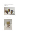
- Identity is extremely valuable but can be a broad category; and it never comes in a box but also with labels, addresses, materials, care, shapes, and sizes. Graphic design is everywhere and I believe its purpose is to create an identity and message but not all messages are for the greater good. Packaging in common food and other products includes labels of misleading or false information. The rules that enforce these labels and most of the time it’s pointless to label on. Words like “Natural” make some foods sound better than what the label implies. People are tricked into buying expensive products with the promise of a better product. I have created a satire based store around this idea expecting people to connect this experience to their own experience. The corner store I’ve created to attract people to view eye-catching products from afar, while holding the extreme absurdness up close. Bodegas usually provide cheap and everyday products in a tight compact space, I have recreated the look and feeling, with more expensive products. I want the viewer to pick up and look at the many products and realize how absurd it is and put it back and repeat. My artistic influences came from Kati Forner because of the product designs she has made with minimalism and clear hierarchy that pairs very well with her color choices. I am also inspired by Omega Mart because of the variety of odd products that would seem normal but out of place as a real product. I combine the styles of Kati Forner and Omega Mart to fit the show message with my experience on misleading products.
-
Seven Recipes to Save Yourself
Megan Bachman
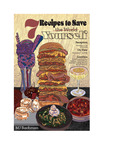
Food is an undeniable constant. Food can be a declaration of love, gratitude, or wealth. It can be a reflection of individuals, as well as communities. The relationship between a person (or character) and food can speak volumes to the audience about who they are and how they interact with the artist's world. I am inspired by the works of Domee Shi (Director behind Bao and Turning Red) and Hayao Miyazaki (Director behind Studio Ghibli). They use food to further their narrative, and do so with enticing colors, textures, and sounds. That is why I chose to create posters and animations depicting food illustrations and their recipes. These foods not only appear on the wall, but in the original short story, as well, presented as chapter dividers. The recipes are not only essential to the narrative of the story, but they are also stand-alone artworks.
Similar to Hayao Miyazaki, I also find beauty in making the animated experience sound beautiful. As well as writing, illustrating, and animating the foods, I also supply the flute music played in the background of the animations. To create the artworks, I begun with a recipe and sketches in Illustrator. During this phase, I focus on the composition and texture of the food. The recipes that I've selected for each of the foods each stem from a color I assigned to them before beginning work. When researching the seven deadly sins, I found colors that were most commonly associated with those sins and used those as a jumping-off point for my color exploration. I found myself using the movies these artists directed for inspiration of the textures and aesthetics behind the illustrative styles I present in the posters and animation. The scale of the posters is used to further the 'larger-than-life' quality of the recipes.
In my animation, I use the opportunity to redraw doos in multiple angles to define my artistic style. I use dynamic lineart and interesting textures to relate back to the style used in the illustrated posters.
When a chef (Ryan) and photographer (Landon) are thrust into the middle of the supernatural apocalypse, it is up to the two of them to work together not only to stop the end of the world but also to figure out which ingredients they will need to do so. Indulge in the delicious world of the seven deadly sins, the supernatural, and food with seven delicious posters, animation, and a short story sure to leave you sinning for more.
MJ Bachman
-
Corporeal Forms
Ella Curran
The human body is the only tangible thing that connects us to the earth. So much is contained within it, at the same time so much happens around it - including ongoing attempts to politicize and regulate bodies in our contemporary climate. We are bound by forces outside of ourselves. Whether the limitation is self-inflicted, relational, or societal, it asks for reflection. My practice is a response to these forces, an assertion of my physical self onto materials that become a record of my presence. Through the labor and performance involved in creating this work, I perceive myself. It gives me permission to be in the liminal spaces of growth and to explore my place within them.
This series embodies the evolution of self. Lived experiences, life cycles, and the properties of natural materials are the starting points. The sculptures reckon with the absence of the body. Whether pressed, contained, or recreated, each work is done to human scale. The inclusion of video allows creation and interaction to exist alongside the object. The works act as artifacts documenting moments through these cycles from confinement to the remains left behind from emergence/death. I offer up my vulnerability, frustration, and joy, making space for the shared experience of facing these cycles in the hope that we will not be still.
Exploration of the limitations of the materials is essential to my process. I begin with the creation of a structure or framework; a rigid boundary to contain the fluid work. This could be the camera view, wood, steel, or hardened forms of ceramic, concrete, or plaster. These become analogs for the physical body. There is an opposition between the high level of attention to the container in comparison to the raw quality of the materials that fill the frame. The fluid elements include water, sand, earth, polyfill, wax, and light. To these there are minimal adjustments or interventions. The material speaks for itself. The manipulation of light, transparency, and visibility is used to conceptualize how our understanding of the world is constantly changing.
Surrendering to the material's inherent properties pushes the work conceptually from a purely physical awareness of the body to a spiritual one. The relationship between the concrete and changeable echoes the need to engage and adapt as we try to know ourselves and our world. This mode of creating with materials allows the work to exist in a perpetual state of the in-between: the liminal state of the rigid, physical world/pressures and the fluid, abstract realm. We will gain the courage to be active participants in aligning with ourselves inwardly and our interconnected world externally.
-

Scavenging For Narrative
Jesus Gallegos Moreno
rowing up in a “rancho” (small farming village) in Durango, Mexico, I only learned one way to “live”: to move forward relentlessly, no matter how many barriers slow you down along the way. Some of the people in the village were stuck at a standstill in their life, with no clear ambition or trajectory on the horizon. With increasing stagnation surrounding me, the world I saw outside of that small village was so incredibly big and vibrant, with so many experiences just waiting to be lived.
I strive to show my way of life as a scavenger, using everything that has ever been around me, even the otherwise discarded experiences, to propel me and my work forward. All of my work displays a passion for narrative that has continuously pushed me toward Cinema and filmmaking as an art form. The thematic elements in Vulture Pictures also acknowledges and exhibits my diversity and experiences as a first-generation Mexican immigrant. The layout and placement of this display attempts to enclose you within the world of Cinema inside the gallery space—to facilitate an immersive visual experience.
In Latin America, the things that you cherish the most are often inexpensive and ephemeral, but the wonderfully bright colors of these items is what gives them life. Using the traditional Hollywood movie poster style as a framing device, I strive to use color in a similar way to the items that might be found in a “puesto” (street vendor booth) to elevate my small-budget posters into something more memorable and meaningful than those of cinema’s new blockbusters. Vulture Pictures is the culmination of every skill and experience that I have had in my life, whether Typography, Photo Manipulation, Cinematography, Photography, Illustration, or Branding. I hope that through having my viewers question their knowledge of the foreign world by sincerely presenting rural Mexico I can aid in connecting them to another culture; Is your world anything like mine?
Inspired by Rik Bracho’s use of a wide range of typography and unconventional pairing of Type, my static media explores the duality of feeling Mexican but being more American. Yolanda M. Lopez’s use of classic, culturally rich imagery found in Mexico inspired the approach I took to my subject matter. The dynamic media was primarily inspired by Adam Grabowski’s experimental techniques in motion graphics. I tried to subtly address important contemporary narratives affecting Mexicans, such as “Illegals,” some microaggressions, and ALMO’s “Hugs not Bullets” policy.
While creating this exhibition I was able to explore my past, and the current situations affecting Mexicans and Chicanos alike. I am proud of the unorthodox combination of media I have explored, and the narratives that I am providing a platform for. My work tells a story—my story: my experiences, my viewpoints, my emotions—all to show you how I have viewed the world by way of original photography from my rancho. Through showcasing my perspective to broaden your cultural viewpoints, I want to spark your interest in the differences that culture can inform your interpretation of the world around you; The world right in front of you.
Printing is not supported at the primary Gallery Thumbnail page. Please first navigate to a specific Image before printing.

