

-

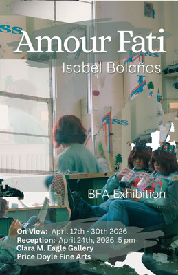
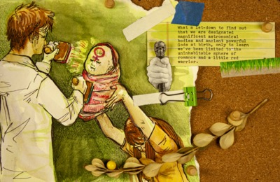
Amour Fati
Isabel Bolanos
conversations often leave me feeling stuck and misunderstood, as I grapple with a heaviness I can’t articulate. As a child, life felt vibrant, but now I find myself haunted by fragmented memories and a complex emotional landscape. This struggle drives my passion for creating art, particularly photography combined with mixed media elements. Through my work, I attempt to express the intense emotions I often can’t verbalize, using various techniques and materials to evoke feelings. Being Bipolar makes it challenging to articulate feelings of sadness or anger. By using different filters I can convey sensitivity, evoke memories, and convey time. I enhance my photographs by integrating other media, such as transferring images onto fabric or wood, or using them as parts of a larger assemblage.
My artistic process is deeply hands-on. The labor involved is a source of pleasure for me, providing an escape and a chance to immerse myself in process. Since I struggle to remain still, the ability to move around and interact with my materials is vital. Working with cyanotypes is most satisfying, where I can engage in mixing chemicals, coating paper, and soaking fabric. My approach is evolutionary; beginning with a single idea that gradually transforms through various iterations until I feel it’s complete.
I admire the sculpture of Petah Coyne. She combines wax, artificial flowers, and taxidermy to create stunning, eerie installations that express tension between vulnerability and aggression. Her use of taxidermy makes me uncomfortable, but that's somehow calming to me. Anne Risum is a Danish painter and alternative photographer whose work creates fictional landscapes, like dreams or memories half remembered. She crafts cyanotypes by layering negatives and experimenting with ink, toning, and fire, giving her work a haunting beauty and sense of nostalgia. I have also drawn inspiration from David Hockney, Lori Vrba, Bicheng Liang, Yixuan Shao, Natali Bravo-Barbee, and Marianne Laes. Each of these artists have influenced the way I form my work and has provided me with ideas to explore and incorporate into my processes.
Beauty is formed in different ways; sometimes it can simply be the opening sentence to draw people in. I struggle so much to have a conversation, but through my work, I can create one. I want others to be able to have a conversation with themselves as they view my work.
-

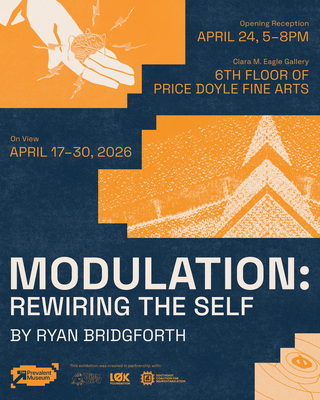
MODULATION: Rewiring the Self
Ryan Bridgforth
Inspired by the design philosophies of Dunne & Raby, Bruce Tharp, and SpeculativeEdu, my work bridges research, future thinking, and creativity through a process known as speculative design. Partially inspired by my own experience with chronic illness, as well as interest in human technology interaction through writers like Charlie Brooker, my recent work focuses on telling the story of neuromodulation. This technology uses stimulation to alter nerve activity, typically to fight drug-resistent pain and chronic conditions. Product design, advertisements, and other future objects are used to envision a world where this technology is as prevalent as smart phones.
Though the use cases have been extrapolated, neuromodulation could allow us to control our emotions and states of being in the future, bringing up new debates about the ethics of human inhibition, enhancement, and our reliance on technology. Presenting this possible future through my work forces viewers to be confronted with new values and considerations. For instance, the posters REHABILITATION, NOT MANIPULATION and Give Second Chances, Safely present a debate in which the government has proposed a law in which incarcerated individuals could receive neuromodulation treatment in exchange for reduced sentences.
The creative process behind these pieces is heavily inspired by the work of design-based research studio Extrapolation Factory, who scan for signals of possible futures and imagine them through design and happenings. I work in many mediums: graphic design, digital fabrication, sculpture, video, whichever communicates the topic best. Focusing on creating bold, contrasting designs that catch the eye, I mold imagery and typography into rhythmic compositions. Creating shared connections between my pieces through common imagery, as well as subtle details that imply bigger concepts, I reward close inspection. Ultimately, my goal is to consider what we are made of: not by providing all the answers, but by asking questions and bringing new debates to the table, sparking conversations to help navigate our future.
-

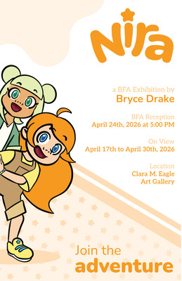
Nira
Bryce R. Drake
Imagination is a powerful tool that allows us to turn our mundane reality into something new and exciting. My graphic novel, Nira, tells the story of two young girls who use the power of their imaginations to turn their everyday lives into extraordinary adventures. With their minds alone, they create exciting scenes in which they befriend bugs, explore mazes, and rescue a cat from the depths of the school basement. Using rounded shapes, bright colors, playful proportions, and dynamic compositions, I create a world in which viewers can be creative. Nira considers that imagination is available to everyone, no matter their age.
My work showcases sequential illustration, typography, and branding working in tandem. By working digitally, I create works with bright colors and larger-than-life characters. I begin by sketching on a tablet, building works with varied line weights and textures. Like Kiana Khansmith and Dana Terrance, I build characters using simple shapes and playful proportions. The characters have round heads and eyes along with straight rectangular limbs. Distorting these simple shapes throughout the novel allows me to create a variety of expressions that make the characters feel larger than life. The characters invite viewers to feel emotions alongside them, drawing readers into the world of Nira.
In the digital space, I create round, playful typography that interacts with my illustrations. I emulate children’s book artists like Devin Elle Kurtz, who integrate their typography within their stories. I seek to push my type further, letting it play with the movements of the characters. I use different typefaces and colors to give the words impact and give the characters voice. Pages 4 and 5 of Chapter 2: Mr. Spider show typography mingling with illustration to complete the storytelling. Unlike a children’s book, however, this graphic novel tells significantly more of its story through imagery and dialogue. All of the typography is dialogue from the characters, positioned so that the speaker is clear without the traditional speech bubbles graphic novels use. The scenes are in fast-paced, dynamic frames that lead the viewer’s eyes from page to page on an adventure.
By being playful with color and shape, I encourage viewers to expand their imaginations and dream bigger about their world. I invite visitors to step into the world of Nira, where you can learn that your inner child doesn’t disappear once you are an adult. Imagination is for everyone.
-

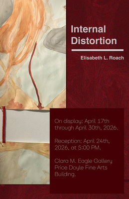
Internal Distortion by Elisabeth L. Roach
Elisabeth L. Roach and Elisabeth Roach
I want to make people uncomfortable with my art. I use drawing, photography, and 4D elements to create gross, distorted, and unsettling pieces that stir conflicting feelings within the viewer. Inspired by Maria Lassnig's abstracted self-portraits, I distort my own image to convey my physical and emotional anguish. Using myself as the subject of the work allows me to express pains and lived experiences directly.
While most of my work is figurative, I prioritize texture, color, and contrast over form. The resulting works are painterly and dramatic like those of Francisco Goya. They reveal the process of their making and embrace the beauty of imperfection by incorporating flaws like sketch lines, warped paper, and blurry photos. Adding audio to the gory imagery heightens discomfort. In my piece Anguish, the sound of footsteps heighten the sense of dread and suspension in the piece.
Beauty and horror are not as opposite as many people believe, and horror art does not always equate to negative emotions. I take inspiration from movies like the original Evil Dead trilogy directed by Sam Raimi which focuses on the connections between fear and humanity. Horror art can be used as a tool for comfort and self-reflection. My use of body horror is inspired by artists like Mokumokuren whose masterful use of body horror expresses themes of human pain and connection.
-

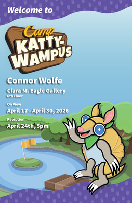
Camp Kattywampus
Connor A. Wolfe
Camp Kattywampus is home to many colorful characters, Roland the Armadillo, Timber the Beaver, Nico the Bat, Dash the Rabbit, & Anthony the Deer. Each character is built from a simple shape, an oval for Roland, peanut for Timber, rhombus for Nico, bean for Dash, and a kite for Anthony. These base shapes help visually show a difference between these characters, help make the game more appealing to a younger audience.
All of the characters in Camp Kattywampus are based on animals found across Kentucky, this was done as I wanted the game to feel close to home as someone who has lived in Kentucky for all their life. Each character has their own way they like to wear their bandana which helps show off their personality. Roland is standard practice with his, no wrinkles at all; Timber’s is ready to be warn as a mask at any moment; Nico wears it backwards to help in not get in the way while flying; Dash put his on as he was leaving the bunk in a hurry; and Anthony wears his more like a tie, showing his matureness. All their bandanas are the same green which ties them together as a team.
this was done to harken to the appalachian mountains
Each environment shown was designed to make you excited about what's beyond the scene, each scene has a distinct landmark but it's not made the sole focus of the scene which lets the layered nature of the environment shine through, almost like you stumbled onto the scene yourself while exploring, something is hiding deeper in the forest. helping to allude to the adventure elements of Camp Kattywampus.
The rolling pattern is used as a part of the branding of Camp Kattywampus. It contrasts against the cool greens and dark browns with its warm orange and its decorative element which helps show it as not part of the environment.
Character Designers such as Yoichi Kotabe who created the modern look of Super Mario and his friends, and Ari Gibson who was the lead artist on the Hollowknight games have had a huge impact on the characters of Camp Kattywampus in their minimal but potent design and their use of solid colors. The logo for Camp Kattywampus takes inspiration from ‘90s era logo with its use of 3D large display font and a colorful palette. The environments of Camp Kattywampus take inspiration from the minimalist backgrounds of the show Wild Kratts which take inspiration from Charley Harper’s geometric illustrations.
-

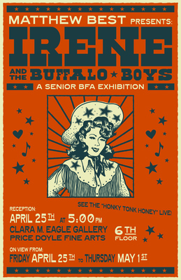
Irene and the Buffalo Boys
Matthew C. Best
As a creative, music and visual art are constantly intertwining for me. Music is something that has consistently influenced my work, whether it be with evocative imagery, a certain subject, or a narrative. Additionally, themes such as nature, nostalgia, observations on life, and the human experience lay the foundational groundwork for the art I make. Hailing from my upbringing in rural Tennessee, I spent much of my childhood listening to the historic music of Dolly Parton, Porter Wagoner, Loretta Lynn, and Willie Nelson, among others, who’s music often touched upon these very themes. The vivid storytelling of country music; songs about rural life, love, loss, and a reverence for the land, are concepts that are all incredibly moving to me as an artist. Irene and the Buffalo Boys is a love letter to these many wells I draw influence from. This body of work centers around my own fictional, vintage-inspired, country-western swing band, with gig posters, merchandising, and various branded pieces serving as a thematic backbone for what this hypothetical honky tonk group could be. Though my band is purely fictional, my goal for the viewer is to be mentally wisped away to a lively dance hall, hearing the strum of a six string, the bluesy whine of a pedal steel, the echoes of boots on a dirty, hardwood floor, and seeing the glow of a plethora of neon signs above their head.
Poster design is a fascinating relationship between imagery and typography. The puzzle-piecing game of visual hierarchy, usage of illustration, and the push and pull of information to create a functional piece of advertising is an exciting form of problem solving. In my poster for the band’s hypothetical Montana show, a whimsical, illustrated crescent moon follows the curve of the band’s logotype, leading the viewer’s eye through the entirety of the composition. I also wanted to incorporate a motif of natural imagery throughout many of my pieces, such as my Arizona poster, in which the composition is centered around a southwestern landscape, framed by a single saguaro cactus in front. Stippling is utilized as a form of mark making throughout the majority of my pieces, with multitudes of small, hand-placed dots adding value and texture to my illustrations, as well as creating a more vintage look.
There are many influences that inspire me in my artistic processes, and I’m always finding more to be enamored with. The bold poster compositions of Nashville’s historic Hatch Show Print showcases vintage, hand-cut type and imagery, creating eye-catching designs for countless events and artists to this day, with many, like Johnny Cash’s and Patsy Cline’s, remaining iconic for decades. Designer and illustrator Taylor Rushing pulls inspiration from American folk and psychedelic art to create stylistic, hand drawn visuals for his musical clients, whether it be a poster advertising Willie Nelson’s 89th birthday party, or a lush, floral album cover for Sierra Ferrell. A strong sense of composition, imagery, and typography, as well as an appreciation for vintage reference, are all aspects I draw from these influences as I navigate my own unique work in the colorful and illustrative identity of Irene and the Buffalo Boys.
-

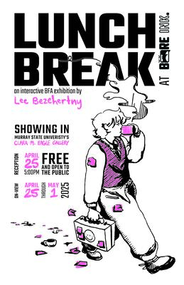
Lunch Break at BORE INK.
Lee Bezehertny
It's been my experience that when transitioning into adulthood, we are conditioned to desaturate ourselves to become more easily digestible for the sake of being taken seriously in corporate settings. My illustrative design work and printmaking in my BFA exhibition focus on the exploration of identity through maturity and how the societal expectations associated with age impact the ways we limit self expression and playfulness as we grow. The exhibition, titled "Lunch Break at BORE INK.," is set in the break room of my fictional office supply company, BORE INK.
I utilize illustrative storytelling, dynamic typography, and the hand-printed production of my designs to create controlled imperfections. relatability, and community with the audience through texture, line, and color. Felicia Chiao, a graphic designer and illustrator, and painter Tyler Shelton have heavily influenced my use of texture and color in my illustrative design style. The hand layered building of color in my screen prints allows for greater visual and emotional depth to the viewer.
A great example of my work that communicates how I utilize such elements is "I Can't Fucking Stand White Walls", a 30x22" screen print that depicts a white hallway with several versions of the same figure drawing in crayon on the walls and floor. The piece is composed of contrasting photographic and flat, illustrative components. The minimal, realistic walls and the loose, colorful, texture line visually communicates both my resistance to the seriousness of adulthood and the incongruence occuring between myself and the work environment I'm surrounded by.
The vending machine of BORE INK.'s break room, branded for my secondary company, Gimme Goods, was inspired by the collaborative automated galleries orchestrated by Steph Krim of Good Things Vending in Chicago, Illinois. The Gimme Goods machine, in all of its silliness, exists to provide an interactive, immersive, and playful experience for gallery guests amidst the white, neutral gallery space the break room exists within.
My BFA exhibition aims to provide an opportunity in a corporate space for others to express their inner whimsy, connect with each other, and embrace that everyone is living their lives for the first time, which allows us to find comfort in the experiences we share as we grow. In the break room I've create for you in "Lunch Break", you stick out like a sore thumb-
but isn't there something beautiful about everyone feeling that way together?
-

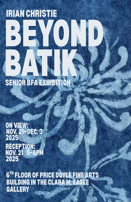
Beyond Batik
Irian S. Christie
I create batik works to tell stories about family, culture, and identity shaped by experiences. As an Asian American artist born in the United States, with roots in the American South and Indonesian, I use batik portraiture to explore how my two cultures meet and shape my identity. Batik began in Indonesia and is often defined by repeating patterns and motifs. My work extends the tradition into portraiture to explore identity and belonging. I use batik to portray people, to reflect relationships, and to hold space for what feels sacred, especially in a world that often asks us to separate or simplify who we are.
My process begins with traditional methods using wax-resist techniques with beeswax, natural dyes, and cotton. I build on those core methods by layering imagery, shifting color, and moving the work toward portraiture. I often use flowers to represent people. Each motif is chosen with care, tied to a trait, a moment, or a memory. These details become a way to preserve stories visually, connecting the people in my life to my cultural practices. Through this, I try to hold on to what matters: the people, the experiences, and the parts of myself they’ve shaped.
This work is not just about technique. It is about making the person feel present to the viewer. It speaks to identity and asks questions about belonging. As someone raised in a mixed household, I’ve always lived between cultures. I’ve seen how people try to define “American” through their perspectives, and how racism, xenophobia, and fear of difference continue to shape that definition. But my life is evidence of something more honest: that America is built from many cultures, many families, many stories. Making this work helps me feel like I belong in that story, too.
Artists like Bisa Butler influence me through her use of textiles to capture identity and memory with emotional depth. Yinka Shonibare’s reimagining of history through fabric and symbolism speaks to my own blending of cultural traditions in a contemporary American context. Sri Irodikromo’s use of batik in portraiture reminds me that this medium is not only traditional but that it is expressive, and capable of carrying deeply personal narratives.
Research plays an essential role in my practice. I study batik not only as a technique but as a cultural language, asking how resistance (both physically through wax and conceptually through expression) can carry meaning. I reflect on removal, repetition, and layering as ways to understand how identity is formed and revealed, not only as materials. Each mark carries weight.
Teaching and sharing are also part of my process. I want my work to open conversations not just about beauty or craft, but the deeper ties between history, cultural traditions, and human connection. I want viewers to understand that batik is not frozen in the past but that it’s alive. It can hold emotion. It can speak. In every piece, I try to preserve what matters, honor what shaped me, and make a space for stories like mine.
-

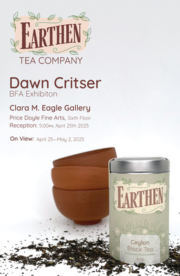
Earthen Tea Company
Dawn M. Critser
To many, tea is more than just a drink; it is a meditative ritual. Earthen Tea Company honors this tradition while blending graphic design with the rhythm of ceramics. Through design and ceramics, the fictional company combines rhythm, form, and tradition through earthy tones and natural materials. The company balances digital and tactile art with traditional and modern aesthetics, inviting viewers to pause and find balance in the everyday.
When creating ceramic forms, consideration is given to how the object will be held and used. Traditionally, chawans embrace Wabi-sabi aesthetics, while everyday tea bowls prioritize comfort and function. Carving organic forms onto thrown vessels allows for an exploration of elements that utilize texture and repetition. The tactile patterns were designed to be explored easily through touch. This process inspired a search for a connection between ceramics and digital design, and a rhythm formed between digital and analog workflows. The carved shapes were replicated digitally and incorporated into the company's logo and product design. The patterns and shapes utilize contrast, variations in line, and textures to create natural and organic designs. Through graphic design, organic motifs are combined with modern typography and Yixing clay color to form a natural yet modern aesthetic. The modern sans serif typography complements the treatment of line in the logos and patterns. Where tea bowls allow for physical interaction with the ritual of tea drinking, the design of Earthen Tea Company creates a calming atmosphere that connects the audience to nature through color and pattern.
I draw inspiration from Farm Design’s typography and structured lines. I aim to replicate the same sense of familiarity through typography and design elements. Much like Butterfly Cannon, a London design firm, I infuse bursts of pattern into my designs while considering the environmental impact. Chinese Yixing potter Qu Yingshao influenced the designs through his carvings derived from his own paintings. I often use the object’s shape to guide the pattern, similar to Qu Yingshao’s decision to connect the teapot lid to the body through the carved pattern.
-

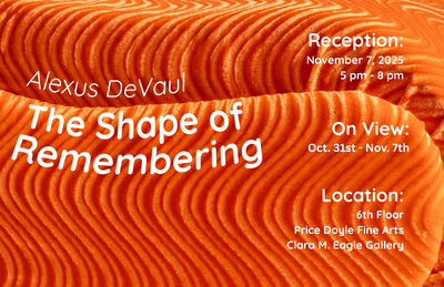
The Shape of Remembering
Alexus DeVaul
My artwork explores memory, comfort, and the ways we carry the presence of those we love. My grandma, in particular, has been a constant source of inspiration and warmth. She has been a consistent but unconscious presence in my art, specifically through the materials used and memories that unfold within them. One memory that always comes back to me is summer afternoons in the living room, shelling beans while we talked and watched TV. The way our hands moved, the easy conversation between us, and the comfort of that small moment have stayed with me. The bean shape reappears in my work as a symbol of connections, nourishment, and memory. Alongside these tender memories, I draw from the imaginative side of my childhood through my monster creations, which I began making to escape the tension that filled my home. They became companions in moments when I felt overwhelmed, and I often sought comfort in my grandma’s home, where creativity and calmness replaced the noise. The way the sculptures are made is to transform memories into forms, shaping something soft, approachable, and familiar that carries emotional weight.
I work with sculpture, wood, and textiles to give these memories a shape. Artists who inspire me include Michelle Holzapfel, who carves domestic objects from wood, embedding them with layers of personal and cultural memory. Textiles bring something different to the works. The fabric has life within its folds, its stitches and softness reminding me of comfort and care. Artists such as Louise Bourgeois and Do Ho Suh use fabric to capture memory and embody personal history within the fabric. As I assemble sculptures, wood, and textiles, I want to make a space where people can connect with their own memories.
When I began my art degree, my grandma started giving me materials she had collected or made by hand. She passes along materials that others might overlook, fabric, rolls of paper, and little odds and ends she held onto over the years. These materials carry more than their physical presence; they hold quiet acts of care and time. They hold a weight of small, intimate moments that often go unnoticed but leave a lasting mark.
The beans return again and again in this show as reminders of those afternoons with my grandma. They might look ordinary, but for me, they carry closeness and quiet work that builds memories over time. My monster artworks appear as extensions of my childhood imagination, creatures I once created for comfort, protection, and escape. In this exhibition, they exist beside the bean forms, forming tenderness and strength, and reality and imagination. All of this work comes from the same impulse to find comfort and connection in making.
-

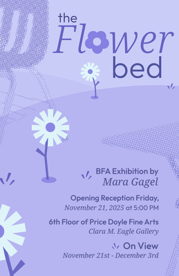
The Flower Bed
Mara Gagel
After the initial loss settles, and grief takes root, it transforms into something else: negative space. It becomes the absence of something that was once so constant in your everyday life that, suddenly, something as simple as a vacant desk chair reminds you of what’s missing. In turn, grief can also bloom, and transform into a sense of community that you may not have had when the loss was first planted. The Flower Bed is a branded communal garden space that focuses on suicide awareness and prevention, but also acts as a representation of everything I wish I could have said or done differently.
This body of work is a showcase of my cross-disciplinary practice including design work that is both analog and digitally fabricated. Alongside screen-printed posters, packaging and informational design, the installation of the flower bed acts as the bridge between these components. Flowers are used as symbols for what blossoms from loss. Specific flowers were chosen–ones that rebloom each year and others that don’t—in order to represent grief’s non-linear nature. The flower bed draws inspiration from installation muralist Alice Lee. Specifically how she arranges two-dimensional pieces in an interactive and three dimensional way. Her installations are soft and rounded with a peaceful rhythm. By treating my own installation in the same manner, difficult topics, such as suicide and grief, become more comfortable to digest.
Branding plays a crucial role in awareness. For example, adding the suicide hotline to the bottom of the posters informs the personal imagery and handwritten phrases, subtly communicating a complex and often overlooked conversation about the nuances of loosing someone to suicide. The Flower Bed’s branding focuses on authenticity through the use of soft, monochromatic color palettes, engaging typography, and geometric illustrations that emphasize negative space. I take inspiration from designers such as Wyatt Grant, who focuses on the impact that simple shapes can have on a composition, for my seed packaging designs in particular. Ultimately, The Flower Bed is a space for community to bloom from the reality of grief and to let the viewer know– you are not alone.
-

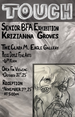
TOUCH
Krizianna Groves
My artwork consists of large self portrait drawings. They are about my experience with getting raped and sexually assaulted. The drawings being such a large scale is a way that I can force the audience to be confronted with what I want to say. Like Yoko Ono’s Cut Piece, I give the audience tools to do what they want with my drawing. By placing the same materials in their hands, I force the audience into embodying my abuser, whether they want it or not. In reality I’m objectifying myself through my drawings and letting the viewer assault me.
Charcoal is a very messy medium to work with. It gets all over your hands, in your nose, and just washing it off with soap and water doesn’t completely remove it. Which relates to how assault can be; how you constantly feel it under the clean skin. Chalk pastels are my way of grabbing the audience's attention. Warmer tones attract the eye and are often associated with flesh. They are also connected with urgency, like a stop sign or an alarm, hence why I primarily use red and yellow. The problem with chalk pastels is that you can’t erase it since the paper gets stained. If the audience uses a lot of color then it gets harder to remove or cover up. Ink is applied carefully to certain parts of the drawing so that way I can keep that area untouched from the audience. In a way it’s like the parts of myself that will always remain no matter what happens. Although if the audience applies ink to the work, then that impact can’t be undone.
Jenny Saville, Maria Lassnig, and Yoko Ono are the biggest inspirations with my artwork. Jenny Saville creates larger than life self-portraiture drawings where she layers multiples of herself on top one another causing a distortion effect; working primarily in charcoal. Maria Lassnig made works about the awareness of her own body over time, constantly changing based on her emotions. Yoko Ono, Cut Piece, is a big inspiration for having the audience be participants with the making of my drawing. These artists have helped me figure out my style and ways to attack the figure, more significantly self portraiture. They have influenced the way I depict my pain, distortion of my own body, and the viewers playing the part of ruining me.
-

Blush Records
Laurel O. Guess
Some of my earliest experiences with music had nothing to do with sound. Before I even understood the concept of musical artists and bands, I would go through my parent’s cases of CD’s and pick out my favorites based solely on the cover art. The cover often shaped my expectations long before I pressed play. The relationship between sight and sound, and the ability of design to suggest a whole world in a single frame, stayed with me.
Blush Records is a fictional record label created as a way to explore how music culture shapes visual identity. This project looks at the emotional worlds that surround band imagery and album design, and how a graphic language can suggest a sound even when the music does not exist. I approached the label as a full ecosystem, building out its roster and imagining the specific tone of each artist through visual decisions in typography, color, and illustration. The three bands developed for the record label represent different imagined subcultures. Glum leans into grunge inspired textures and heavier forms, while Second Rodeo and girls with bangs both take on a playful more feminine tone. But each identity belongs to the larger world of the label through shared sensibilities in composition and tone. This allowed me to test how broad a visual ecosystem can become while still feeling unified.
My understanding of restraint and conceptual precision is influenced by the work of Peter Saville. His album covers for New Order, such as on Power, Corruption & Lies or Blue Monday, show how a designer can use unexpected references and minimal information to create strong emotional associations. My process for designing is also influenced by poster designer Jay Ryan and his hand drawn gig posters. I appreciate and incorporate analogue methods such as scanners and distressed surfaces, and improvised layering techniques that feel handmade and slightly unstable.This exhibition is ultimately
about the pleasure of inventing. It treats design as a tool for storytelling and imagines the kinds of bands and identities that might exist just outside the frame of reality.
-

Route 404
Sarina C. Hamilton
Through graphic design and printmaking, I create work that unifies and connects people through shared experiences. I have developed a fascination with the universal experience of death and how it connects us all. While each of us experiences it differently, we all share in it-eventually, we all die. This realization has inspired me to express this commonality in my work.
I wanted to challenge myself to create something more than just a brand or product; I aimed to convey a complex and layered idea-something greater than myself. I often reflect on the trivial aspects of my daily life, which leads me to question what truly matters. How much time do I spend scrolling through social media or working a 9-to-5 job? How often do I connect with others? It seems absurd that I invest so much time and energy in these superficial concerns instead of focusing on what truly matters.
"A line that often resonates with me is, "There is no gift shop at the end.” This got me thinking: what is there we’re?”
I am no philosopher, but I am human. I used my skills and experiences to create something that communicates these ideas to others, fostering connection and encouraging them to ask these questions. While my design work is primarily digital, I also employed screen printing techniques for certain aspects, such as the tote bags and apparel featured in the exhibition.
Learning these textile skills has enhanced my understanding of product design and visual communication. I wanted the products in my store to catch the viewer's attention, so I chose a complementary palette of orange and blue to create a sense of juxtaposition in the space.
Many artists inspire my work, but the most influential to me include Olly Moss, known for his colorful illustrations and typographic film posters, which inspired my use of bold and bright typography within my posters to guide the audience through the space; Alan Watts, a senior artist for Meow Wolf's OmegaMart and several of their exhibitions, has inspired product design and the selection of items I chose to feature such as several of the mugs in the exhibition-but what would you do with them? Can you even drink coffee in the afterlife? -; and designer April Grieman, recognized for her bold, textural, and geometric designs, which I emulated in my brand design.
Through my work, I aspire to communicate bigger, complex ideas that encourage viewers to question their encounters, using the skills I developed at Murray State University. Ultimately, I believe that art should catalyze meaningful discourse and introspection. By challenging perceptions and inviting deeper
engagement, I aim to create an experience that resonates on multiple levels, creating connection and understanding among diverse audiences.
Sarina Hamilton
-

Horse Sense
jordan harrell
Art is a language of connection—between people, animals, and the quiet spaces in between. At its core, this work explores emotional bonds, particularly those shared with horses, offering a visual expression of love, trust, and healing that words often cannot reach. Through oil painting, colored pencil, and mixed media, each piece invites the viewer into a moment of relationship—where grief softens, companionship deepens, and memory lingers.
Influence comes from artists like Peggy Judy, whose painterly style brings emotion forward through bold brushwork and tone. Her ability to convey depth beyond realism continues to shape this body of work. Inspiration also draws from the sensitivity of Georgia O’Keeffe’s forms and the emotional clarity found in Andrew Wyeth’s portraits—each reminding us of the beauty in stillness and the power of storytelling through simplicity. These voices guide an approach rooted in softness, vulnerability, and connection.
The painting You Came Back tells one of these stories. It captures the first meeting between two horses, Bailey and Izzy, following the loss of a longtime companion, Dusty. Their immediate bond—unspoken yet unmistakable—embodied a moment of return, a kind of emotional reunion that felt larger than life. Through this piece, a private story becomes shared, inviting viewers to reflect on their own moments of loss, hope, and new beginnings.
More than portraits or landscapes, each painting seeks to become a place—one where viewers recognize themselves, where animals become mirrors, and where love is felt without needing to be explained.
-

Beyond Remission
Moira C. Johnson
In my artistic practice, I delve into the intricate layers of childhood and medical trauma, navigating its impact on my present experiences and highlighting how the lasting effects, both physical and emotional, can be just as painful, isolating, and life-altering as the illness itself. My work merges design, branding, and personal experience by creating service posters, therapeutic products, a website, etc. for a counseling brand that supports people who have suffered from Leukemia or Lymphoma. I use colors that symbolize the illness suffered, balanced with calming tones, and bold shapes that serve as both accents and metaphors.
Graphic design has been my way of expressing emotions by offering a creative outlet. It provides a sense of organization that feels both curing and intentional, allowing me to channel emotions in a meaningful and functional way. Beyond personal expression, graphic design also serves as a powerful tool for conveying anger, sadness, and happiness while also functioning as a means of education. Through this body of work, I aim to raise awareness of the long-term effects of cancer, using design to translate these complex experiences into visuals that inform, engage, and resonate with others. By combining thoughtful composition, color, and typography, I hope to create a dialogue that highlights the lasting impact of the illness in a visually compelling way.
While I explore various mediums in my practice, digital art remains at the core of my work, whether through graphic design, illustration, or typography. The ability to build visual identities and communicate ideas through design is what drives my creative process. I’ve created a visual identity that includes large-format posters designed to promote key services in a clear and engaging way. Each poster features illustrations that visually communicate what the service offers, making the information both accessible and inviting. To further connect the design to the organization’s mission, I’ve incorporated droplet imagery, subtly referencing blood and, in turn, Leukemia, to add depth and symbolism to the work. I envision these posters displayed in patient waiting rooms or hallways, serving as both informative and reassuring visuals. Their goal is not just to advertise the organization’s services but to create a sense of support and accessibility for those who need it most.
As I continue my artistic path, I find inspiration in artists like Hannah Wilke, whose personal work reflects both her own experience with breast cancer and her mother’s battle with the same disease. Her ability to use art as a means of processing trauma has influenced my own approach, though I express it through a different medium. Like Wilke, I see art as both an emotional release and a way to spark conversation. I’m also drawn to the bold, directional typography of Saul Bass and the bold, san-serif work of Michael Bierut, both of which support how I integrate text and design to create work that is both expressive and communicative. Their approaches inspire me to consider how typography can shape meaning, guide the viewer, and reinforce the emotional impact of a piece. Looking ahead, I am especially drawn to brand design, where I can shape the visual identity of a project from the ground up. The challenge of crafting a cohesive brand and seeing it come to life is both exciting and deeply fulfilling, reinforcing my passion for design as a tool for storytelling and connection.
-

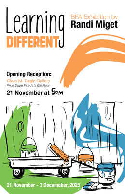
Learning Different
Randi N. Miget
The biggest way graphic design can have an impact is how it interacts with individuals. It is both a necessity and pleasure in society that has the power to give solutions to problems and makes those solutions accessible to everyone. Taking inspiration from my family’s own experience with my younger brother who is on the autism spectrum, I have seen the challenges that come with accessing good neurodivergent education and decided to address those challenges by bringing the solution to the very homes it affects. Learning Different is a variety of branding and product design projects for at-home learning aids that explore inclusive design principles and raise awareness of consistent education opportunities for children that are part of the neurodivergent and special needs community. These concepts are explored in multiple mediums combined with my design work including screenprinting, book binding, digital fabrication and product design.
In the book Mismatch: How Inclusion Shapes Design, Kat Holmes cites a statement that inclusive design is about focusing on the diversity of people’s interactions with a design rather than creating one thing that’s for everyone. My “Communication Cards” product was designed with the idea of individual interactions in mind rather than solely universal use. Tailored for individuals that struggle with verbal and literary communication, these interactive cards are designed with a combination of dyslexic friendly typography and simple, descriptive illustrations. The purpose of this product, and others, is to encourage interaction in multiple ways that are unique to each individual.
Visual aesthetics were also taken into consideration while looking at other artistic influences like Mick Champayne’s illustration style and Charles M. Schulz’s early work with the Peanuts. The Learning Different posters have evolved over time into their own style of typography and illustrations that are reminiscent of recurring branding elements seen in my other product designs. With consistent use of play between positive and negative space, the posters and other collateral designs share a consistency in interaction and usage of illustration, typography, and branded motifs. Graphic design has the power of creating impactful and exciting visuals that can stop someone in their tracks, but while you can design to create, it is also important to remember that you can create to inspire.
-

Virtual Visions
Emma Nelson
Virtual Visions
I have always believed art should be enjoyable for all audiences. Often when we watch a show or movie, the art and design that goes into producing them goes underlooked. Creativity doesn’t just live in a gallery, it exists in everyday life.
When I first became interested in creating art, I immediately focused on character design and conceptual work. Watching TV shows and movies as a child inspired me to start creating my own characters with backgrounds and personalities. This in turn helped me to create their visual elements through illustration. I studied Star Wars concept artist Ralph McQuarrie’s designs, and looked at everything from environmental design to weapon and prop blueprints. Whenever I played a video game, I couldn’t look away from the menu animations and opening screens. I want to express this same creativity by illustrating character designs and animating them through my fictional company, Virtual Visions, which creates and promotes digital avatars called Vtubers.
A Vtuber, or a virtual youtuber, is a 2D or 3D face tracked avatar that content creators use as a fictional online personality to represent themselves. Virtual Visions strives to recruit talents while providing them with high-quality character models, promote collaboration, and manage their online presence. I decided to draw and animate a fully rigged fox model, Huli, that visitors can try out themselves. Inspired by Japanese illustrator LAM’s vivid illustrations and unique Vtuber designs, I embraced a striking purple color palette with elements like ancient armor and a calm demeanor that visually represent his character.
Lastly, I included illustrations of two other character designs who are his companions. These two, a ghost and an alien, represent the other models that vtubers can use. Each character has their own splash and promotional art including a couple illustrations of them together. They also have their own merchandise including keychains, stickers, and trading cards.
In creating Virtual Visions, I hope to bridge the gap between illustration and innovation. Art and design is not stagnant; it is constantly evolving. This show is a testament to how art can embrace the new while maintaining tradition in a unique and fun way.
-

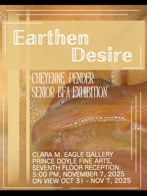
Earthen Desire
Cheyenne L. Pender
Artist Statement
Fruits have long been used as a metaphor for women’s bodies, reducing them to symbols of ripeness, sweetness, or fertility. Fruit is scientifically defined as “the fleshy or dry ripened ovary” of a plant. The fleshy, fruit-like forms I make explore the objectification of women’s bodies and the subjectivity of beauty and attractiveness. I study the shapes of fruit and women’s bodies, combining coil building with carving to create my work. I focus on “zooming in” on the figure to the point of ambiguity, forcing the audience to decipher what I am showing and why. I use clay for its flesh-like texture and its ability to be stretched or smoothed much like skin. I try to recreate surfaces you would see on a fruit-like form using a mixture of underglazes, stains and glazes to mimic the color and texture of the fruits, while also blending in the curves and crevices of the female body to emphasize the form of the artwork. Due to fruits and females both being living creatures it connects them not only in consumption but also in nourishment.
I experiment on how different body types in the same position differ, and model them onto the forms. Focusing majorly on voluminous figures such as stretching, bending, and fetal positions that model well onto the forms. This is inspired by Daniel Maidmen, an artist who focuses on drawing vivid, explicit female portraits; and Jessica Stoller whose desert ceramic works focus on the idealization of femininity and objectification. The closer one observes my works, the more human it seems, testing the moral consciousness of the audience.
Femininity is defined differently by people based on their beliefs in the contexts mentioned above. However, many of these are passed down beliefs, and it influenced me to encourage the audience to slow down, question what they are seeing, and reflect on the ways bodies are objectified, consumed, and judged by standards of beauty and ugliness. This process of being judged and compared to those around us is something that has happened throughout history, and many women including myself have gone through: The feeling of being the desirable fruit picked out of the others only to be used for the consumer's own wants and needs.
-

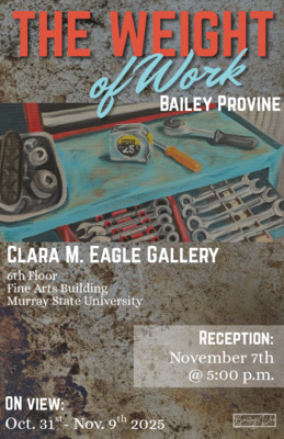
The Weight of Work
Bailey D. Provine
The United States foundation is built on laborers and the importance of sacrifice. My Dad and my Grandaddy provided for our family by working construction and building custom cars for many years. Their hard work provides a prosperous and fulfilling life, but it takes a toll on their bodies. My work explores the softer side of manual labor. Through watching and working beside them, I have learned the value of hard work. Through depictions of trade work in my paintings, I connect to the shared experience of living in the rural United States and cultivate an appreciation for these labors of love.
By painting and putting long hours of work into my paintings, I feel as though I am fully connecting to my work. All these paintings are photo-based and focus on naturalism, some of which I took myself and others are from years back. Like Honoré Sharrer’s, Tribute to the American Working People, my paintings elevate these contributions. I am inspired by her work and other artists that shed light on similar topics. I am also inspired by local artist, Jennifer Fairbanks and her use of naturalism and portrayal of still life's.
Through my application of the paint, I convey the feeling of ruggedness through texture. This can be seen on the top of the toolbox shelf and is related through the paintings that are on physical pieces of metal. I have spent many hours in the shop with my dad and him the same with his dad, and that is what makes this series so personal to me. These paintings commemorate moments spent with family, foundation of American people, and aspects of rural life.
-

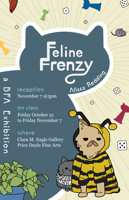
Feline Frenzy
Alissa N. Redding
Growing up, board games were the backbone of my childhood, it was a dry comfort during rainy days, and a refuge during frigid ice storms with nothing to keep out the chill but a roaring fireplace and warmer company to grip tight to. Feline Frenzy is a love letter to the days when it was just family and friends around a table, laughing and bickering in the way only people closest to us can.
Feline Frenzy is a completely new creative way to play, with a board that is customizable and cat-themed cards and pieces to get you to the most important end of all: the food bowl. From the lazy and chaos-loving cats, to the more toned-down and comfortable color palette in the form of fun colors, everything is structured to create a game that can be played again and again.
I chose to take two routes for the illustration of the game. The cards are the main focal point of play, they have bolder outlines and more unique colors, every card is a character of it’s own, the illustrations communicate that. The font of the cards create an oxymoronic sensibility, a serious face to a silly game. The illustrations of the cards are centered to become focal points. The board has no outlines at all save for the track so that the biggest focus could be seeing where players are going next. Additionally, the board is also irregularly shaped to pay homage to Tetris. This makes building the board an interactive step in getting the game ready to play. There may be a beginning and an end, but how you get there is completely up to you.
When I was drawing the illustrations for Feline Frenzy, I wanted the focus to stay on the fun of the game, and draw into a style that is meant to be interesting and familiar. I have a special love for games like Candy Land and Uno and I’ve chosen to translate that love of addictive simplicity into a completely new kind of game. Inspirations came from Dexter’s Laboratory and the illustrative works of Jean Jullien. Feline Frenzy is a brand-new game, but in style and design it feels familiar. The descriptions of each silly cat are pulled from my own love of cats, how I believe that they’re secretly wanting to take over the world like Todd, or playing the card of a perfect little angel like Donna, these cats each have their own personalities.
-

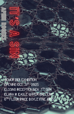
It's A Sin
Jamie Rogers
Sex is political. Counter-cultural responses to sexual propriety are often modeled as resistance to conservative values. Many subcultures have a long tradition of opposing mainstream norms, particularly regarding sexual and political correctness. While the association of pain with sexuality dates back to ancient rituals, such as those for the Goddess Inanna in 3000 B.C., the post-World War II era witnessed an exponential growth of sexual fetishism, particularly in BDSM. This period also saw the emergence of fetish materials like rubber, latex, and military or medical gear, with leather fetishism evolving into a distinct subculture. Leather and latex were employed to challenge the perceived innocence symbolized by cotton and lace.
Applying this context as a foundation for my exhibition, I have crafted both wearable and traditional sculptures that aim to explore societal perceptions of sexual agency within the framework of perceived sexual deviancy. Inspired by artists such as Nicole Moan, with her highly detailed corsetry, and Wolfe Von Lenkiewicz, with his dark, surreal paintings that confront traditional aesthetics, I aim for my pieces to be visually appealing yet quietly disturbing.
The central theme of my work is the tension between sexual liberation and conservative hypocrisy. I delve into the ways sexual agency is explored and, in some ways, exploited for political or religious gain. This is expressed through the juxtaposition of the conservative ideology of “keeping sweet”—a philosophy born from fundamentalist Latter-day Saints that has been co-opted by other evangelical circles to teach female subservience and the relinquishment of personal agency— and the comparatively sexually liberated “outside” society. The hard ceramics I create reflect the strong, yet balanced, power dynamics required for fully realized sexual agency.
I employ materials that evoke the foundations of kink: leather, latex, and velvet. Furthermore, I utilize colors like black, red, and gold to evoke ideas of femininity, sexuality, and personal power.
This emphasis has pushed me to creatively combine disparate textures and materials into cohesive pieces, while simultaneously stretching my technical skills in ceramics. Through this focus, I have pushed the boundaries of what is possible with clay, producing work intended to be visually appealing while provoking a personal conversation with the viewer’s own biases associated with sex and sexuality.
-

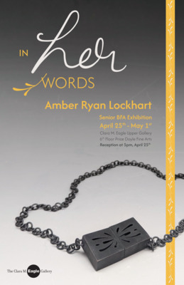
In Her Words
Amber Ryan
"Don't bite your nails - it's not ladylike." "You're too big to be in ballet class." "Hey, Thunder Thighs." The whispers I heard in classrooms at a convent girls' school, not only from students but also from my teachers, would eventually crush anybody. This was the same school all the women in my family attended for generations, and the judgment instilled came down through the family. It only got worse as the years went on. Trust should be an inherent part of family and friendship, but time and again, the trust I believed to have built up with my women friends was betrayed. I bought into the system. Even having moved schools and having gone to college, the same games were played, and the betrayal of trust continued. Instead of standing together, we pit ourselves against each other. We allow ourselves to put other women down in order to make ourselves feel better. I am not immune to this impulse, but I hope to examine its sources and effects on myself and others in this work.
This body of work considers the inherent sexism women hold, shown by how we treat the women around us. These are words many of us hear throughout our lives, and not from the men we expect to hear them from, but rather from the women who are meant to love, guide, and walk with us. Our friends, mothers, grandmothers, and, in my case, great-grandmothers. I have combined my great-grandmother, Eileen’s, handwriting, taken from high-resolution scans of her phone book, fine metal hollow-form construction, glass enamel, and digital fabrication to bring her words to life. Each work examines the path I have taken and how my choices have come to shape my life. It helps me better understand my place in this world and what I have come to know as my truth.
The work of Cynthia Myron uses constructed spaces to open a dialogue between viewers, revealing shared memories. While Myron’s work contemplates physically constructed spaces, mine talks about those we have created as a society - walls built that we need to work to bring down together. Lauren Selden’s metalwork, often an object set atop a hollow-form base, juxtaposes geometric shapes with organic castings and fabricated parts, creating balance. Like my own work, hers incorporates geometric patterns on surfaces and integrates shadow, adding a visual and conceptual layer. Her practice encompasses both the hand and technology to explore her memories, as does my own.
My artwork aims to push the limits of materiality with the help of technology, creating works that actively engage my audience. Soft floral motifs, rigid structure, and strong lines underpin much of my process, contrasting each other, almost mirroring the battle between my own internalized sexism and the feminist I hope to be. It is not fair that this system of inherent sexism failed me and many other women. I hope that we can find some sense of justice by unveiling some of the words that impacted me most, but made me the woman that I am today, and not a woman in her words.
-

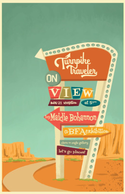
Turnpike Traveler
Maidie K. Siress
Road trips are the ultimate American family pastime. When researching ideas for my senior exhibition theme I discovered that Route 66’s centennial anniversary is in 2026! This felt like the perfect opportunity to make a celebration for the mother road of America. Turnpike Traveler is a travel agency brand celebrating Route 66. Not everyone wants to plan a week long vacation stop by stop - Turnpike Traveler takes care of the planning for you! Every poster is an advertisement of your stops along Route 66, along with a complimentary illustrated map of your travels. Turnpike Traveler’s mission is to breathe new life into the nearly forgotten highways, hidden gems, and timeless towns all across America.
These illustrations tend to render quickly, I love the look of looser mark making, I have developed a painterly look to my larger illustrations. I enjoy making designs that are beautifully functional. Illustration is always my favorite part of projects, and I get excited when a project calls for it. There are lots of things that influence my work. The biggest being nature. Color palettes, shapes, themes, and subjects are all tied to nature when I’m given the opportunity. I love the wild freedom of the American landscape, its diversity, and unwillingness to conform. Chris Turnham, is an illustrator for National Parks themed books, his work has captivated me since I discovered him. Before my graphic design career I was a history major, my interests in history have carried over into the design sphere. I love mid-century typography and color. Artists like Allison Cote incorporate mid-century design elements into their work. I have incorporated more mid-century elements and typography into my designs and illustrations. They also present a certain challenge of making new things look like older design and illustration. These two passions of mine have intertwined into my senior exhibition. Including the American landscape into a fun historical style has been a thrilling challenge.
-

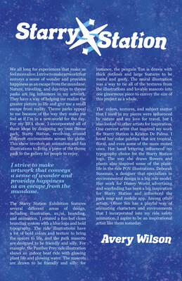
Starry Station
Avery Wilson
We all long for experiences that make us feel more alive. I strive to make artwork that conveys a sense of wonder and provides happiness as an escape from the mundane. Nature, traveling, and day-trips to theme parks are big influences in my artwork. They have a way of helping me realize the greater picture in life and give me a small escape from reality. Theme parks appeal to me because of the way they make me feel as if I’m in a new world for the day. For my BFA show, I incorporated all of these ideas by designing my own theme park, Starry Station, revolving around different environments across the globe. This show involves an animation and fun illustrations to bring a piece of the theme park to the gallery for people to enjoy.
The Starry Station Exhibition features several different areas of design, including illustration, ux/ui, branding, and animation. I created a fun but clean branding system with a blue logo and bold typography. The ride illustrations have a lot of bold colors and texture to bring the spaces to life, and the park mascots are designed to be friendly and silly. For example, the Panther Prey ride illustration shows an indoor boat ride with glowing plant life and glowing water. The mascots are drawn to be friendly and silly; for instance, the penguin Tux is drawn with thick outlines and large features to be round and goofy. The mural illustration was a way to tie all of the textures from the illustrations and lovable mascots into one ginormous piece to convey the size of this project as a whole.
The colors, textures, and subject matter that I used in my pieces were influenced by nature and my love for travel, but I also looked to other artists for inspiration. One current artist that inspired my work for Starry Station is Kristen De Palma. I loved her color palettes that are tropical, floral, and even some of the more muted ones. Her hand lettering influenced my typography choice for the Starry Station logo. The way she draws flowers and plants also inspired some of the plant-life in the ride POV illustrations. Deborah Sussman, a designer that specializes in environmental design is a big role model. Her work for Disney World advertising and wayfinding has been a big inspiration for Starry Station and influenced the park map and mobile app. Among other artists, Oliver Sin has a playful way of animating characters and environments that I incorporated into my ride safety animation. I aspire to be an inspirational artist like them someday.
Printing is not supported at the primary Gallery Thumbnail page. Please first navigate to a specific Image before printing.