

-

Between Fire
Ashley Schell
When looked at through the lense of morality, human beings are quite funny. We are constantly wedging ourselves between fires; something so much grander than ourselves. It’s something we are very good at. For example, an entomologist leads an expedition into the wild and discovers new species of insects that can be wiped out with the swipe of a farmers machete. Should the farmer wipe out the species, or should the farmer go hungry and let the insects live? In this situation we ask ourselves what the right thing to do is, but that’s the catch; the right thing doesn’t really exist. Humanity lives on a quick-moving spectrum in which either way you turn, you or somebody else gets burned. This thought prompted me to start an investigation into the fragility of our human ecological structures, more specifically the consumerist society that we’ve created and the ability for it to collapse at any time. To do this, I make reflections between man and nature, creating a balance between calm and chaos while navigating the ephemerality of modern society's ideals. I’ve constructed a visual dialogue with imagery such as tree logs, flames, shopping carts, targets, and vultures. As consumers, we feed off of information that is left behind and recycled with the possibility for it to build up and become too much to handle. This is why I use the symbology of one of my favorite consumers; the Vulture.
Drawing, screen print and ceramics are mediums that I use to explore this visual language. Bold and limited color bring attention to specific areas of my compositions that may have the potential to connect and go wrong, most especially in my drawings. The large scale drawings confront the viewer allowing them to reflect on themselves and their own place in the logpile that we call a world. In contrast, my screen prints utilize smaller dimensions and delicate hand drawn qualities to reinforce the essence of fragility in our society's constructs. My ceramic works use the imagery from both my prints and drawings giving them a chance to exist in a three-dimensional plane. Throughout each of these mediums, I am finding things that I can attach meaning to that help me to find order within the chaos.
I take inspiration from printmaker Erin Wohletz, for their compositions and ability to delicately render their subject matter. Nichole Rae Klein also inspires me with her oil paintings that represent tense and off situations. Confronting these tense or off situations is important because in this world where we consume so much, whether that be information or physical objects, we must find ways to cope and be prepared for the future. We have to question ourselves about the things that we consume and the things that we put out, and put our thoughts into how this will impact our lives and the times that have yet to come.
-

Unraveling Layers of Identity
Jay schroeder
I’m a firm believer that art is something that should be done with passion and honesty. Difficult topics should not be avoided, despite backlash or hate. Making art about important topics, as heavy as they can be at times, is incredibly rewarding. For me, art does not need a censor and I believe art with a message should be unapologetically honest, come from the heart, without doubt or hesitance. My photographs and videos explore themes of body and identity in an expressive and performative way. I explore how these themes interact with one another in a way that allows for viewer interpretation.
My photo series Canvas focuses on the connection between art and body. In this piece, my body becomes the canvas as thrown paint splattered against my back with little to no control over how it was done. This creates a series of ten images in which my body/back went from having no paint to being close to completely covered in it. I blur the line between subject and object to confront the portrayal of female bodies as objects rather than subjects. As a Queer artist with an androgenous body, I decided that I would become the object.
The photos Kiss me and Fly with me, are tongue in cheek ways of addressing suicidal ideologies. As one who has experienced such thoughts, I have found that sometimes the best way to cope with and address these parts of myself is through humor. These images visualize the mentality of suicidal ideation from my experience. Research shows that typically people don’t kill themselves because they want to die, but because it is the only way they can think of to escape from their current reality. Depression does not define a person. Rather, it is a part of them and their identity. This work uses humor to reframe social stigmas around suicide. I have no shame in my mental illness or my suicidal past. It is a part of me so why not talk about it?
I have been inspired by Kate Gilmore, a video artist who touches on themes such as feminism and inequality, especially in the art field. She works in a way that gives ode to abstract expressionists, most of which with recognition were or are men. Queer artists are still underrepresented, much like female artist are. Most My work is in conversation with queer artists who photograph queer bodies, such as, Zanele Muholi, Mickalene Thomas, and Robert Mapplethorpe, who advocate/advocated for the LGBTQIA+ community.
-

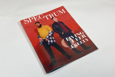
Suited
Twinkle Bhojwani
Jennifer Morla, a contemporary designer, once said, “asking questions generates more ideas.” I am an external processor, I tend to think out loud in order to generate innovative ideas. When I create work, I do not only think about solving the problem, I also think about influencing the visual world around me, because being a designer gives me power. Design helps others to see the world through my vibrant lens.
Suited is about the confidence, character, and style that comes with the decision to be bold in both attitude and appearance. I want women who see the magazine to be inspired and believe in the potential they have to encourage and lead those around them. Through the design for this brand, I want to evoke powerful positive emotions. I plan to suggest these emotions through sleek typography and bold photography. I pair both vibrant and subtle colors together to make it easier for the viewer to navigate through the magazine.
I use my designs to evoke an emotion by pushing ideas, manipulating line, experimenting with shapes and colors, and observing detail. My love for sleek serif fonts such as Didot aided to the design of the Suited font. I paired it with Barlow which is a condensed sans serif font that compliments the serif. I chose a colorful palette for the interior of the magazine to create hierarchy and aid the direction for the viewer.
My work is visually influenced by Herb Lubalin. He would manipulate type in such an
Illustrative and expressive way, that it would be both an image and typography. I like to express an idea with fonts rather than with imagery, and he is an advocate for this. I am most inspired by his design of the font “Avant Garde.” Zuzana Licko and her husband created Émigré magazine which is a magazine created by immigrants for immigrants. The magazine became known as a “revolutionary design publication.” The fonts made for this magazine were so popular that the magazine became a type foundry. She changed the contemporary design world around her, which to me is powerful.
-

Roby Joe Dreamboat
Roby Blackwell
Roby Joe Dream Boat is a perfect play date, Roby Joe Dream Boat is brunch with florals adorning the majority of the table. It is escape. Escapism finding the most beautiful parts of the past and curating a make believe world. Arriving where choices revert back to a surreal childlike viewpoint. Everything is more unapologetic and completely sure of itself. It’s dreaming—it’s dress up!
There is a sense of complication through maximalism that I find interesting. My generation is inspired by the endless influx of media; how Instagram profiles have turned into perfectly planned out color schemes, with set saturations and grain levels. I make work about millennials and Generation Z. Exploring how we portray ourselves on social media, and the fantasy of how we portray this curated life. Pulling vision from the mid/late 1990s, the early 2000’s, as well as the 1960’s. These were such vibrant times in pop culture and inspire this collection. Using contrasting color combinations that are reminiscent of these times elevates the wearable printed pieces to transform the viewer into another time or space. I have created a collection of clothing and accessories that I’ve sewn and produced. I use motifs that are recognizable, and playful and using flat shapes gives the imagery a graphic quality. Using my love for printmaking, I am now pushing the convention of its possibilities to use it in non-traditional ways. Silkscreen ink is printed on fabric and plexiglass to make wearable print pieces. These printed pieces animate the space making a cohesive collection that is wearable, 3 dimensional and interactive.
I create these wearable art pieces and put them on characters to exist in this world I’m sculpting out for my art to live in. Likewise, these icons become artifacts within the work. Where the line between child and adult are erased as well as make believe and reality. Take a breathe— smell the peonies and garden roses, hopscotch your way to the table, brunch is starting soon, and then followed by kite flying.
-

Black Mass
Courtney Bowman
The Black Mass is beginning soon. It is a safe space for women and queer folk alike. Joining the journey that is the Black Mass will take you on an adventure you never thought would become reality and will make you constantly question if it is so. The Black Mass is like rain on a sunny day. It is comfort — It is a sense of togetherness you never knew you needed.
Through multi-media I retell stories and ideas based in the occult while unapologetically situating them within the queer and female communities to which they have historically belonged. Letting subjects and themes take their own forms and characters within the coven that is in Black Mass is an important aspect. As more members joined the coven there was an exploration of power and where it lies. Does it belong to me as the artist? Or do I merely capture the conscious insecurities that have been placed away from society as my muses take on the roles given to them? Willingness to give in to something and someone is what makes up Black Mass, from both sides of the camera. These works of art are almost a love letter to myself, and to those who partake in the madness.
Within multimedia that I work in, there is always small reoccurring details. Whether it be the choice of colors, usually appearing in the pink range, or small kitschy/childlike decorum, my work consistently pays homage to the interests I thought long forgotten. I also find myself dabbling in the darker side of things, not straying from using death as an aesthetic. It is easy to overlook or ignore such a topic, but it is something that we all face, so why not force a viewer to come to terms with it in a sickly-sweet way. My main subjects include exclusively women as well for the continued hope to further expand the lesbian eye in the art world. Instinctively there is want to create work of my people for my people. I yearn for the safety in numbers and have a fetish for the finite. Everyone may not be able to join in the activities of the Black Mass currently, but it is a sight to see. It is beginning soon.
-

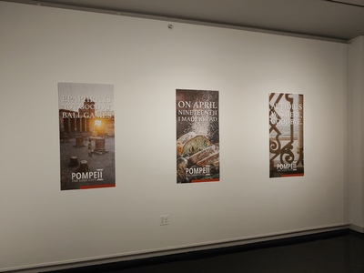
Legends Between the Lakes
Colton Colglazier
My work explores the ways in which the viewer might use technology to interact with the exhibit around them. The exhibition space consists of 5 travel posters united by a common theme and intended to pique the viewer's interest. Through the use of an accompanying mobile website, the audience may further interact and delve deeper into the meaning behind the posters. By utilizing technology in this supplementary manner I intend to add greater depth to the objects that exist in the physical world.
The subject matter of the exhibition is the forgotten remains and stories of the people who once inhabited the Land Between the Lakes. These stylistic depictions of abandoned structures and dilapidated buildings are intended to cultivate viewer intrigue. As the viewer is drawn in, the mobile interface will provide background information and supplementary interactions and photos. There is a distinct irony between the depiction of a world forgotten and the immortalization of that world through art and technology.
In a more abstract manner, the focus of my work is the simplification of the way a viewer digests information. I want to create a flow of information that is strictly organized by a hierarchy of relevance, making it easy to comprehend even if the finer details are not seen immediately.
Stylistic inspiration for my work is drawn largely from Herb Lubalin, Dan MacAdam and Kevin Mercier. Lubalin is a significant source of my typographic inspiration and hierarchical reference. MacAdam’s prints have been a great resource as I worked out how to display the architectural elements in the compositional space. The UX work Mercier produces, helped me to construct a UI that is easily navigable; furthermore he inspired the subtle use of transitions as the user courses through the supplementary material. I have taken inspiration from these artists and their work to try to incorporate my work in the physical and digital realm.
-

A Ceiling and Four Walls
Cara Crowley
When someone presents nothing about themselves to anyone other people rush in to fill the gaps in this person’s behavior. In my work I like to explore the tension between craving vulnerability and trying to hide yourself away. When I create an image, I try to think about what I can obscure and what I can reveal in the picture plane and how that impacts the meaning of the work. Layering imagery allows me to cover up and reveal different things in the composition, through this method, I can push certain things backwards and accentuate others by pulling them forward. I am drawn to high contrast and value because of its dual nature and as a reference to “black and white thinking”, which is prevalent in anxiety and stress.
When I look at other peoples’ work, I am most drawn to expressive line work and color in terms of their process. Artists like Ernst Kirchner, Rachel Whiteread, and Susan Lichtman interest me because of their use of highly saturated pigment and compositions that make the viewer feel unsettled. For me their works show how uncomfortable certain social interactions or spaces can become.
The subject matter of my work most often applies to my own life, but I use silhouetted figures and objects to create spaces, or situations that become universal. These spaces and figures become confusing and alarming with the addition of skewed perspective and unreadable details. The unavailability of the figure makes the viewer feel these people are unapproachable, anonymous, or dangerous in some way. By using shaped panels which speak in the language of theatre sets and I can create an environment in which the paintings interact more directly with each other and the viewer. This allows for a continuous narrative that can change depending on where things are in relation to one another.
-

Invisible
Talitha Cunningham
I have explored a number of ideas and media since starting my journey to become an art educator. One theme that I find myself returning to are issues related to mental illness. This interest derives from my own personal experience as well as those of people in my life who also deal with mental health problems. My exhibition, titled ‘Invisible’, seeks to illustrate the hidden aspects of mental illness.
I have chosen to use furniture as the main structures within my show because of the implication of human form, even in the absence of people. Furniture can be individualized and even act as a reflection of the owner. Each piece is a representation of a different mental illness and though they are not traditional furniture forms, they are still functional. They utilize color to highlight the individuality of the pieces as well as the people who deal with mental illnesses.
These works give the viewer insight into the daily struggles of someone who deals with mental illness. Creating a different experience with each piece that gives viewers insight into the impact mental illnesses can have. They are constructed in ways that make them interactive both visually and physically.
The differences between the two chairs in ‘Mirrored Opposites’, pulls you into different mindsets. While ‘Restricted’ makes you feel anxious when approached and frustrated as you interact with it, trying to reach the top. The use of contrasting colors and materials to form ‘Trigger’ brings the viewer into a state of unease and when interacted with you get consumed by the form. Each piece reinforces different emotions as the viewer interacts with them forming a better understanding of what it is like to deal with mental illnesses.
Throughout the process of researching for this exhibition, I have drawn inspiration from is Christian Sampson, a photographer who made a photo series depicting the invisible side-effects of mental illness. He also makes visible the normally unseen struggle of coping with mental health issues and how they consume their sufferers. I have also drawn inspiration from Cat Bates, a jewelry maker who hand-braids most of the rope she uses for her jewelry. I have utilized her hand-braiding techniques to create my own rope to use for the hanging installation, Lethal Balance.
-

I love dick
Gerik M. Kubik
With my new set of work, I am exploring my experiences as a gay man through painting. What it means to truly be myself, and the way I viewed myself since coming out. Religious cues are hinted throughout my older pieces, much of it inspired by baroque art and it’s cotton candy like visuals that hold grotesque subject matter.
As an artist, I’ve never been attracted to the idea of displaying my art as something extremely serious, and so I want to embrace my humor and sass in my paintings. The topics I choose are of course very intense, serious, and not always as humorous as my viewers would assume. I can confront serious matters such as society’s resistance to accepting the full spectrum of human sexuality and still find ways to laugh about it within my painting practice. This really pushes my thought process and motivates me to work and to love what I do, and is also an insidious way of influencing a change in the mindsets of my viewers. In some sense I guess I’m trying to de-escalate the intensity of my subject matter by making it over-the-top and humorous. Perhaps this will encourage my audience to lighten up and find ways to still laugh despite the hardships in life. Zodiac influences have influenced my recent works, pushing me to put more thought into my pieces.
Some of my influences for this body of work include Daniel Jaen, Kehinde Wiley, and Lisa McCleary. Daniel’s openness to explore and display male nudity in the gay community with graphic figures was an immediate attraction. WIley’s portrayal of the male gaze on the male body, references to religious imagery, and use of decorative floral patterns are inspiring for me. Lisa McCleary’s work contrasts the ridiculousness of sexting with pieces hyper-realistic images of the body to talk about the disconnects in contemporary sexuality and exchanges of intimacy. Both of these artists encourage me to pursue these formal methods and this content without restraint as I develop my BFA work.
-

Hops Noir
Simon McNeil
Hops Noir
Simon McNeil
I thrive inside confinement; I have to know the boundaries of the box in order to think outside it, so the formidable task of constructing my own box required a certain amount of self reflection. During a wistful trip down the six-pack aisle, I had an epiphany; in a sea of Millers and Bud Lights, I always ended up choosing drinks with interesting packaging/design, be it heavy illustration, bold color, or at the very least a logo with a ‘handmade’ quality. As a designer, that was how I wanted my work to be consumed, and it was the knowledge that people enjoyed what I made that drives me to not only make, but improve.
I have invented a fictional brewing company, titled Hops Noir, and my show features packaging, 12oz bottles and a cardboard carrier, advertising, large poster-size ads, a wall-vinyl, and collateral for the brewery. My work has moved toward keeping the handmade-qualities and imperfections that come from designing and sketching manually as the work transitions to a digital space. My recent work has incorporated spray paint and textured digital brushes; I work to keep the unique texture this provides when I scan/digitize elements for a design. When using photography in my work, it is important that people are present, the presence of the human figure, even if in just arm or hand, adds a sympathetic element, humanity, to the feeling of the brand. The human quality is an important visual cue to conveying the feeling I want to bring to the brand, and the people who would consume the product. In an era where industry has taken the human element away from the things we consume, imperfection and the human touch breathe a kind of life into the brand and product; even something mundane and disposable as a beer doesn’t have to be cold and distant. Brewing is an art, and I want to respect this art with my packaging.
Since having done a research project about Keith Haring, I’ve become enthralled by the Pop Art style; challenging me with the freedom to work looser with less complex forms, contrasting with my own preferred tightness and intensity. The crowded compositions of Haring’s work speaks to my own tight, puzzle-esque sense of design, but in practice this has challenged me to communicate without being busy, and in my own work I fight to learn restraint. This design sense compliments bolder typography, ensuring that the message is clear and apparent, while still allowing ample compositional room for the more visually-engaging elements such as illustration or photography. My exposure to Pop Art has also pushed me to work with a brighter color palette, though not quite as dramatic or saturated as historic examples. The lighter colors facilitate better communication, where darker palettes bring technical challenges in printing and clarity, working brighter has encouraged compositions giving the viewer’s vision a place to rest. Playing off my younger interest in historical type, I was fascinated by the way vintage advertisement utilized their economy of space, something again akin to my own busy senses. Now that I work on restraint, I’ve begun to appreciate the poignancy of fewer words, of clearer thoughts. A joke is best requiring no explanation, and a design is best with some moderation, moderation I work to reign in without losing the human touch of Hops Noir’s visual identity.
-

Remnants & Recollections
Ashley Reagan
Within my work, I explore a relationship between nature and memory. In both nature and the mind’s processes of cataloguing previous experiences, forms can become pervasive, overgrown, untamed, be lost, or be found, perhaps changed by their surroundings. Each piece explores not only the easily forgettable side of latent recollection, but also the recurring and insistent nature of traumatic memories.
In each ceramic memory-scape, photographs transferred onto forms lost and buried in the foliage both represent memories and express the ways our minds catalog experiences. These memories become lost over time, details blurring, deteriorating and often deforming until only remnants of the original occurrences prevail; relating to how the mind can be sometimes impassable when trying to recall. The interactive experience of looking for the lost item within each piece is important, as it presents an introspective opportunity to the viewer to consider their memories.
Other works examine what happens when an experience is traumatic or uncategorizable. The human brain stores memory throughout instead of in just one section. When experiencing trauma, adrenaline floods the body, causing the experience to be imprinted into the brain; which then holds onto that emotional intensity and impulse and ties it to the physical event. Occasionally these damaging memories can resurface, often in the form of unwanted thoughts. The metal wearables created are the physical manifestations of these damaging, recurring thoughts. Debilitating flashbacks can prevent the body from responding properly; the jewelry is uncomfortable for the wearer and embodies those same restricting feelings, leaving the wearer incapable of forgetting the jewelry’s existence. In the creation of each piece I reference invasive plant species and their growth patterns; the way that many vines drain the life from the foliage underneath them, sometimes overwhelming the entire landscape. Similarly, the jewelry pieces appear to grow over and inundate the wearer, reflecting their intrusive nature in physical form.
Both Jessica Calderwood and Jess Riva Cooper’s work were important touchstones for me in making this series. My work is in conversation with Calderwood’s early sculptures, which uses not only botanical imagery but also captures the feeling of being disembodied or overwhelmed. Cooper’s installation-based ceramics and the way that she creates entire environments within the exhibition space inspired me to approach similar questions about interactive experiences in ceramics. Cooper’s ceramic busts communicate a feeling of discomfort and the idea of being overtaken by something invasive to the body, which informed some of the decision-making in my jewelry.
-

The Pursuit of Happiness
Delaney Rogers
Perfection, it is the expectation perpetuated by mass media. We are spoon-fed the propaganda of the American Dream through sex-filled advertisements of beer and food our entire lives. Anything less than a god-fearing nuclear family eating three square name-brand meals a day and wearing the newest clothes is seen as a moral failing. We willingly participate in the capitalist game of conformity, it doesn’t have to be policed, only continually advertised. How far can this go until it becomes a cult mindset? And does any of this actually equate to happiness?
I am depicting a “fictional” world where social conformity has become a cult practice, representing the visual culture and values of mass media within it. The figures in my paintings are set in liminal environments where they interact with symbols like the smiley face, which acts as logo and figurehead of the cult, in these spaces they wrestle with their perceptions of themselves, their mental health, and the cult. The imagery all relates to the “sex, drugs, and money” mindset valued by the media, as well as party culture. This party imagery is really key to the work because partying is not only valued as a form of conformity that often perpetuates an environment of self-medication but it is also a form of escapism for the figures. They battle between letting go in the only way they know how and being confronted by the ever-present subconsciously ingrained cult pressures.
I critique the outcomes of our capitalist, consumerist society by exploring the materials and symbols commonly found within it. The wearable pieces use plastic and some readymade items to comment on the value we hold of those materials. A few of the pieces represent how an oppressive society could even make oppression or addiction opulent and visible on the body.
I work from personal experience. When constantly flooded with new information from brands, ads, T.V., music, social media, and just people with their general opinions this “mind pollution” has to find its way out as new imagery. I’m interested in how we fit ourselves into the narrative around this overwhelming amount of information and the pressure to somehow agree with it all.
-

Means of Preservation
Bailey Roman
In my work, I use imagery of food that has been destroyed and then preserved to create an allegory for maintaining relationships that should be severed. Parasitic relationships occur frequently, as human nature tends to allow toxic endeavors to continue through a means that is more destructive rather than productive. I perform and then document moments with the fruit that allude to unmet expectations, a rotting sense of escapism, or a lingering negative emotion that haunts the subject. I destroy the objects through flame, microwaving, boiling, smashing, stabbing and more chaotic means, then try to preserve what has been destroyed through petrification, freezing, and covering the item in wax. These actions embody the absurdity of desperately trying to hold onto rotten and destructive relationships.
I use a limited but highly saturated color palette that creates a kinetic emotional connection in the work, in a similar way that a conductor directs and has a physical impact through a visual connection rather than an auditory one. My work process naturally includes working on multiple pieces at the same time and following through with a dance to strike a physical chord through a visual means with the viewers. The mark making is expressive but controlled. I balance tight rendering with loose strokes of the paint brush and or charcoal in order to create an entryway to the emotion. My compositions evolve with the mood that the painting takes on; the more frantic and busy the mark marking, the composition becomes more emotionally charged. Some compositions the more simplistic the more sobering the tone is. In my work I hope the viewer takes these extreme measures of preservation as an allegory of the costs of not letting go and not holding onto personal boundaries.
Throughout my process of research I scour through the music of the decade and research the use of citrus in song lyrics and consider how it conveys to contemporary symbolism. I also derive influence visually from varying artists who direct their music videos mostly independently i.e Kevin Abstract (self directed) and Tierra Whack (co-directed by Thibaut Duverneix and Mathieu Léger). The music videos of these artists reference an inspirational range from theatrical Maximalist to narrative takes on stunt and prank reality t.v shows, which in turn greatly influences the way I approach my process of creating my still lives in terms of compositions and color palettes. In the visual arts sector, artists who left their mark on me include: Erwan Frotin, Danger Daniel, and Leila Nadir/Cary Peppermint (co-op artists) for their high saturation and use of dynamic but simple composition. The artists Erwan Frotin, Leila Nadir and Cary Peppermint create still life objects from edible matter and straddle the boundary between 2D and 3D work. I relate to the way these artists draw from the ephemeral nature of food in the way it breaks down and while also commenting on how humans alter it and interact with it.
-

Terra Internum
Cameron Savage
Cameron Savage
BFA: Printmaker
Scientists can trace the modern human’s beginnings to western Africa and map out migrations that moved hominids into the rest of the world. Mankind traversed a vast and unknown wilderness for the pursuit of food and resources. We have always been explorers, desperately searching for anything new. I’m interested in mankind’s thirst for knowledge of the unknown, and the possibilities that exist outside our little blue rock. Will Earth’s resources eventually be exhausted? Are other planets suitable for the continuation of humanity? Can civilization exist outside our solar system?
Contemplating these questions and being influenced by science fiction pop-culture, I explore color and imagined landscapes. Fictional landscapes and geometric forms contrast and engage one another in my work. The work displays a constant tension between “man-made” structures and their impact on naturally formed structures. Since my forms are fictional, they are untethered from reality, allowing a nearly endless amount of freedom. I’m heavily inspired by album cover art and poster designs by artists like Dan Mumford, Luke Preece, and Rickey Beckett.
My medium of choice is screen printing, which allows me to access vivid colors and stylized mark-making, resembling the graphic nature of posters. Like Al Held, I too use a vibrant color palette and an extensive amount of forms to engage a composition. The prints present exotic contrasting colors and deep landscapes that allow the viewer to travel to strange, alien lands and become the explorer.
-

Remnants
Sara Talwalkar
Closed and confined spaces provide my introverted personality a place to examine, explore, and unwind. Being an introvert has inspired this senior thesis exhibition, exploring the relationship between interior and exterior spaces and child-like play. Growing up I didn’t crave a social life outside of my nuclear family and home. I spent a majority of my time inside my bedroom, but curious about the lively atmosphere outside of my bedroom. The act of play with my siblings would break down my introverted tendencies and present me with new objects, toys, and materials to explore. Now, my dorm room has become my refuge, similar to my childhood bedroom, and play has been found when I experiment and make work in the art studios.
Inspired by my childhood toys, the books, boxes, and objects I make are derived from my introverted childhood. I use repetition within the candy wrapper folios of the books to give visual impact and mimic the multiples of the boxes themselves, as well as many of my childhood toys. Some boxes have been made to custom fit the item inside creating contrast between a nondescript exterior and a bright and colorful interior. Other boxes hold remnants of items from a celebration I would discover once the party was over when I felt comfortable emerging from my room. The text and imagery on the inside of the box lids, as well as using primary colors inside with a cream exterior provide context to the interior and exterior conversation. The archival boxes are in contradiction to the non-archival objects inside. This pairing comments on the relationship of precious versus non-precious and the celebration of commonplace items, like candy wrappers which are normally discarded.
I am interested in the relationship between the viewer, the object, and the space in between, while simultaneously inviting the viewer to interact with the work. The combination of the formal qualities, the desired tactility, and the small scale of the pieces produces a coherent senior thesis exhibition that is interactive, targets a wide audience, and is adaptable to any available space. As a printmaker who is drawn to bookbinding, Barbara Barnes Allen and Subodh Gupta are two artists who influence my work. I have taken inspiration from Allen’s use of everyday items and Gupta’s use of sculpture and repetition. Taking inspiration from these artists and life experiences, I have used bookbinding and box construction in this senior thesis exhibition to portray fragments of the introversion from my childhood.
-

Terra Incognita
Savannah Jane Walton
Seduction is not about the culmination or gratification of desire; it is about the thrill of the desire itself. I am the architect of my own wonderland, creating ‘Terra Incognita’— unknown or unexplored territory— through my large scale compositions. I compose my acoustic map with expressive mark making to enhance the experience of movement, space, and perception through the abstract structure. Interlocked with the expressive marks, I pull from music theory to create controlled nonsense, developing an overwhelming geometric pattern that translates sound through movement of time. Where there is order there is language— if you explore, you get rewarded with new findings, just as you are reading a map to depict a code, or reading a clock, counterclockwise.
Visualizing this experience of sound in the monochromatic composition, is shown through altering shapes to create abstracted human form within industrial structures to put the viewer in a metaphysical sense of place and rhythm. I am developing a map that seduces you into a garden of euphoria—the essence of Mushin. Communicating movement of vibrations through the act of repetition of design rules, type as form, and musical notation to represent the chaos in our organic environment versus industry. I manipulate the gestural lines to disconnect us with the familiar, taking us into a visual vocabulary of architecture. Using a process of layering reductively and additively is how I deconstruct the perception of my large scale composition with multi media—screen print, wood cut, drawing, painting, bookbinding, and sculptural installation.
-

Perspectives
Eriko Whittaker and Eriko Whittaker
My current body of work raises consciousness for individuals or groups who are marginalized as other based on one’s nationality, religion, race, culture and more. I use painting to illustrate difficult ideas and make them more accessible, thus creating a space of dialogue and representation. By showing new ideas and stories, the stories of people’s lives and the complexities of the human experience are extended.
I paint in a vibrant color palette, utilizing color to express emotions and place the subject in an environment tailored to their stories. A specific mark-making style, consisting of colorful ‘dots,’ are included in the painting to engage the composition and to bring attention to the subject. These abstract spaces also contrasts with the naturalistic rendering of the figure and environment, thus producing energy and tension. One example is Friendship. In this painting, the mark-making activates the space in which the three friends are sitting in.
I also incorporate components of mixed media in my art work by collaging pieces of paper directly onto the painting. The pieces add another layer of meaning and complexity. The collage materials are often stitched onto the painting with needle and thread. On a further note, my process of collaging is neither deconstructive nor an act of ‘surgery.’ Instead, the materials I use when collaging undergo a transformation. I take an ordinary piece of paper, and by editing its shape and its surface with paint or drawing, it gains a new meaning and function. When I add all the collage material together, they work together and narrate an essential part of the story. In each painting, the collage material interacts different with the subject matter.
An example that incorporates the paper collage is Jasmine, a portrait of a young African American girl. She is standing before a building that mimics buildings commonly found on university campuses. There are pieces of paper with sections of color that are collaged into the painting. This painting reflects on institutional racism, and the pieces of collage represents her desire to fight through oppression and to gain her agency.
-

Bloom
Claire Wilson
The sense of home and spending time in nature has been rooted in my heart since I was a child. The beauty of the natural world brings me freedom as well as peace, tying many of my memories together in a single gesture. Summers spent running barefoot through freshly cut grass, picking daffodils from the side of backroads, and planting a sunflower garden in the backyard have all been formative experiences for me. Nature has been a theme I have been continually drawn to throughout my art career and it seemed to be the perfect fit to pair with my love of illustration. These symbolic parallels between the growth of plants and humans hold an important place in the branding of Bloom.
Bloom – a fictional flower shop made up of a series of branded package designs, posters, t-shirts, and garden tools. The logo includes a sans serif font with line drawings of two flowers and a branch of leaves. The logotype is used throughout the body of work as well; and references the organic, hand-drawn theme within the branding and illustrations of the work. Using a hand-written typeface for the logotype as well as in other aspects throughout helps create a strong brand identity between the packaging, posters, and other design elements. Hand-drawn illustrations help provide a personal connection for the audience, as well as represent my connection to the subject matter. A second script typeface is also used to contrast the sans serif and which again reinforces the theme found in things that are created by hand and found in the natural world – being perfectly imperfect. The color scheme includes soft, natural shades of earth tones and floral colors.
I draw inspiration from Alli Koch’s illustration style, Julianna Swaney’s color palettes, and Jessica Hische’s hand lettering. All three designers create unique works that are organic and personal in feel. My goal for this body of work is to create a consistent brand identity and to remind my viewers of the beauty in the natural world and that simply bringing a bouquet of flowers or a plant inside can create a more positive atmosphere. The size of the seed packets encourage viewers to get closer to view the smaller scale illustrations and planting instructions while the large scale mural allows them to take a step back and absorb the exhibition as a whole. The theme of objects being handmade continues within the media used, including terra cotta pots, natural wood shelves, and recycled paper textures – no two objects are perfect or exactly the same. Creating this discussion with the viewer allows them to connect with the idea behind the entire branding of Bloom: the organic qualities found in something that is hand-drawn reflect the imperfect perfection found in nature itself.
-
Syke
Aurora Zwyghuizen
“Colour is, on the evidence of language alone, very bound up with feelings.” -Marion Milner
The psychology behind color has intrigued me greatly. I’ve wondered how exactly it affects people and their mood. There are many similar meanings to every color. I have been researching a set of colors and what psychologists have to respond with. With this research, I am creating an article about color and fashion; and how it can affect the wearer. I created this product using my photography and asking people how a certain color makes them feel. Every person was photographed in a public place their color.
Through researching color, I have looked into psychologists and designers with how they talk about color and the effect it has on mood. Dr. Martin Katzmann is a psychiatrist and clinic doctor. During a research study, he answered questions about fashion with positive qualities, how we would feel, etc. On the other hand, Karen Haller, a fashion designer and style expert, talks about fashion and the use of color in brands. She gives advice on picking the correct tones to convey certain looks. Dr. Katzmann and Ms. Haller are two people that inspire my research to go deeper into the meanings of the colors I have chosen.
Creating books is what I enjoy doing. Creating this magazine and doing the research on these colors was a new experience for me. I wanted to be able to challenge myself. There are a total of six models for the magazine, so that people can know most of the colors of the spectrum. There is a description of every color, with different adjectives. There are several photos of the models in different outfits to capture how they feel. The model has a few words to say about how the color makes them feel as well.
I see a lot of big, bold and colorful typography. With that I see a lot of typographers going for a very scriptive font, which is what I have used as well as bold fonts. For color I went with a gradient to have a more bold effect, much like in David Milans work. I chose to stick to what other designers are working with to be more modern.
-

Tales of an Idiom
Catherine D. Alexander
Idioms are word combinations that have a different figurative meaning than the literal meanings of each word or phrase. With the figurative and literal opportunities of these idioms, I have created new narratives with size and scale, allowing my viewer to interact with my art.
Compositionally, when I was creating these photos I wanted the viewer to feel as if they were part of the stories told within them. I chose to use black and white 4x5 film photography, which is a large format camera that would allow me to achieve a life size scale in my photos and create an immersive scene for my viewer to feel a part of. I also selected the 4x5 camera for the level of detail it would allow me to capture within my photos. Another quality I liked about the 4x5 is the contrast of the black and white film. The film itself makes my photos feel dated or historic, much like the idioms I used as inspiration.
The phrase “See no evil, Hear no evil and Speak no evil” is often associated with the idiom turning a blind eye, which means to ignore or to pretend not to notice the things happening around you. For this piece, I combined the processes of screen printing and quilting. I chose to sew a quilt for this piece because most people will cover their faces with a blanket or hide under the covers when confronted with something they don’t want to see. It is the same as ignoring or turning a blind eye.
With the series of framed photos, I was inspired by the idiom a little birdie told me. While thinking of ways to create this series, I drew inspiration from the Norse myth of Odin’s ravens, Huginn and Muninn, and how they would come to earth to steal thoughts and secrets and return to tell them to Odin. In creating my photos I used both 35 millimeter black and white film as well as digital photography to give the photos an old-fashioned look. I created a narrative about these “gatherers” or birds that would search the world for secrets and return to their master or “keeper” to tell her their stories. The frames help to create an environment that would be in the keeper’s home.
Lastly, I was inspired by the phrases the more you let go, the higher you will rise and let go of your baggage. I made this photo rise from the floor to the ceiling to emphasize height and to use the space to create a sense of weightlessness, as though the figure in the piece were floating. The size forces the viewer to look up and down in order to see the full image, almost mimicking the motions of falling or rising. The background is a picture of clouds repeated over and over again, forming a kaleidoscope-like sense of space in full color while the figure and objects are black and white to contrast the busy background and seem as if they are floating off the image.
-

Bible Stories: A - Z Initial Caps
Jalynn Ashford
“Bible Stories: A-Z Initial Caps” is a complete alphabet collection of handmade initial caps with imagery of a biblical theme. Initial caps are capital letters that are intended to decorate the start of a body of a text, as in an illuminated manuscript, to help pull the reader into text and keep them engaged. My curiosity to explore the Bible in order to learn about the many stories that it contains inspired this exhibition. I chose to create 26 initial caps because I find them to be an intriguing way to combine both type design and illustration into one piece. Each letter has a theme that’s first letter of the word corresponds to the letter it is associated with (A-Adam, B-Balaam, C-Creation).
Letterforms in the series are drawn. I have designed the letterforms to be bold slab serifs and have a classical impression. My own illustrations play an important decorative role in the designs. The stylized illustrations on each letter have been created by reading each passage and then creating symbols, motifs, and imagery to give the appropriate visual feel for each letterform. The imagery consists of important subjects from the story that is combined with decorative graphic elements, which I intend to intrigue the viewer with curiosity – enough to urge them to come in closer and study the pieces a little longer to explore the details.
I implemented consistent, clean stroke weights and graphic style throughout all 26 letters because I tend to be attracted to visual balance in my designs. Letters are a widely understood and recognized form, but still provide opportunity to create unique letterforms with character to tell and enhance a story. Palettes that include thoughtful colors that contrast each other are being used to be vastly distinguishable. A color gradient throughout the 26 pieces are reflective of a rainbow – which is described as a covenant and a promise in the Bible. Large blocks of solid color create clean images that are elegant and bold.
I look to illuminated manuscripts as an inspiration for combining imagery with religious text. Illuminated manuscripts demonstrated how decorations in the form of initials or illustrations can be used to benefit and supplement text. I also look to custom-letterers such as Jessica Hische and Marla Moore incorporate elegant, unique hand-lettered typography into a majority of their work.
-

21 Days to Self-Actualization
Chase Barrow
“Art should not be different from life,
but an action within life. Like all of life with its accidents
and chances and variety and disorder and only momentary
beauties.”
Zen Buddhism, Huang Po Doctrine
As the world moves inexorably through time, day after day, we are confronted with our own actions and their consequences. We are part of many interconnected systems; a culture, a society, and a planet, all of which are frighteningly large in scale. It is overwhelming to comprehend, and even more difficult to live up to, knowing how small a part of a whole we are, but that our actions have enormous effects on the environment and the people in it. We can live in denial, but not without consequences. In this day of unlimited tools and knowledge, it can be difficult to look at all we have access to, to fathom our collective power, and to know what to do with it in a meaningful way. Without work being directly tied to survival, we have replaced personal meaning and value with productivity.
There is additional pressure to be always producing when art is your life’s work. Where does work stop when work is art and art is supposed to fill your life? What is a good balance? As artists in a capitalist culture, all artwork has become commodity, and our self worth is tied to how much commodity we can produce. The pressure to produce is compounded by self-comparison to other artists, resulting in feelings of inadequacy and guilt. We try to keep as busy as possible to keep those feelings from overcoming us.
A lack of self-awareness, self-discipline, and focus has been a major challenge throughout my life and is becoming more and more of an issue as I seek out personal and professional relationships. Likewise, the pressure to produce and its effect on my self worth drives my struggle in our strange and pervasive culture. My work confronts these issues through the creation of an ideal form of myself, a character I perform who fits archetypal social standards and levels of productivity. This performance is actively and continuously documented both inside the gallery and beyond, exploring the anxieties of doing the work one "should" be doing while subjected to public scrutiny and judgment.
-

Invasive Flora
Sadie Burnash
Flowers are a beautiful, ever changing part of nature. Historically, flowers have been symbols for beauty, love, and fertility. However, I choose to paint poisonous flowers to represent the fatal beauty of the things we are drawn to even when they are not good for us. Within my work, poisonous flowers symbolize negative thoughts and emotions I have about self-harm and being trapped.
Little moments in my life bring about anxious feelings. To both represent and to combat these feelings, I create images of domestic space relatable to the viewer, but fraught with tense energy from proliferating flowers and intense impasto textures. The vacant rooms in my paintings seem normal at first glance, but upon further reflection, the viewer finds that the flowers are positioned in unnatural locations and are growing intrusively throughout the environment.
I create a visual language throughout my paintings that allows me to translate color, texture, and overall energy of an everyday moment into something that makes the viewer concerned. Heavy impasto pulls the viewers’ attention through the space, while the flatter areas are places of rest or of avoidance. I implore the viewer to question the narrative setting, the meaning of the flowers, and their personal role in the scene.
My work reflects on the ways doubt, avoidance, and guilt can grow profusely and pervasively in our minds. I want to explore the intensity of the intrusive thoughts that people experience in their daily life, even if others can’t see them. As in gardening, it can be hard to get rid of stubborn, invasive flora, even for the best gardeners. When harmful thoughts and feelings come back, season after season, what matters is how we respond to them. Do we let them take over everything in their path, or do we learn to live with their presence, giving them the attention they need, but slowly reclaiming the breathable air around us as our own?
-
Refracted
Isabella Cardozo
Artist Statement
Through my paintings and prints, I am exploring the idea of displaced identity through the obfuscation and distortion of the figure using both perceptual experience and formal interventions. My process involves observing my reflection in a mirror with broken pieces of glass attached to it, which interrupts the continuity of the representation of my image. Further, I use multi-hued, broken modulation to describe the figure in expressive, linear brushstrokes. The use of glass is meant as an allegory for fragility. Because the mirror image is an element of identity, the broken down reflection is intended as a deconstruction of the self, which is often related to feelings of insecurity and inferiority.
I sometimes break down the image further by by attaching my relief prints to my image. The process of carving away at my image has the same purpose conceptually of dislocating and abstracting my identity. Fragmentation of my image caused by the reflections in glass and the linework in the prints not only disrupts spatial logic, but also refuses to let the viewer see me fully. This push and pull allows me to express my unwillingness to let others approach me and get to know me.
I am influenced by Cristina Troufa’s spiritual self portraits, which showcase a part of her that is unreachable to the viewer by leaving large negative spaces unpainted in her body in contrast with a realistic depiction of herself. I am also inspired by Jenny Saville’s use of hyperrealism to illustrate the palpable quality of the human skin through thick paint application and expressive brushstrokes. I want to place myself in the contemporary dialogue about the fragmentation of my identity as a latin american woman living in a foreign country through the process of making this work and relating to my viewers experiences of negotiating their own complex identities.
Like many, I subconsciously affix my reflection with my ‘self,’ yet this relationship is not stable, and constantly changes. To delve into this issue, I immerse myself in an optical environment in which my reflection is broken down, representing this feeling of misplacement. The push and pull of the paint against the flatness of the prints creates an ambiguous sense of space. This reality in which I observe my fragmented mirror image feels more palpable and true to experience than the idea of a seamless, unified reality.
-

Androgynous Mothers and Social Discomforts, Part B
Kora Carlson
The sun is our grandest mother. No one really knows who our greatest grandmother is anyway. But we know that they rose and fell each day, just like our view of the sun. But some days, their lights completely disappear. Those days, dark clouds come carrying storms and rain always finds its way down. Other days our skin smolders with how bright the shine. Bright she burns, so bright we burn. I think that this heat will never slow down.
What I mean is, I’m a grounded space cadet. I’m extremely fascinated by the act of bewildering. I want to be a gardener when I grow up but I’ve never been able to keep my plants alive for long so I gift them before they go downhill. I love the sound of a pomegranate breaking open. I don’t mind that growing up in Western Kentucky has made me a classical country jukebox. I cried really hard the first time I drove through the mountains. And I’m really influenced by the folx who continually open up spaces for every identity imaginable.
The current political and social climate in the U.S. is a maelstrom to be creating within. I know that my work will expose my belief systems and psychic connections even if I don’t talk about it in this artist statement. Given how the work inherently exposes my own personal politics, I’m not sure the gallery is really on my side. But I’ll tell you this; in my work I transform traumatic or controversial subject matter into imagery that’s more palatable for the community and myself. I question the future of trans rights and reproductive rights, while promoting a space that celebrates representation. My making process is impacted by the existence and denial of the climate crisis, as seen in the Breathing Bag and the Artificial Ventilator. In each piece the forms are altered by visible pressures, mimicking the ability of oppressive systems to eclipse individuality. The tools and uniforms are laid out as a gesture of the nurture that it takes to keep this garden alive in spite of inescapable forces.
I think that until we nurture all mothers, the earth will go un-nurtured. I think that it takes a community to know what nurture is. I think that through creating, we are constantly performing with nature even if we’re not using “nature” itself.
It all goes back to how the sun is our grandest mother.
Printing is not supported at the primary Gallery Thumbnail page. Please first navigate to a specific Image before printing.