

-

ARTISTICO
Alma Garcia and Alma Angelica Garcia
The word Artistico in Spanish references someone gifted with the arts, providing meaning to the name of this fictional self-branded stationary store. Artistico is a paper goods store that provides personalized items with unique and fun designs. The products are composed of elements like packaging, posters, illustrations, notebooks, pins, greeting cards and more. The body of work as weel as the logotype is unified by the bold and dynamic typeface, Comfortaa. Artistico embraces vivid colors, fun patterns and clean designs that create a strong brand identity.
Recieving a piece of high-quality perzonalized stationary feels meaninful. As an artist I express myself better through my compositons and designs. With my work, I like to grab inspiration from the people and places around me. Developing an identity in graphic design has helped me create a style worth sharing with others. Throughout my work, I like to pair bright colors with playful pattern in hopes to get the audience’s attention and interest.
Throughout the brand Artistico I want to provide meaningful pieces of art and through package design that incorporates a unique experience and composition that works with other pieces in display. The brand incorporates playful icons that are seen across the work tied together with fun colors and organic shapes. A big part of these compositions is the usage of sustainable French paper that provides the vintage aesthetic.
For the visual of the storefront, I was inspired by many works of Dani Klaric. She takes on empty and dull spaces and fills them up with one-of-a-kind pieces that transform the space. In the same way, Lotta Nieminen’s work inspired me to work with different shapes and compositions. She incorporates patterns in her illustrations. In my designs, the overall use of typography was inspired by the style of bold sans serif fonts that Massimo Vignelli’s work has. Also, companies like Rifle Paper Co. and Papersmiths utilize bold colors and playful characters into their stationery. With my work, I want to provide the audience some of the joy that always comes from handmade stationary items.
-

Like Pulling Teeth
Sam E. Haines
Like Pulling Teeth’s album Living and Dying in a Bathtub captures every detail and the drive of a punk band except for the fact that they do not exist, its existence, however, does not negate the impact the lyrics, music, and imagery have in the same way real bands express our emotions and turmoils through their creations. For me, there has always been a strong connection to the grunge and punk music scene - the loud noise and screams about our world’s injustices or personal grievances echo and ring in a captivating manner. Former Dead Kennedys lead singer, Eric “ Jello Biafra” Boucher has stated “Punk rock will never die until something more dangerous replaces it” (1978 – 1986) and his impact on his followers, myself included, couldn’t agree more. However, rather than choosing to make music as an outlet for my advocacies and emotions, I have taken a predominantly visual route through distorted imagery with harsh lines and dark colors in an amplifying manner. With this show, there is cohesion in both art forms to produce the anger and aggression that makes a punk band what they are.
With such a roaring sound, punk music will always have album artwork that wraps it together with an equally roaring aesthetic. I have always been fond of the way Barbara Kruger modifies found photography and turns them into cutthroat political commentary by Barbara Kruger, she works heavily with high-contrast black and white imagery but accents one other color, predominantly red, to create an eye-catching and grim appearance. Similarly, Bill Direen is a musician who will use heavily altered photographs and prints for album work to match the post-punk scene, which I have also come to reference in album work and band collateral. The imagery used is not meant to be ‘beautiful’ in any way, but rather bizarre and visceral. As for the typographic elements, I have found inspiration from Brent Ashe, who uses San Serif typography and a minimal color palette to bring a bold and sharp aesthetic to the advertised product: including album art and band logos.
My media of choice are digital-based, including photography and illustration. However, through my merchandise, I have incorporated screen printing and relief printing to give a more traditional “Xerox” appearance while using modern digital art programs. I chose mediums that are commonly used when advertising tours and creating merchandise sold at the venue - large-scale photography and illustrations in posters, opaque designs printed into shirts, bags, and pins, as well as a full-length music video and interview to hone in on the music aspect of the exhibition. Everything from the large-scale album works to the design on ticket stubs all match the bold text and dark color palette, giving a more grunge style. The work I am bringing you today is all for a band that doesn't currently exist but has work and music that represents everything I stand for.
-

Murder & Merlot: An Interactive Mystery Experience
madison johns
As a maximalist specializing in illustration, I use common elements to visually connect my work and make the narrative and aesthetic more cohesive. Bold colors and patterns enhance detailed imagery, character design, and environmental design, along with monochromatic and complementary palettes. These elements are often paired with similar typography. All font choices are deliberately representative of the personality of each individual piece and its voice. Each suspect has their own signature font to help the viewer visually connect to the character, but the entirety of Murder & Merlot is branded in such a way that it has a specific heading font, Theories, a subheading font, Haarlem Deco, and a body font, Avenir Next Condensed.
Work flow begins with visual research and references. Flat, crisp, vector illustrations with many vibrant colors are some of my favorite things about graphic design. The way that small organic shapes come together to produce a larger interesting image is something I am always working to achieve. Masking patterns over flat areas or blocks of color is a fun way to strategically add texture and dimension. I draw inspiration from Neethi, an illustrator who uses shape, perspective, and loud patterns and colors to grab viewers’ attention and their eyes around the piece. Lulu Debreuil is another illustrator from whom I take heavy inspiration. She uses all of the aforementioned elements, especially flat shapes with patterns, to create gorgeous, captivating imagery. To avoid visually overwhelming an audience with too many conflicting elements, I take breaks during my workflow to view my progress from afar. Working with software where layers can be hidden is essential when deciding how much is too much. Balancing white space and intricate detail is a crucial step in my process because it is important to give the viewer’s eyes a place to rest among so much visual stimulation. This is something I use to my advantage in Murder & Merlot. Manipulating where a viewer will go for rest after high amounts of visual intake allows room for hidden clues and messages that may not be otherwise interpreted.
Growing up, I watched old mysteries with my family. Alfred Hitchcock, Agatha Christie, Clue, and other icons of the genre brought us together and gave us a common interest. In an attempt to share that bond with others, I have completely brought to life an interactive murder mystery exhibit where viewers can observe all of my designs which will help them solve the mystery. I have incorporated a variety of different skill sets such as layout, composition, typography, color, character design, and illustration. The aesthetic is vibrant, but mysterious, and immerses the viewer into the world of the characters making them feel as if they are involved. Each character has colors, patterns, and display fonts, as well as a poster detailing their role within the mystery. Clues are displayed throughout the exhibit, along with additional posters and artifacts from the story to aid the viewer in their investigation and the final solution.
The ultimate goal is for the audience to come together and have a memorable connection, similar to what Agatha Christie did for my grandmother and me. Using illustration and graphics to make others feel excited and included is part of why design is important, and an interactive exhibit where the viewer becomes a fundamental part of the piece achieves this goal by providing an opportunity to unite an audience. Murder & Merlot is saturated with imagination and creativity in the hope that it will allow others to feel the same sense of excitement that I feel when designing.
-

Olive Branch
Abigail Kyle
Art has become a means for me to reflect on and understand myself and my surroundings. When I experience something beautiful, I want to keep that moment with me. When I feel joy or confusion or grief, I search for a way to both process and visualize those emotions. This desire to express and capture emotion drives my creative process through photography and design.
Photography can only say so much about who someone is on the inside, but I have a desire to photograph in a way that connects a person’s outward and inward self—I want glimpses of their true personality to be felt through their portraits, and I think clothing design can accomplish this same goal. My goal with the apparel I’m designing is to spark conversation and reflection rather than explicitly state any specific ideas or values the wearer might hold. Not everyone will interpret each of my designs to have ties to biblical themes, but I hope the viewer wonders about the importance of the words and the nature imagery and how they connect. I chose to design these shirts with bright and optimistic colors, rather than adopting the neutral color palette that is often associated with nature, and I used forms that felt organic, relatively simple, and recognizable. These decisions came from my hope that the shirts will feel welcoming and will invite viewers into open discussion. Additionally, my goal is that they could be worn and appreciated by anyone, rather than having an exclusive demographic of just the people who understand the references. I want the promotion of my shirts to feel available to everyone through photo and video advertisement, while the supplemental booklet I’ve designed gives deeper insight into the inspiration and meaning behind my work.
Much of my design process for this clothing brand has been influenced by the paper cutout designs from Henri Matisse, such as his piece Snow Flowers. This work and its flat, solid forms gave me inspiration specifically when designing my first shirt, titled “When the Waves Rise.” I was also influenced by the patterns in Jessica Walsh’s monochromatic work for Pet Plate when I was designing my “To Work and Keep It” t-shirt. As I photographed models wearing my shirts, photographers like Cass Bird served as my inspiration, especially Bird’s editorial work for Harper’s Bazaar.
-

Finding Solace
Cassie Melcher and Cassie Victoria Melcher
In a world filled with heavy overwhelmingness, the creatures I sculpt help root myself and the viewer in a lighter, gentler place. The creatures have diverse body shapes and sizes, colors, and an exploration of pattern and texture with a focus on tactility. I want viewers to feel compelled to touch or engage personally with my sculptures, and for the creatures to live through the viewers by interacting with them or their environment. This brings moments of curiosity, self-acceptance, or compassion. Though we are often overburdened with negative thoughts, our inner critics speaking louder than anyone in the room, my sculptures present the opportunity for a peaceful, comforting break.
The wide range of creatures I sculpt is inspired by the variety and diversity of all living beings, but with a focus on animals. Identifiable features such as eyes, mouths, and noses are often left out to reject and remove labels from my sculptures. I seek to reduce their forms down to essential expressions of animal curiosity and unselfconsciousness. In dialogue with the way Chanakarn Semachai uses sometimes humorous animal imagery to talk about radical self-acceptance and belonging, my work also expresses self-acceptance and joyful freedom through the peace in my soft sculpted creatures. Semachai, or Punch as she is known, works to bring pieces that embrace all people through her color and shape choices. The shapes I choose to sculpt produce a gentle or friendly appearance, inviting positive interactions. The purpose of my sculptures is to give a sense of joy, curiosity, and acceptance. I find that I most enjoy working with more bulbous, smooth shapes because they are reminiscent of plush forms and best convey a sense of comfort and support. It is through their shapes, colors, and textures where differences are enforced and welcomed.
Starting as nothing more than a mud mass, clay is a malleable tool able to take on any number of forms and aligns well with my desire to experiment and play. In contrast to my ideas of wonder, warmth, and gentleness, it is hard and cold to the touch despite the life poured into each sculpture. With this consideration, a dichotomy is created between the comfort these sculptures represent and the material; a soft presentation of a cold reality. Like the Velveteen Rabbit, these make believe creatures may not be alive, but they are real in the sense that they were made with love and care and that is enough for me. They are designed as companions and guides to self-acceptance and care. I find solace in how something so gentle, open-minded, and curious can be evoked by an inanimate sculpture. Through them, I am reminded to make time to find joy and reach for peace.
Cassie Melcher
-

Clamor of a Catalyst
Gretchen Ruth
The beauty of change and time are found in cycles of destruction and rebirth. Time is active, spitting out transformed versions of everything in a constant cycle it remains as an ever present inevitability of existence. To adjust with this transformation can be stifling as much as relieving. This body of work focuses on repurposing found materials while pondering the inherent nature of change.
Some objects are left to collect dust and remain as they are. Every object questions what is truly disposable. Do the things we throw away remain discarded forever? To challenge this, I cultivate an art practice that aims to enhance the potential of reclaimed objects by incorporating them into multimedia experiments. Paintings, metalworks, fiber, and textile objects shown are all composed of scraps that are usually left untouched.These materials experiencing the catharsis of renewal are able to exist intrinsically as artifacts. The outcome of these pieces is dependent on the intricacies of each object's individual creation.
Every project starts with an initial tactile response. Simply being curious about the outcomes of putting two different things together.The constant problem solving, along with pure intuition, makes finding each solution a step further into a subconscious state. This feels like a haze that is mindless yet mindful. A frantic distortion of the self which leaves no indication of its existence aside from the work made. Actively taking the role of a catalyst to cause a metamorphosis of these materials. They become objects beyond their piles.The fleeting nature of creating these works mimics the transformative nature of ourselves. The same as all things in this world. This art practice attempts to memorialize the ephemeral qualities of this body of work: the artmaking process, the present self, and the remnants of what was left behind.
Gretchen Ruth
-

honey, i'm home
Kaley Shackelford
Within my current work, I explore the tension between surface appearances and the complicating phenomena, emotions, and circumstances that lie underneath. The stories I tell are grounded in my everyday experiences as a woman, as well as familial, ancestral, and communal observations. My work utilizes motifs such as irons, laundry baskets, and kitchenware that are attached to traditional gender roles, examining the tension that these items emit and, at the forefront, how I have internalized it. This deeply contrasts with my love for the domestic and its ability to foster moments of intimate care and bonding, which also emerges within the work. I aim to navigate these home spaces that should, ideally, be our safe-havens, but have been tainted by social standards and expectations that are difficult to ignore or transcend.
Psychological color is an integral element in my work, as I mesh natural color palettes with moments of bright, fiery oranges to imply that these accents are merely heightening something that already pervades the everyday. The process of painting is essential to my practice; intuitively building up and stripping away paint acts as a very literal way to reveal underlying layers and construct additional barriers, coverings, and second skins. Other ways of making have also played invaluable roles in exploring these feelings and concepts. Hand-building with terracotta has allowed me to venture into the uncanny with dishware that is irregular and heavy. There are also moments of embroidery, a medium through which I aim to pay homage to a long history of women artists who were not often celebrated as such.
My paintings share some qualities with Lois Dodd’s, as her observational paintings utilize painterly, intuitive brushwork and vibrant, complementary colors. Dodd frequently returns to motifs such as windows, house exteriors, and clotheslines, but is able to create a variety of exciting outcomes based solely on familiar surroundings. My work also dialogues with Shannon Cartier Lucy’s, particularly paintings in her Our New Home series, as they are grounded in everyday spaces and often put women in vulnerable positions that can make the viewer feel alarmed and concerned for the figures involved. Her works are always framed in a way that is conscious of the aspects of viewership, ambiguous as to what degree the viewer is a voyeur. My paintings ask similar questions when dissecting the performative aspects of domestic life, creating compositions that force the viewer into situations like peeking through a cracked door or looking down on the figure.
-

Cosmic Displacement
Meg Slatton
In my work, I explore the concepts of humor, identity, and fiction. I have always had a desire to make others laugh and use humor to express broader concepts. I plant humor into my work through telling engaging stories. Being able to create fictional worlds and otherworldly experiences is something I have an interest in; and it’s something that I am continuing to pursue. Most importantly, I’m exploring issues of identity within my works. I am specifically focusing on the themes of ethnicity, race, sexuality, and self-acceptance in these current pieces. I am incorporating the unique elements of my identity into otherwise fictional settings in order to create more dynamic work, like that of my graphic novel, Interposed & Orbiting, for example. It is a collection of sci-fi novels that center around aliens and are a metaphor for my own struggle with my Mexican identity and my multicultural upbringing. Using aliens and outer space as metaphors allows me to create a more digestible story for my audience, while also allowing me to depict my experiences in a more comical way, which both pleases and frustrates me. I love that my multicultural experience will be able to be more easily understood by a wider audience, but it’s also frustrating to feel the need to simplify my experiences due to it being such a multifaceted subject.
This is also expressed by other artists I am in dialogue with: Marjane Satrapi and Jose Posada. Marjane Satrapi creates art based upon her identity in reference to multiculturalism. Her work also touches upon the same feeling of frustration that I feel with my graphic novels, with her use of contrast and space. I am also in dialogue with Jose Posada and his use of line as value. Posada’s use of line was the inspiration behind the detailed shading within my graphic novels. This dialogue with Satrapi and Posada has allowed me to grow as an artist and be able to get out of my comfort zone when it comes to expressing my Mexican identity through my art.
Being able to talk about my struggle with my ethnic identity has always been difficult for me, as I was often discouraged by my peers for doing so when I was growing up, so being able to express that experience through my art was the inspiration for creating this collection of works. I hope that when people view these pieces, they are able to empathize and relate to the struggle of feeling lost or trapped within one's own identity and the perception of that identity. This collection is asking two different questions: Can you accept your identity, faults and all? Can society change its perceptions of how people of a certain race or ethnicity ‘should’ look? While these questions have a very real weight in our contemporary world, within my graphic novels I depicted an optimistic and hopeful narrative because it is my wish to see that reflected in both society and myself.
-

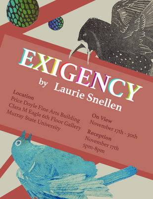
Exigency
Laurie Snellen
Birds are very sensitive to environmental changes and indicators to issues surrounding the biodiversity crisis. Exigency, by highlighting common beloved songbirds, allows for a link to the crisis that is so much closer than what many are used to seeing in the news. It also encourages users to explore solutions they can apply in their everyday lives like window stickers for bird strikes or bird boxes for bluebirds.
The relationship between the complexity of nature and the part people play in it has always been of interest. These current works act as a bridge between the environment and the people. Natural imagery and symbolism can be used to invoke a viewer's interest and curiosity by focusing on either unnatural additions to an ecosystem or parts that are in decline as a lens for both environmental and social concerns.
Using natural imagery that are integral parts of the problems combined with manufactured effects such as aberrant overlays on the birds the concept takes form. This implies an abnormality in the environment, through the opposing natural and unnatural elements. By using relatively well-known birds such as Meadowlarks, Bobwhites, or Bluebirds that are usually identifiable to someone living in a rural community, they allude to environmental issues already affecting those communities. In this way a connection can be made by the user to their own experiences.
Similarly to artists like Marilee Salvator, my work is very heavily influenced by extensive research. Intense value shifts with pops of vibrant hues of color can create very breathtaking imagery. My linework and composition could be comparable to artist Jenny McCabe’s, although I prefer to add more vibrant, less natural hues to shine a light on human intervention in nature and create an opposing composition. This provides rich groundwork to continue to explore relationships between humans and the natural world.
Through Exigency, learn about the biodiversity crisis and how it is something that affects us even in our own backyards. Life is precious and connected to each other and everyone of us can be part of the solution.
-

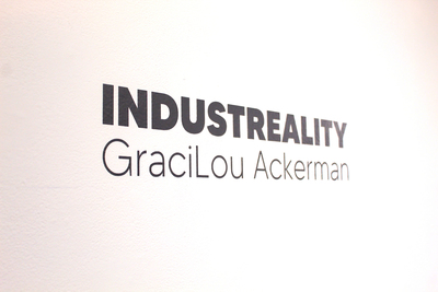
Industreality
GraciLou Ackerman
Days go by, rain comes and goes; buildings are built, occupied, and abandoned. Walls that were once so vibrant with life are eventually silenced. Generations upon generations witness the same subject with different eyes, perspective, and time. Minds are stimulated with excitement through the curiosity of our senses. Restorilazation and revitalization are a necessity to honor the enchantment that has once taken place. Constructing an infinite memory out of what was once a fleeting location is the goal to be achieved throughout the artwork.
As a community we cannot let the walls be silenced or forgotten. The sounds heard, textures witnessed, and the industrial infrastructure itself that once held such importance must be esteemed. The buildings and structures alone in them self is of art, the linear patterns, the geometric depth, the shape, and forms standing alone are mostly overlooked. Bringing these sites into the contemporary context with digital photography lets the unoccupied location have a new life, in a new era.
Personal influence was cultivated within a small blue-collar county, of Carmi, Illinois. A town full of momentary dreams. The remote town forced creativity and appreciation to be pushed beyond the stereotypical. One child might find peace, beauty, and comfort in the subway, or surfing in the ocean; however, for me, it was found in my own back yard. Watching my father work in his collapsing metal shop with his worn-out equipment. Waking up to the sound of a diesel engine running, a chain rustling, or an air pump accelerating might displease a stranger but to me, it is a lullaby and alarm clock. To me it is what I call home.
-

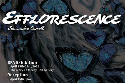
Efflorescence
Cassandra Carroll
Curiosity is an innate human drive that is often lost in childhood, but easy to find if one looks. I find a strange beauty in examining the broken wings of a dying butterfly. Within my work I hone in on these beautiful moments, and have found textiles to be the most diverse medium to show what I see. Within textiles, I’m able to emphasize the glimmer with glitter and the soft textures with felt and silks. When taking a road trip in Kentucky, we often pass by hills that’ve been blown to pieces, exposing the layers of rocks and opening opportunities for new growth within them. This growth is glamorized, but the slow decay of those rock forms and the fossils within is often ignored. Mistletoe feeds off of a tree like a parasite, yet these blemishes and natural diseases are admired. While negative at first glance, it consistently reveals hidden value and beauty upon closer examination.
This process of transformation within the natural world inspires me to create work. I use imagery like bugs and fungi to show they are as beautiful as they are necessary. By using a textile medium when using this imagery, I create a relationship between decay. It’s important that textiles degrade the same way. The transformation from growth to decay is part of a beautiful bigger cycle.
This balance of growth and decay and how nature creates an environment that causes people to closely examine their surroundings. I spark the viewer's interest by using vibrant colors and eye-catching material to depict macabre imagery. Disease and parasites are heavily associated with my consistent theme of growth and decay, as it is a growth that causes decay– like many other diseases. All too often, people tend to go about their days on autopilot ignoring much of the world around them. My goal is to encapsulate the viewer in an environment and push them to comprehend new subjects and perspectives by bringing attention to the world around them.
Stay curious and observe the beauty of our world that has always been there. -

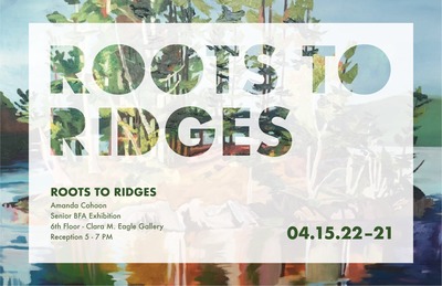
Roots to Ridges
Amanda Cohoon
We all want a place to call home where we get to put our roots down. For some, this place is the state they were born in, and for others, it is a place they stumble upon along the journey of life. Some of us are lucky enough to live in such unbelievably special places, however, we don’t always seem to notice or appreciate this. The seemingly endless nature of our bustling society seems too often keep our focus shifted away from the natural beauty around us. This thought prompted me to begin this series of paintings and prints that highlight not only everything I love about my home state of Kentucky, but also all that it has to offer, from land to resources. Roots to Ridges stands for many things; from the roots we put down, to the roots of the agriculture that provides for us all, to the ridges that our livestock roam, to the ridges we explore. To bring this to life, I first focused on my hometown. These works explore multiple facets of the Kentucky landscape, from the rolling hills of horse country to the lush forests, rivers, and small towns that shape The Bluegrass State’s identity. This visual story creates a balance between our breathtaking geography to the agriculture that provides so much for us. My mission behind doing this is that I hope it brings the viewers to appreciate all of our untouched natural beauty. Our society's constant need to expand is consuming not only miles of land, it is consuming wildlife, habitats, and scenery that can’t be replaced. Through the appreciation I hope to spark, I also hope it sparks the conversation of conservation. Conserving what we have is important for so many reasons; the most obvious reasons are to protect wildlife and to promote biodiversity but also so that we can preserve what we have so future generations can enjoy it as a reality and not a distant memory.
In these works, I address many components of the Kentucky agriculture system from the industry overall to livestock and crops. My lithographs take a scientific visual approach. The choice to complete these works monochromatically in black and white allows the viewer to get lost in the realistic detail used. Through my careful attention to rendering, I work to capture the essence of what is and what once was and to intimately appreciate all that our agricultural system provides for us. In contrast, my screen-prints and paintings incorporate a more colorful and playful approach. Vast and bold color bring life and energy to my oil paintings. I use these heightened color palettes to convey my feelings of love and gratitude for the landscape’s generosity and never-ending beauty.
I take inspiration from printmaker Stephanie Berrie’s ability to render subject matter with attention to detail and for her compositions. Ioana Villatoro also inspires me with her acrylic paintings of the natural world that she enlivens with intuitive, expressive decisions about color and mark making. Highlighting all that Kentucky’s environment provides is important for those that live here because in a world that is so fast paced, we could all use a reminder to slow down and take a look around, Hopefully, Roots to Ridges inspires us all to take pride in the wild spaces our Southeastern state of Kentucky.
-

Consuming Fashions
Malcolm Fife
We live lives that revolve around consumption and buying more than we need. Past fashion preys upon our laziness and encourages our rather prodigal spending. Why repair something when you can just buy a new one? We have become disconnected from how the clothes we wear are made and distanced from the people who make them. Fast fashion companies are more concerned with profit than creating durable products, paying their workers a living wage, or protecting the environment.
I want to contrast current fast fashion trends with older and more thoughtful practices, some of which are coming back. A century ago, people took great care in creating garments that would last a very long time. They also went to the almost insignificant (to them) trouble of mending their clothes, rather than throw them away as is common practice now. Visible mending, a new wrinkle on an age old practice, makes a statement through extending the life of a garment while also making that garment desirably unique.
Wearing used and thrifted clothes can be a way to make a difference and an easy habit to acquire. I myself wear secondhand and vintage clothing on a daily basis. In my experience, the vintage clothing community is a safe and supportive place for people of all ethnicities, genders, and sexual orientations, allowing them to merge aesthetic appriciations of the past with contemporary activism. This is exemplified by the popular motto and hashtag: "vintage style not vintage values,"
My work is spread over multiple media: painting, printmaking, and ceramics. The square format throughout much of my work alludes to social media interfaces influence our self fashionings. The juxtaposition of historic and contemporary ways of "consuming fashions" should invite the viewer to reflect upon their own practices to fashion a sustainable self.
-

Instropection: Another World
Gabby Gillette and Gabby M. Gillette
For 20 years I experienced physical, emotional, verbal, and mental abuse at the hands of my biological mother. At an early age I had to face the harsh reality of my situation and develop skills that helped me survive day-to-day, but that left me with a very skewed idea of who I was as a person. But the one thing that I knew for certain about myself was that I loved to create. I would write stories and draw characters as an escape, and as I got older I would build bigger and more elaborate worlds to explore until it turned into my passion. Writing and drawing were an intertwined part of me that I could never be without; everything I wrote had to be drawn and everything I drew had to have a story behind it. Introspection: Another World, is my exploration into who I am, both as a person and as an artist. The central piece in this show is a book, entitled “Introspection”, which features a collection of short stories and illustrations that explore themes of identity, family, self-discovery, and trauma. Some illustrations are a visual representation of what is happening in their story while others are more figurative as an emotional response to their story. These illustrations and these stories serve as a place of healing for me, allowing me to look inside myself and explore who I am and what I once was. As an artist, I’m inspired by the world around me, with things like music, and culture, but movement is a big inspiration for me. I find it interesting seeing movement in texture and trying to create a texture out of movement itself. Junji Ito’s illustrations are what I strive for when I’m creating a piece, something that’s very detailed and that’s moving in some way with the lines. Bob Masse is a designer who’s posters combine Art Nouveau and Psychedelic styles with influence from Alphonse Mucha. His line art and figures have been a major inspiration to my practice. With all this inspiration and a mind full of never ending worlds and stories to explore, I’m putting my true self on display in another world.
-

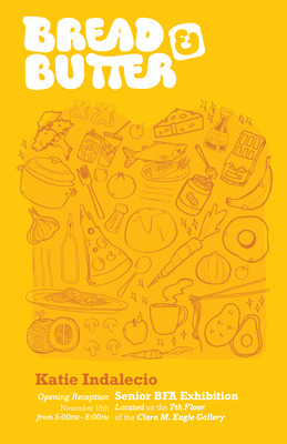
Bread & Butter
Katlyn Indalecio
Katie Indalecio | Bread & Butter
A dash of joy and a pinch of whimsy. Ingredients of my ever-evolving design approach. As if instinctual, I find my thoughts wandering to food for subject matter. Food and Design parallel one another in many ways, through bold colors, interesting textures, and unique flavors; they are both subjects that are consumed on a massive scale daily. What better way to represent my interest in food, and also display my versatility in illustration, layout, and typography than in the form of a magazine?
Bread & Butter is a simple, forthright title for both the food magazine and the exhibition itself. My show features a self-branded magazine, package designs, posters, and an instructional cooking video inspired by a recipe from the magazine. The magazine consists of lively illustrations, bold colors, and clever typography that engage readers of any age to appreciate food through the scope of the brand. A huge part of my process starts in the sketching/planning stage. I spend a lot of time here because I involve so much illustration within my design. Since the brand extends to physical products and videography, I focus on consistency and detail to connect each element to one identity. The main focus in the magazine is the illustration as it enhances my layout, hierarchy of type, and maximalist intention. I have chosen to work with a bold, saturated color palette to give my brand a vibrant and energetic feel. My color palette is complimented by my choice in typography, which features fun pairings of letterform families that echo my influences in design.
Consistent research helps me stay aware of everyday content that is created by both print-based and digital food media. A few contemporary food identities that have fueled my inspiration are the King Arthur Baking Company, The Momofuku Group’s discontinued Lucky Peach magazine, and various personalities from the company Bon Appétite. Designer identities that have informed my design practices are Kate Bingaman-Burt, for her “doodle-like’ illustration style, Aaron Draplin for his eclectic visual design, and Gian Wong for his work in lettering. These influences have informed my own design voice that I have communicated throughout the food identity Bread & Butter.
-

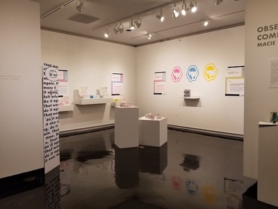
Obsessively Compulsive
Macie Kane
When I was 7 I was diagnosed with Obsessive Compulsive Disorder (OCD) which is a debilitating neuropsychiatric disorder that affects men, women, and children. But, most people often use it as an adjective to describe when a person is organized or a perfectionist. My designs attempt to inform and demonstrate to viewers who do not have Obsessive Compulsive Disorder what it is like to have OCD. Through package, product, and layout design, I have created boxes and informational materials that not only raise awareness about Obsessive Compulsive Disorder, but also demonstrate the repetition and overwhelming, chaotic nature that is associated with living with OCD into tangible experiences for viewers.
The work in my show begins with a moire pattern that illustrates the brain scans of a person with OCD and a neurotypical person, and the subtype of OCD that is typographically illustrated using a decoder design on the interior of the box. Inside of the larger box I designed interlocking compulsion boxes whose exterior matches the chaotic, overwhelming decoder design of the larger box they are in. These boxes are meant to demonstrate the repetition of obsessions and compulsions. Also inside of the boxes are various informational materials including, decoder filters, stickers, a brochure, and an informational booklet. The materials on the inside of the box are meant to be a way for viewers who don’t have diagnosed OCD to begin learning about what OCD actually is while also dismissing the trivialization that is often associated within the disorder. Because OCD is a diagnosed medical disorder I relied on factual information from the International Obsessive Compulsive Disorder Foundation, which is a foundation that is chaired by medical professionals who have researched and/or treated OCD.
Stylistically, my work consists of minimal illustrations and typography. Throughout my designs I only use 5 colors and black and white. I chose these 5 colors for my work because they are bright and overwhelming while still having the ability to overlap and contrast to make the layered typography designs. The 5 colors I use in my works help me to complete intriguing and educational layered compositions. While choosing these colors I was inspired by Massimo Vignelli’s Knoll designs in which he uses bright, saturated colors, bold sans serif fonts, and typographic overlay. For the overall typographic designs I chose Futura, a bold sans serif font, to make the designs seem overwhelming to the viewer while still being readable. Paula Scher’s use of typography as an illustrative element, especially her work with typographic overlay and her “How are you?” posters inspired the layout designs of my informational materials and posters. Overall, while designing the pieces in my show I drew a lot of my inspiration from minimalist designs often seen in modernist typography design.
For more information visit…
-

#representasian
Shin Kim
As an Asian American, I am always dealing with racism. The racism worsened during COVID-19, not only for me but for the AAPI community as a whole. There was an increase in hate crimes because we were considered the cause of the pandemic. There were attacks, harassments, and threats made against Asian Americans. People tried to help on social media with the #stopasianhate movement. However, like other trends, this one soon disappeared. The unsettling nature of social media that allows people to apathetically scroll onto the next post and the acceptance from both communities fuel my show. My works discuss what it’s like being Asian American. In the past, I was hesitant to speak up about my racial problems because of my docile nature. However, it is time to stop living in fear because I deserve to have my voice heard.
#representasian combines graphic design and photography to raise awareness about the issues I face as an Asian American. There are typography works, illustrations, and package designs. The typography posters use soft colors and bold sans serif fonts to highlight racist quotes that people have said to me in the past. Next to them are kinetic type videos that animate other quotes. Both works are scaled large to force the viewer to pay attention to what is being said. The illustrations and milk carton designs depict my fondest memories of my trips to Korea. They also use soft colors to create a soothing quality that expresses how I felt when I was there. My photography is used for a similar purpose. The film photos document my trips to Asian American towns to show proper representation and to convey the warm feelings associated with each place. Lastly, is a documentary video on my parents’ immigration story. Having my parents and myself as the focal points bring attention to what we have done to accomplish the American Dream and the struggles to get there.
I’m constantly inspired by designers and photographers who shake the art world. Jessica Walsh is an unapologetically loud designer who uses bright colors and funky typography. Her color choices inspired the color palette of my show. She also incorporates a lot of display fonts, which influenced the font choices for my posters. Victore’s works are rebellious and defy perfection. He’s influenced by racism and comments on its destructive quality through the usage of erratic, handwritten fonts. My type videos comment on racism while encompassing an unstable feeling with overwhelming animations. Nikki S. Lee is a Korean fine art photographer who explores the struggles of understanding American culture. By conforming into different stereotypes, she found herself constantly changing her identity. Instead of finding the need to change myself, I embrace and display a representation of my Asian American identity through my show.
-

Sonder
Keleigh Mabry
Sonder- the realization that each random passerby is living a life as vivid and complex as your own. -John Koenig, The Dictionary of Obscure Sorrows.
I find comfort in realizing everyone’s lives are as terrible and fascinating as my own. Dealing with stigma about mania and depression has affected me throughout my interpersonal relationships- I have felt and often still feel isolated. I’ve learned a lot about myself through my research in clinical psychology and by creating art about my bipolar disorder. I’ve set myself the goal to make other mentally ill people feel less misunderstood and isolated.
In my prints I display identity, depression, and pressure through anthropomorphized figures. But, the figure never has a human head. It is replaced with an item that aids in telling the story of the individual’s mental state and complex emotions. I use unrestrained lines similar to blind contour and portray the figures in varying sizes- often large- to take up space with the viewer. My surrealist style is inspired by Mark Ryden and Kathryn Polk, using imaginative freedom to explain the figure’s story. They are alone, unobstructed by an environment except for objects they are engaging with and key momentos around them that form an idiographic synopsis of their state of being. Their isolation creates an invitation for the viewer to join in and take up space in the piece, providing the figures company.
Whether studying psychology or dealing daily with my own mental health, this body of work visually portrays mental health fluctuation in hope to create oneness and solidarity. I present an opportunity for viewers to evaluate mental illness and its impact on our fascinating, detailed, terrible, and happy lives. I encourage you to sonder and realize how simultaneously unique and analogous a stranger truly is.
-

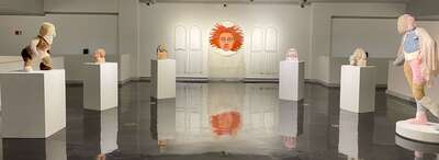
I Love You; I'm Glad I Exist
Ashlynn Eve McIntyre
Artist Statement
Ash Eve McIntyre
I create figural work exploring themes of object-human relationships in the context of childhood trauma and its aftermath. The works are made using a variety of media, including wood, ceramic, paint, and even found objects such as stuffed animals. The same craft techniques that are used to create comfort within domestic settings, I utilize to give care to the figures.
In the work, there is an emphasis on comfort and platonic love in my work. Stuffed animals are used in my sculptures to relate back to both domesticity and physical comfort. While the works represent the traumatized individual, the tone of the pieces are generally of emotional recovery and resilience. In this context, elements of ideal domesticity such as stuffed animals and hand-made clothing express realistic and achievable forms of happiness.
Many of my works reference the Greek mythological stories, like those from Ovid’s Metamorphosis, in which characters often undergo a transformation into an object or animal after experiencing a traumatic event. This transformation creates a paradox in which the character both survives and dies. In Ovid’s recounting of Greek myths, their new form is often supposed to protect them from further harm, but ultimately this objectification only further takes away their agency. These references to mythology allows the work to make obvious that traumatic loss of identity is a long-established but often unspoken human reality.
The relationship between psychological death and physical comfort in my work ultimately yields itself to these artworks acting as their own alternative to heaven. Despite surviving, their object bodies have been taxidermied into the state of eternal comfort.
-

Advocate
Lauren Morgan
From an early age, I was exposed to the detrimental effects cancer can have on individuals as well as their families. One after another, I experienced the passing of family and friends. The heartbreak that I endured during these times inspired me to push for more advocacy and change in the cancer world. Through my design work, I am exploring the human connection, how humans interact with each other, and how art and design can influence the way we see challenging situations. This connection is explored in my senior BFA show, driven by my passion for fundraising and advocacy in the nonprofit industry that I've continuously pursued.
The Advocate project is an awareness campaign that combines my graphic design education and skills with my passion for advocacy and awareness for cancer research. Through design, I educate viewers about Advocate - a campaign that focuses on the discrepancies in stage 4 breast cancer treatment and funding. Breast Cancer has the highest percentage of received funding over all other cancer types, yet only 2-5% of this funding is allotted to stage 4 research. Stage 4, or metastatic breast cancer, is breast cancer that has spread to other parts of the body and is incurable and deadly.
Advocate reaches multiple constituents. The patient, caregiver, and fundraiser all have a role in making up what Advocate promotes. These three channels work together through awareness, support, and assistance. Advocate is made up of elements of branding and poster design, advertising, digital marketing and research. It combines shades of blue and green; representing knowledge and growth. The focal point of my show is four posters, which give a glance of the reality of metastatic breast cancer. In these posters, statistics of the disease are spread across the majority of the page, which are highlighted around the broad range of patients it affects. The posters aren't meant to give the viewer the full answer, but to want to learn more about the subject - as advanced cancers can be complex and easily overlooked.
Much of the inspiration of my work stems from both Corita Kent and Massimo Vignelli. Through both Kent and Vignelli’s use of active designs with color, lettering, leading lines, and more - I was inspired to create digital and moving graphics for Advocate. Each highlight the work Advocate brings to the table, and the people that help support them.
The Advocate project aims to educate the viewer about the complexities surrounding terminal cancer diagnoses. To help those better understand the discrepancies in awareness and research of those going through a journey much overlooked. To encourage advocacy for not only their own health, but others. And to know that with great courage and perseverance, there is always hope for the future. I hope by viewing my show, you too are impacted by connections made through interactions with one another, and inspired to make a difference in your own community.
-

All-Consuming
Maddie Ortt
My work focuses on themes of identity and personal history, the things that make us who we are. Whether that is what kind of
childhood we had, the trauma we have endured over the years, the thoughts about ourselves that we believe to be true, or just simply the environment we grew up in. I’m interested in the psychology of metacognition and how we can become so analytical and aware of our own thoughts or the thoughts others have of us. This internal investigation of why myself and others are so critical of ourselves has been one of the driving forces in my work.
Using food and human anatomy in unexpected ways, I question the causes and outcomes of unhealthy perceptions of our bodies. I cover heavy subjects like eating disorders and the detriment they do to your mental health and your way of thinking. Such as, the idea of craving to be able to see your own bones, or the unhealthy thought expressed by an acquaintance, imagining how skinny they could be if their intestines were removed from their body. I believe clay as my medium helps me bring these ideas to fruition by the malleability of the material and how it is both visceral and fragile.
These concepts in my work have been very personal to me, which has made the creation of these sculptures more of a healing process for myself. Digging into my own eating disorder as part of the inspiration for my work was something I never thought I would do, but now realize it was necessary for my artwork. I hope the viewer can gain a greater understanding and perspective of what it’s like to experience these disorders and not be hesitant to discuss them as well.
-

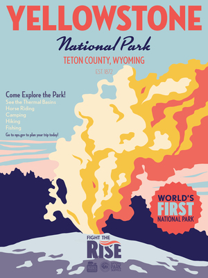
Proceed with Caution
Rebecca Potts
Throughout my childhood, my parents often took me out into nature to go hiking, camping, and just explore. Now when I am in nature, I am reminded of my childhood and reflect on the memories of safety and comfort that I experienced, but through the lens of the person that I am today. As I have learned about and engaged with people in my community, I realized that their experiences and views of being outdoors and in the environments that I grew up feeling comfortable in are much different than mine. These different experiences are based on factors such as family or community, external factors, social location, and their personal experiences.
My work is a way for me to reflect on and convey my own experiences as a child as opposed to how I feel today, and also to be an advocate for others who feel unsafe in outdoor environments. I reflect on the complex relationship between people and their surrounding environment in two different media - painting and graphic design. In my paintings, I explore my personal and experiential relationship with the natural environment, as well as how my relationships with family have affected my experiences. I think about what it means to be a woman in nature alone, and how I can sense that with the comfort I feel, there are also feelings of uncertainty and a lurking danger. Through graphic design, I create influential advertising campaigns and posters about inclusion and safety, and visual identities and branding that present a welcoming and inclusive environment.
To show the tension between the comfort I feel in nature in relation to danger that exists, I place myself in paintings as a child and as an adult in situations where the feeling of lurking danger is present, or where the figures are vulnerable in some way. The images that I paint feel precarious and unsettling, but comforting at the same time as I often appear happy in nature with my family. The figures in my paintings interact with recurring symbols and elements such as fog, water, or roots. I use elevated, dark colors and gestural mark making to show opposition and emphasize an unsettling mood. A few of my contemporary painting influences include Shannon Cartier Lucy and Teresa Dunn. Shannon Lucy paints unsettling or uncomfortable scenes that can also be intimate or inviting, as a lot of these scenes are in familiar, everyday spaces, and this is a balance that I also strive for in my own work. In Teresa Dunn’s work, I am mainly inspired by her mark making, use of color, and level of resolve that she achieves in different areas of her paintings, as well as the ways that she uses figures. Her mark making is very gestural, and she also brings in a lot of non-local colors in order to create more conflicting scenes.
The colors that I use in my graphic design work are warm, natural, and tonal colors that visually communicate feelings of familiarity and comfort. I use bold serif typefaces such as Gastromond and Freehouse that appear adventurous and lighthearted, paired with wide sans serif typefaces such as Avenir and Effra because these typefaces appear approachable, friendly, and dependable. I am influenced by the ways that the designer Jessica Hische creates importance and draws attention through her bold and elegant typography. The flat and minimalistic illustrations and icons that I use in my infographics and advertising designs also make them easily digestible and welcoming for the viewer. In the design of the logo for my national park system, I used a shape that resembles an arrow as well as a minimal illustration of a mountainscape. In this logo and in my illustrations, I am influenced by the designer Chester Don Powell. Specifically, I am inspired by the flat and intricate illustrations and bold typography that Chester Don Powell used in his designs of Works Progress Administration posters for national parks.
-

Kansas City Beasts
Lauren Powderly
Sports design is marked by the ability to unite people behind a communal message. Growing up, athletics and art became anchors in my family. Most of my time was spent playing outside with my dad and brothers, while my mom taught me how to stretch my creativity and make art, seeing things for the end result and finding the beauty in the process of creating. Later on, I witnessed sports and art build community and cultivate creativity, functioning as something more than just entertainment, but a key part in bringing people together. This project entwines the energy and unity of sports culture with the essence of clean design.
Britt Davis’s work and my own experience as a St. Louis Blues intern serve as the inspiration for this portfolio. As an intern, implementing new brand guides highlighted the paramount role branding plays in the sports industry and within a community. Through design, teams create personality and cohesion, a story that fans can rally behind. This project series combines these formative experiences with Britt Davis’ use of creative strategy in drawing inspiration from a city’s people, culture, and history to create a unifying and cohesive brand.
The Kansas City Beasts brand is built on the foundation of intentional design–utilizing typography, texture, photography, and a strong color palette to create a cohesive identity system. The construction of the team’s culture and fan experience inspired a design that would connect the essence of the team to the community. The brand features unified yet bold, modern typography, which sometimes interacts with the layout or photo itself to create an illusion of depth or abstraction within a design, invoking the city’s trueness and grit. The brand maintains a balance between clean and complex relationships, relying on textures and patterns to break up space within a composition. These formal elements result in work that is both functional and communicative. The designs present information in a comprehensible way regardless of fans’ knowledge of sports, highlighting the city’s collective people rather than individuals.
The digital and print project series communicates the identity of the Kansas City Beasts through manipulating contrasts within the foundation of the design. The poster series in particular centers on cut-out photography on top of vivid, textured backgrounds, combined with bold typography to form an engaging composition. These eye-catching projects brim with impactful visuals, intentional movement, and a lively yet subtly gritty tone.
-

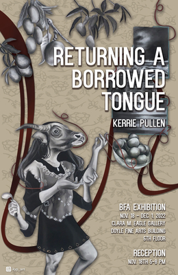
Returning a Borrowed Tongue
Kerrie Pullen
Exploring and embracing my Filipino heritage has not only inspired the work I create, but changed my perception of cultural identity and traditional art. Being bicultural, half white and half Filipino, and learning about the migration that my mother and others experienced has allowed me to connect to my identity. I encountered a new space as an outsider and began to realize how much my identity was impacted through an adjustment process. Questions like, “Am I Filipino enough to be this? Who am I to know anything about what it means to be Filipino?” constantly arises. The consequences of displacement and ongoing conflicting questions that arise in everyday life have dominated my way of thinking and creating. This body of work is not simply to celebrate my culture but to bring attention to experiences of feeling different and isolated, but also finding connections within an unfamiliar environment. As time goes on, those experiences are constantly changed and intertwined with each other to create a new cultural identity.
My work reflects a multicultural perspective, bringing together Filipino American undertone and abstraction. The importance of intangible elements, the feeling of emptiness, alien-ness, through patterns of absence and in-between spaces is heightened within each drawing. Combining topics such as colonization, racism, community, family, history, traditions, finding a safe space, and love, individual experiences become visible. Beneath what is seen on each of the surfaces are layers that are overlaid by another layer and parts that are destroyed and covered. As with many untold stories, they become invisible and I incorporate references to cultural details and symbols familiar to Filipinos such as food, fashion, family, and folklore to resurface varying histories. Aspects like textiles, assemblage, real food, and using found objects are used to further push the conceptual ideas in the work. I use color to represent specific ideas or historical and cultural aspects. For instance, in one of my recent pieces titled Take up the Brown, I reference the border from a manuscript called Boxer Codex. This manuscript was made during the late eighteenth century when the Spanish colonized the Philippines, so I reference the flat, floral lines they used in combination with the way I draw and collage contemporarily to give back that power to the Filipina posed within. I arrange objects and forms in a way that is considered and complex, but still accessible to the viewer. Each element is placed to provide visual movement and multiple details to look for, as if the viewers must follow along to a map of Filipino culture and discover it as I am doing at the same time.
The figures depicted are representational and often include members of my family and at times myself who actively pose to enhance the narrative. It is important to include different womanly bodies who personify my American side and my Filipino side, and referencing old photographs to flesh out new meanings. I incorporate my mother, presented as a woman with a carabao (water-buffalo) head, who represents the positive characteristics of Filipinos as hardworking, strong, and graceful.
The more I explore my culture and the impacts colonization has on bicultural individuals, the more information and layers I build from. My desire to use the power of visual language transcends national and cultural boundaries and alters how I am shaped as a person of mixed history. At the heart of the work is an attempt to harmonize the contradiction between past and present, invisible and visible, Filipino American.
-

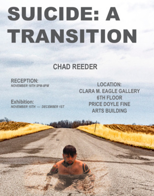
SUICIDE: A TRANSITION
Chad Reeder
I have been shaped by loss. My art is deeply personal and is directly informed by the effects of suicide. My photographs and videos are a way to confront the reality of losing so many loved ones, as a way to reconnect to the world by seeking friendships through conversations about suicide. This is in order for the viewer to be presented with themes and formalities which challenges the stigma of suicide in order to save lives.
Suicide is something that cannot be left alone or not talked about. My works challenge the way one perceives suicide to reflect a different perspective on life itself. Having lost nine loved ones to suicide, I want to show that transformation is necessary in order to accept what one cannot change. Life is precious and something that should be handled with care, with my framing and subject matter I push this new outlook I have on life. If suicide is not constantly talked about, society will continue to lose beloved souls to their own unseen struggles.
In order for the viewer to be confronted with the many emotions by the image as I have been dealing with so much loss, my works are in color. This shows the transformative affects suicide has had on my life, ranging from wanting to take my own life to how to cope with overwhelming loss everyday. I am interested in representing moments and scenes that can be interpreted as rebirth or the moment of death. I do this to further push a new way of looking at suicide. This transformation of life from experiencing loss to suicide is achieved formally through different perspectives of light, pattern, shape and form. There is sharp lighting in some to reflect light as a way to see the world differently. Pattern, shape and form come together to resemble the harshness and loneliness one is hit with like a freight train when grieving. These themes and formalities are my self reflection into my own life and how suicide has completely transformed me into someone new.
My work, Taken Up, is about portraying the way suicide feels to me. The viewer is looking at a moment of time where someone just vanished in front of them. This is how my experience with suicide has affected my life. The visual elements of this work that aid in achieving said goal is through light, contrast and texture. Light is important in all of my photographs because it represents the transition that I have gone through. The light is meant to reflect my changed perspective on life. I want the viewer to see how there is still beauty in loss. The contrast on the spotlight of the clothes with the sharp shadows is a reflection of the contrast between life and death. Texture is important as well because it symbolizes the grittiness and rawness of suicide. With this I aim to push more impactful conversations concerning suicide to show how the beauty of loss can prevent others from taking their life. Through these experiences, I have been given a second chance at this life and this is what I am portraying.
My inspiration comes from my friends and loved ones who took their own lives. Suicide is a heavy inspiration for me and is what led me to become an artist. Learning how to live without them has enlightened me to become someone better than I was yesterday. My work is in dialogue with the artist Will Morgan whose subject matter and sharp lighting I try to emulate. With his works he creates this dreamstate and you also feel a sense of loss coupled with loneliness . My way of approaching a photograph is very similar and getting my work to speak for itself, this is something that is very important to me.
Printing is not supported at the primary Gallery Thumbnail page. Please first navigate to a specific Image before printing.