

-

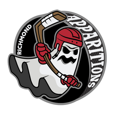
Richmond Apparitions
Shannon Riley
I’m constantly surrounded by sports. Between playing sports and attending many sporting
events, sports became a part of my identity. The sport that quickly formed a central part of my identity as a sports fan was hockey. My father introduced me to hockey after I had already begun my own athletic career; like any sports fan, watching games together, cheering on our favorite teams, and experiencing the excitement was an invaluable experience. I found the speed, agility, and tenacity exhibited by hockey players on ice to be an absorbing display.
Outside of the game itself; the personality, appearance, and history that defines each team is something I’ve been equally fascinated with. I find sports design to be edgy and aggressive with bold typography, agile movement, and formidable body language in its imagery. One notable difference between major and minor league hockey is the creative liberty allowed in minor league branding. This creative liberty allows for fun, extravagant branding. By meshing my love for sports design with the subject of a minor league hockey team, Richmond Apparitions was Created.
Choosing the location of Richmond, Virginia. I wanted to explore a city that is deeply rooted in American history as well as paranormal history. Paranormal history has always sparked my curiosity and imagination. When creating my logo for Richmond Apparitions, I knew I wanted a ghost as my mascot to be more playful. In my designs as a whole, I incorporate a palette of grays and blacks with a singular statement red. This allowed me to build a playfully darker aesthetic within the branding, while maintaining visually appealing designs through fun typography, bold hierarchy, and strong use of imagery and design throughout.
Inspiration for the identity work I’ve built for my Richmond Apparitions, comes partially from the branding by the creative team consisting of Jeff Ipjian, Wes Tiongco, Bryna Taylor, and Amanda Le, for the 2019-2020 NHL Anaheim Ducks. This system includes a monochromatic palette paired with a bright color dynamic which I found very appealing. With the addition of gritty layers to add a paper-like aesthetic. I am also inspired by graphic designer, Alex Flick. His designs mix colorful illustrations with bold yet fun typography that add a playful approach.
-

Out From Amongst The Brood
norris skipworth
While making this body of work I focused on the idea of worth. To be more specific, how undefined, personal, and perpetual this task of assigning value is. Using the curation of objects as a convoy to discuss how and why we assign this value. Our current knowledge of the objects, assumptions, whats adjacent, the attention the items have been given. Focusing on the conversations had between the subjects and as a result the viewers. I was recently brought to the idea that intelligence can be measured by the amount of connections one can make. With this in mind, my goal for this work is to have potential for a multitude of responses, an intelligent piece of art.
Through dealing with the found and curating what's available, new perspectives can be associated with this imagery while also benefiting from its familiarity. I enjoy contextualizing things that have already been recontextualized. Finding that many things at this point have already been re-recontextualized. The addition of Miss Piggy who has already been set the context of a chess piece, or a vandalized cardboard Maude from a Louisville alleyway to a Murray gallery. Turning things on their head that have already been faced down.
Working in this way creates a balance between improvisation and planning. Having the general idea of the work and while allowing the art to appear in accidents during the process. Attempting to maintain an enjoyable state of surprise and control. The self actualization of some work through found objects in juxtaposition with objects containing clear hints of time and craft is what points the conversation towards value.
The why is more ambiguous— I am less willing to disclose. My why would only dilute others thoughts when asking questions or make their own connections. When clay is propped like an angel or wax poured into a lion, does it have more inherent worth? I suppose that would depend on how the viewer values me as an artist.
-

In The Church of My Girlhood
Daisy Slucher
I often find myself overwhelmed when I look back at history and see the pattern of violence against women. It can feel as if this is the way that things will always be, but I don’t want to accept that. In the Church of My Girlhood is a body of work birthed from these feelings of powerlessness. Instead of shrinking back in fear, it aims to make and take up space and fight back against these systems in ways I wish I would choose more often in my own life. The pieces reflect on my own experiences as a woman while acknowledging that the subject matter, often relating to the unease accompanied by being perceived as an object, is shared by women and femme presenting people all over the world.
Through these works, I am addressing the history of female objectification in paintings. Many before me have played into or challenged the way the viewer looks upon the female subject. I am continuing the conversation. I control gaze in the works to create confrontation and to give the figure more agency in how it is viewed at times, as well as to convey vulnerability when that eye contact is dropped and the figure is in turn passively being viewed. There is discomfort and a question arises whether we should even be allowed to see the body in this intimate setting. All of the works teeter between empowerment and vulnerability. That tension is what I’m interested in expressing.
There is consistent messaging being shared, primarily from men, telling us that our nude bodies are shameful as a way of gaining control. For women especially there is a burden of blame put on our shoulders for distracting, misguiding, and tempting men into making poor decisions. That is the supposed power our naked bodies hold. While the shedding of clothes can be seen as metaphorically releasing oneself from this burden and empowering, the imagery of discarded clothes and that symbolic and physical barrier to one’s body being released can also create a sense of vulnerability that can be unsettling for the figure. The tension of opposition is presented in the works in this way.
The show’s title is borrowed from an excerpt in the book All About Love, by Bell Hooks. It implies that the lessons I’m learning and the questions I’m wrestling with have culminated to create a sacred space of learning and growing. There is a level of sanctity to these works and their content that I have not always honored, and as a whole the input of girls is not always valued. I am honoring them now. These pieces hold anger and sadness and awe for the strength of the collective female, as well as a desire to keep creating, so as to open the door for more conversations about what we can do differently in the future and to find sanctuary in relatability.
-

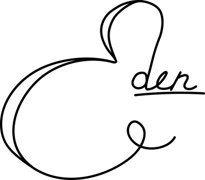
Eden
Kay Yount and Kay Yount
Eden is a show based around the concept of love. Love can be clean, messy, warm, cold, good, bad,it can be conditional or unrequited. Love is enigmatic— no one understands or experiences it exactly the same. I wanted to find a way to capture a part of this thing that I crave, something that is so close and yet so far out of reach. This exhibition is my way of giving to others my conception of Love in my own way.
Eden is a garden occupied by the two lovers, a cyclops and a blind prince. In secret, the two lovers meet in this garden of Eden, have tea, and read. Although their love has been forbidden, they are here at this moment, and as a participant in the space, you have been given an opportunity to share in that..
In this show, you will see cut vinyl and paper come together to create an immersive environment for you as the viewer to step into and be a part of. Having this space allows me to bring you into my world and showcase my interest in creating a narrative environment.. The use of illustrator and photoshop along with the meticulous process of plotting and weeding, allowed me to create these vignettes, showing you what it is like to be a part of this world. Atop pedestals, there are a set of five zines, three of which tell you the story of these lovers together, and one for each lover by themselves. Each have been hand stitched and carefully displayed for you to peruse.
The inspiration for Eden comes from many places; one example beingLouise Fili. Inspired by her gorgeous typography and limited color palettes, she is what inspired me to first make a handwritten title. Something one of a kind, just like my other two inspirations. Luba Lukova and Kacey Slone. Inspired by her use of negative space, Luba Lukova stands as a perfect example for the technical concepts in the work on display; The use of line, color, and space and how it interacts with the world. Kacey dives fearlessly and deeply into some of the emotional development and expression I am also hoping to convey.
-

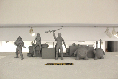
Life Isn't Fare
Eric Abarbanell
Born too late for the space age, too poor for space tourism, and too early to explore the galaxy, I’ve turned my obsession with sci-fi pop culture into a design career. A steady diet of bad films and cheesy sci-fi left me feeling like the world lacked something. It lacked pageantry and fun. We all share pop culture, and it gives us a sense of a world that’s more fun than the one we live in now. The movies, toys, and games of my youth helped shape my sense of what the world could be, a world that could be something more. That sense of wanting to make the world more than just the day to day is what made me go back to school at 37 and pursue an art degree.
Too often design is merely functional; despite being intended to tell a brand’s story those stories can be flat. Instead I like to use bright colors, simplified forms, and nods to other works to make even an annual report into something of an experience. Even a logo can become a character in and of itself, turning a brand into a story. I also use images and tropes of sci-fi and fantasy to bring a sense of fun to life. There’s something rewarding about creating an ad that makes the world seem more adventurous and full of possibility.
This is what my show, Life Isn’t Fare, is about. I wanted to show off my layout skills and packaging design skills, as well as my logo designs, but in a realm that allowed me to build a sense of fun, too. The astronaut is something I’ve always sort of identified with, exploring spaces that are strange while isolated from his environment. The astronaut with his taxi image was a recurring piece from my past works, and so I decided to build a toy line about that sense of fun I wish reality had. A bit of adventure, a bit of silliness, and a world and show defined by logos and icons, similar to our own daily life. It’s a show about exploration into new spaces, a work a bit about myself, and a way to show that design can be fun.
The comic and animation work of Vaughn Bodē and Ralph Bakshi are heavy influences on my work, especially their off-beat questioning of society. The wild colors and cartoonishness of Frank Koziks’s poster work was what first made me consider becoming a graphic designer. Discovering Lester Beall’s use of vivid color and master of using and breaking the grid was a pivotal moment in my development as well, and countered my fascination with Romek Marber’s near-scientific cover designs. Mieke Gerritzen’s typography has also been a big influence and helped me rethink my own use of typography and how to make it stand on its own. My show’s work was also very much in the footsteps of Larry Hama and Ron Rudat’s work in toy package design and illustration; their world building on GI Joe is one of the biggest reasons my show even came to be.
Please enjoy the little slice of the toy aisle I’ve presented, and the figures and characters in it, and hopefully leave feeling a little happier, and a little more weird, than you came in.
-

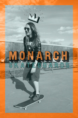
Monarch Skateboards
Kieran Beasley
Kieran Beasley Monarch Skateboards
Monarch Skateboards is a company that designs and produces skateboards and skate merchandise for a primarily teenage and young adult demographic. This diversity of skate style and culture allows me to blend experimental imagery and themes with my personal design style which is often structured and patterned, with designs and illustrations both monochromatic and exploding with color. Skater personalities and tastes are always varied and individualistic. I design with that in mind, to appeal to everyone in and out of the skate park.
To fill my designs with more personality, I incorporate a mxture of darker, grunge inspired designs and illustration with bright colors like pinks and blues, which allows me to build off of traditional skateboard trends while adding my own personal flair. I use gritty textures for classic looks and bright patterns for more modern looks. Blended into the designs are also patterns to consistently lead the eye across the boards and posters. The skateboards I design are made with blank decks that print my designs onto using vinyl.
To aid me in brand consistency and bringing life to skate culture in my designs I took inspiration from a few sources. Santa Cruz Skateboards has been a big inspiration for me; their designs mix colorful illustration with a consistent brand look, even when their designs vary to include photography. Aesthetic Apparatus is another place I get my inspiration from; their bright colors and gritty textures always look great paired with their bold typography which I try to emulate in my skateboards, posters, and other merchandise. They have everything from posters to packages to storefronts and keep brand consistency even if the design styles vary from project to project.
-

Kinda Like
Autumn Brown
I was raised in a community that was raised to not empathize with queer people or their struggles. I was hyper-aware of my differences growing up, both internal and external, and spent a lot of time pondering identity and how people perceive one another. My work is the result of that introspection; sequential artworks depicting characters in states of transmutation or duality that explore both beautiful and repulsive facets of identity alike. I encourage my audience to join me in questioning the way we categorize ideas like gender, sexuality, and self image. I manipulate familiar multidimensional surfaces, primarily ceramics, mixed media videos, and zines, to create small narratives. The work provides a unique opportunity to form a relationship with the viewer as they interact with it. The tactility of my work grounds the experience in the relatable, while the integration of humor and empathy encourages people to understand both themselves and each other. The viewer’s ability to enjoy my pieces, regardless of their prior experience with the subject matter is my priority. I want my audience to see themselves depicted in my work without shame. By doing this I hope to alleviate the stigma associated with “otherness.”
I am influenced by Lisa Barcy and Lisa Hanawalt for the ways that their art practice mirrors my own. Barcy integrates and manipulates found objects in her animations in a way that inspires both my still and motion-based work. Hanawalt parallels the way I use lighthearted imagery to speak on deeper and more sensitive topics, all while managing to keep a humorous tone.
-

Perceived Obsolescence
Steve Burdine
Steve Burdine Artist Statement (50+n)-20=T will be how much longer I have lived than I ever expected to. I believed that Reagen was going to lead the country into a Nuclear Holocaust. Instead it has been a trickle down erosion of freedoms through neoliberal capitalism and the steady march of deregulations that once protected the working class, such as Reagan's attack on the PATCO Strikers and the war on drugs. Existing in a neoliberal capitalist society has always been frustrating in a fundamental way. On one hand, I want to earn a good living and make enough money to not have to worry about basic bills. On the other hand, I do not want to support a system that continues to create monsters. Artists like Keith Morris and Chuck D were making music that critiqued neoliberalism as well as Reagan. Their complex soundscapes influenced my Art. I add visual elements in a way that represents sampling(in Hip-Hop) and hardcore chord structure (or the lack of it) and recognize that my path to abstraction was through doing graffiti in my youth, driven by the push for aesthetic beauty over legibility of the words. These marks I made on the decaying buildings in my city was the first expression of my angst in my art in an abstract way. My current work makes tension with basic shapes and the layering of paint, often with remnants of things in my house. I learned this language from artist Bing Davis. As a mentor he taught me how to use decay in my art by using unconventional items to make art from. The layering of these materials in my work reflects the sedimentation of trash as each subsequent layer of discarded things builds on top of the next. Some elements that extend beyond the ground, or even start to peel, create a feeling of the deterioration. I have some obfuscation of the layered images so the viewer may feel the curiosity or frustration of the almost recognizable. This restriction of access is one I feel when I work hard but yet am still blocked by class or other external systems. Often I will try to constrain the tension with more formal shapes like rectanglesbut, as with life, this constraining often fails. My work can be like seeing a pile of refuse where some parts are recognizable but it never actually resolves to a recognizable whole. The color choices I begin with, primary colors and/or earth tones, are the color palette of the Unions and of labor. When I feel like my work has become too precious, I either stop working on the piece or I do something to it that renders the precious part dead. I want some elements to remain unclear, feeling like a fleeting thought or memory, which is how I often feel--distracted by daily inputs from marketers and social media which amps up my need for self-preservation. The work is a way to filter all of this information barraging me and distill it down into something less disorienting. My conversation with neo liberalism and the frustration I feel is what I aim to express in these works. Leaving the viewer with the feeling of apathy, disgust, disorientation, or darkness while interacting with my work. Overall it is not as important for the viewer to walk away with a working definition of neoliberal capitalism as much as with a sense of the tension and frustration many of us feel because we do not even recognise we are living in neoliberal society.
-

DWELLS Coffee House
Amillia Cecil
I thrive through the creation of minimal and concise designs. To me, I find the beauty not only in the finished design or shape but throughout the process as well. Through my delicate lines and dramatic forms, I am able to create connections with my clients to not only fuel my passion but cultivate their dreams. My love for design is found in illustrations, branding, and typography. These are the skills that I have been honing the past few years. Illustration allows me to combine the commercial use of design while also having creative freedom. Through delicate lines that vary with length, width, and distance apart; I have been able to create a stylized form of imagery that adds to the overall theme of a brand. Being able to understand the rules to design is the foundation to be a designer however, knowing how to manipulate the rules to create not only a dynamic but also a balanced design is what produce a more diverse design.
Due to it’s organic element with endless possibilities and functions, clay has been a medium I have enjoyed working with. Currently, I find myself being drawn towards the minimal shapes with sharp lines paired with a black or white glaze. It is the dramatic forms such at the lengthy straight lines or interesting curves that I highlight by only having few design elements to keep the attention on the functional yet modern shape.
The process of branding a coffee shop has been an encouragement to finding the middle point of where both my passions can be seen in the same idea. I have been inspired by Radim Malinic’s work due to his package design and brand identity. His depth in this field and his ability to create eye catching work due to his great sense of color, has been an influence if my current work.
A ceramicist that has inspired my work is Branan Mercer. His work is interesting due to his dramatic shapes that could not only stand-alone but also works beautifully with his thick glazes.
-

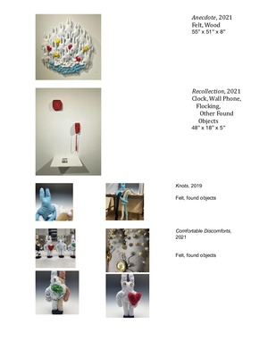
Lost and Found
Kayla Chinn
We often do not value moments until they become memories or we do not value memories that come from difficult moments. Within Lost and Found, I explore how we lose, gain, or fabricate memories to protect ourselves from traumatic events. My constructions present these difficult experiences through the comfort of repurposed objects and handmade soft sculptures. Both of these artistic processes have become a way for me to cope with the loss of many loved ones. The women I have lost used sewing to help others feel comfortable in their own homes, to make the discomforts comfortable. The discomforts being negative experiences that impacted my family, loss of a loved one, financial struggle, emotional disconnection, and more. Through the act of building a living space and filling it with organic stuffed pieces, I commemorate the work the strong women from my family did to help others when they fell on hard times, creating comforting memories with their quilts, homemade toys, and homey charm.
My found object assemblages and soft sculptures also mimic how memories are formed, we subsciously pick and choose what we remember, which is the same nature I used when creating these works. My works reclaim objects others have discarded much like Joseph Cornell’s assemblages, I want my objects to spark the memories of others as they seem them both individually and in relation to one another. The collection of found objects to represent the memories we forget being a representation of this mentality. The use of soft sculpture comes from a place of struggle with personal discomforts. Experiencing these events that are universal such as; loss of a loved one, financial struggle, and emotional turmoil and presenting them in a similar way that helped my family cope with them.
Within Lost and Found there is upholstered furniture and objects, not only are these staples in any living environment, they are objects that many people have a sentimental memory about within their own personal context. This ability to create relatability between the viewer’s own memories and the ones I am trying to create further pushes the idea of these memories being universal to everyone. The pieces in the show are mundane in nature but gaudy in texture, the majority of the pieces and objects have a treated surface, being treated with anything from beads, glitter, string, plastic bags, and beyond this my use of multiplicity makes these objects seem mundane rather than special.
-

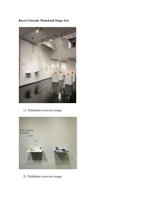
Nos Vamos Mañana
Karen Colorado
Growing up, I always hated moving. Every moment leading up to that move is a celebration, then a goodbye, then a memory. We wonder what we will do with the things we take with us, as well as what will happen to the spaces we leave behind. The first time I moved I didn’t know any of these things, nor did I think it would change my life completely.
My work is a reflection on my experiences from moving to America and what I have learned. I strive to challenge people to think about what makes a house a home through my lens as a Salvadoran immigrant. My work displays the emotions and items I associate with my move and reimagines the spaces from my youth. The wide assortments of color and naked terra cotta are a nod to Mayan folk art and Hispanic artists before me. I play with scale and saturation in my pieces to remove the items from reality as a reminder that they are sacred, yet distant memories. The work looks familiar yet feels unsettling; posing questions about how we view the immigrant experience. What is it like to see your loved ones for possibly the last time at an airport or as they walk towards the U.S-Mexico border? When I.C.E officers slash jugs full of water or take backpacks full of survival essentials in the Sonoran desert are we obligated to do something about it? How do we show compassion to those making life-changing transitions?
Inspired by the testimonies of millions of Latin-Americans in this country, I take what I learn from my community and highlight the differences and similarities in where we come from and the places we go to. My symbolisms and thematic choices are influenced by Mexican-American artist J. Leigh Garcia, whose work deals with the ‘residual racial discord’ of major historical events between the U.S and Mexico, particularly Texas. Though my work is more personal to mine and my family’s experience, I feel it’s important for me to acknowledge and learn from the heavy end of the Latine diaspora. Moving to America is riddled with obstacles no matter the method of doing so. Having moved so young and not knowing when -or if- I would return, I struggled with remembering all my ‘lasts’ and preserving those memories as I age. It’s a celebration of what I had before boarding that plane, and a tribute to those who unfortunately don’t get to have that choice.
-

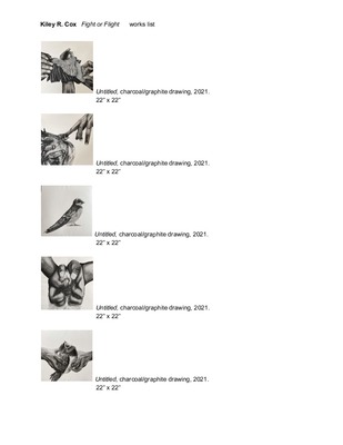
Fight or Flight
Kiley R. Cox
Content Warning: Trauma
Birds are beautiful, fragile, yet strong species that defy the laws of gravity. Birds have been used as symbols throughout history, and have been a huge influence within my work. To me, birds are the most relatable and enviable animals to humans. We long to adopt their risk taking behaviors, their romantic way of mating with one another for life, or even just their ability to fly and go wherever they wish. To be a bird and not care about anything in the world would be liberating. People as a whole are a lot like birds; we are both strong and fragile.
For young adults, it is this liberation and freedom that we crave so much and strive for in life. So when it is taken away from us, it is painful. As a woman, to be put in situations that take away our power over our own bodies, which has been done since the beginning of time, is nauseatingly painful. “Fight or Flight” is a representation of that power and control being taken away by creating this malicious interaction between birds and human hands.
Using charcoal, I am able to capture beautiful and soft textures of the birds while also emphasizing the harsh shadows and tense angles of the hands which are harming the birds.
The content of the work in this exhibition is very heavy and personal for me, as well as anyone else who has experienced the feeling of helplessness and feeling trapped in a situation or relationship that is destructive, unhealthy, manipulative, or even violent to be in. While particulars of transgressions against our physical, mental and spiritual autonomy differ, trauma does not exist in a hierarchy. I offer these images to survivors to validate their experiences and mourn for their own loss of self-worth and power, and to other viewers as a means to communicate the intensity and impact that traumatic experiences have on people. I hope that viewers empathize with these birds being mistreated and relate to them in ways that might help them to not only recognize their own self worth, but also to underscore the importance of acknowledging, preventing, and stopping this kind of treatment.
-

Transience
Sarah Cox
Everything is temporary, whether it is our anxieties, our joys, or anything in between. These emotions are fleeting, but it is important to focus on these moments of intense mental states. My current work highlights the micro and macro aspects of emotion and body language with various personal experiences from myself and others.
My lifesize drawings focus on the larger narrative and allow a connection between the audience and the work, whereas my screen prints highlight individual features of the human body. The imagery is developed by having conversations with those who identify as women in a specific age demographic as it personally feels the most relatable and comfortable. Sharing mine and other women’s experiences through the work provides a deeper understanding of how diverse our emotions can be. They discuss their experiences about specific body parts they sense emotions and what color may be associated with those feelings. Where do they feel elation, anger, or sadness? It is then highlighted with color to provide a visual language rather than a verbal language. Color psychology is also a factor to the work, and it allows an exploration and a gaining an understanding of how and why we associate colors with specific meanings. This also allows an exploration of how this concept can change with symbolism.
The work is a commanding size, allowing women’s emotions to be seen and given attention, regardless of the feeling’s temporariness. This provides the opportunity to discuss discrepancies between males and females and how portraying emotions have been criticized, or often, invalidated women’s feelings altogether. I am inspired by many women artists such as artist and educator Jenny Granberry who also works with the human figure, using more monochromatic themes. Jen Mazza has also been an inspiration for a long time with her intimate compositions and selective color palettes throughout her different series. My work uses a combination of body language and color to create an outward projection of our inner moods, and this has been a focus for the work.
-

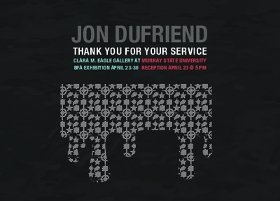
Thank You For Your Service
Jon DuFriend
This show is a visualization of my experience returning home from war and using art to breakthrough instead of letting the experience break me. The pop-art style of this exhibition is intended to reflect the optimistic nature necessary for my recovery. I have used this style throughout most of my work to display heavy topics in a way that engages the viewer. This show will be a multimedia explosion that will showcase the skills I have learned while using my G.I. bill to earn my BFA at Murray State University. The goal of this exhibition is to give the viewer fine art through the lens of graphic design (using as many graphic design elements as possible). I will be displaying 3 large groups of graphic designs with posters, vinyl mounted on foam core and vinyl on plexiglass with one of the sections including a large monitor that will display a video collage that visualizes the mental state of life after war. This exhibition will be a commentary on my military service and my experience returning home from combat in Afghanistan. I am using the “Pop art style” as a way to intrigue viewers toward my work with bright colors while describing traumatic events / hard truths of war that are normally avoided by civilians. This video will be presented in front of a larger foam core and graphics display that includes a blue thought bubble and “wham” shape. The main idea of the show revolves around the thoughts or memories of war and how that has impacted my life forever. My goal is to not only represent my personal experience but to relate to those who have been through similar events.
-

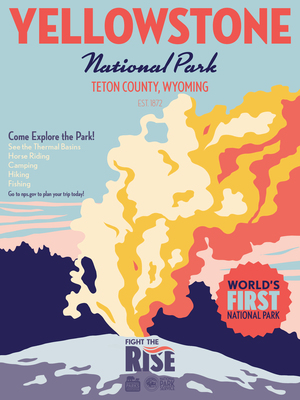
Rising
Elaine C. Fitzgerald
I have always been fascinated with the vastness of nature. It comes with this feeling of importance and magnitude that I want to capture. My show draws attention to the wonders of nature that are being lost to climate change. One the one hand, I want to give the viewer an appreciation and sense of wonder for these pockets of nature; I focus on the sublimity of these places, designing for five national parks that are being greatly affected by climate change. On the other, I want the viewer to understand that these spaces are being lost. I feel that illustration is the best form of communication to talk about climate change because, while these ideas and themes can be spread with text, it is easier for the viewer to visually understand the changes happening to nature through illustrations rather than large bodies of text.
In the Fight the Rise project, I have created an awareness campaign that uses a poster series because posters are an easily accessible form of spreading information, ideas, and imagery. I use vector drawing to create clean and concise shapes that form the illustrations, as well as a limited color palette that provides high contrast to the composition. This draws the viewer’s eye through the work and gives the work visual hierarchy. This hierarchy pulls the viewer’s gaze through the diptychs the posters create and tells the narrative of climate change’s destruction. I am illustrating national parks because they are well known areas that have more of an emotional and cultural impact than other lesser known stretches of land that are also being affected by climate change. I chose Sequoia, Everglades, Glacier Bay, and Saguaro National Parks because this collection of parks shows the range of climate change’s effects in vastly different environments. I am also illustrating Yellowstone National Park because it is the first national park, and one of the most recognizable features of the United States. Each park has two posters that form a diptych. Both halves of the diptychs mirror each other’s typography and palette creating a visual narrative. I use large, bold headers to grab the viewer's attention and smaller, finer fonts to provide the main information of the posters. Each poster also has a twenty-five point star icon that emphasizes an important fact about the park or climate change. The posters are large in order to overwhelm and inspire a sense of awe in the viewer to draw them into the illustration. I am printing the posters on recycled paper to further push the idea of working sustainably. I have also created collateral for my campaign which includes T-shirts and a motion infographic that explains ways to contribute to the fight of climate change. All of the collateral is designed to advertise my awareness campaign using the same typography, color palettes, icons, and hierarchy as my posters.
My campaign connects very different areas in the country, so I looked to campaigns like the National Park Service’s Recreate Responsibly campaign and the Lewis and Clark National Historic Trail poster series which both span multiple parks and states. By looking at these campaigns I was inspired to use the same hierarchy of typography and star icons across all of my posters to tie the compositions together despite their vastly different illustrations.
-

BITE
Ian Gresham
We all wear masks for different reasons. Some wear them to appear more confident, others wear them to act funnier than they may otherwise be. I wear mine because I’m terrified of facing the consequences of being myself - a gay man. My constant state of being is a mix of anxiety and fear that it’ll slip and I’ll be discovered, and then abandoned, ostracized from my family and those around me. These feelings have been on and off for me for the past decade since I came out to myself, and I found comfort in an unexpected place - Chick-Fil-A. The cow mask in my work references Chick-Fil-A and my employment there.
The restaurant had a less-than-reputable standing with the LGBT community while I worked there, and there were moments where the workplace felt cult-like. Full-grown adults gathered around watching old, creepy VCRs about Christianity, or automatically repeated phrases ingrained in them by the company months after leaving. However, I’d never worked with a more understanding and accepting group of people. My coworkers included straight, gay, and nonbinary individuals who made me feel like I could be open about myself for the first time, and that was liberating. I felt a comforting sense of togetherness with my queer coworkers, my fellow ‘cultists’ - we all had to wear our own masks to hide ourselves, our queerness - and yet we were vulnerable because we were in the public eye. We were hidden, yet vulnerable. The nudity and cow masks in my work represent this - the push and pull between being hidden, yet vulnerable to the eyes of others, as well as the figurative mask that I as a gay man wear to protect myself.
The work explores the many feelings associated with wearing this mask. While wearing it includes a sense of fear, doing so among fellow ‘cultists’ made me feel less alone. ‘FEELING YOU’, features a soft, yet impactful and intimate touch between two ‘cultists,’ reflecting on the way shared small moments of vulnerability provide comfort. Additionally, absurdity and hyperbole diffuse tension and deflect fear for me. Why would a naked man in a cow mask stand alone in a drive-thru lane after hours? If customers have the audacity to sing while waiting for food, maybe there are people out there who are lawless enough to fuck on a fast-food counter? Ridiculous lines of thought like this distract from the looming knot of anxiety forming in my chest.
I am inspired by the queer men who have come before me - men who were brave and open about their sexuality in ways that I aspire to. Hugh Steers creates a balance between intimacy and anguish in his work. There’s a beautiful solidarity in soft touches that are shared in moments of suffering and anguish. I am also drawn to the way Robert Mapplethorpe’s work questions the erotic and the obscene. I believe there is bravery in obscenity - in a willingness to put out work that others may openly scoff at, or be disgusted by. I find his ‘behind the black curtain’ photographs to be compelling depictions of powerful men in vulnerable situations. While these men willingly gave up some measure of control and freedom to someone that had power over them, they not only retained their own agency, but also created their own power in turn.
-

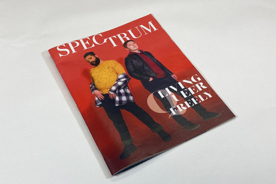
Spectrum
Archie Hardesty
Through research I have explored what exactly speaks to queer audiences and can also be embraced by non-queer audiences. In this exhibition and accompanying magazine, I want to create a queer magazine that intersects feminine and masculine gender performance, specifically how the two performances can live within one person. Creating colorful and dynamic shapes and pieces in this magazine is key. The viewer should feel engaged looking at the layouts this presents, but also feel informed and educated as they read it.
Spectrum is meant for those who relate to queer life, but also for those who are wanting to learn more about this community. The fonts and colors are used to create a modern yet refined feel to the magazine. The color palette stems from wanting to be professional, with moments of high upbeat energy. Employing cyan and reds which play into gender stereotypes to create the intersection between masculine and feminine. When creating the layout and background for this magazine, no rectangles are used for shapes other than text and photography. By doing this, the intent is to create a sense of breaking out and being different from other magazines and what norms have been set. Triangles and circles have connotations to gender and sex, both having the ability to be masculine and feminine depending on the location and use of the shapes. Editorial photography reinforces the articles of the section. The photography has a sense of fashion photography to it but will allow the viewer to perceive the intersections of gender through clothing and stance. The life and energy the models and designs exude should encapsulate the viewer to recognizing that queer individuals exist outside of the stereotypes that are placed on us.
Inspired by both Ben J. Crick and Raine Bascos, I want Spectrum to exist in a place where queer can live freely. These designers create bold and energetic designs to keep their pieces youthful and modern. Those ideas and designs are the kind that can make this happen. It should be a visual playground in which these ideas can wander and be freely discussed. This work exudes dynamism and life to make it live alongside in this contemporary setting. Being queer is one of the best aspects of my life and it is only right for me to discuss other apects of this community outside of what the media provides. It deserves to be in a contemporary spotlight.
-

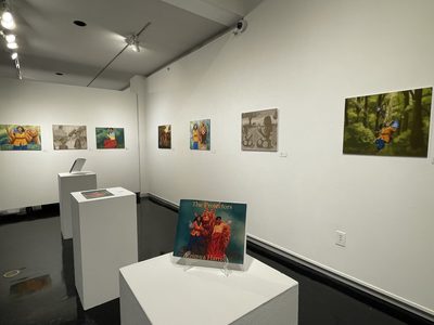
The Protectors
Keimya Harris
Many black people like myself loved seeing someone that looked like us in the media and print. It was rare and few to see shows and media that embraced black culture no matter how big or small the role was. As a child in order to cope with the minimal amount of black media and print I decided to create my own stories and make black characters the forefront within my stories.
When creating The Protectors it allowed me to create a new narrative that challenges having a white person as the main character and eliminates the trope of a white savior that also makes appearances in narratives about black people. Studying aspects of black culture allowed me to have a better understanding and portray it more effectively and accurately. The Protectors story focuses on the theme of self discovery and racial identity by creating parallels between our world and theirs. In the beginning stages of my creative process I generally start by figuring out what scenes would be memorable and help communicate the message I want to design. By producing these storyboards it helps me think about how to visually present each scene.
Illustrator E. B. Lewis inspired me to produce work that made me want to design black characters with colors that make their skin tones contrast from the backgrounds in my work. The relevancy of this is to prevent them from being drowned out in the backgrounds. Maria Dimova’s use of color and how she combines colors influence me to do the same in my work and to explore color theory. The pages are usually created with markers, watercolor, and digital media. The creation of this plot being exposed to the world will open up new opportunities and understanding of black culture. It can also open up the possibility of discussing issues of race and help my audience become honest with themselves. Through my work I hope this can assist the growth of black representation and challenge the way people perceive black culture.
-

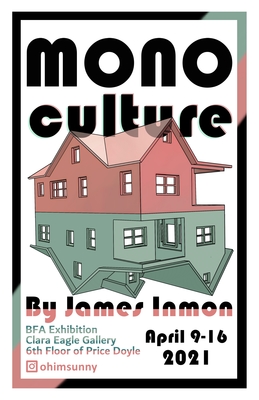
Monoculture
James Inmon
My work has its roots in structures; the regularity of structural components feel right to me and serves as a counterpoint to the visual noise of the natural world. My most recent work has focused on houses and home structures. Most contemporary houses are only a slight variation on one another, and there doesn’t seem to be too many models to choose from. The suburbs are full of sameness which can become pattern. This observation sparked my interest, so with my latest pieces I’ve been exploring this idea of multiplicity in a suburban setting, whether it be with a watercolor painting or a wooden sculpture of a house.
I’m a person who likes puzzles; I’m in love with the process of finding a solution to a problem. Similarly, I enjoy exploring the things around me to try and better understand their nature and how they exist and function. I treat my art as a practice of exploring and comprehending the world around me. This method of understanding is why I find woodworking so enjoyable; it is a medium filled with processes that require you intimately understand your material. It’s constantly checking your knowledge and testing you, and if you happen to make a mistake you’ll know immediately.
I’ve been looking at how Jerry Bedor Phillips utilizes the interaction of shadows to help emphasize the forms of his bookbinding covers and I have embraced this in my recent house sculptures as a way to maintain a simple but pronounced shape. These concepts of suburbia become apparent when looking at my work; for example in my most recent piece Who’s Helen Beck, you see the form of a house that you could see a hundred times driving through any American suburb. It’s painted a light pastel color reminiscent of pastries to imply this is a cookie-cutter form that has been dressed up just enough to be pleasing to the eye. There is also a lighting element that allows the windows to emit a soft warm glow to further assist this idea of visual comfort. I am currently working on four more similar houses to bring the topic of multiplicity deeper into the conversation my art poses.
-

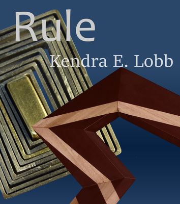
Rule
Kendra Lobb
I struggle with the need for control. I feel this was due to being raised in a broken home, where all important decisions were dictated by others. The feeling of being trapped in situations that I did not choose pushed me to find a place where I got to make the decisions and rules. I have found this in my art practice. The process of creating art allows me to make a controlled world that has order and to share it with others. I want to give my audience choices in how they interact with my work, giving them the freedom I felt I was denied.
My work consists of large-scale linear wood sculptures and geometric handheld metal objects. Conceptually, each piece relies heavily on process and the relative difficulty of completing a piece. Using process-heavy mediums is crucial to my work as it is the act of making that is how I exert control over my environment. Eventually, I am able to go into autopilot, becoming absorbed in the task at hand, as I fully have control over the process and end product. While the need for escape and control increases the compulsivity in the way I work increases, leading to self-sabotaging behaviors. The large difference in scale and medium gives separation to my work. My large-scale wood sculptures reflect the internal struggle that I have with control, putting on display my compulsive nature through repetition. My metal works are created with the intent for the audience to interact with them. Viewers are the ones that get to decide how they interact, or what a piece’s use is. I use geometric shapes as they allow for a broader interpretation of purpose because there are fewer preconceptions associated with the forms. Their set rules and predictability bring comfort.
The artists that I’m currently looking to are Dewitt Godfrey and Andy Harding. My woodworking pieces are visually inspired by Andy Harding's work. I also admire Harding’s use of reclaimed materials and actively use this in my practice, often taking others’ decarded scraps and using them in studies as well as turning them into final pieces. Dewitt Godfrey’s work is inspired by natural geometry and uses it to make rules as a foundation for his own works to follow. He experiments through the use of models and then displays them as part of his exhibitions. I have a similar tendency in my own art process using models and observational knowledge being the center of my creative process.
-

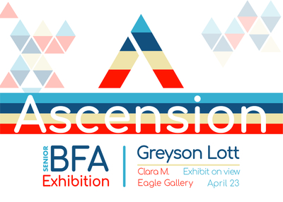
Ascension
Greyson Lott
As a small child, I always found myself running wild and exploring the vast amount of land around my house in the country. Climbing trees and crafting narratives and quests in my head. To this day, I feel free and relaxed when surrounded by fresh air. Nature’s beauty has always captivated me and at first glance, it’s seemingly incidental. Upon further inspection, you realize its design is methodical and structured; everything is built for efficiency. This natural efficiency is something I’ve always tried to express as a graphic designer. Simple, structured design that is organized to express itself and convey information in a clear, beautiful way.
Ascension was born to share my love for nature and attempt to capture the feeling of comfort and freedom that all nature lovers experience. It is a clothing and equipment brand dedicated to helping hikers, explorers, and nature lovers alike connect with the outside world. We produce clothing, gear, equipment, and information all dedicated to inspire and motivate people to explore nature and discover new passions, no matter your skill level.
Stylistically, I wanted to incorporate movement throughout my brand. This is done through a bold color palette that has a slight vintage aesthetic and is tied to repetitive, flat patterns that help modernize the brand and give it a sleek, dynamic layout. Along with bold but minimal typography, these elements combine to create a brand that is not only fun and visually exciting, but structured and efficient in helping connect people with nature. Ascension incorporates many visual forms such as photography, illustration, and motion graphics. The video commercial helps set the mood of the brand and expresses this style and my love for motion graphics that I have found in the past two years. Physical assets such as the catalog show off the company side of the brand and some of the products we offer. I wanted to create something that merges my love for nature and design, while standing out with its style in order to help others discover this love as well.
My design inspirations come from artists such as Herbert Bayer, whose work easily stands out with his dynamic use of color and form; Massimo Vignelli, who was a master at communication and clean and clear visual structure; and Aaron Draplin, who combines bold shapes and colors to create elegantly simple and fun flat design. The former two were strong advocates of the Swiss Style and helped define modern design as a whole with their marvelous sense of structure and space. The Swiss Style incorporates principles of cleanliness, readability, and objectivity and as a whole has always influenced my design philosophy. Ascension personifies these principles of design while combining my love for nature in hopes of helping others discover a similar feeling. I put much love into it and it serves as an expression of myself.
-

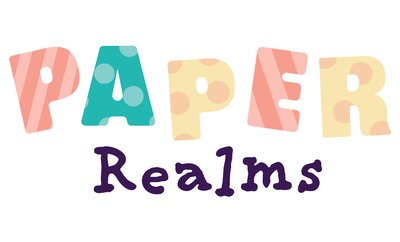
Paper Realms
Corinne O'Neal
Video games fascinate me because of two key elements that are pivotal to a good game—an engaging story and well-designed visuals. Without these elements, a game is a lackluster experience that will lose players and not connect with a large audience. Paper Realms is a lighthearted rhythm game developed for the Nintendo Switch and meant for all ages. This exhibition demonstrates key points of the game aesthetic that will engage the player with charming stories, interesting characters, friendly illustrations, and dynamic UI mockups.
Vivid color, interesting patterns, and dynamic compositions are the key design elements in my work. The world of Paper Realms relies heavily on flat, minimalist shapes and colors to bring the characters to life in a papercut-like setting. The character illustrations are simple but unique, giving personality and individuality to each. The in-game menus use the rounded san-serif font Freude to promote friendliness and allow easy readability, delivering pertinent information effectively to the player. The motion graphics are smooth with soft transitions, bringing an energetic feel to the player without startling them. Paper Realms invites the player into a friendly environment to engage with a lighthearted storyline.
My inspiration comes from artists inside and outside the gaming industry. Jessica Hische is a lettering artist and illustrator whose work is elegant, soft, and friendly. Her character illustrations use flat colors and minimal shapes to convey their message. Her soft and unified color palettes lean to contribute to the friendly aesthetic she creates—a feeling I invoke in my character illustrations. Kobayashi Ryuji is the Art Director for the Animal Crossing series, steering the franchise towards elegant simplicity in terms of in-game design and branding in order to engage the audience in a friendly manner. The use of rounded shapes, fun patterns, and minimal character design within the franchise has heavily inspired my own approach to illustration, UI design, and branding.
-
Songbird Music & Arts Festival
William Reynolds
Songbird came from my passion for music and love for music festivals. The experience of people coming together to live in the moment and listen to live music creates a sense of community. There is a feeling of true happiness and unification with people coming together for a singular purpose of having fun, and that is something I want to get across within the brand. The design elements within the branding stem from the ‘60s and the psychedelic music festivals of that era. Especially popular within the ‘60s, psychedelic music had a specific design aesthetic that came with it. The themes spread from the era were that of peace and freedom that came from ideas within songs, and the improvisational free-formed structure of the music itself, which helped cater to the hippie movement. This translated into vivid colorful imagery and patterns, accompanied by organic flowing typography within the aesthetic of ‘60s design and can be seen in concert posters and album covers from the era. With Songbird, I want to create an environment which lets people experience the mindset of being at a music festival through colorful branding that carries themes from that era into a modern context.
Songbird uses visual elements from ‘60s design by taking inspiration from the organic, flowing nature of psychedelic music, vibrant colors of the hippie movement, and typographic styles of concert posters from the era, merging it with modern flat design. Wes Wilson and Kiryk Drewinski are huge inspirations to the branding and are both known for creating vibrant psychedelic concert posters that incorporate organic, fluid like forms made from typography and flat illustration. Songbird utilizes their layout design schemes through vibrant colors, flat illustration, and flowing organic typography which can be seen in most aspects of the branding, such as the lineup posters for each day. The branding also incorporates the Push Pin style as well, with some design choices taking inspiration from Seymour Chwast and Milton Glaser by combining classic and novelty typography, with halftoned photographs that are apparent within the lobby cards and environmental posters to create a playful, illustrative feel. These elements combined celebrate the ideas that started from the ‘60s hippie movement and are still carried on to this day through music festivals. By utilizing motion graphics within the social media advertisements and having a UI interface for a phone app, the brand creates a much stronger communicative feel in order to bring this aesthetic into a modern context while making it easier for viewers to navigate through. I wanted to create a brand that carries my love of psychedelic music and style into today’s modern context of communication in order to help others discover this love, while still keeping a traditional feeling of the 60’s through design choices in typography and color. Through Songbird, I hope to share the same positive experiences I have had at festivals with others.
Daniel Reynolds
-

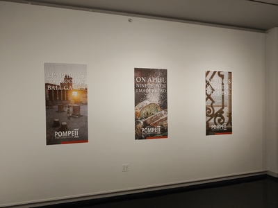
Pompeii: The Lost City
Mallory Rice
Knowledge has always been important to me. Learning new things is exciting and I want to use the graphic design skills I have acquired to bring that joy to others. In order to combine my interests in learning, historical events, and my passion for design I have decided to create a traveling exhibit centered around the rise and fall of Pompeii.
By presenting information in an exciting way I expect to maintain an audience. In order to keep my audience engaged this exhibition includes a variety of pieces including digital timelines, informational pieces, and photographs to emulate a museum exhibition. Adding to this experience, large vinyl accents and text on the walls gives the exhibition a well-rounded sense of scale. I am employing a warm color palette with earthy tones and an accent color of rust red in order to represent colors associated with a volcano. To create cohesion through my body of work, I use a rule in the accent color at the bottom of the pieces so that there is a visual reminder that all of these designs are tied together. Through these works I am able to appeal to a wide range of demographics and bring history to people in hopes that they walk away with a sense of excitement about history and Pompeii— the same excitement I feel when designing for it.
I find that the works of April Grieman influence some of my design choices. I am drawn to the way they use text as a pattern to create an aesthetic. In my pieces, like the informative piece on daily life in Pompeii, you can see that I try to emulate that feeling with the use of Large type on the vertical axis to create a visual profile consistent in my body of work. 1220 Exhibits is another influence on my choices for this body of work. They create a space that the audience can react to in a way that helps them understand a product or lesson the space was designed for. They explore new techniques that elevate the information being presented. Their designs also help create flow throughout a space to make the learning experience go smoother.
Printing is not supported at the primary Gallery Thumbnail page. Please first navigate to a specific Image before printing.
