

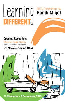
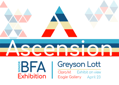
-

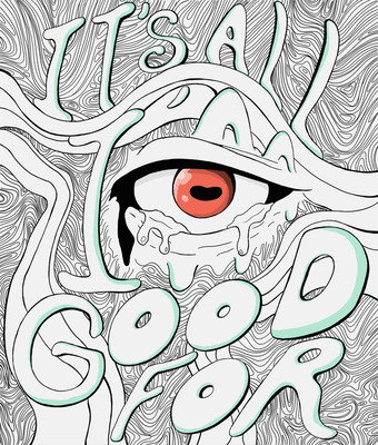
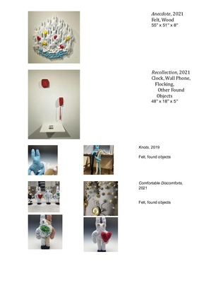
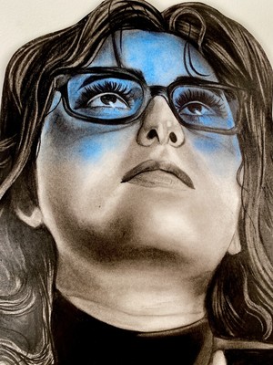
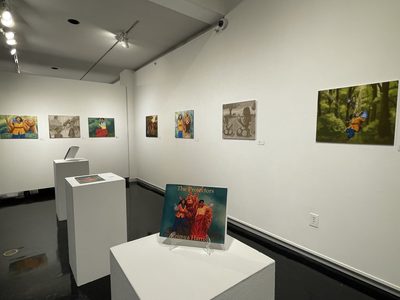
The Things I Tell Myself
Troian Cummings
Internal struggles and emotions govern my work; concepts of comfort, discomfort, and shared human perception are explored. My work is a physical metaphor of the struggles, self-protection, and vulnerabilities that we, as humans, collectively experience.
The making practice is a natural growth process; spontaneous and almost meditative in nature. The pieces start as fairly loose plans and evolve and mature as each project proceeds. Media is selected based on initial understanding of what the piece will be and adjustments are made if the idea naturally changes. In the jewelry, organic elements (like living/dead plants) and their natural defenses (like spikes/thorns) are employed, as well as colors that are fundamentally perceived as acidic or poisonous, to emulate the elegance and power of nature’s imperfect perfection. The ceramic work is much more abstract. Through metaphorical bodies, ideals of beauty and body image are explored. Each vessel is unique, just like each person is. The shape is spontaneous; never planned, and always based on the vessel that was thrown. The inside of these vessels are glazed in comforting colors and the folds of porcelain become sensual in the holder’s hands. When the two media are combined, they are in a symbiotic relationship. The metal is supportive, structural. The ceramic provides mass dominance, almost like a gemstone.
The work evokes primal feelings, like heightened anxiety or the feeling of needing to protect something. In the same way Rebecca Horn’s performances draw on a crowd's energy, the viewer/wearer of my work should feel a sense of tension, comfort, and slight disturbance-all at once, in some cases. The jewelry is a sort of protection or armor and also a place to store my vulnerabilities. Viewers should feel connected and have the desire to touch these pieces. I hope to develop a dialogue that encourages people to question their surroundings and feel the need to become more self-aware.
-

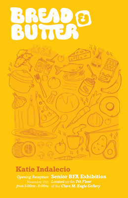
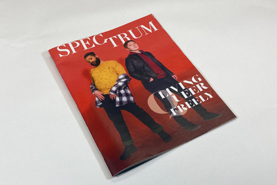
Code Craft
Megan Durbin
This exhibition, Code Craft is a web design firm that I created, that uses traditional advertising to promote their services and locations. Code Craft emphasizes the hands on craft of websites and connection to the local community through illustrative posters, booklets, and a client welcome package.
There are illustrations used throughout the website, posters, and booklet that creates a more hands-on feel than if photos were used in their place. The posters use a combination of photo realistic illustrations that catch the viewers eye, and a more organic illustration of a map that allows a resting place for the information about the brand. The colors are primarily cool, which communicates a calm and welcoming feeling that aids in the balance from the busy illustrations of the buildings. The combination of the color palette and vector illustrations create a mimic of the flat design of websites. The typeface used throughout the branding is Avenir Next, a sans-serif font that helps maintain the easy-going persona of Code Craft, and creates a connection to the current web world as sans-serif fonts are the most common fonts on the web. Throughout the website and booklet there is more white space being utilized since there is more content to display. The use of white space contributes to the calm and welcoming feeling that the posters also portrayed.
A few of the artists whose work inspires me currently are Kate Moross and Alex Estrada. Alex uses very clean and modern designs in her web work, and sticks to a simple color scheme throughout her work. Kate alternatively uses bright and popping colors with no specific color scheme to match her flowing bouncy style. I pull from both of these with a combination of bright popping colors, but a cleaner and more modern design overall.
-
Pop-up Aesop
Lacey Ellis
In Pop-up Aesop, I connect traditional Aesop Fables to their moral lessons uniquely through sequential illustration, typographical technique, muted colors, textured material and handcraft. Aesop Fables are usually represented by a singular illustration, if any, but the application of multiple illustrations and pop-up techniques give the morals of the stories a new opportunity to connect with the material of the books and have a more lasting and meaningful effect for the viewer.
By reading to my daughter I have been re-exposed to children’s literature. Experiencing the enjoyment a book can bring a child has inspired me to create children’s books of my own. The Aesop Fables were a perfect choice for my books in the sense that there is no pre-developed imagery. These stories are very short, which can more easily keep a child’s attention, and provide meaningful moral lessons. I chose only to illustrate fables that were based off of animals to make the story relatable to all children. My animal characters are realistic in design however I took special care to give them friendly demeanors with fun expression.
This body of work consists of delicate handmade books that are comfortable to hold because of their scale, containing illustrations, hand drawn typography, patterns, and digital design. The illustrations emphasis key moments and ideas in the fables and provide a whimsical feeling to the imagery through layered pop-up and paper engineering techniques. The book covers are made livelier with screen-printed patterns and washed colors add texture and depth to the line based illustration style.
I have developed my pop up skills by studying Robert Sabuda’s techniques. My illustrative influence is E. H. Shepard, the original illustrator for Winnie the Pooh. Shepard’s style has affected my color choice and character development. Similar to Shephard’s illustrations I focus on line variation and simple details to describe a story through my characters.
-

Casey Hill: Altered Perceptions
Casey Hill
Casey Hill | Altered Perceptions | Spring 2017
I look at seemingly normal or unattractive things which have colors or textures that intrigue me. In my work I focus on objects that are commonplace. My paintings then emphasize these points of interest and my own personal correlations to change the viewer’s experience of the object itself.
I find Rachel Whiteread’s work motivational due to her subject matter, commonplace items. Her representation of these items creates a sense of preciousness and a need for preservation. She allows the objects to stand as their own unique thing by creating plaster forms as a sort of preservation of the item. The viewer then is forced to confront these objects and question their importance and history. Similarly, I find Josephine Halvorson’s work inspirational due to the aspects she captures of common, everyday items that are. She renders these items in their natural environment, but by scaling her paintings so that only a part of the object is shown the viewer is forced to focus on something that might otherwise be overlooked. Halvorson often focuses on textures and smaller details, such as scratches or chips on the item depicted.
I create works that appears to be abstraction, but are not. By distorting a tangible object so that it is not immediately recognizable, I allow the viewer to see the painting without previous recognition, and thus any prejudice, of the thing that is depicted. Without this sense of recognition, the viewer then has more liberation in making their own associations with the work and can investigate it more freely. This allows the viewer to approach my works, allowing them to find their own personal associations to what I depict. I begin to play with the idea of the sublime within my work. The sublime is something that is beyond normal concepts of measurement. It’s an idea of grandeur that we can’t comprehend, such as the importance and beauty of ordinary items. By altering scale and using a traditional media I play with the relevance and importance of these items, thus bringing into question the sublime within the trivial.
My works have evolved from a simple abstraction based on scale into something else that takes on a life of its own, thus transforming my paintings from a depiction of a thing anew to myself allowing the viewer to see the painted representation as a new experience. While working on my paintings I have begun to include not just what is there, but what else could be there. This can include my thoughts or personal correlations. By doing so, my process allows the paintings to evolve on their own. With my work I have begun to encourage this more, from building additional textures and colors to allowing additional forms to work their way into the painting. I find Chuck Close’s work inspirational due to how he distorts his subject matter. Close uses a variety of color and organic shapes to create a distortion that, when viewed from up close, creates what appears to be an abstracted work that uses a variety of shapes and colors that would not be expected within an actual portrait.
By being open minded and considering objects on different levels, we begin to appreciate their uniqueness. My work relies on close attention to detail in order to encourage people to look closer and make observations of their own. I hope for others to realize that there is something beautiful to be found in items that are frequently overlooked. I play with the idea of the sublime within the trivial by altering scale and using a traditional media to depict beauty and importance of the items I reference.
-

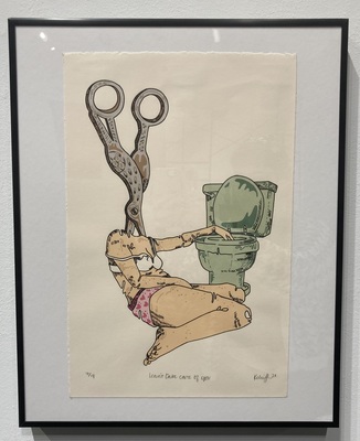
Rock, Paper, Scissors
Sara A. Hutson
Rock, Paper, Scissors is a set of graphic novels that I created while investigating and commenting on the abolishment of social boundaries for the sake of contributing to a greater cause. The viewer can witness three di erent triads as they explore the work. First is the trio of characters that the reader will follow through the novels. Each character is derived from each of the social classes. The next triad is the set of primary colors that the books are illustrated in. The colors are also tied to social class, and, while the characters are separate, will make up the palette of the illustrations. However, as the characters come together, the palette will extend to include the other primary colors, developing the world into something greater than when they were alone. This development of color is meant to reinforce the concept of the uniting of the characters, and building something stronger than what existed before.
The final triad is rock, paper and scissors. This familiar triad is one that is widely recognized as a beloved children’s game. This game only works when all three of the triad are present. Rock beats scissors, scissors cuts paper, and paper covers rock. Likewise, this greater existence is not possible without all three characters, or more clearly, all three classes working together.
I created the novels so that, when held, they feel like a childhood storybook. This, combined with the childhood game of rock paper scissors, is intended to connect to any viewer as we have hopefully all read a storybook, and hopefully played at least one round of this game.
I hope that through these novels I can communicate the bene ts of working together towards a common goal, rather than allowing our di erences to segregate us. My in uences include John Chad’s graphic novels. Their level of detail inspires me to create a more intricate environment for the characters and the reader to inter- act with. I also reference Lucian Bernhard’s contrast between bold typography and cell-shaded illustrations to give my novels a dramatic, but readable quality.
-
Variations
Brittinee Jones
Trees symbolize growth, strength, and wisdom. Trees also have a function, and these organisms can record everything that happens around them and to them. Trees record a physical mark of growth and this linear record is physically beautiful and an inspiration for my current body of work. While interested in these states of physical being I researched the growth patterns found in different living beings. It became evident that growth patterns are actually more similar in trees, hair, and elevation levels. Each being on this earth is very different from the rest, but one thing that connects us all is the physical marks that show scars, aging, and growth. I use different patterns of growth for different beings to show how these physical marks can still be shown, and how closely humans relate to other organisms. Linear elements dominate my prints and woodworking. I use line to create a fluid composition combined with natural and neutral earth tone colors. I create rich and layered work to give my prints texture. Mark Schatz’s sculptures inspire me to think bigger, and use different materials to execute an idea. With this body of work I challenge my audience and myself to see the similarities in things that do not share the same physical structure
-

Out of the Ash
Amanda Kaler Combs
Artist books and boxes are intrinsically dualistic. They compel the viewer to interact in an intimate and revealing way; but at the same time the outer surface forms a protective barrier between the viewer and its contents. Through my work I attempt to reconcile two opposing aspects of my personality; the need to control my environment and my appreciation for unexpected outcomes. Artist books and boxes, via assemblages, become, in my work, a metaphor for cognitive dichotomy.
Drawing inspiration from assemblage artists like Paula MacGregor and Joseph Cornell, I explore the relationship between objects and their contents. I use cast-off fragments like bark, leaves, rocks, and animal remains in combination with living plants to allude to the cyclical nature and transformative quality of all living things. The natural elements I combine with found objects suggest an ambiguous narrative when they are removed from their usual context. This juxtaposition also represents for me the idea that opposing states of transformation and statis exist simultaneously; the natural elements symbolize a metamorphosis and the found objects represent stagnation.
Ideas of restriction and protection; and growth and stagnation have always interested me because I have impulses toward control which can be stifling. Dyeing and making paper, as well as the layering of an etching plate are meticulous processes that express my restrictive aspect, while the unpredictability of working with natural elements appeals to my mercurial side.
The contradictory formal and conceptual components coexisting in my work represent that we often experience two opposing conditions existing in a constant, rhythmic ebb and flow. I seek to communicate that ideas can conflict and coexist leading the viewer on a path of self-actualization, a resolution of inner duality.
-

Remembering
Taylor McCord
Time doesn’t wait for anyone. It always changes the way you look at something, or the way it looks. This is something I learned from a young age, and have tried to battle against it in order to preserve memories I’ve made. I started out collecting family photos, then I moved on to taking my own, but as I got older I realized there is no real way to preserve a memory, it’s always changing. As years pass little moments are forgotten even physical relics from the past deteriorate and age with you. Because of this, I soon realized there’s no pure way to stay connected and felt saddened when looking back. It was like a layer of separation was formed between me and the memories. It’s a longing to connect to something, some person, some memory that is no longer present. This is what I’m interested in, the layer of separation felt from the past after time takes its course.
Since my work is inspired by my memories, I use photographs from my childhood, furniture to amplify the imagery of the home, fabrics and other relics from my past. By using materials strongly tied to my past the work becomes a reproduction of my memories. I create artificial stand-ins for things I’ve experienced like…
love/loss/home/joy/death/dissociation/bliss/pride/nostalgia/want/grief/playfulness/
innocence/depression/comfort/intimacy/longing/freedom/security/hope/peace/
through installations set up to allude to the image of home. In doing this a weird inbetween atmosphere is created as the work resembles something familiar, something that could be found in a home, but each piece is altered in a way so that it doesn’t just mimic a home. This could be through the use of sound, video, or lighting to distort the way the piece is viewed.
This alter in reality helps to amplify the separation felt when trying to hold on to the past. By doing this I hope I can recreate this feeling. I hope the person viewing it might connect to this and reflect on their personal experiences.
-

Dawson
Murray State University
Tianna Nawrocki
Artist Statement
My work emphasizes a lack of presence through empty spaces and discarded objects. This emptiness combined with the use of domestic imagery implies a lost or forgotten narrative. The content of my work deals with thoughts on mortality, the passage of time, and the strength to overcome obstacles. In addition, my work focuses on nostalgia and sentiment, remembered by ordinary objects and structures. I am inspired by Albrecht Dürer and Beatrix Potter for their use of line, attention to detail, and their realistic art style.
Etching and ink on paper are my chosen mediums because they give my work a soft rendering quality. I am able to procure rich values and strong lines that resonate a sense of foreboding. The spaces I create have a dream-like quality which makes my pieces eerie and uncanny. I purposefully limit color in my work to represent a time that is quiet, serene, and in the past. My scale, use of line, and value emphasize a quiet and serene atmosphere.
-

Spider's Lace
Rachel Schmidt
My current work is about identical lessons learned by separate people from different personal experiences. Interviews with friends and family are conducted to identify a lesson both me and the subject of the interview have learned and combine the separate experiences into one story. Because the story exists in a place beyond any one human character, they are transformed into animal fables, which are then illustrated with print based installations.
The stories are built around what the interviewee would most like to teach to someone younger. The fables exist in a world where these lessons become established as rules in nature. I’m looking at artists like Joanna Mueller, who uses animal and ancient North American myth symbolism to achieve a narrative-like effect, and Anne Hamilton who uses installation and print multiples to create immersive experiences. The media and style of each print installation is entirely dependent on the fable. The prints range from black and white linoleum cuts, to soft and colorful lithographs, and the installations range from to little wooden boxes filled with dozens of small monoprints, to wearable books on live models.
Design elements are incorporated to give the show cohesiveness by unifying the different stylistic aspects of the separate works with a common visual narrative. A series of posters accompany the works of the show, identifying the title of each story and installation and matching it with a unique icon displayed near each piece in vinyl. In addition to the posters there are small hand-bound books identified by each fable’s icon; each book contains a written fable laid out with experimental type and minimal graphics. The show gives the viewer a sense of discovery as they move through the fables via illustrative prints, books, and installations.
-
Collective Being: Arranged Chaos
Lashae Taylor
Compositionally I focus on the use of texture, found objects, and color to create a painting language, that includes, but is not solely centered around subject matter in a way that invites the viewer to a conversation. Conceptually I am interested in relating living and nonliving forms to common experiences of existence. The experiential ideas I explore include deterioration, awareness of self, chaos, and conspiratorial characteristics of our culture. I combine varying media to communicate these subjects in an abstracted ethereal manner.
Nature and it’s connection to the the human spirit influences my use of nature-forms and man-made items. These objects work together with other media to draw out a specific connection or emotion from the viewer. Historically I am attracted to the way the artists of the Expressionist movement radically distorted subjects for emotional effect in order to evoke moods or ideas of their own. Contemporary Artists Pat Steir and Seth Apter also influence the way I use color, texture and found objects. Mixing media provides a sense of exploration and freedom which gives me a chance to express myself in such a flexible, varied, and creative way.
I challenge myself to solve chaos, plan, and improvise daily. I combine a sense of control and intuition to manipulate paint and other media using varying methods and building on old techniques as I go. Studying the artists’ work that I admire gives me inspiration to create expressive compositions in this manner. I begin with a broad compositional idea that continuously evolves as I make. The abstract compositions I create are further emphasized through hidden imagery, varying texture, and color that make up the dialogue between my materials and concept.
This expression of myself through painting and sculpture creates a broadened platform for me to communicate my thoughts and experiences. We are products of our environment. What makes up my environment spills over into my work to start a conversation about awareness of self, chaos, deterioration, and conspiratorial characteristics of our culture. These concepts are constantly in my mind and have an effect on all of our lives. To recognize the way these things effect us helps me gain a stronger understanding and control of my own state of being.
-

Beloved Microcosm
Logan Weihe
Beloved Microcosm- Logan Weihe 2017
My work is non-objective and abstracted, as it references the human form and also invents new forms, combining the matured physicality of the human body and our beginnings (smaller pieces i.e. cells, atoms). I am interested in the seemingly endless problems that the human body can solve, as well as working towards understanding its limitations both physically and mentally. The intersection of contrary ideas and the forcing of harmony between them fuels my creative process. The idea of opposites becoming one entity both formally and conceptually is rich for me, as I want to explore those points of friction and resolution.
My current work involves a process of arriving at a general concept about the body that peaks my curiosity, and then working intuitively with the paint to explore this idea. As I create, I am continuously learning more about the specific scientific process that I choose to inspire each piece. The paintings I produce are spontaneous interpretations of cellular bodily processes, including the illusion of movement as well as the manipulation of composition and color to create energetic worlds. I make oil paintings that speak about microscopic processes visualized through advancing scientific technologies so as to juxtapose the contemporary use of visual technology with a very traditional way of creating. Additionally, I am infatuated with the elements that our bodies are made up of, and employing the gesture of painting, using my physicality to create the image is exciting for me. Jenny Saville’s grotesque depiction of the human form and the visceral quality of her work coincides with my interest in undesirable reality and experimenting with the size and weight of my marks. Lee Bontecou’s work inspires mine in the way she creates cellular like organic forms, often dealing with space that becomes a sort of vacuum. Arshile Gorky fragments the figure in abstract ways in order to tell stories of his past, and from his paintings I seek to better understand emotive color as well as how to use the figure non-objectively.
From the sheer number of processes that occur within us each second to the fleshy quality of our bodies, my attraction to the human form comes from my search for the power or force that created our bodies in all of their complexity, whether it be God, chemistry, chance, or something that is not meant to be explained. I strive for my audience to be fascinated with themselves and to see their own body as something remarkable, in its intricacy and flawless execution of thousands of processes.
-
FREEDOM
Ruochen Zhou
Artist Statement
I am trying to show the freedom in my works that an artistic life provides to me and also find the process of making artwork is a way to release inner stress. I am focusing on the sculpture because making sculpture is perfect for creative expression and release of tension. I like to use the technique some like twisting, combination of the line and shape, hanging and mix material on my project, I think that is more suitable to show the meaning of freedom. And, sometimes my artwork takes a critical view of social, political and cultural issues, it is similar to a lot of artists in the world, Ai Weiwei is one of them, I am his big fans, the reason may be we both come from China, I can easily be understated the meaning he want to show in his work, and that was always my reference. I think that also a part of “the freedom” I keep searching for, it is the freedom of expression. So, I keep creating different project try to show the freedom feeling and talk about the social problem or the problem of human and nature. I still enjoy making other things as well to balance myself, I used to make some graphic designs, drawing and painting blend into my life, I like that so much, and I want to combine the 2D designs and the 3D sculpture.
In most of my works, there is a narrative of freedom, which is mainly reflected in the way I produced and emotional performance.
But what about this? For me, this makes some of the ironies of sensitive topics and from my understanding. As a Chinese art worker, in some cases, we do not have the freedom of speech, and in some cases, "some people" need to hide some of the real reports of things, so as to maintain social stability. But I think everyone has their analysis and understanding of things, of course, the best way is to say it boldly.
-

an Act of Preservation
Jo R. Bennett
The inevitability of change present in nature is a familiar subject. It is a reliable constant throughout my life and has so far provided plenty of experiences both positive and negative. Change has taken me on a journey through relocation and travel, my education and career, and through my own identity. But just as in nature, moments of experience are fleeting and unstable. With a life in constant transience, I find myself persistently fascinated with the ephemeral but fixated with finding stability.
My work explores this fixation in the ‘act of preservation’ by treating found objects with reverence, much like Doris Salcedo in the way she treats the materials or subjects used in her work. The decisions I make are with the intention to safeguard, pausing the natural cycle of time, and create a sense of significance and permanence. The end result is an often desperate attempt to interrupt mortality and make lasting these fleeting moments.
The materials in my work, whether found or refined, are elegantly composed with simplicity and drama in mind, a similar approach influenced by artists such as Sarah Hood and David Chatt. Many items are pieced by contrasts, such as organic vs. geometric, stability vs. instability, warmth vs. coldness, hardness vs. softness. The resulting work appears in many forms of interest to me, each for different reasons. Reliquaries exist for the purpose of preservation, tucking things away and exposing only clues to its contents. Jewelry, on the other hand, exalts the ephemera and forces the wearer to actively participate in its preservation. And finally, I'm interested in repairing dilapidated objects. Not to restore their function but to preserve history and memory, existing as both memorial and memento mori.
-
of all things I do
Angela Davidson
The inspiration for my work is derived, in part, from my appreciation of repetitive processes. Kinesthetic activities such as working in a kitchen and building have always come naturally to me. Producing objects made from clay is an exercise that I find satisfying in a way that is similar to these other tasks. There are many steps to a finished piece of my work that few people will ever see; throwing the clay, pulling handles, trimming a foot, and the development of the two dimensional design. In manipulating the surface of the ware I achieve one more gratifying step. Since childhood I have been attracted to, daydreamed of, and drawn a variety of obsessive linear patterns. The action of carving a complex pattern onto the surface of a leather hard piece of pottery provides a level of stability and calm for my otherwise erratic mind.
How my work feels in the hands of the person holding it is an important component that I consider during production. The sense of touch is a fundamental part of our daily experience. It is crucial in creating our unique human existence, and it will differ from one of us to the next. This is the thought process I consider in order to achieve a functional pot. The form of the object and the composition on the surface can be derived from all areas of life; those we are close to, the nostalgia of childhood, experiences we have had with our environment; each of these connections can be interpreted in some way visually. The elemental form of the vessel along with the surface design is intended to represent a contrast between two worlds: the bulk and delicacy, refinement and physicality, and control amidst chaos are all things I struggle to balance within my own personality.
The concept of my work is to be functional as well as visually stimulating. In a way similar to artists such as Matt Metz and Kathy King, I wish for the participant to be compelled to examine the piece in order to understand the story behind its conception, to pick up and hold it in their hands, and for the item to find a meaningful place in the user’s daily life.
-

Unleashed Pet Boutique
kaitlin heldenbrand
“The goal of design is to raise the expectation of what design can be.” – Paula Scher
Even the most humble products deserve to be presented in an extraordinary and elegant manner. As a graphic designer I have the ability to use my art to communicate to the world on a regular basis. I feel it is my responsibility to contribute to making the world a more beautiful and interesting place through my designs. Unleashed Pet Boutique explores the boundaries of branding humble products – dog treats and care items for dogs in an extravagant manner because even these products should be presented beautifully.
Unleashed investigates packaging and design in a method that makes the customer feel like they are buying something special for their pet through the way the product is displayed. I have always been drawn to packaging and designs of Margo Chace. I feel that in this series much of my patterning in these packages is directly inspired by her use of organic illustration in her packaging work. Her design style of using hand-made illustration in her packaging work rather than photography engages the viewer more because it adds a hand-made and unique quality to the work.
This series incorporates mesmerizing patterns layered as green monochromatic print on the green papered packaging that allows the pattern to add a whimsical nature to the packaging without it being overwhelming. This aspect of the packaging has a hand-drawn quality that also gives the feeling that the products are original and one of a kind which is an aspect I want to be prominent in my work. The variety of line and shape within my illustration between the layer of the brown belly band and green box of the packaging creates contrast and allows the viewer to distinguish what is meant to be decorative and what is informational. The packaging, tags, and bags all incorporate a layer of a brown recycled paper on top of the green kraft paper in a different way which creates diversity within the brand and keeps the eye moving. The brand uses specialty paper which adds texture to the packaging as well as creates a quality of being more expensive, one of a kind, hand-made. The colored papers that are used are earth tones associated with healthy products that are all natural. The posters that advertise the brand incorporate the packaging displayed with the ingredients lying out around the products emphasizing the natural and fresh quality. The Unleashed brand exemplifies the idea that even humble products deserve to have unique design that can elevate them to new heights.
-

Stagnation Transfiguration
John Jarrett Kinsland
Age and lack of time was a constant problem for my family and a personal concern for myself growing up, maybe because I am the only person in my family under the age of 55. Lack of energy became neglect for my family’s 142-year-old farm and 40-year-old tire business. Growing up, I became all too familiar with visions of decay in what once had been a thriving place of growth and order.
My aging family’s lack of energy was a main ingredient in the state of decay but economic flux and failure to keep up with the times were also to blame. Witnessing this decline planted a seed of desire to see progress and a way out from the current state of things. “Ad-hocism” and off-the-cuff construction using materials that were readily at hand to solve utilitarian problems became a wellspring of inspiration and creative opportunity for me. Growing up, fences, roofs, mailbox stands, gate latches, and feed troughs name but a few of the things made from old tires I found; from tarps made from inter-tubes to chairs made of steel wheels, the list could go on.
As an artist, I continue the essence of my family’s ingenuity combined with my physical and mental need to improve and build. In some of my recent sculptures, I make use of tire parts linked and woven into forms that simultaneously seem to be on the verge of falling apart while having a noticeable structural integrity. I hope to portray to the viewer a foretaste of the atmosphere from which the resources came and a sense that a new possibility for the materials is being found. The idea of struggle and acceptance of limitations and failures in the construction process can be seen in my work and serve as important references to the reality of what is possible as I quest for new possibilities. These intentions spill over into my ceramic work with the tower-like forms built from loops of clay, mimicking the shape of tires. Juxtaposing play, structure, and defiance against forces that overwhelmingly oppose their creation is a goal of mine.
I strive to create works that have an open ending or a kind of ambiguous existence, leaving the viewer free to impose their own narrative on the forms. As guiding rails to that narrative, I implant elements of hope, somberness, playfulness, and urgency. An influence on this approach is historic Cabinets of Curiosity that speak on the nature of wonder and humanities desire to both understand and not know. Indeed wonder is very often found in the things we feel a kind of connection to without having an understanding.
Alwyn O’Brien‘s ceramic work has also been an influence of mine in terms of its playfulness, fragility and urgency. Sterling Ruby and Leonardo Drew are also large influences on my work due to the raw and unkempt aesthetic of their sculptures along with conceptual themes of masculinity and its fragility.
Jarrett Kinsland
-

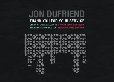
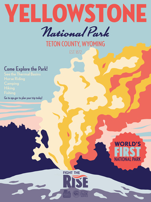
Ramble: Graphic Design Exhibition
Ethan Shutt
The content I prefer to work with typically deals with the ideas of nature and our place as humans inside of it. This exhibition, Ramble, shows the branding of an outdoor company that encourages a person to exist in nature that is different from our often urban and ordinary lives. By allowing viewers to either think or feel that they are in an outdoors store environment I am attempting to create the desire to go hiking and camping.
This body of work is rooted in creating an interaction with the viewer, whether that interaction be design-based via packaging or signage or using illustrative means to invoke a feeling. I use three-dimensional processes such as packaging design as well as two-dimensional processes such as silkscreen and digital printing to create an overall cohesive brand that largely focuses on convincing a person to buy their product to begin their adventure.
I often look at work by artists who pull double duty as both illustrators and designers. Currently I find the work of James Gulliver Hancock and Jessica Hische influential; Hische’s work inspires mine by adding illustrations as an accent to a typographic design, and I use limited color palettes in a similar manner to Hancock’s work.
Value primarily defines the subjects in my work, I use a graphic style employing blocks of color and value while also occasionally using line illustrations that accent elements. I make realistic and recognizable imagery with illustrations. When working outside of an illustrative style, I create typography based layouts that balance readability and creativity as well as using photographs to effectively convey an idea to a viewer.
-

past imperfect
Bentley Utgaard
How do we understand the various structures that sustain our consciousness? How do these structures form, evolve, and eventually fail? Geologic layers of experiences and memories accrete, evolve, and erode continuously. Microscopic genes mutate creating new iterations of life; diseased cells multiply to a critical mass. The interplay of the seen and unseen, and the space between what is tangible and the shadow it casts fuels my research. Exploring biological underpinnings provides opportunity for communicating about the force, delicacy, and ambiguity of life even through its decay.
The small sculptures are intimate tableaus about presence and absence, outmoded ideas, as well as memory creation, loss, and authenticity. Enameled forms layered with decals of Victorian-era engravings, patterns, and/or hand-drawn imagery evoke a sense of wonderment through not understanding everything, as if piecing together a mystery or reading between the lines. Is the whole greater than - or, conversely, less than - the sum of its parts? The use of found objects and other non-metal materials lends more contextualization and spirit to the work. The art and craft of metalsmithing itself brings with it historical significance, materiality, and emphasis on process that melds with the work’s conceptual potential. I look to contemporary metalsmiths Myra Mimlitsch-Gray, who creates ambiguity and cultural commentary by mutating traditional forms, and Haley Renee Bates, who innovates with her studies on structure and perception, as they set high benchmarks for conceptual development without compromising craftsmanship.
The jewelry works present small-scale narratives and contrasts in form. The Vanitas Series brooches strike a balance between the familiar and the unrecognizable using cast natural objects placed in formal portrait-like settings. Matte finishes suggest a latency and “frozen in time” quality. Placing these objects within such constraints examines their preciousness and potential in an absurd way, seeking a nostalgic experience of biology. Other jewelry pieces explore perceptions of structure through conflating the natural with the machine-made. My attraction to this contrast in form is inspired in part by Lee Bontecou’s wall sculptures that appear at once mechanical and anatomical. They strike a subliminal chord. Jeweller Cristel van der Laan is also influential for her astute marriage of geometric and organic forms.
This body of work invites the viewer to spend time contemplating what constitutes and changes our conscious lives. There is a melancholy naturally associated with themes of loss, but my hope is that the work evokes a sense of embracing the unknown in a curious way.
Printing is not supported at the primary Gallery Thumbnail page. Please first navigate to a specific Image before printing.