

-

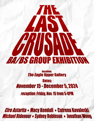
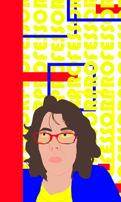
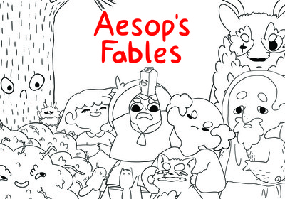
The Last Crusade
Catrena Kovaloski
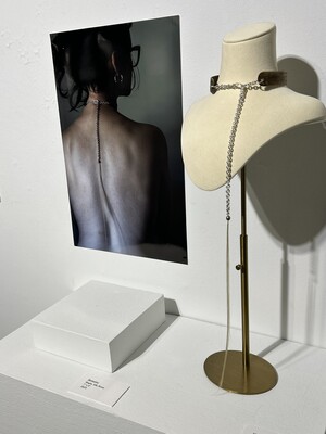
Through photographs, I utilize minimal and direct composition to address objectification of the female form and domestic violence. The photographs I take focus forwardly on the subject matter and are meant to have the viewer interpret the scene without any unwanted distractions. By incorporating myself as the model, I allow my experience to be shown through my eyes rather than as an outsider. The photos with their black and white tonality correlate with color theory as they strip away the emotion from the scene and allow the viewer to interpret the work. My photographs address abuse on the psyche portrayed in a physical depiction. This is accomplished with the use of dramatic lighting and compositions that abstract the female body by cropping the frame. This is utilized in “Voiceless”, a self-portrait, by using Rembrandt lighting to create an atmosphere of mystery and subtle violence. A photographer who influenced my work is Brooke Shaden. Shaden intended to portray concerns with motherhood in, “Fallen Fruit”, however, my first impression of the piece was about the sexual violence that can occur within domestic abuse which resonated with my personal experience. My work, with the use of minimal visual elements and direct composition, creates an introspective look into objectification and domestic violence. It exists to process my experience with consensual relationships and domestic abuse, while not catering to what is considered comfortable with the disturbed and explicit disposition.
-

The Last Crusade
Michael Ridenour
Michael Ridenour
My work comes from imaginative inspiration as well as a personal nostalgia. This visual influence on my work comes primarily from Japanese animation as well as my memories of the visual culture of my youth—I filter these touchpoints through current trends to inspire new work. The vast majority of my art involves drawing with graphite and/or charcoal. My art making reflects critical thinking about my experiences by trying to portray a breadth of emotion in the confined two-dimensional space of a drawing. I am interested in continuing to explore the ideas of childhood nostalgia in my future work. I am attracted to pieces that I can relate with and pay particular attention to work based on popular culture.
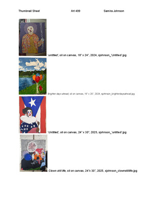
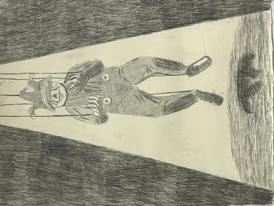
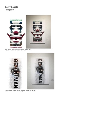
I seek consistency in my artwork through the use of a monochromatic color palette and cross-hatched line work. I am attracted to the idea of how nostalgia might lead to a deterioration of stress and relief from some of the strain of life. For instance, in my drawing “Atlas” the central character from the popular video game “Halo” struggles to lift a heavy cinder block over his head but is ultimately caving to the pressure and weight of it. Another work that is influenced by my childhood is the “Back to Square One” piece I centered on the theme of popular trading card games. “Self-Portrait”, inspired by my feelings of finals week where I am a clown. Even though clowns are known for being ridiculous, they have to perform for the audience's expectations. “Confined” which sticks to the limited access of youth where the plush doll is locked in a glass vault for its own protection. But this is also scarring the toy psychologically for not being able to go outside and have fun. Though it is a sort of transition from a previous theme of mythical animals drawn on torn journal pages, it further incorporates some elements of my personal childhood such as a passion for mythology and wildlife.
Some direct influences on my art pieces are from Japanese animation studios, such as the films of Studio Ghibli directed by Hayao Miyazaki that often feature stunning and whimsical scenes that frequently also contain complex symbolism and intense conflict. I am also inspired by character designs made by James Turner for the Pokemon franchise, particularly how he makes his own designs of Pokemon while still maintaining the traditional values and iconography of a very established brand. Speaking of keeping things traditional, my final influence is an American sculptor named Daniel Arsham. Most of his art pieces are based on characters and paraphernalia of popular culture as well as classical art and having them seem to be eroded with crystals exposed. This in a way is relatable in a way with my artwork because it takes these themes of remaking the popular culture and turning them into an ancient.
-

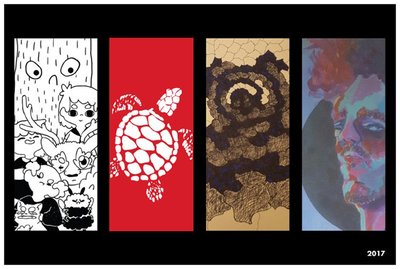
The Final Crusade
Sydney Robinson
At some time, all people struggle either mentally, physically or emotionally. Most have some form of struggle that we carry around with us. Some show their struggle while others hide it very deep down. I create illustrations to show people that they are not alone in their struggles.
I build illustrations that incorporate heavy outlines, with a tone of cartoonishness and I also incorporate type. I want the illustrations to have heavier strokes to help provide a sense of unrealisticness to very serious concepts. I incorporate text as a way of giving the piece a direct meaning. I want to create the illustration's anatomy that is genderless as a way of allowing everyone in the audience to connect more with the piece itself.
I also build typography that incorporates a hint of color with a simple layout. I want the typography to express and highlight the overall importance of a quote in which it is referencing. I think the right use of color can help enhance a point and be more eye-catching to the audience. When I create a typography I want to use phrasing in which it sounds as though the words that are being displayed are being said to the viewer themselves as a way of connecting the pieces to the viewer.
The design process for the layouts of these posters was influenced by illustrators such as Max Erwin and Carles O’Dowd. Their use of line work in their pieces is not over realistic. I find unrealistic artwork to be very comforting and somewhat cartoony. I find that cartoony artwork is a nice way of taking harsh reality and softening it down to make viewers more comfortable with the subject. I want the art I display to stimulate both the viewer’s mind and emotion. While leaving the viewer wanting more.
Sydney Robinson
-

Through all of it
Thomas Townsend Jr
My art is about feelings and thoughts that can’t be expressed with words. I want to make art so that my audience can understand the importance of the places I have been and their significance to me. The drawing I recently made, Self-portrait, is about how I am dealing emotionally with familial loss. In my piece Family Museum, the background was made to have a museum or memorial feel, displaying two rooms for my passed family members. In addition, the value of contrast helps elevate the understanding of depth and space, giving it a more authentic look.
Listening to music and being able to connect with my thoughts in my own space is one of my biggest motivators. Most of the drawings I make don’t have color because it seems more personal and shows my improvement with tonal contrast as well as my attention to detail. My paintings are enhanced through my employment of symbolic objects and colors. My artwork that does use color, displays my range of color value and blending, capturing the eye of the audience.
I draw influence from the likes of African American artists such as Toyin Ojibwa Odutola and Jacob Lawrence. Odutola’s portraits tend to fight against the negative stereotypes most often depicted of black people. Lawrence illustrates the black experience by painting the streets of Harlem where he grew up. Another point of inspiration from Odutola’s work is her use of the contrast of black and white which is seen in my own art for more dynamic emotional expression.
-

The Last Crusade
Jonathan Wong
I’m driven by a desire to explore human emotions and how we are influenced by social media. While a useful communication tool, it is also a part of the reason for poor mental health. I am myself an emotional person. Making video and photography helps me to soothe my own anxiety, while working with people who express their own conflict with their current life. Photography and film serve as a vessel for the variations of personal mental health struggles, friendships, and offering a timeless reflection of emotional states. I want my art to be therapy and remembrance that grounds you to reality, showing you, the audience, themes of friendship and loss to bring positivity. Social media can bring dissociation and regret, video media can help change that narrative, as ironic as it may seem. Through pieces like "How to Use a Book" I delve into the impact of technology on modern society, utilizing vivid imagery and video inserts to social media videos that seem to have the solution to all problems. “XANNY”, “As it Was” and “Deep Sea” focus on showing an angle of specific mental tropes based on individual experiences. These can come from the stress, depression, and overstimulation pervasive in modern society. Emotions are universal for every person, and my goal is to portray my feelings in those moments with the hope that the audience can relate in their own way. Everyday tasks or moments can still bring momentary sadness but that isn’t always bad. They are the product of fully experiencing life. In my creative process, collaboration and introspection intertwine, culminating in works that speak to both personal experiences and reality. Drawing inspiration from luminaries like Massimo Vignelli and Paula Scherr, I navigate the intricacies of design/video media with a keen eye for detail and narrative clarity. Ultimately, my artistic vision is about shared emotional experiences. Regardless of how big or small these may be, I want to bring those emotions out of you to self-reflect on your experiences and how it feels now regardless of time. Every piece is made with vulnerability, through use of color, music, angles, facial expressions, and the use of social media everywhere. If I am able to elicit any strong emotion from your mind, then I have achieved my goal.
-

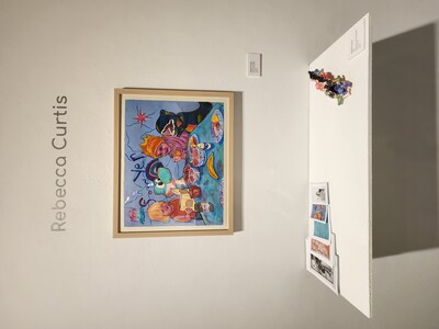
The Essence of Introspection
Rebecca Curtis
Fantasy was a household theme during my childhood. It appeared in the form of unicorn figurines, a fairy mural on my bedroom wall, a healthy obsession with Amy Brown, a love of Sci-fi movies, and regular Dungeons and Dragons games with my parents. After experiences including sexual abuse, divorce, coming out, and my son’s autism diagnosis my art made a metamorphosis from fantasy to reality. My current work explores the positive and negative feelings associated with all of those personal events.
Uniquely raw, figurative works combine themes of love and trauma into my recent prints, paintings, and ceramics. Taking notes from Doron Langberg’s explorative and evocative use of color, my color palette is highly saturated and portrays the intense emotions of underlying narratives. Similarly to contemporary painter, fellow queer artist, and mother, Jenna Gribbon, I am using personal references incorporating LGBTQ themes and referring to my son’s struggles and triumphs. The figures in my work are to be regarded with empathy as you capture a glimpse into tender scenes of interaction and personal discovery.
Embracing representational art in all mediums, enables me to weave these universal narratives together. My prints, ceramic works, and oil paintings are executed with elements of realism to allow viewers to enter the scenes and relate to the figures as well as to my experiences. This art is the prime mode in which I express the love and grief and empowerment and anxiety of daily life.
-

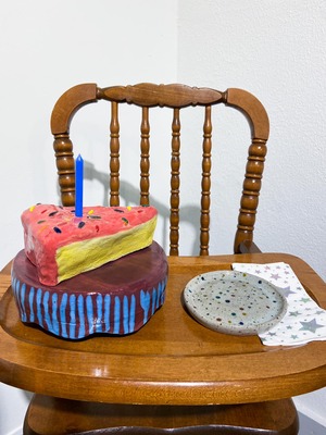
The essence of Introspection
Mahaila Pinchot and Mahaila Pinchot
The work I create is experimental and stylized. I like to use certain art making processes such as photography or ceramics to document different events or emotions that are going on in my own personal life. The concept of taking something common and turning it into tangible art is a topic I am passionate about and continuously exploring. This particular body of work is a celebration of my journey working through my own personal experiences and highlights. As well as a way to honor my life, past and present.
The imagery used in these photographs are inspired by places that are memorable to me and invoke the sense of nostalgia. These photos help document the ordinary moments that have accounted for so much of my life that oftentimes are forgotten. Throughout my work I am constantly finding myself dealing with the subject matter of a photograph, and problem solving on how to add the right amount of detail and information which allows the viewer to grasp the sense of nostalgia that I am creating. The ceramic work used in this show is a direct reflection of this emotion. The realistic cake slice represents the ‘party’ aspect one might feel when feeling a sense of accomplishment. In addition to this, the color scheme used throughout my work is influenced by childhood memories. Being able to manipulate an object brings a sense of awareness to it which plays a role in the concept of turning something boring into something extraordinary. Using art as a way to convey a feeling of sentimentality is something I like to do in my work.
One contemporary artist that has been a heavy influence in my work past and present is Virgil Abloh, who was famous for his collaborative work with Louis Vuitton, as well as his sole label ‘Off White’. His way of taking mundane objects and creating elaborate art with them is something in which I can relate and admire. I see my work reflecting ideas similar to his such as remembering past experiences and using art as a way to voice those experiences. In addition to Virgil, another artist who had a great impact on me is Karl Baden -- a contemporary photographer who is best known for documenting and shaping perspectives with his images. This concept is something that I carry with me through my own work by constantly trying to convey thoughts or ideas that the viewer can also relate to. In addition to this, Baden’s photography is very stylistic and used in a documentary way. I relate to this because my work is similar in the fact that it is distinctive - regardless of medium. In addition to this I also enjoy the need to archive my experiences through photographs. I'd like my work to allow the audience to feel a sense of recollection of their own life experiences, and hopefully inspire someone to capture those memories too.
-

The Essence Of Introspection
Skyler Pointer
In my youth, I grew up watching cartoons and I mean a lot of them. Animation has always been very important to me as I am fascinated by how we give characters movement and how it gives them a personality. Some people might look at these characters and see more than what others see in the sense that a viewer could assume how these characters are supposed to act based on how they walk or how their arms move. The storytelling that we can do with these characters gives us almost unlimited possibilities with where we can go within this form of art. Animators like John Dilworth, Natasha Allergi, and Maxwell Atoms have been some major influences on where I can take this medium. I am fascinated with the storytelling and characterizations of Allergi’s Bee and Puppycat cartoon as well as the combination of comedy, horror, and deep storytelling within John Dilworth’s and Maxwell’s cartoons. The main inspirations within my body of work are the comedy and how these characters are given personalities.
One of the main themes of this body of work besides showing off animations is standing out or trying to fit in by not being yourself. Within the looping animation, the viewer sees this wolf character and each time he comes back on to the TV screen, he is dressed up differently to try to capture our attention via a television. In the energy drink commercial, an alien drinks an energy drink causing the character to act crazy and to do funny things. The skateboard commercial showcases a skateboard hurting a monster in comedic fashion and then riding away in said skateboard. Overall, with this work, the viewer should take home the idea to have fun and to be themselves.
-

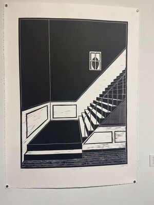
The Essence of Introspection
Molly Ramsey
My childhood home was built in the 1940s and thus it had an exceeding number of nooks and crannies that accented the home's personality. Although the house was beautiful it was also old causing it to have a vast amount of work to upkeep, and as a child, I dreamed of moving to a different home because of this. My work is now focused on the architectural structures of my childhood home and how these memorable spaces were used.
Printmaking and specifically relief with its direct carving, allows me to watch my designs come to life in a way that I find incredibly satisfying. A printmaking artist that inspires me is Meg Tannehill Justice, her use of color and the ability to incorporate the divides of positive and negative space is incredibly interesting and eye drawing. Like her, I rely on positive and negative spaces and lines to describe memorable interior spaces.
In addition to the homes I have lived in, I examine the structures that have become homes, such as apartment buildings. I show the people that live there without having a figure physically present in the image. This combined with the works where I investigate my childhood home, examines the small nuances that make a home unique and endearing.
-

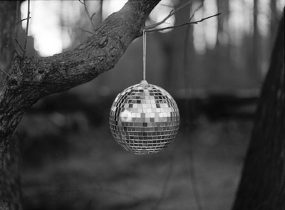
Essence of Introspection
Olivia Swaidner
Olivia Swaidner
This past year of my life, I have seen hardships and sorrow like I never imagined I could. Taking steps forward and continuing to photograph has been an outlet of expression and motivation to help keep me moving forward. With my experience in this medium, I have found that the process itself is where I find freedom. Especially when dealing with analog photography, the process to create a final image is long with many intentional decisions made along the way. My passion for photographing nature comes from being raised in the open fields and dense woods of western Kentucky and spending my childhood immersed within it. My inspiration is also drawn from my belief in natural theology- that nature is a creation and that in itself is proof of a creator which is explained in Romans 1:20- “For since the creation of the world, God’s invisible qualities—his eternal power and divine nature—have been clearly seen, being understood from what has been made, so that people are without excuse”.
This series combines digital prints and scanned film negatives on inkjet prints. These images use mostly quiet natural and urban landscapes to express the feeling of emptiness. By shooting into the light, I attempt to create a sense of hope and even grateful celebration in the midst of these barren scenes. The use of perspective allows me to create a bigger space to depict the feeling of loneliness. Todd Hido is one of my main inspirations for this series. Although he works in color film, our work is similar to one another in how we romanticize empty and forgotten places, though I do that through space and low contrast. No matter the grim days we live, it is important to find a balance between desolation and hope. To help find that balance, I plan to continue photographing landscapes that reflect the seasons of life that are then being navigated in ways that capture the light still shining through.
-

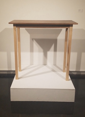
The Essence of Introspection: Miranda Tynes
Miranda Tynes
Artist Statement
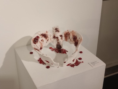
My name is Miranda Tynes and I am a multiple medium artist. I have enjoyed painting, ceramics, and woodworking so far. These disciplines are very different from each other, but it is nice to work a different part of the brain, eye, or hands to create in these different mediums. With painting I work my brain and eyes for color and composition, with ceramics my hands and eyes for form and movement, and with woodworking my brain and hands for the process, physical work and attention to detail. I also like experimenting with adding separate materials to each process. Some contemporary artists who inspire me include Jessica Stoller, Malcolm Smith, and Angela Wang . As for Stoller, we do not share visuals, but I do share concepts with her and the way she speaks about feminist issues in her interviews really hits home. As for Smith, I am inspired by the movement and combination of line and curve in Smith’s works, and how he can tell a really important story. As for Wang, she is an illustrator whose religious imagery inspires me greatly, and the delicate, yet intricate, detail is beautiful and something I wish to add to my work. While I wish for my work to be beautiful, I also use my work as a way to express things that I would usually have difficulty expressing to people verbally. My work is a form of expression and communication about my views. This show is about issues revolving around femininity, self love in spite of the world and doing what is right for you, gender expectations, and how it feels to be pressured by them. On the other hand, the show is also about the gruesome nature of menstruation and playing on the topic of women being “mean” or “angry” when menstruating, but also taking that emotion and turning it around into vengeance for women who have experienced abuse. Outside of the art world, I have always been a very spiritual person, have loved learning about religions, and been fascinated by divine beings. Other influences can be seen in the loose representations of florals in the Art Nouveau period, the intricate delicate beauty of the Victorian period, the rich heaviness of the design of many old cathedrals, the vague slightly mysterious and strange beauty of cubism, and the absurdity hidden in surrealism. These things may not all seem to connect immediately, but I like that they all have some sort of fascinating aspect. They all have that thing about them that just makes you have to keep looking, and keep exploring it, and it stays with you. You never forget it because it has touched your soul in some way. I have so many influences from a time when people could devote their entire lives to creating beautiful works. They had a way to make things intricate with ethereal beauty and did their best to perfect each piece. I hope someday I will be able to do the same, I hope to create something intensely beautiful, so wonderful it can surprise the viewer and they forget the world around them and are fascinated by something's beauty even if for only a few moments of their life. I hope to bring a few moments of wonder to someone, and make a memory they will cherish, and can remember as one of the reasons to keep going. This world is very hard to live in, so I hope to one day have at least one work that, like the many great artists of the past, can bring someone peaceful wonder for a few moments, and let them remember there are some things that make life worth living.
-

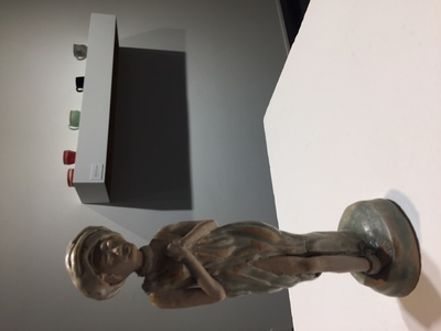
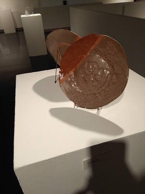
Unique Perspectives
Kylie Conaway
Through my work I strive to create a sense of completeness and contentment. I make my art for others so that they can have something meaningful in this chaotic world. Ceramics is one of my main focuses because I enjoy the amount of control I feel when I throw something on a wheel. The tranquility and peacefulness I feel from it can't match anything else. In day to day life I am a very unorganized, scattered brain student; but as soon as I start working on ceramics or photography I can become the most serious person you have ever met.
The process for my pieces revolves around others. I very much enjoy giving but I prefer to create from a vague idea than a solid one. I believe in a sense that clay has a mind of its own. The more you try to force it to look like one thing you can end up getting a completely different outcome. I start with a simple idea of an object such as a vase. As I start to begin the process of deciding how big and what theme I want to go with, I slowly sink into a rhythm of building the clay up and working on the thickness. While creating a piece of work I do not focus much on what I want but on what others would enjoy. My artwork is almost always functional. I make a lot of vases and bowls, but I enjoy making tea pots, cups, or mugs. Anything anyone could use on a daily basis. Recently I have started experimenting with photography and the different ways to tell a story and express emotions through it. With photography, I enjoy having the ability to look at things from a different angle. To move in close and show the little details that aren’t always seen at first glance. There's a sense of mystery, clarity and stillness with each photograph the closer I get to an object.
My artwork is mostly inspired by the people and objects around me. In particular I would have to say I have been influenced by Tara Wilson's functional ceramics. Her pieces have a lot of movement and are often very figurative. A lot of the time I get caught up in the basic form of a mug or bowl and I forget that the soft skin of the pot could be altered and manipulated. These different styles I feel are very satisfying and calming and something I would like to experiment more with in the near future. In photography I have explored different views and styles and have developed an interest in up close photography and will be experimenting with it as well.
-

Unique Perspectives
Michael Crabtree
Michael Crabtree
Artist Statement
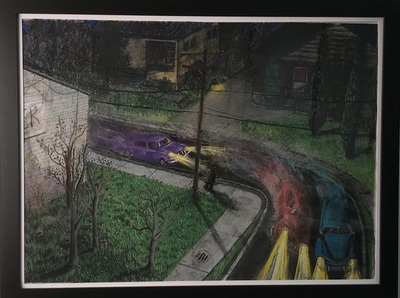
I make drawings that communicate my experiences through the lens of illustration and narrative artmaking. Drawing is a foundational artistic practice, and I enjoy its simplicity and practicality. Pastels have become a direct means to add expressive color to my drawings and create the atmosphere that I aim to capture. My process begins with a memory or feeling about an experience. I will usually have a picture in my head that I am trying to capture. The next step is to start making the drawing. As I am working, more ideas fall into place and something new and different than what was originally envisioned ends up on the paper.
These drawings are made to be looked at with wondering eyes. My drawings communicate a narrative about places, moods, and human experiences. The meaning of these drawings can be open to interpretation. The story is not clear, leaving room for the viewer to imagine the narrative for themselves.
I am influenced by the work of many artists and illustrators, but Quintin Blake continues to be one of my favorites. I have learned so much about telling stories by looking at his work, how even simple images can communicate a full story and expand on a text with humor and wit. I am also greatly influenced by the work of David Hockney, especially the landscapes and more recent ipad drawings. I am drawn to his bold use of color and ability to capture the essence of his subject. His color sensibility reinforces my own, inspiring me to bring my visions to life in multilayered hues.
-

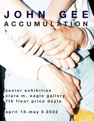
Accumulation
John Gee
My photography explores the tension between the self-consciously constructed image of the world and the fleeting accidental moment of a snapshot. Portraiture allows me to document people and experience a moment with them while I make an image that is my interpretation of reality. Part of my work takes the form of editorial photography and often features subjects that take on a sculptural appearance, as if they are precious, immovable objects. When not making editorial style images, I enjoy capturing the aspects of life that others may not notice. This stems from my sentimental personality as I get emotionally attached to objects and memories and, for that reason, I capture and hold on to every little moment. The “point-and-shoot” style helps me capture this nostalgic feeling. The spontaneity and intimacy of the snapshot is something I explore across multiple camera formats from 35mm point-and-shoots to 6x7 medium format film to digital photography. I often use harsh flash, which freezes that moment in time and creates stark shadows combined with rich colors to create a warm feeling and exude a sense of longing for an earlier time. As part of the generation that shaped “selfie” culture, I explore the idea of curating an image of myself and projecting it onto my work. In these works, there is a push and pull of capturing the tension between careful control and accident, between the incidental and staged. Ultimately, my work is an accumulation of memories of how I see myself and people and moments around me.
-

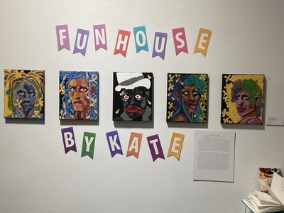
FunHouse
Kathryn Huttunen and Kathryn Rebekka Huttunen
Kate Huttunen Artist Statement
Am I black enough to question this? Am I valid, are my opinions valid?
Do I sound like that? Do I look like that?
Will my partner like me for me – not for an exotic kink?
My work is informed by personal memories and self-reflections about both black and white culture as an adopted woman of color. I often find myself contemplating how society views me and how I view society. As I grow as an artist I find myself questioning my identity in my artwork. What is gender in the black community? What is gender in the white community? How do these ideas impact how one community views the gender of another? I am interested in conceptions of gender within the black community, including the ways some roots trace back to our ancestors. Having a mixed gender identity or not having a gender at all was much more common in many African cultures before colonialism’s violent whitewashing and the heteronormative pressures embedded within it. For example, forced masculinization can have an effect on how black women identify as nonbinary. While being nonbinary in the black community, it is common to keep the title ‘black woman or black man’ alongside as ‘blackness’ is something you can’t get away from. I believe it is an important topic to discuss in my art as it's a part of my life.
All of my work is a form of self-reflection on these personal questions and experiences as they are influenced by the outside world. Addressing these themes in my artwork is a coping mechanism and a diary where I can release my energy onto the canvas. My paintings use surreal imagery and convey loss, yearning, and confusion. I combine different textures with paint. Thick markmaking clashes with smoother, thinner passages as if two different worlds are coming together and trying to find unity in all the chaos. A recurring theme of sunflowers can also be seen in many works. The sunflowers are a nod to Disney and other animation corporations whom have used blackface as a joke usually in the form of sunflowers/exploded makeup and the censored character Sunflower in Disney’s Fantasia. Sunflowers hanging are also a nod to lynchings that still happen but in different forms in the United States.
Some of my influences include Rashid Johnson, Mickalene Thomas, and Yinka Shonibare. Yinka Shonibare influences my use of texture and color, light and shadow, and composition planning. Rashid Johnson for the unapologetic blackness and confrontation he brings with his work. Mickalene Thomas influences the lgbt themes and discussion in my work as well as how I see and discover myself. I hope to communicate my thoughts, stories, and struggles through my artwork so people like me know that it’s okay to feel lost in a world that tries to confine you to one group. My work starts a conversation with those who can relate to these struggles in an effort to build community.
-

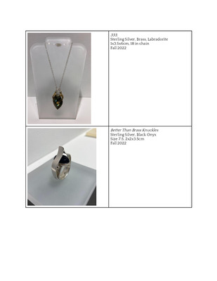
Unique Perspectives
Emma Salger
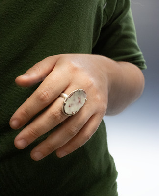
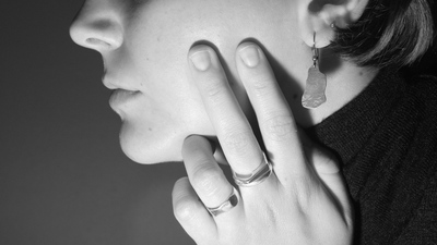
The jewelry I build is intended to empower the wearer. Each piece of jewelry in this exhibition is inspired by my own personal experiences as a woman, but the attempt is to develop a piece that can empower anyone connecting to the message. Choosing to make wearable and empowering jewelry is an act of defiance because wearing my work gives me strength to push against existing societal gender barriers. Growing up as the youngest girl in a male dominated household and being taught a lot of gender expectations, there is an existing struggle to feel strong. Wanting to find a way out of the realm of gender norms, while simultaneously deciding to major in education really felt like I was failing at escaping that box. While working as a metalsmith, I feel as though I am able to defy the boundaries and stereotypes that were set in the past and feel as strong as the men in my life. Kristel Bechara’s artwork focuses on women’s empowerment. Bechara captures a diverse group of women and empowers them by showing off a side of them that is hidden or unexpected. I am empowered by metalwork in the same way these women have been empowered.
Ayesha Mayadas is someone I look to for inspiration when planning out the construction of a piece of jewelry. Her work is very intentional, clean and is able to capture your eye through the employment of unexpected structure. My ring, Better Than Brass Knuckles, stemmed from walking at night and having a need to protect myself. Better Than Brass Knuckles could actually be used as a weapon if need be, therefore offering a source of protection to the wearer. Women should not feel the need to carry a defense weapon when walking home or to their car; However, it is still necessary today. Better Than Brass Knuckles not only offers safety to the wearer, it also draws attention to this exhausting issue.
The artwork I create stems from personal experiences that connect to these overarching fears that a lot of people have. The arm cuff, Does this cuff make me look fat?, is one of the more personal pieces in my show. It was inspired by a time I was wearing a piece of clothing that hugged my body wrong and caused me to be in my head the whole time rather than enjoying an experience. Does this cuff make me look fat? allows me to take the power back from a time of insecurity, while continuing the conversation that some women don’t feel comfortable in their skin because of retired societal standards. The goal of my work is to empower others, be it through sharing my experiences or through their own personal experiences with the jewelry I have created.
-

Unique Perspectives
Paige Small
Artist Statement: Paige Small
A community is a place that helps one grow and feel supported through vital interactions, which helps one become who they are meant to be. Being embraced in a society that exemplifies all these things is essential. These connections most often become the ones that mean the most and have the biggest impact on someone. Examining the relationships and community surrounding me has inspired this work.
My prints show the physical embrace of being held, loved, and comforted. Hands are chosen as symbols of community and the human interaction of support and togetherness. Flowers are another symbol I have used to express care and gratitude. Layering and extending the transparency of colors adds to the complexity of my prints while adding to the comforting and inviting imagery. This use of symbolism and color illustrates the feeling of being embraced by and included in community.
Laura Berman and Morgan Echols influence the color in my prints. These artists have inspired me to explore transparency, saturation, and the layering of color. As a printmaker, I can make multiples of all my work. This allows a larger community to enjoy the prints while appreciating the small unique qualities that make them special. Within art making, exploration and the creative process in and of itself is important to me. Being able to freely create, explore, and push materials in new ways is just as essential as the outcome.
-

BA/BS Practicum Group Exhibit
Jasmine Groves
In my art, I utilize patterned fabric, domestic objects, and portraits to achieve my desired results. My body of 3D and 2D artwork focuses on domestic spaces and the physical sensation of fabric surfaces (clothes, sofas, curtains, stuffed animals etc.)
I often find inspiration when I look through my family’s photographs from the 1960s and 70s. My great grandmother was a seamstress, and encouraged all of her female descendants to make their own pillows, quilts, and even wedding dresses instead of purchasing them. Also, the 1960s and 70s were an incredibly important time for Black America. The visual culture of this era has always been interesting to me; many of the archetypes (wide pants, big afros, brightly colored carpets) are kitschy for some and nostalgic for others. Two of my favorite artists include Mickalene Thomas and Nick Cave. Both of these artists utilize fabric, the Black American experience, and nostalgic themes in their art.
-

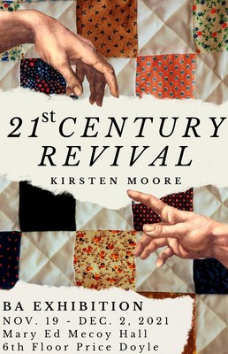
21st Century Revival- BA/BS Senior Show
Kirsten Moore
Growing up in Kentucky, I had no choice but to acknowledge that I was smack dab in the middle of the Bible Belt, where culture is in many ways defined by Christianity and there is a church on every corner. These deep southern and Christian roots have defined who I am and how I view the world, inspiring me to examine the roles these two factors play in my life as well as the lives of others through my art. 21st Century Revival takes a dive into this specific culture, questioning how southern Christianity has impacted the lives of those who have come into contact with it in both positive and negative ways. These pieces envelop a positive sense of community, inspired by communal activities like quilting or sitting together at church, while still addressing the negative ostracization that can come from being a part of this culture, much like being “stoned” for being who you are.
The space created in this body of work is one of contemplation and remedy; challenging Christian culture to acknowledge the power it has over the south as well as allowing those who have experienced religious trauma to feel validated, seen, and to potentially heal from the hurt. Tying into these ideas, my work often includes a blend of religious iconography and quilt patterns, taking inspiration from both Biblical stories and the quilts my family had growing up, which are very much a part of Kentucky culture.
My art combines expressive oil painting with mixed media elements, be it sculpture or fabric. I often use photoshop and collage elements in order to combine my realistic figures with a layered and abstracted environment. This surrealistic approach, together with the blend of naturalistic color and the bright, saturated color in the quilt elements, creates a heightened emotional zone. The installation itself references structures found in places of worship, inviting the viewer to sit down on a surface that has the capacity to either instill peacefulness or cause confrontation and discomfort while reflecting on the painted imagery.
I am drawn to the works of Kehinde Wiley, especially his Stained Glass series. Though his work isn’t about Christianity specifically, it still uses the detailed and ornate style of traditional religious paintings while still incorporating modern people and elements of design; a perfect visual conversation between old and new, figurative and abstract. The story quilts of Faith Ringgold also serve as a source of inspiration. The abstracted figures encapsulated in a quilted border maintain a patch-work aesthetic, playing with color, pattern, and flatness while telling difficult stories. I often combine the painterly qualities of Kehinde Wiley and the flattened, fabric-like elements of Faith Ringgold in order to create an other-wordly environment for my figures and stories to live in. I also play a unique role in this story of southern-Christain culture, where I am still exploring who I am and where I stand on such matters. To be a Christian while advocating for reform and recognition toys with the very core of my identity, pushing against the structure of the very thing I have devoted my life to while still loving it wholeheartedly.
-

B.A./ B.S. PRACTICUM GROUP EXHIBIT
Conner Murt
This work is a study of everyday spaces and activities of daily living that are often overlooked. These photographs capture raw moments of people’s lives, without artistic fabrication, communicating a sense of candor. I create photographs of interior spaces that stand out mentally to me and which include objects with unique characteristics. I illustrate portions of a given location, but intentionally do not give away all of the specifics of the space. There is an absence of a figure, yet symbolic fingerprints are apparent in these very personal spaces. Although the individual is not the focus, the space or environment is enriched by the past and future presence of that individual. The un-fixed daily activities and scenarios captured in my scenes provide insight to an individual and the life they lead. Oftentimes, big highlights of people’s lives are the only memories captured by photographs; however, photographing everyday domestic objects offers a realistic viewpoint of life to reflect upon and view in a different light. I invite the viewer to take an active role in the work by means of reflection, personal interpretation, or memory through life experience.
The search that is involved in finding the spaces for the photographs is of greater importance than the editing and post-process that follows the making of the photographs. I provide balance and context to the subject of the photographs through the framing of the scene, thus allowing a story to be ascertained. The consistent presence of the individuals’ responsible for the space and their physical absence within the photographs propels the continuation of this conundrum. The photographs depict spaces and physical domestic objects that have worn over time, providing a conclusion in a still frame while allowing the onlooker to imagine the story that may have led up to that point. These snapshots of everyday life allow the mind of the viewer to wander and allow the photo to play out in a variety of ways that are dependent upon their mood, life experience, and personal interests. -Conner Murt
-

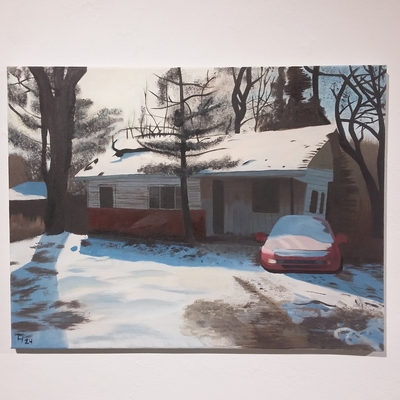
BA/BS Senior Show
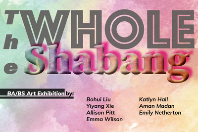
Emily Netherton
Memory is a complicated thing. We often long to hold unto the past, but struggle to actually remember it accurately. We place such importance on memories that we continually collect artifacts to remember things by. We take pictures to remember moments. We hold onto personal items to remember people. We often display these artifacts and spend so much time with them that we place more importance on the objects than the memories associated with them. The relationship with our past and our past selves is complicated. It is both the same person we are now, and a completely separate person from who we are now. We tend to romanticize our past selves even though our memory of that self is inaccurate. In my work, I focus on reconnecting those objects to the memories, and addressing the attachment we have to them. I break down the process of memory, and depict the lack of clarity we have around memory. I also address the relationship we have with our past selves and how we have changed. I tend to use simplified figures and bits of color to obscure memories, in the same way our memories and self are distorted over time. I paint on frames and other storage items in order to communicate our tendency to store and sort our memories in a safe place to be accessed later. I also paint on other found objects to portray our inclination towards connecting our memories to random yet specific objects
-

BA/BS Art Exhibition
Utarius Rose
Utarius Rose
Artist Statement
As individuals with different personalities, we tend to distance ourselves from each other. Trying to connect with others is hard. So, how do we form connections and how do we create conversations that bridge the gaps between us? I believe the connection can be made by sharing personal emotional experiences through translating them into artistic narrative forms. I make drawings, paintings, and prints that insert surreal elements into representational spaces, often incorporating the figure. Both concepts and details excite me because they expand my imagination and inspire both mental and technical goals to focus on. I imagine my art as a sequence of different ideas, sorting out visual messages to pass on through each of them that creates a place for emotional connection with my viewers.
I take visual as well as verbal motivation from both artists and people in my life. A great known artist who uses vivid realism is Kehinde Wiley, who is quite literally changing the faces of portraiture with his sensitive, vibrant, and political portrayals of black people, including teenagers he meets on the streets. From his work I reflected on the visual quality of his art, but also pay attention to the narratives of inclusivity in his work. Another artist who inspires is Kara Walker. She inspires me more on a verbal level when I look at her work. One great example would be a quote that I love by her and I say to myself everyday, “There’s no diploma in the world that declares you as an artist -it’s not like becoming a doctor. You can declare yourself an artist and then figure out how to be an artist”. That speaks volumes for me and ensures that an artist can be anyone, it just takes the artist to learn how to express themselves.
My number one inspiration is my mother, Shanida Rose. Although she isn’t a known artist, she uses the art skills that I have shown her to create contemporary art of her own using our household as her vessel. Her work inspired me as an artist because it always reminds that anyone can be an artist as long as you’re expressing yourself in your own way!
Within my work, I explore my own internal thought processes about how to express one’s inner emotions with an outstanding visual of experience. Making a way for my viewers to open themselves with what’s troubling them noticing that everyone feels the same emotions.
-

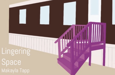
Lingering Space
Makayla Tapp
Lingering Space
Since I was young, I have had a fascination with childhood memories that I should have been too young to remember.. Over the years, these memories have changed and warped, yet the strongest memories that have remained the same are those of my parents, and the spaces they inhabited. As my memories of my parents fade, I begin to lose details, such as the way their voices sounded, the way they smiled, the way they laughed. But the pieces that linger are the spaces I remember them being in, the homes they lived in, the places where we made these memories.
My work is spurred from these past experiences, memories, and my parents, often combining several different influences into one work. I am interested in concepts such as childhood, nostalgia, memories, misplacement, in both personal works and others’.This series of screenprints is about my mother and father and how their absence has impacted my view of the world. For this I composed several screen prints containing imagery that is significant to both myself and the memory of my parents. A muted palette is used throughout the pieces, with additions of color in specific areas to draw attention to them and invoke thought from the audience. In “Lost,” an empty car interior is shown, the driver's side cobalt blue, my mother’s favorite color. Without her as the driver, any passenger would be lost. In “Apt. 2,” my father’s last home is pictured. It is a simple apartment complex with a single illuminated door and windows that belonged to his unit. These are places tied to my parents and are reminders of them, places where memories were made.
My style is influenced by both Micah Bloom and David Ralph who both utilize techniques and themes that mirror my own works. Bloom’s flat color paintings and his use of perspective within his works are similar to my own pieces. His paintings often include settings within the home, reflecting the work I have created as well. Ralph’s series of paintings, “Escape Into Life” focuses on temporary dwellings, such as mobile homes or apartments. His work discusses the existence of humanity and how the dwellings we reside in are symbolic to how we live. Spaces we inhabit have a significant role in the way we live, as we leave pieces of ourselves in them. I invite the audience to take a closer look at the spaces I have chosen to represent my parents’ memory and discover memories of their own.
-

Desires of heart
Hsuan Hsiu Cheng
Desires of Heart
When I touch clay, it gives me a feeling of meditative focus and potential, but also vulnerability and surrender. I am reminded that I am His clay. “And yet, O Lord, you are our Father. We are the clay, and you are the potter. We all are formed by your hand” (Isaiah 64:8). Clay’s malleability allows me to put my feeling or emotion into my work. Many of my art pieces are inspired by my personal experiences and faith.
Some of my work addresses emotional feelings, like depression, struggles, peace, and joy. In my sculpture called Healing, I use the texture on the outside to represent the struggle, and the brokenness of being a human. The flower inside the sculpture shows the possibility of healing and regrowth from within. Even though it’s broken, He still heals from the inside and out and made it whole again. I hope the viewer to feel touched when they see the work. When people see artwork, they might comment on how it looks at first, but I care more about the meanings and ideas behind the art pieces.
My faith is also an important influence on my work. In my series of sculptures titled “Desires of heart,” I use water to represent the elemental power and God’s creation. The heart on the water represents me. It talks about how I gave my heart for Him and no matter how many trials and sorrows I endure in this world; He holds me still among the water of the ocean. The heart also evokes the scripture “Wherever your treasure is, there the desires of your heart will also be” (Matthew 6:21).
My attraction to abstract form began with Hunter Stamps’ ceramic sculpture I like how emotion-provoking, dynamic and chaotic his pieces are. I also admire Antonio Canova’s sculptures because of their strong emotional appeal. While they are very unlike my work in form, his sculptures inspire me to explore abject emotional states with my artwork.
Chloe Cheng
-

Changed Trauma
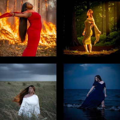
Jessica Free
Changed Trauma
In this collection, I am exploring my past trauma that I have obtained as a result of the abuse I experienced years ago. Although my experiences from the 5 years of abuse were bad, the good now overrides the bad. Through these experiences, I have grown into a strong independent person as I have gotten over them through forgiveness and time. Often associated with place, I have never forgotten the memories but I continue to grow from them. Time is a heavy component in this collection. To emphasize this, I used black and white photography to make the places resemble aged moments in time. My influence for this exhibition is the reappearance of past abusers into my life and the memories that have resurfaced. Throughout my work, I will be exploring my trauma as a means to define who I am today. I am using digital black and white photography to give life to these traumatic experiences. I am drawn to photography as an art medium by its life-giving properties, as photographs often give life to experiences, objects, or places. I often use landscape photography as an exploration of the world, people, abandoned places, and amongst other things. Through my photographs, I intend to form a connection with viewers with similar or different backgrounds and evoke vulnerability while allowing the viewers to explore their own trauma. This collection as a whole is an exploration of traumatic experiences that focuses on remembrance and growth. As time passes and your trauma ages, you still carry it with you, sometimes by place or people, as it either haunts you or encourages growth.
Printing is not supported at the primary Gallery Thumbnail page. Please first navigate to a specific Image before printing.