

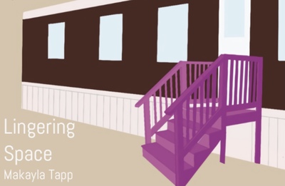
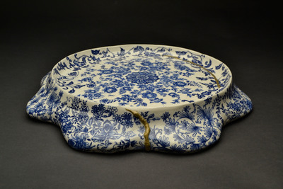
-

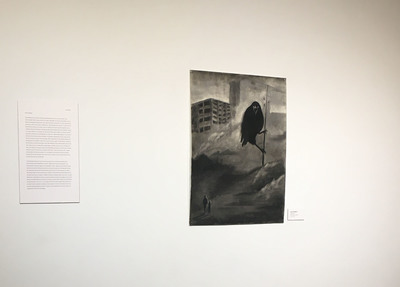
Unprecedented
Chris Gill
Personal experiences hold images and objects together either with, or in place of memories, people, feelings and so on. The pieces I’ve created borrow imagery and iconography of vibrant Belizean life and culture while expanding on the practice of veneration of figures through art and the adornment of charms to express devotion, along with any other object of significant meaning or context.
Using painting in combination with metalsmithing, the works discuss a narrative between objects and their attachments or connotations to queer identity and as well are used to present the figures as beings of worship.
The figure is important to my process of documenting the uniquely Belizean queer experience. While I use bright, heavily saturated Caribbean iconography as meaningful tools to represent an unspoken minority within an already small country, my strong Catholic upbringing infuses the work with a ritualistic aim of sanctifying queer bodies. My figurative pieces are my ways of making queer bodies sacred and accounted for, as well as representing them in ways that encourage them and give an insight as to what our history could have looked like.
The local artists of Belize all carry a specific spirit and vibrancy in their work. I look to them to feed my art and create a base for my concepts. Borrowing styles from other Belizean artists such as Walter Castillo, and Alex Sanker, tropical themes unify the majority of my work while they are contrasted with themes of containment and comment on the mental and social oppression of queer individuals in the celebratory, breez, beachy landscapes of my home country
-
Barkedin BS Graphic Design Exhibition
Katlyn Hall
Katlyn Hall
BS/BFA Group Exhibition
April 28th, 2020
Barkedin Animal Rescue
My design project is based on local animal rescues. I am inspired by communities that volunteer time and money into the welfare of animals. The animal rescue brand is called Barkedin. This is a made up rescue as a case study for my exhibition. The name Barkedin is a play on from the word Linkedin as a way to connect veiwers of the purpouse of the rescue.To connect with potential adopters and find homes for strays and animals that are on the euthanasia list in shelters due to overcrowding.
I also wanted to learn what it is like to create a brand from scratch based on what professional designers work on from clientele. Based on research, Barkedin is designed with bold modern colors and flat, silhouettes inspired by Finiish patterns. Barkedin is supposed to have a sense of professionalism with a series of four informative posters on the statistics of animals that are sheltered, or strays that get euthanized or killed each year.
The logo and spine cover illustrations of the volunteer book were inspired by the Atrament font face used for the posters. The animals are abstract and modernized with a uniform line work to make my branding stand out from other rescues. The typeface for my logo Barkedin is Gill Sans to give a modernized look with a sans serif typeface and use of grey color to go with the mint green of the logo. I chose gray and mint green as my colors for the logo because I wanted to stay away from the black type and usual bright colors.
-

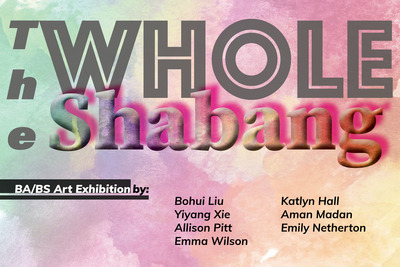
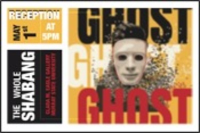
The Whole Shabang
Bohui Liu
We all live on the same planet, but we look very different. Sometimes people can be criticized by their skin color or country they are from. People always define a person in a glance, simply through someone's appearance can be concluded that he or she has some characteristics. But in addition to skin color and language is different, everyone has their own personality, there are advantages and disadvantages. If we just see the appearance then to comment on a person is also irrational and unfair. In this theme, I represent that we have lots of differences outside but we are the same internal. First I used a pencil to draw people’s portraits, then I filled in one color for each of the portraits in the background. In the background, I use white, black, and yellow colors to represent different skin colors of people. I keep the portraits in pencil because I enjoy the original mark, and this also can indicate people are the same from inside. The white, black, yellow rose next to them also shows that rose has different color but they all rose basically. People can not change who they are, everyone is born with the color of their skin and the way they look. So never judge others by their looks, their skin color, and their nationality. We are all the same.
-

Whole Shabang
Aman Madan
Aman Madan
Spring 2020
Artist Statement
My work usually has something to do with balance. Being a Hindu, I have always believed in Karma, which is the sum of a person's actions in this and previous states of existence, viewed as deciding their fate in future existences. The law of Karma ties along with balance in life. Therefore, I’ve been a firm believer in balance. I believe it exists everywhere and is essential for any sort of growth. The key to life is balance. Some of my recent sculptures were completely exploring the term balance in different ways.
As a graphic design major, majority of my artwork is done on the computer, using Photoshop and Illustrator and other design software’s. My designs vary from typographic quotation, illustrations, UI&UX design to 3D installations to video sculptures. I chose graphic design because I seem to do fine with technology and I feel it is a good way to communicate to the audience and yet be creative enough to grab their attention and convey the message. I tend to work with the visual hierarchy, fonts and contrast to make it readable yet aesthetically pleasing, trying to find the balance and keeping up with trends. Graphic design gives me the freedom to incorporate my drawings within my work. My UI mobile application aesthetics are made user experience friendly, easily navigable. I use gradient color in my UI designs after researching about the application. Some artists I look forward to their work and take inspiration from are Craig Frazier, David Carson, Milton Glazer and Saul Bass for Illustrations and Massimo Vignelli, Paula Scher, Louise Fili and Paul Rand for the typography.
I lean towards working with a limited color palate, mostly black/white or complimentary colors because for me it adds up a timeless quality and makes the work cleaner and helps add contrast to my work. Sometimes using just one color against the black and white helps me to add an emotional appeal to the artwork or emphasize on something (keeping up with the meaning). I have a corporeal drawing in which I only added hints of red, to convey that the figure is hurt, which heightened the emotional value of the drawing. Most of my graphic design work uses combination of two complementary or contrasting colors. Illustrations is where is where I chose to work with a wider color palate, as it depends what I’m trying to express and what the client requires and then try to find the balance between that.
As Danielle Orner said, “Life is a balance between what we control and what we cannot. I’m learning to live between effort and surrender.”
-

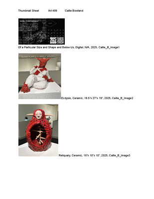
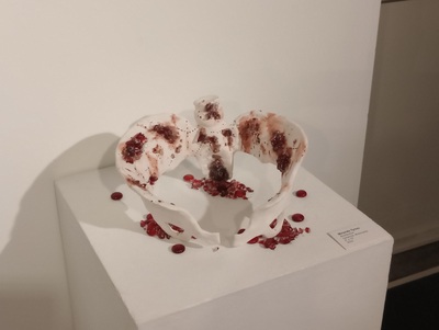
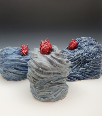
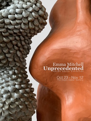
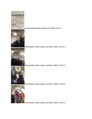
Unprecedented
Emma Mitchell
The broad concept behind my work is that of acceptance for one’s true form. As someone who struggles with self-acceptance, building ceramic sculptures bearing flaws and strange features has been a sort of therapy. When looking at my work, the viewer should feel empowered and safe in their own skin. They should see a reflection of their own flaws and insecurities in my sculptures, and feel a sense of belonging.
Out of the five senses, the one I resonate with most is touch. In all ceramic work, touch is utilized in the making; whether the finished product is meant to be held, felt, or seen. Through the element of texture, my work awakens the human desire to reach out and touch; however intimate and unconventional. Although I don’t want the viewer to touch my work without expressed invitation, I do want the sculptures to evoke the innate desire to feel. I am continuously experimenting with different textures and the sensations they provoke in the viewer. In executing these textures, nature is used as both the tools and the inspiration. I have used lava rocks as well as other unconventional tools to texture my sculptures. Some of my sculptures invite touch as they are visually satisfying surfaces, while others are hostile and rough to the touch. Texture not only serves as a physically appealing aspect, but a visual one as well. The contrast that texture adds to a piece draws the eye in all different directions; inviting the viewer to look at every curve and crevice.
The form beneath the texture is inspired by both natural formations and the fluidity of the human body. My sculptures begin as a flat surface, mirroring a starting point in every journey towards acceptance. I often let the clay dictate which direction it wants to grow in; offering help when gravity threatens failure. I enjoy working with clay because it’s natural, almost a creature of its own, growing and collapsing with the elements.
I draw inspiration from modernist sculptor Barbara Hepworth as well as German contemporary artist Birgit Piskor. Hepworth’s work was influenced by motherhood, history, and war as she sculpted forms evoking the human body and the space it occupies. The minimalist quality and psychological meaning reflect in my work. Birgit Piskor focuses on catching transformation and inevitable change as she sculpts with concrete. Her sculptures depicting the feminine form inspire my work to be poised and elegant.
-

The Whole Shabang
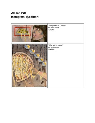
Allison Pitt
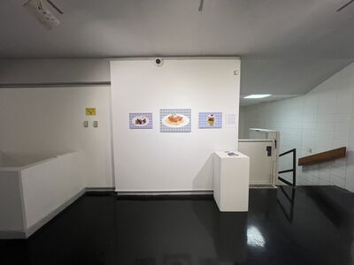
My art is a combination of my two favorite things; painting and food. I use my paintings to communicate my relationship with food. Over time, my love for food has transformed into a disgusting obsession. This is shown in my work, as I display all of my favorite foods and drinks, in a manner that is unsettling. This reflects my feelings after a binge of food or my ever changing relationship with the foods that I love. I also discuss the image of my own body, and how I see myself in my own head. Like in my head, the images in my art are distorted and contain pushed perspectives that don't always make sense. I use this as an outlet for my feelings, whether I am craving pizza, or feeling guilty for my indulgence. While I use painting to manage my own relationship with food, I find that others find comfort in images of food, as I do.
I use primarily oil and acrylic paint to make my artwork. I am drawn to the paint because of the fluidity and interaction between shades. I like taking my own reference pictures, so that I can capture the exact motion or placement that I have in my head of specific subjects. I use these images and my imagination to invent a composition that pushes perspective. This reflects my in and out relationship with the foods. I like additions of things that don’t make sense or confuse the viewer with the sizes of different objects and creating some flatness on a dimensional plane. I enjoy this as an art to keep my mind creative and my artwork very intentional. Overall, I intend to use these concepts and my personal relationship to food in my artwork for myself. But I also want others to find something in my paintings, whether it be just a love for that food or sharing a similar feeling as I do.
-

The Whole Shabang
Allison Pitt
My art is a combination of my two favorite things; painting and food. I use my paintings to communicate my relationship with food. Over time, my love for food has transformed into a disgusting obsession. This is shown in my work, as I display all of my favorite foods and drinks, in a manner that is unsettling. This reflects my feelings after a binge of food or my ever changing relationship with the foods that I love. I also discuss the image of my own body, and how I see myself in my own head. Like in my head, the images in my art are distorted and contain pushed perspectives that don't always make sense. I use this as an outlet for my feelings, whether I am craving pizza, or feeling guilty for my indulgence. While I use painting to manage my own relationship with food, I find that others find comfort in images of food, as I do.
I use primarily oil and acrylic paint to make my artwork. I am drawn to the paint because of the fluidity and interaction between shades. I like taking my own reference pictures, so that I can capture the exact motion or placement that I have in my head of specific subjects. I use these images and my imagination to invent a composition that pushes perspective. This reflects my in and out relationship with the foods. I like additions of things that don’t make sense or confuse the viewer with the sizes of different objects and creating some flatness on a dimensional plane. I enjoy this as an art to keep my mind creative and my artwork very intentional. Overall, I intend to use these concepts and my personal relationship to food in my artwork for myself. But I also want others to find something in my paintings, whether it be just a love for that food or sharing a similar feeling as I do.
-

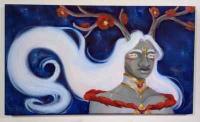
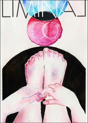
Unprecedented
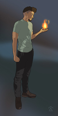
Drey Reed and Drey Reed
My goal as a designer is to draw the audience’s eye, making it clear what information is most important. I make my designs visually pleasing through the overall layout and use of color combinations. Recently I have discovered an interest in character design. I aim to improve diversity seen in tv, comics, and video games. Which is why I have decided to focus on designing a more diverse character, in this case one that is based off myself, half white and half black. I designed this character with the intent of him being in an animated tv show, which is why I chose a flat shading style. The color of the clothes was intended to work well with the skin tone but also to contrast the warm colors from his fire abilities. The cool green of the shirt as well as the dark pants and shoes both contrast the bright flames throughout the illustrations. Both the scale of these illustrations and the thick outlines on the character brings the piece to life a bit, adding an energy to the piece that would otherwise be missing. I feel it is much more impactful to see these near life size, rather than on a small poster you could just hold in your hands. I feel my biggest inspiration for my character designs would be Bryan Konietzko. He was the art director for Avatar the Last Airbender, a tv show I grew up watching. Even now, I like not just the show, but the art style. While many cartoons tend to greatly simplify the human figure or take liberties with the proportions, the style in this show is much more realistic as far as cartoons are concerned. The characters are rather simple in terms of line work but still have interesting designs and tend to be very memorable. These are some of the qualities I focused on bringing into my own design.
-

Unprecedented: BA/BS Senior Exhibition Fall 2020
Samantha Tudor
Cryptids are heavily based on oral legends and strange occurrences. Some of these legends are based on good versus evil like the Wendigo, an evil spirit that possesses someone who commits cannibalism, and some are based on happenings that cannot be explained like the Chupacabra.
I have been fascinated by the appearance and lore of cryptids and how these stories are created. That fascination has begun to seep into my work. I am also interested in the evidence, real or fabricated, that is provided for these creatures as I create my own cryptids and compile relatable evidence to support my claims.
My works often start with a mysterious dream or a sketch made from an inkblot. Inkblots are a form of projective test, a test that uses ambiguous stimuli to activate the subconscious mind. I use inkblots because it draws on the underlying issues that I face. I create cryptids that embody my subconscious mind because I find that it engages more people in a meaningful way.
As humans, we are obsessed with information and the truth. However, people also like to be amazed whether or not what they are looking at is real or fake. My work plays on that fine line through the stories, articles, and other documents created in support to develop credibility. The large-scale sculptures of these beings encountered on my journeys act as documentation of and tribute to their existence.
-

Strange Fruit
Tia Whitaker
As a young child, I was always interested in history. I found it fascinating how big or small events, directly or indirectly, affected the life that I am now living in today. Although my hometown was small, the history of it was enormous. Trips to the city museum fueled my love for history and the desire to learn even more about myself, my town, and my country. Being a person of color, I was aware of the adversity that my people have faced. Knowing the turbulent history that African Americans have faced in this country has always inspired me to create imagery that celebrated black people and educated others who are not aware of these atrocities.
My theme, Strange Fruit, was a term used to describe African Americans hanging from trees during the early 1900s. It was also a song sung by the late Billie Holiday, whose lyrics were the inspiration for my work. While creating prints for this exhibition, I considered all the things that I have absorbed, both from my personal life and my educational experience. I wanted to combine my love for art with my passion for history. As a child, I was aware of moments in history such as slavery, segregation, and discrimination; but that was as far as my knowledge went during that time. As an adult, I can dig deep and learn about the hidden moments kept from me to preserve my innocence. My goal is to take this newfound knowledge and use it to educate others. I have chosen to depict this theme to represent my feelings about this history and how many, including myself, have been shaped by it.
My style is heavily influenced by the work of fellow African American artists, Kehinde Wiley and Kara Walker. I enjoy the way their detail-packed scenes beautifully depict people of color while also providing some history for the viewer to take away. These unsung moments in history require a tremendous amount of detail and attention. The main form of printmaking I use, lithography, reflects this idea because it allows me to create detail-packed scenes while fulfilling my desire for realism through the heavy use of line and the ability to create a full range of value. My lithographs use a strong value scale that invites the viewer to examine the intense details. I use landscapes and still-life's as the primary objects in my compositions and then add smaller figurative elements that symbolize black obsessions. Lithography allows me to draw highly detailed images that are primarily black and white, adding formal contrast and movement to the composition. By combining these elements, I invite the viewer to take a closer look, examining the use of detail to discover the work's true content.
-

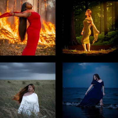
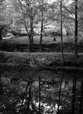
Our Rainbow and Butterfly World in Progress
Emma Wilson
I have always been an artist ever since I was a child. My mom was one of my influences to become an artist because she always made arts and crafts with me. My aunt, Janet Wilson, is a very skilled self-taught painter and was also a large influence on my artistic life. I thoroughly enjoy the art of photography. I often capture photographs in black and white. “When you photograph people in color, you photograph their clothes. But when you photograph people in black and white, you photograph their souls.” -Ted Grant
Tara Chisholm once quoted, “Photography is the beauty of life captured.” With photography, a moment can be captured that you might not ever get back again in your lifetime. My photography is very sentimental because it’s mostly about family. I enjoy creating work that is personal to me and relevant to my life. Family is so important to me and so is being able to create work about my troubled past life experiences as well as happier present times. My past work focuses on the concept of the happiness that family brings and my current work is centered on the dark moments that I experienced as a child.
My work featured in my exhibition focuses on my family and I overcoming the impact of the experience we had with an abusive man living with us for part of my childhood. We had a house fire in 2007 which was actually a blessing in disguise because it allowed us to kick the abuser out of the house for good. The abuser always told us that we would never live in a rainbow and butterfly world, so we have now created our butterfly and rainbow world.
Look who won. -

The Whole Shabang
yiyang Xie
I always want my works can deliver a positive and relax feeling to my audiences. I usually use the computer as my work tool. The form of my works is graphic design. I like using computer work and create my work. Using a computer, I can try different positions and combinations for my work also it is easy to change.
-

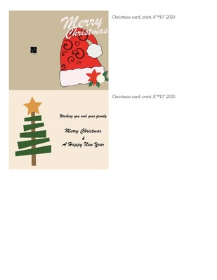
The Whole Shabang
yiyang Xie
Entertainment is an element that is relatively lacking in this metropolis. Especially for those who work hard at work. So, I decided to make two greeting cards. In one year of life, everyone must be looking forward to the holidays. The most important meaning of the festival to us is that it is totally immersed without thinking about its meaning. Humans invented the program for carnival, noise, gift-giving and laughter. Let yourself pull away from the busy, like a buffer zone, these are usually lacking. Only festivals can immerse everyone in this atmosphere and create the illusion of loneliness being eliminated. My two greeting cards represent the most important holiday in the two relationships. One is Christmas with family and the other is Valentine's Day with love.
-

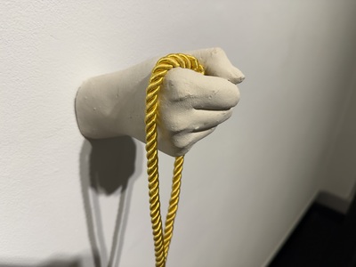
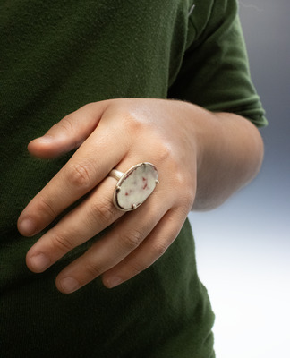
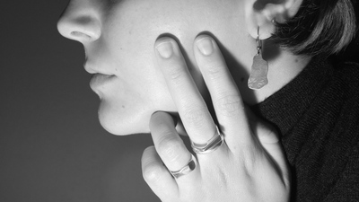
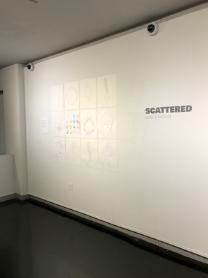
Scattered: Shelby Adams
Shelby Adams
Currently, I am focusing on the aesthetic nature of my artwork and how its appearance aids to its use. My work tends to lean towards the more organic/imperfect side of crafting: whether it be in my ceramic work or metalsmithing, I enjoy the small variations in form that create a true sense of the handmade. I further this sense of hand-craftedness by exposing the materials themselves, such as leaving metal to patina over time or leaving the clay exposed while glazing. The strong sense of materiality within my work, along with their organic sense of form, creates very naturalistic objects that emphasizes the materials themselves. I’m interested in the minimalism that these choices can evoke and how these aesthetic leanings affect the functionality of each piece. Recently, I’ve begun to incorporate shapes that are not simply round. I began by forming bowls and cups with my hands, giving them a sense of an abstract, bodily shape. I’ve pulled these forms into my recent metalwork, as well, implementing them into earrings, pins, and patterns.
Influences for my work include Chris Staley, Tom Kemp, Mary Giles, and Peter Pincus. I draw inspiration in the forms, color, texture, and materiality that each of these artists implement into their own work and experiment with ways to reinvent it into my own.
- Shelby Adams
-

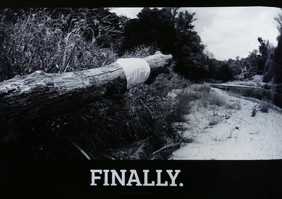
FINALLY.
Tiffany Day
Tiffany Day
Trash has become part of our everyday scenery. Check the Highways. Litter Breeds Litter. The physical effects on nature made through human intervention, drives me to document the aftereffects of what those interactions cause. Whether it be forgotten buildings in the middle of the woods, or plastic bags caught on broken tree branches, I capture images of the environment in disrepair. Through exploring ideas such as human interaction with nature, I hope that my work heightens my viewers’ awareness of the global climate crisis as they move through nature every day. I pay attention to everyday evidence of this environmental crisis in my work in hopes that it helps others notice it around them.
Through capturing images of abandoned buildings the viewer sees the consumption and disposal of resources made available to humans. This creates an idea of a consumer society which leads to the disposal of consumable products and trash. I am passionate about protecting the environment through recycling and educating others to do the same. Photography acts as an important way to record and to mourn the careless destruction of our world. The camera is a way to highlight the idea of destruction by capturing images overlooked by society on a daily basis. I walk through nature noticing every piece of trash left behind and can find a beautifully tragic image in the midst of these walks. I play with the scale of my images to find the most impactful effect desired. I want the images to feel not only large due to the importance of the topic but also small due to the lack of widespread determination to enact change in the issues at hand. What started out as a technical accident turned into a compositional choice to put the main object in the middle or almost in the middle of the composition to highlight the desired concept.
Much like another favorite photographer, Ansel Adams, I am constantly inspired by nature. Adams’ landscape & nature photography is beautifully inspiring, with all of the textures incorporated and the rich black values. Before I even realized it, I was photographing nature with similar ideas as Adams. Adams writes, “I cannot change the optical realities, but only manage them in relation to themselves and the format.” Like Adams, I formulate images through a photographer's eye to depict the realities of issues that threaten Earth’s future. I utilize natural forms such as trees, rocks, and water yet emphasize the harmfulness of manmade interventions.
Benjamin Von Wong sparked my interest in using photography to raise awareness for important environmental issues. Much of his elaborate photography is centered around environmental issues. The first image I ever saw of his was an image that depicted a mermaid lying lifeless on top of an ocean of plastic bottles. Seeing this image struck a chord in me, because the artist beautifully captured a very serious, ugly, issue in our world. I use my admiration for Von Wong’s work to inspire me to create photography that sheds light on issues that invoke passionate determination in myself and others.
-

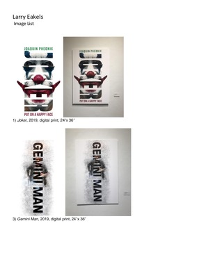
FINALLY.
Larry Eakels and Larry C. Eakels III
I have always liked to create things and make interesting pieces of artwork. Making work in the design field has been very delightful and engaging for me. Learning about how people react to imagery even when its digital or print has been one of the biggest things, I have learned from becoming an artist and focusing in graphic design. I chose to do graphic design because of my experiences with past classes and pieces that bring joy to me. As well as, the aesthetic you can achieve doing design work. Being able to create sleek, clean, and simple designs to fit the modern style is very pleasing and catches my attention and others. Seeing or knowing that my viewers of my work can understand it and also get a vibe of interest into the pieces gives me a satisfactory feeling which I enjoy.
Most of the work is made digitally, but always starts from sketches with a pencil and paper. Easiest way to make many different ideas for a topic is starting from paper and pencil then you can scan your desired pieces to the computer and go from there. Being able to make multiple revisions digitally is one of my favorite things about design and also the use of technology is amazing of all the beautiful things you could create digitally. Along with digital design I can also do print design as well which is another reason why being a designer you can do many things that can do physically and digitally.
Currently, my work has been inspired by advertisement and my poster design class. Experimenting with layers and colors to create diverse and complex posters that are also very clean and concise. Being able to continue this aesthetic in my current work brings me joy and hopefully viewers of my work can appreciate and see what I see with my work.
-

FINALLY. BA/BS Senior Exhibition
Emily Glowicki
My most recent work delves into the relationship of sculptural form and ceramic tradition and how we perceive amorphous beings that exhibit resonance of the recognizable. I’m interested in where we draw the line between form and function in ceramics and how we can explore both possibilities through the creation of ambiguous three-dimensional representation of these ideas.
My work addresses these ideas through both sculptural vessels and nonobjective forms that leave the realm of the vessel completely. This exploration of form and fluidity started with single word: torpid. Torpid, according to the dictionary, is an adjective to describe slow, sluggish, languid movement, and the first thing that came to mind when thinking of this word is the 1958 American science fiction-horror movie “The Blob”. The first work in this series is Torpid, which is my response to the slow moving, vaguely ominous amorphous being and an investigation into representing the essence of torpidity in a rigid sculptural object. Over the last year, the series has progressed from the representation of languid movement to an investigation of our perceptions of objects and their apparent function, or lack of. After spending time attempting to marry the formal aspects of the blob with traditional ceramic profiles, my more recent blob forms leave the world of the vessel altogether, but still imply a relationship to ceramic tradition as well as the historical and archeological significance of pottery with references to blue willow china patterns and surfaces inspired by geological occurrences.
Pieces from this series often evoke a sense of whimsy and mystery and intend to inspire curiosity and questioning from the viewer. Two individuals that directly influence my current work are mixed-media sculpture artists Dan Lam and Alexandra Searle. Dan Lam is an artist who works primarily in polyurethane and resin to create psychedelic, other-worldly drip and blob sculptures dominated by vibrant hues and uncontrollable form to create a sense of unpredictable entertainment and whimsy while simultaneously shrouded in an unnerving sense of the unknown. Alexandra Searle creates installations dominated with concrete and medical materials to draw attention to the relationship between soft and rigid objects in a formal setting in relation to the human body and health. Works from these artists inspire me to explore new ways to represent malleability and flow in my work.
Ceramics has remained my preferred media as this series has progressed; However, during research and continuous production of works, an interest in installation has arisen in me and the blob series will continue to morph just as the blob itself does.
-

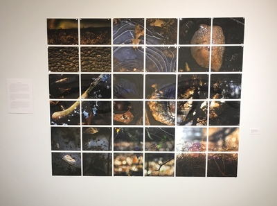
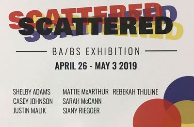
Scattered
Casey Johnson
My art comprises one unifying idea: the body. We are our bodies, and with these bodies we experience life, death, and countless emotions. With my drawings and other work I embrace these experiences and depict stark symbols relating to the body.
I explore traditional symbols of play—such as toys and games—as well as images tied to life and death. The body is more than just a thing that can live and die. With our bodies, we feel emotions and interact; with these ideas in mind, I compose pieces related to color and our capacity for connection and interaction. In this sense, these drawings are not simply about the body; they are about life, movement, emotion, and death.
In my other work, I also explore the concept of body and bodily experiences; my photography, for example, emphasizes the lifelike and organic qualities of what is essentially lifeless, such as animal remains and city scenes. My prints explore subjects of dreams and the arcane. And my sculptural works explore the boundaries between organic and inorganic substances. In this sense, all of my work encompasses the ideas of the body in some way.
Casey Johnson
2019
-

Scattered
Justin Malik
When designing my art I like to keep in mind specifically the audience’s reaction when viewing my work. Think of this as the ‘user experience’. If you are using an app on your phone and you quickly realize that the user interface is really bad and you can’t figure out what you’re supposed to do, that is the exact kind of frustration I want to eliminate when people see my work. Keeping that in mind with the fact that I draw a lot of inspiration from the minimalism movement, this is how I develop my designs to a point that makes it pleasing to the eye and easy to understand.
One particular piece of art that always comes to my mind when I think of inspirations is a painting called Composition with Red Blue and Yellow by Piet Mondrian. I love the simplicity of this piece. It’s literally just one big square that is divided up into smaller colored squares and rectangles separated by thick black lines. I find it very aesthetically pleasing to look at and it is what I hope to achieve with my own art.
For this work in particular I made vector illustrations the instruments of the four families of a symphonic orchestra. The thing I love so much about vector illustration is how simple and clean it is. This is the core of what minimalism is to me; taking an object or a subject thing or a thing and reduce it down to as basic as it can be. But even with all that simplification it is still possible to know exactly what that ‘thing’ actually is. And as a nod back to user experience I added in a little secret for the people who look close enough at these pieces.
-

Scattered
Mattie McArthur
Artist Statement
I use photography as a way to capture the world around me. I take pictures to draw attention to the things the naked eye may easily overlook. These small details allow us to see the world in new ways. My goal as a photographer is to make photographs that the viewer can engage with. My work can be viewed as a portal into an unseen world, that opens the eyes of the blind metaphorically and gives the viewer a new form of seeing, that they may never see the world the same again. The environment has so much beauty to offer, and it is a shame to walk around blindly not taking it all in.
My subject choice of nature comes from my livelihood. Most of my life has been spent interacting with the outdoors. I have a personal and emotional connection with the land. I take great joy in capturing these special details that raised me. I want to preserve these memories, as well as share them with all who will see. It is important that we give attention to who we are and where we come from.
I am inspired by the beams of light casted by the sun, as well as the shadows formed by the interaction of nature with itself. Color has become something that I use strongly in my work. It portrays the rich details and beauty in each form of nature whether this be a decaying leaf or the flowing stream. We do not see in black and white, and I think when capturing the exquisiteness of nature, it is important to bring to life the beauty that is radiating and contrasting so boldly with one another.
-

Scattered
Sarah McCann
I have been dealing with loneliness my whole life. I was given up for adoption at birth and brought from Paraguay to the United States. I feel a kind of loneliness for someone I have never met: my birth mother. In grade school I didn’t have many friends who would spend time with me outside of class. My brother was usually busy with homework and my mother and father were busy with work, leaving me a lot of time spent on my own.
My main emphasis in college has been drawing. I wanted to refine my skills that I’ve been developing since I was a kid, so it made sense to focus there. The most influential experience though was being able to draw the figure from a model. I had been drawing character and caricatures of people for a long time, but I didn’t really understand the human anatomy. Being able to draw from life has changed my understanding of what the body can do and what kind of poses are possible and now my figures are more expressive.
I didn’t think that my work had any kind of theme or concept behind it. I have realized though that everything I do, from my personal work drawing television characters to everything I have made in college that I have made has been a tool. Either a tool for me to deal with my loneliness and anxiety, or as a tool that has use for others. My work serves a purpose; that is to improve the world it’s in.
-

Scattered
Siany Riegger
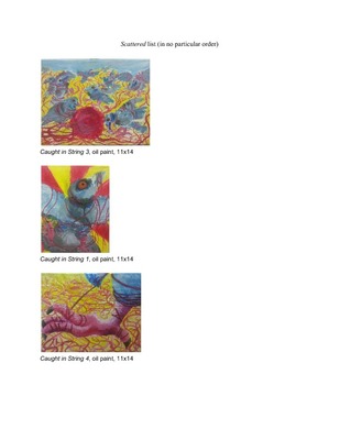
What viewers should be able to see in my artwork revolves around the concepts of the sublime and of nature in general. This is done by utilizing the theme of predator and prey relationships to portray the sublime. One side of this work involves the predator and prey relationships with animals, particularly birds. This is where I am inspired by wildlife, which makes me curious about the idea of nature presented in my work. By using the theme of “survival of the fittest” in my artwork, it can bridge the gap between horror and nature to create the sublime. For these works, I tend to work mostly with oil paints on canvas.
The other side of my work involving the sublime engages in conversation about Catholicism, and the nature of demons in this sect of religious faith. It is an interesting concept because the way evil is interpreted in theism is not as widely accepted as the good in theistic faiths. This is a new addition to the current sublime concept, which forces how to gauge predator and prey relations along with different topics revolving around religious culture today. The way this happens is by forming a satire of how demons are portrayed within the Catholic sect of Christianity and how they are portrayed in media. This is a way of satirizing this theme through real life means, and from widely accepted portrayals in media. For artworks like this I use painting materials and drawing materials to conceptualize my work.
-

FINALLY.
jade simpson
I create graphic design pieces with the goal of inciting a feeling in the viewers. I have found through the years that creating a well developed color pallet is a major part of my process as an artist. This is because color can help enhance the specific emotion or idea that I am pushing for. I enjoy designing a variety of posters over subjects from music to commentary on social issues. The reason I choose the topics of mental health awareness, suicide awareness, gender roles, domestic violence, drug abuse, and other similar topics is because I want people to stop avoiding them. I want to inspire a change in the world and get people to start talking about them on a larger scale. I want to put the very real problems of society in their face and make them want to change their behaviors and attitudes. If not I hope to at least compel them to bring awareness to others. The less heavy pieces that I creat I want to awaken the fun that is sparked in Children. A feeling where the stresses of life are the farthest thing from the veiwers mind. Just breathe and have have. Be happy. This work is generally inspired by graphic artists that use vibrant and wild color theories, funky patterns, and interesting methods of creation. Artists such as Jessica Walsh, Stefan Sagmeister, and Milton Glaser.
-

FINALLY.
Nova Tabor
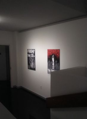
Horror has always been something that has fascinated and intrigued me. Love for horror and horror imagery is something that was given to me by my older brother. I can remember being six years old, and sitting next to the arm of the couch, positioned perfectly so that I could see the TV, but my brother would not spot me unless he physically leaned over. Horror, especially the campy and sometimes silly fare offered by the slashers of the 80's, is psychologically fascinating. The movies allow viewers to surrender their control, and allow themselves to be scared and vulnerable, in an environment where they know they are safe. The visuals and backgrounds from certain movies stick with people for years, if not decades. When I began making my poster I wanted to honor these movies that shaped my childhood, by using their image and tone in a way that was distinctly mine. I also wanted to create my own fictional movie, to see if I could capture the same essence in a new way, that still fit in with the classic films. These posters are my love letter to the genre of horror, a genre that I feel is often misunderstood. They also utilize my passion for graphic design. The posters while reminiscent of the originals, utilize my distinct style of illustration and layout, to create works that are unsettling and scary but also fun and not to serious, much like the classic movies they were based upon.
-

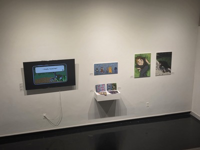
Scattered BS/BA Group Exhibiton
Rebekah Thuline
One thing fascinating about being an artist is how we perceive the world through a creative lens, finding beauty and importance in even the most practical objects. As humans, we live in a fast-paced world and it’s easy to overlook everyday scenarios, as well as people, places and things. Every so often I get a chance to pause and look at a moment, an object or a genre scene and just enjoy it for a second and admire how the light and composition play off each other. To step out of my busy mind, to ponder over what I’m looking at before I slip back into whatever I was doing before.
My goal with my art is to share a moment with the viewer. To highlight the importance of even the smallest things, their roles in life, and how to be grateful with what we have now with something such as a glass jar, a fleeting moment, or nature. Out of all I paint, nature is where I tend to lean the most towards because of the significance it has in our life. Everything we have in some way leads back to nature. I enjoy experimenting with light and color to draw attention towards the subject and create an atmosphere from natural lighting to dramatic lamp lighting.
I look to Vincent Van Gogh and Janine Antoni for inspiration in style and meaning. Van Gogh had a way of expressing his ideas through his use of color, lighting and perceiving through a different lens to bring attention to an unseen world full of fleeting moments that grasp attention. Janine Antoni takes something ordinary like an everyday task and transforms it into an art form somehow for her sculptures and performances. We are told that life is short and should never waste it, but, we should also remember to live in the moment and try to be happy with what life has given us now.
Printing is not supported at the primary Gallery Thumbnail page. Please first navigate to a specific Image before printing.