

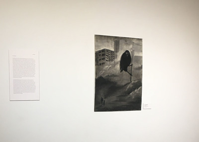
-

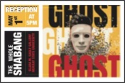
Diverse Directions - Callie Bowland
Callie E. Bowland
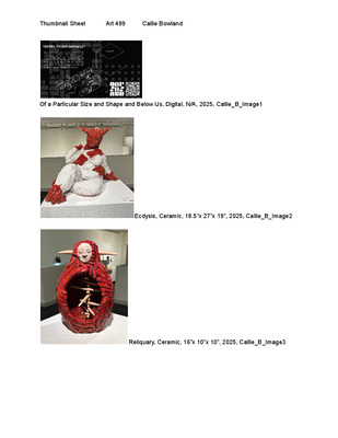
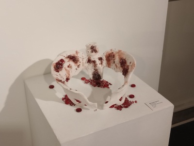
My ceramic works explore stress, masking, and how they affect the body over time, in addition to what can be considered the true self, and how society reacts to it. They all feature an element of abstract, twisting flesh.
Reliquary uses it as a very literal interpretation of inner beauty, turning flesh and bone into an ornate vessel, playing with the parallel of the human body as a vessel for the mind. It also poses the question of what makes up a person, by contrasting the corporeal flesh and bone with a mask- like face–are we the physical body itself, or the image we have of ourselves?
Itch uses it in a wound, as a representation of physical tension and the human psychological state that parallels how an animal can end up scratching or licking at a painful spot until it is raw, not understanding that it is making their pain worse.
Ecdysis uses it to make up a figure that represents mental struggles and parts of the self that get hidden from others through masking the toll that takes on the body, as well as the relief that comes from removing the “mask”. With this piece I was thinking about how mental illness is often represented as demons and monsters that afflict the victim, and how people with mental illness, despite there being more understanding of it in today’s society, are often still treated with fear, disgust, and judgement.
Two significant influences for my ceramic work are Junji Ito and Louise Bourgeois. Ito’s particular handling of horror, especially in Uzumaki and The Enigma of Amigara Fault, inspire the way I’m abstracting flesh, and the body in general, as ropelike, twisted coils.
With Louise Borugeois, I’m especially interested in the ways she distorted the feminine form to critique how women are treated in patriarchal society. Her piece Arch of Hysteria in particular was an influence in Ecdysis, where I referenced and then distorted my own form.
My design work, a style guide for the hypothetical restaurant brand Of a Particular Size and Shape and Below Us, combines brutalism and concepts from nuclear semiotics to create an experimental dining experience that is expressly anti-human. The main influence for the style guide, nuclear semiotics, originates in a report titled “Expert judgment on markers to deter inadvertent human intrusion into the Waste Isolation Pilot Plant”, which contains proposals on how to deter future humans from entering nuclear waste disposal sites.
-

Diverse Directions - B.S. Senior Exhibition
Ellen C. Downing
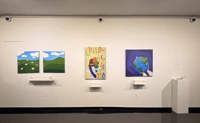
Rooted in Faith, my work explores child development by examining how children interpret Biblical truth and the various narratives found in Scripture. I am fascinated by how children learn and interpret life, but more importantly, how children interpret faith. I grew up in a family where Christ is the center of our lives.
Using simplified forms, vibrant colors, and smooth textures, I create fun, illustrative paintings. The works of Joel Schoon-Tanis inspire me to incorporate aesthetic choices that reference childhood and make the work more accessible. Drawing from Biblical stories, my pieces incorporate themes of growth, compassion, and faith, using parables and symbolism. All of my paintings have interactive, movable magnetic components where everyone is welcome to engage and move the components in my work, communicating concepts in faith and scripture.
By combining storytelling and exploration, I draw inspiration from Faith Ringgold by transforming Biblical narratives and turning them into visual forms. My paintings examine topics of having child-like faith, belonging to God, and the parable of the Lost Sheep. Parables and narratives are commonly found in the Bible and in stories for children to help teach complex ideas in accessible ways. Combining these aspects, I engage viewers of all ages.
My paintings explore how children interact with and understand Biblical truth with simplified, illustrated narratives. This body of work is geared towards a younger audience, but ultimately, all ages are welcome to engage and develop a deeper understanding and connection with Christ.
-

Operation Surge/Wish You Were Here
matthew W. Lopez mr.
Artist Statement Matthew Lopez
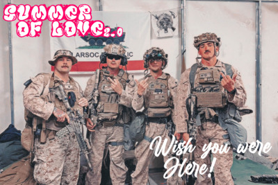
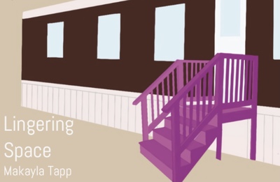
This collection of videos and posters was created with active duty members and veterans primarily in mind. The gallery installation invites viewers to sit, interact, and exist in the space. The setup encourages lingering, allowing laughter, silence, and reflection to coexist within the environment.
The first video parodies the earnest style of 1940s military training films. In it, I invented a fictional VA program called Operation S.U.R.G.E., using deadpan humor to highlight how absurd and disorienting college (and civilian life in general) can feel after leaving the military. The transition is ridiculous, and I wanted that absurdity to be front and center, while remaining relatable to veterans and anyone navigating a major shift in identity.
Peaches explores how the past and present refuse to stay separate. Subtle details, such as the smell of cigarettes, the grit of dust and sand, the texture of worn fabric, illustrate how a fleeting sensation can trigger an overwhelming flood of memory. The poem acts as narration, carrying the emotional weight of those sudden, uninvited returns to another time and place.
The prints take the form of vintage-style postcards and polaroids, with each post card bearing the phrase Wish You Were Here. This recurring message functions as a quiet, ironic nod to the ache many veterans feel after separation from service, the sense that the people left behind are still waiting, and that part of oneself is still back there too. The idea of memories is a nostalgic concept and in capturing this nostalgia I’ve directly mirrored it with Photos from home pinned up and stuck around the installation.
I began working in video because it’s the most direct way for me to tell stories. After years of drawing comics and building a career in illustration, photography, motion and sound felt like a natural evolution. Video allows me to merge narrative with atmosphere, sound, texture, and movement, working together to convey emotion without explanation.
Donny O’Malley, through Vet TV, captures the irreverent, deeply human (albeit, dark) side of military culture. His use of dark humor and absurdity allows veterans to confront their experiences through laughter and satire. In my piece Operation S.U.R.G.E., that same tone transforms confusion and alienation into comedic recognition highlighting how humor can connect people who feel disoriented by change.
War photographer and correspondent Joe Galloway, for his use of observation without embellishment. His documentation of conflict, its intimacy, chaos, and quiet shows how bearing witness can itself be an act of empathy.
Cole Thompson for his uncompromising creative independence. His stark, minimalist photography reminds me that simplicity often carries the most emotional depth.
-

Inveterate|Hevel
Cameron Neal
The impulse to pause at a mirror seems universal; the compulsion to double-check your appearance, to make sure you look alright. This kind of vanity is ingrained in people from childhood, even if it is not conscious. But when does this characteristic become a character flaw?
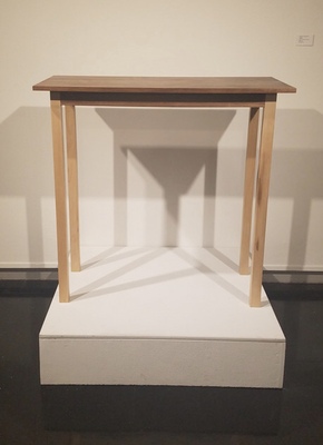
My work combines wood, metal, and fibers into sculptural forms to help remind us that life is fleeting, and not to waste so much time worrying about appearances. Vanity is a learned behavior shaped by decades of defined beauty standards. My work approaches this in symbolic ways; using materials like hair and pearls, representing the beautiful and pure, and applying them to objects we use to beautify ourselves, such as combs, brushes, and mirrors. The resulting objects are removed from their intended purpose and given new meaning. Their heirloom quality suggests our continued fascination with vanity and its grip on time, while their lack of function reinforces the futility of the pursuit of vanity.
Don Miller is a woodworker from whom I have taken inspiration. In his work, the form is always dominant; providing all necessary context for meaning without requiring function. His ability to create quietly beautiful works that are both direct and mysterious inspires me to take more time with craftsmanship, and to allow the materials to speak. Elanor Moty is another artist who inspires me in how she conceives her jewelry pieces as discrete compositions, separate from the human body, while still intended for adornment. Her designs also follow organically from the inherent qualities of her materials, forms following from the natural geometry of gemstones. I want my future practice to allow materials to speak for themselves in a similar way.
-

Diverse Directions
Grace L. Rittenhouse
This body of work explores an evolving fantasy world of my creation through painted illustrations. It emphasizes the beauty of humans and nature using small details like intricate patterns and subtle expressions with soft, blended art in a wide range of vibrant colors. This exploration is mainly through portraiture and original characters.
By using oils, I focus on creating unique characters; drawing inspiration from mythology, folklore, and cultures from across the globe. The two works Newborn Star and Moon Prince take inspiration from traditional Chinese fashion, the symbolism of marigold flowers within Mexican culture, and the traditional uses of opium poppies in various cultures. These characters have been with me since I was in middle school and have evolved with my skill and knowledge. The simple brush strokes speak for themselves when highlighting bright reflections of light in hair strands and glossy fabric, while the variety of brushes create unique textures. My work also heavily layers with various colors in order to create a sense of depth found in real colors and how they interact with each other.
My characters reflect the fantastical worlds they inhabit, with this exhibition focusing on the ethereal beings that rule over and occupy the night sky. They represent my interest in fairy tales, mythology, fashion and worldbuilding by taking inspiration from different cultures. A strong influence in these works is manga in the shape, line, and colors for the characters, especially artists like Hirohiko Araki, Yana Toboso, and Kamome Shirahama. Araki’s eccentric characters and unique fashion design are incredibly inspiring and add a new layer to his visual storytelling. Yana Toboso takes immense time and effort in researching both historical context and visual references in order to bring a grounded accuracy in her fantastical narratives. Finally, the intricate manga of Shirahama breathes in a sense of movement and uses that weightlessness to carry your eyes across the pages and immerse yourself in her intricately designed worldbuilding and magic.
-

Diverse Directions - B.S. Senior Exhibition
Luca C. Schaefer-Knight
My art focuses on human connection, narratives, and emotions. I explore how people relate to themselves, to nature, and to each other, especially as they relate to shared experiences and mental health. My comic and zines detail the lives of teen characters and how they cope with trauma or mental illnesses. This is centered in how people seek to escape reality through reflection because of their fascination with stories and imagined characters that embody their struggles. The artist Lucy Kagan inspires my work for zines as well as characters, as she also uses zines to share about her characters and creates characters that are unique. Showing how people are different is important to me, as each person is unique but we’re all similar in our differences as well.
In my process, an individual’s expression and detail are crucial. I closely observe how subtle body language and movements are used to generate empathy and emotional truth. My character expressions and styles are influenced by the popular contemporary artist Jin Kim, who worked on younger characters, such as those in Encanto and Frozen. In particular, color is quite essential to my practice. Particularly when it comes to conveying emotion and experience, the colors I use help convey the deep emotions that go along with people’s lives. My palette mostly consists of high contrast between bright, light, dark, and muted colors to accentuate these diverse emotions. The character, Wren, that I created is a great example of this contrast as their virtual identity is bright and colorful while their real-life identity is dark and muted, showing how they feel constricted stricted at home and free in the virtual world. The visual language in my works are influenced by contemporary media that explores alternate worlds and changing identity, such as the shows No Game No Life, The Owl House, and Sword Art Online. The story-telling in these shows, as well as the lead designer Joe Sparrow–who worked on The Owl House and creates comics in his freelance work–helped me to create the environments and engaging story of my comic and characters. These influences help me to create spaces that make people feel emotionally connected and immersed, while also being very symbolic to the story.
I am driven as a designer and artist by the conviction that art is fundamental to understanding and human connection. I aim to use my art to facilitate empathy, to show audiences how creativity can promote healing and connection, and to help them see aspects of themselves in others. As I continue to use art as a bridge between experience, identity, and emotional truth. I'm eager to investigate new media that broaden my storytelling, especially in character and narrative design.
-

Diverse Directions
Sadie Smith
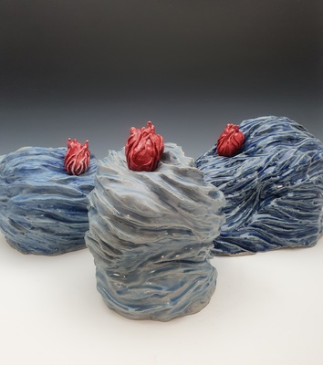
My work explores the complex interactions between individuals and the way we interact with family and romantic partners within the household. My sculptures display these interactions while each exemplifying the unique emotions associated with the situation, juxtaposing amorphous, body-like ceramic forms with the nostalgia of antique wallpapers, carpets, and furniture. Each piece reflects my overall theme of this interpersonal interaction by creating different subnarratives in relation to it. One example of my work is “The Ambivalent.”. Its stiff, body-like appearance encases a smaller fabric object laying peacefully inside. This mother and child impression between the figures relates back to my theme of relationships, and each object will contribute their own experience as they are imprinted by each other.
My process is highly experimental as I continue to test new glaze recipes, combinations, and stains on my works in an attempt to capture my intended feeling. Once my work is bisqued, a base stain or glaze is applied and will serve as a primary conveyance of mood. I will then apply a pattern to either the entirety, or a portion of my form. This part of my process is inspired by Mary Cassatt and her pullings from Japanese ukiyo-e prints. I use these prints to flatten my form, pushing these abstract shapes into the realm of home life and nostalgia.
I am also inspired by Daeun Lim and her exploration of interactive objects. My works often have parts that can be separated from one another, their imprint remaining, and I draw from the smoothness of her forms while also merging with it the body’s ridges and lumps. My pieces also incorporate mixed media such as fabric, rope, and plaster forms of which add an element of depth in terms of domestically and things you may see around the home, especially growing up in the south.
While my pieces continue to explore specific emotions, their vagueness remains an open opportunity for the viewer’s interpretation. What I may consider an unsure situation, a viewer may find comfort in, and that is an aspect of abstract art that is so special and interesting to me.
-

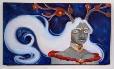
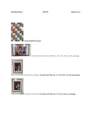
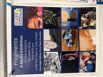
Fragments
Jakyah Acree
Growing up, I’d always been infatuated with fairies and other mythical creatures. After losing my mom during my second semester here at Murray State, I felt a strong urge to reclaim my childhood as a way to both remember and honor her. Cosmic Fayes, Cursed Immoral Rouge, and Cursed Corrupt Fiend take inspiration from both the whimsical and the dark sides of fantasy. The female fairies are vibrantly colored and ornately dressed.
They draw inspiration from Winx Club and Art Nouveau. Each is dressed in a way that represents their individuality but remains cohesive hinting at the fact that they are part of the same team. Conversely, the male vampires are rendered in black and white. Their sanguine alter egos loom over them denoting a menacing change. The conventions of illustration support the growing visual narrative. Saturated colors, glitter, and metallics tell a story of life, beauty and nostalgia. Thick lines, muted tones, and angular figures explore the pain of loss. In the future I want to continue to make art with vibrant color, bold contrasts, and beauty that captivates the eye.
-

"Fragments"
Zachariah M. Alexander
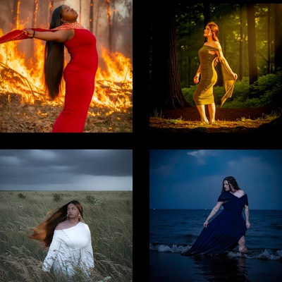
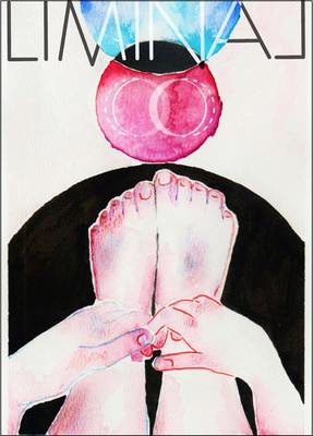
My work explores identity, memory, and womanhood through portrait photography that reflects personal experiences that shape emotional and psychological growth. With each photograph, I aim to convey a transition between innocence and maturity, dependence and independence, and fragility and strength. The series challenges notions of innocence and maturity, fragility and power. The process of creating the portraits is shaped by an admiration for moments of strength and struggle in the women I have grown up with those who are part of my family or closest friendships. There is beauty in those contrasts in that the reality is women are human yet often bound by unrealistic expectations formed by society and home, and internalized over time.
These narratives guide the use of lighting, environment, movement, and balanced compositions. The colors used in each photograph convey distinct emotions: red for passion and loss, green for growth and change, blue for isolation, and white the combination of all colors to represent a liminal state, a space of transition where someone is not quite one thing or another, but somewhere in between.
My current show explores this visual style, combining color, symbolism, and elements of nature and womanhood. Each photograph represents a different element found in nature: fire, water, air, and earth represented through the women who have shaped my life. By portraying these women, I explore the fluidity of feminine identity and the shared cycles of creation, destruction, and renewal that define womanhood.
Artistically, the work draws influence from David LaChapelle’s theatrical use of color and storytelling through tableau, Trish Morrissey’s focus on family and female gender roles, and Cindy Sherman’s ability to transform herself into different personas. Their practices demonstrate that photography can be more than a record; it can be a space to perform, question, and reinvent.
Ultimately, this practice remains deeply personal. My work uses photography as a means of reflection, locating beauty in the complexity of lived experience and exploring the strength that emerges through vulnerability.
-

The Best of Whinot Productions
Adam R. Ashlock Mr.
Art is a space where humor and absurdity are welcomed with open arms. It's a way to break down barriers and connect with others—especially when traditional social interactions are challenging. Growing up with Autism Spectrum Disorder (ASD) means I've navigated a world that often feels out of sync with how my brain works. Conversations are challenges, and it’s easy to feel disconnected from the people around me. But growing up I found that humor is a universal language. It's a great way to find common ground and create a shared experience that feels natural even when other forms of connection don’t. Humor and storytelling in these films serves as a way to reveal deeper truths about life, even in the most ridiculous parameters.
Aesthetic choices often lean toward subversion and unpredictability, taking the ordinary and transforming it into something strange or comedic. ‘Freelance’ is a perfect example of this approach, a live-action project reflecting the experiences of a broke, full-time college student. The video follows my attempts to earn money through odd jobs over two days, only for it to vanish in an instant as debt takes over. The punchline, “I hate my life,” followed by a bouncy credits song, captures that dark humor and highlights how even the mundane struggles of life can become a source of comedy in a sort of mocking tone. Humor here is more than just entertainment—it's a coping mechanism and a way to make these universal struggles more relatable and enjoyable. I use film to explore humor in a variety of ways, but for the most part I create simply because I want to do so.
With Autism, thinking is unpredictable and often non-linear. I don't fully plan out my projects—just a rough outline—because trusting instinct and letting ideas develop in real time is how the best work happens. Thoughts jump from one idea to another in unexpected ways, and the unpredictability is something I embrace in the film process. This free-flowing approach often leads to random, absurd ideas, and it’s in this space that the most interesting creative decisions are made. Animation, in particular, has always held a special place in my heart because it most mirrors how my mind operates; It's silly, whimsical, and a little detached from a straight pathway. It's a special interest that's very near and dear to me.
In the same light, the work of contemporary artists deeply shapes how I approach storytelling and comedy. Craig McCracken was a man who started young in the industry and hit gold with his brilliant techniques, his shows having a mix of emotional depth, character-driven stories, and bold visual styles. The defiance of Everett Peck’s Duckman was like hate mail to the censors, defying the expectation that crude, rude and dark humor couldn't touch your heart and be a major player in adult animation. It's here where I derived my comedic philosophy that nothing is truly off limits, and that Comedy should always leave you different than when it found you.If there’s one true kindred spirit, it’s Wayne White. He takes cheesy thrift-store paintings and slaps huge, perfect carnival letters on them—pure joy, zero pretension, massive laughs. Never preachy, yet scary-smart. That’s exactly what I chase: turn my awkward, autistic, broke life into cartoons and videos that just make people grin and feel good. He nails it every time—that’s the energy I’m after.
Ultimately, my goal is simple: to entertain. Having Autism has made connecting with others difficult in many ways, but through my work as an online entertainer, I’ve found a way to bridge that gap, and show people the many facets of who I am. This work is a conversation with the audience, rather than a chance to teach or give commentary. If you learned anything meaningful, its your own fault. No matter the reaction, the only hope is that the experience will create a lasting memory, one we can both share. Through my work, the message is clear: My name is Adam, and I hope you're entertained. -

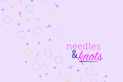
needles&knots
Maria Castlen
Growing up surrounded by tales of the “olden days”, embroidery was a thrilling discovery. It was a beautiful and unique way to create, while also learning a skill my mother praised. As I’ve grown, I’ve discovered ways to combine graphic design with the embroidery through branding. needles&knots prides itself for the beginner-friendly and practical embroidery kits. Whether you’re a seasoned stitcher or just learning your lazy daisies, our kits take care of the supplies so you can focus on what really matters: crafting something with you love.
At the beginning of its creation, I began to create needles&knots’ visual identity, starting with my favorite embroidery stitch, the lazy daisy. The visual identity is supported by a bright mix of pinks, purples, navy, and yellow. These are accented by a motif of embroidery related illustrations, as well as, you guessed it, lazy daisies. Composed of a mixture of a san-serif font and flowing handwritten, the needles&knots logo is inspired by embroidery stitches. Both flowing and rigid stitches are often combined to create a harmonious embroidery piece, balancing each other out. I chose a san-serif font to balance out the handwritten portion and provide more structure. All the elements, in different combinations, create needles&knots’ visual identity and are applied throughout the brand. Most noticeably, the packaging is where these all come together. The brown kraft paper, for the packaging, was chosen for its rustic and minimalist aesthetic
There are many artists and designers that inspire me. However, for this project, in particular, there were a specific few. The Not Your Mother’s brand was a big source of inspiration. The typography, color palette, and decorative elements work so well together, and the overall aesthetic is a particular favorite of mine. Spoonful of comfort is another inspiring brand, specifically their packaging. It’s simple yet strong with a wide range of elements, while staying cohesive. Although a newer inspiration, Shivani Toshniwal’s work for Amika, designing their website, is an additional favorite. Her design for their website blends perfectly with their packaging as well as being easy to navigate, simple, and eyecatching.
-

Fragments
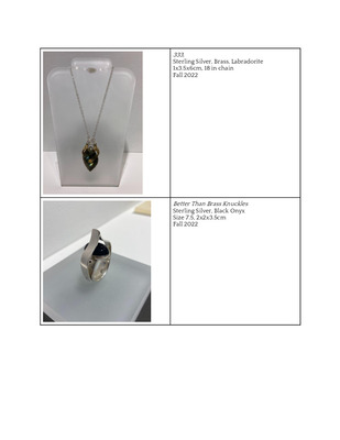
Rose m. Craig
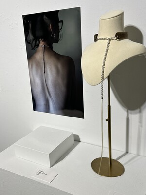
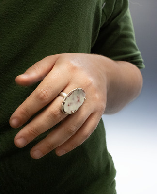
My work explores the intersection of functionality and self-expression through jewelry. Jewelry is a piece of art that often becomes emblematic of the wearer, revealing fragments of identity and how someone chooses to be seen. It serves as a second skin connecting form and function and becomes both a form of personal expression and presence. My pieces connect the body and materials, using form, structure, and materials to create a narrative related to the wearer's identity.
This exhibition features three pieces of jewelry alongside photographs of the jewelry modeled on the body . Keeper of the Vulnerable balances fragility and strength with its enamel piece contained in a sterling silver basket setting connected to an oval-shaped ring. The enamel piece symbolizes one’s vulnerability and is protected by the stronger sterling silver ring. The ring represents the tough exterior that protects the fragile enamel piece. Nexus of Harmony exhibits completeness and unity with a series of circles and uses the Jasper stone at the bottom, being a product of the earth, to show groundedness and humility. Mark of One focuses on identity and beauty. The necklace features an enamel piece with a fingerprint design representing the physical aspect of identity. The piece itself acts as a “beauty mark” with the enamel, malachite, and mother-of-pearl insets sitting asymmetrically to the side of the necklace in a seemingly random place, acting as a natural beauty mark.
My metalsmithing work is inspired by contemporary metalsmiths Janis Kerman and Sophie Kissin. Kerman's use of organic forms, often constructed from flat sheet metal, inspires the balance and structure within my own work. Kissin’s organic and expressive approach informs and inspires my exploration of form and movement in metal. Together, these artists and their work influenced the way I think about metal as a material, composition, and form, as well as the expressive potential of jewelry as both art and adornment.
-

Fragments
Kailee Goff
My current body of work explores the intersection of graphic design and photography through the format of a lifestyle magazine. This work highlights individuality and diversity, an appreciation for the uniqueness that each person has to share. By combining visual storytelling, portraiture, and thoughtful layout and typography, this project creates a space where people can be seen for who they are and celebrated for their individuality.
I sought out and photographed some individuals I had never met before, engaging with their lives, perspectives, and stories. Each photography and layout design was created using Adobe Creative Suite, merging image and typography to celebrate individuality. I purposefully selected iconography, such as re-occurring objects from their daily lives, to emphasize key aspects of their character. To highlight the subjects’ differences, I separated them using monochromatic color pallets, allowing the iconography, typography, and imagery to stand out and distinguish each section of the magazine in a playful way. Influences such as Paula Scher, who uses design as a form of storytelling and representation, Cipe Pineles, whose playful modernist style connects image and type in editorial work, and JR, whose portraits give my approach and reinforce the purpose behind this project.
At its core, this work reflects my growing understanding of the value found in every person’s identity. Beyond our differences – we all deserve to be acknowledged, understood, and celebrated. Each composition serves as a reminder that diversity is not just something to observe, but something to embrace as a defining part of what connects us all.
-

BA/BS Senior Show Fragments
Hugo S. Hodge HSH
TALKING WITH VISUALS
In this exhibition there is a variety
of typographic and layout design
that I composed illustrative
imagery around. This is mainly
because I’m developing job
skills and a intrinsic joy towards
creating something from your
head into reality. Designing my
drawing lets me tell stories, depict
the world I see and learn more
about the things in it. There’s a
new appreciation to be gotten
out of even basic things like the
industrial design of an apple
product or the fashion design
of an outfit. The world is vastly
different when I get to record and
analyze it through a pencil.
In this exhibition, I loved working
on posters alongside a 28-page
comic story where you can see the
character of two boxers about to
fight each other. The posters show
a series of images ranging from
semi-abstract representations to
digitally altered photos, composed
within swiss design rules and an
intuitive understanding of white
space and focal points to grab
your attention.
These ideas bleed into the
paneling and staging of a comic,
too; being able to organize
imagery and text through a
compositional line of sight also
helps me understand how to
organize drawn figures and
panels in a similar way. Hand-
to-hand choreography is better
when you know how proximity
works with panels and can crop
to lead the eyes around them,
establishing a mental continuity
all by itself.
Influencing my work from an
abstract graphic design and
storytelling perspective are
modernist designers Saul Bass,
Joseph Binder, plus Otis and
Dorthy Shepard; alongside comic
artists like Togahiro Togashi,
Tatsuki Fujimoto, and Akria
Toriyama. The illustrations in the
comics are influenced by Steve
Ditko, 1980s Phillipe Durelliet
and Segio Toppi, and Kevin O’
Neil’s work on the League of
Extraordinary Gentlemen. I hope
that by looking at these works,
you’ll have as much fun looking
at them as I did when making
them.
-

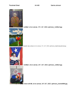
Fragments
Samira Johnson
Being Black and Puerto Rican in a predominantly white area requires a flexible sense of self. I struggle to express my complex cultural identity in a way that feels authentic. Instead, I often feel like I’m performing an oversimplification of who I am. This body of work explores multifaceted identities through clown imagery. Clowns enact emotions through bold makeup, patterned clothing, skits, and props. It is their job to play the part. Similarly, I choose to hide behind the appropriate social mask out of a sense of obligation. Clowns are joyful symbols of humor and childhood, but thanks to horror films like IT and Killer Clowns from Outerspace, they are also haunting. I depict this duplicitous nature by painting my subjects in vibrant colors and incorporating unexpected imagery. I’m inspired by the surrealism of Odilon Redon, the ornate patterns of Khinde Wiley, and the saturated iconography of Takashi Murakami. Paint allows me to layer and revise in much the same way as applying makeup. No matter how you feel about clowns, the ideas of masking or performing the self are universal.
-

Fragments
luke c. medley
I create artwork with physical durability and timeless conceptual ideas in order to leave behind a tangible legacy, or something permanent, in a world that is constantly changing. In this art form, I make functional artwork that is detailed with visible craftsmanship as well as a resiliant construction. I am truly fascinated with exploring how I can make art in a way that not only looks good but can be used and appreciated. Working with metal allows for a stronger medium and longer lasting material while also attributing to its longevity of life. Creating an object that can be passed down from generation to generation gains not only sentimental value but an appreciation for the craft and a feeling of the object's permanence and worth.
Artist inspiration
1- Seth Gould- | Metalwerx I take great inspiration from this artist because he not only makes tools but he makes the tools extremely detailed through blacksmithing and metal work. He specializes in making jewelry saws and usually you can buy these saws for no more than $25, but he is making these simple tools into art pieces themselves. He uses craftsmanship in every tool made. I love his work and appreciate this artist as a whole.
2- Nash Quinn- Nash Quinn — SNAG//SPACE I take even more inspiration from this artist's use of mechanisms. His use of hinges and all around craftsmanship when making mechanical rings and even containers is unmatched. His attention to detail really shows when he completes his artwork and explains how the mechanism works he designed and created.
-

Fragments
Addison E. Miller
Plants have cultural, spiritual and medicinal importance. Artists have long been inspired by the beauty of flowers, but how do we determine what’s considered a flower and what’s considered a weed? In the series “Beyond the Evergreen”, I create characters based on the environment around me, specifically, the plants and animals in my own backyard. I illustrate species which are often considered a nuisance, elevating their importance and honoring their ecological importance. My work created, develops their personalities, and explains how they interact with each other in their ever-changing world. tells the stories of the characters I have created and give my audience a glimpse into my character’s personalities and how they relate and interact with each other in their ever-changing world.
When it comes to my style of drawing, I am heavily inspired by the works of E.H. Shepard (the illustrator of the Winnie the Pooh books) and Beatrix Potter (the writer and illustrator of Peter Rabbit). Both artists' works focus on giving anthropomorphic traits to animals or other various objects. Though these artists have quite a considerable influence on my work, my style is also reminiscent of the works of Kiana Khansmith, Dana Terrace, and Alex Hirsh. All three of these artists have illustrative styles of drawing. These artists use shape to their advantage when it comes to character design, with their bubbly characters having rounder features and their more serious characters having sharper features throughout their design.
My process starts in my current sketchbook. Sometimes characters get reimagined from an earlier time in my life, the ones that I feel I could improve upon. Most character designs change over the course of time. When I am satisfied with the design of the character, they are ready to be incorporated into the story, character personalities may be inspired by a real person or be based on appearance.
I work mainly with COPIC or Huhu markers on Bristol paper. This is my chosen medium because of the smooth and easy blending of the materials. This makes it possible for me to achieve the look I am trying to achieve. Recently, I have been incorporating colored pencils and gouache into my work as well. Typically, the colored pencils and gouache are used to color the background, which serves to make the characters pop more than a marker-on-marker look would.
Overall, the central theme of my story is community. Multiple installments of “Beyond the Evergreen” include characters that are different in appearance, age, gender, and social status all of them not only coexist, but together they thrive and become friends. In the future, I plan to continue developing this story. I can see it potentially becoming a series of children’s books.
-

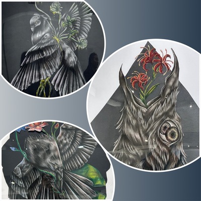
Fragments
Vuanh Pham
My work draws on animals, birds, and, most recently, flora as symbolic vessels through which the human experience can unfold. By placing our intricate emotional capacity into the bodies of creatures and plants, I create a space where the complexities of being human can be observed from an outside perspective from my own. These forms allow me to explore the intensity of emotional growth—its highs that feel like flight, its lows that demand shedding, retreating, or transforming.
Animals and birds become stand-ins for our instinctive selves: the parts of us that react, protect, yearn, and adapt. Their movements and postures mirror what it means to navigate vulnerability, strength, isolation, and connection. With the introduction of flora, I extend this metaphor into the cyclical nature of growth—how we root, bloom, wilt, and regenerate. Plants offer a quieter language for change, one that emphasizes endurance, seasonality, and the unseen processes that shape who we become.
Through this interwoven imagery, I hope to reveal an emotional truth that words often struggle to hold. My work is ultimately a study of humanity through the lens of the natural world—an invitation to see ourselves not as separate from it, but as evolving beings shaped by the same forces of tension, beauty, and renewal.
-

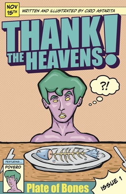
Thank The Heavens! By Ciro Astarita
Ciro Astarita
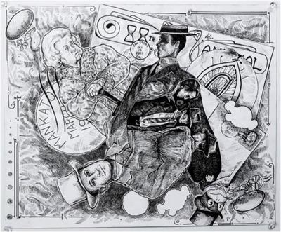
‘Thank The Heaven’s Issue 1: Plate of Bones’ is an issue of a comic I have created inspired by the older style of weekly publications such as that of Casper The Friendly Ghost or Archie that people would buy at newsstands. This comic is set in Europe in a vaguely distant time period and inspired by my background as an Italian American. My work aims to combine the best of both worlds of physical and digital art by blending traditional art methods, primarily illustration in the form of comics, with the ease and convenience that technology and digital tools allow for in layout design and storyboarding. When creating this comic book, i used varying lineweight with little to no value to create a stark, attention grabbing aesthetic. this work is 15 pages for a total of ninety-four panels all hand-drawn with pencil on paper, inked, scanned, and layed out digitally. This was influenced by traditional inking techniques of the past. There was also a careful attention to detail in the rhythm and flow of the panels with an emphasis on consistency and structuring the comic using hierarchy. Some of the artists that inspired this work include Italian comic artists Angela and Luciana Giussani, the creators of the Italian black comic ‘Diabolik’ and comic book artists and writers Frank Miller and Dave Gibbons, creators of the comics 300 and Watchmen respectively. When creating the designs of these characters, I looked to ancient greek and roman sculpture and tried to replicate that stoic style often featured in those timeless works of art. This is paired with biblical motifs within the narrative and framing of certain scenes.
-

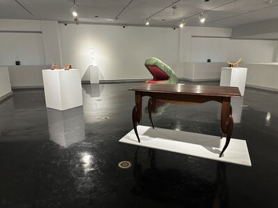
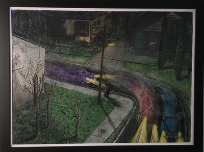
Drifting Through It All
Cross Berry
Mimicry is an important adaptation for survival in the natural world. In nature this comes in varying forms, such as a stick bug that camouflages itself from predators, or how the Myrmarachne camouflages itself as an ant to ambush its prey. Mimicry in our childhood allows us to enhance our creative development. During my childhood, I often tried to mimic the way my cousin would create fantastical creatures. These creations gave me a sense of comfort and confidence in my own imagination, which allowed me to explore design and the way life functions. In my day to day life, I continue to see mimicry within my own children, and the positive effects it has on developing their imaginations.
Mimicry is the primary adaptation that I explore throughout my work. I push the boundaries of functional furniture, focusing on the form of the furniture and how that plays into its functionality. Utilizing zoomorphic qualities throughout my work, I aim to both transcend and embody the craft itself, lending a sense of camouflaged beings to inanimate objects. Their functionality is integral to understanding how they would live in their natural environment. My biological curiosity resonates with the work of both Michael Brolly and Luigi Serafini, who use their art as a vessel for creature creation. Throughout this work, take the time to ponder how these creatures use their form as an object to become either the predator or the prey.
Cross Berry
-

"Drifting Through it All"
Jayson Coley
In my exploration of abstract and portrait photography, I aim to transcend the confines of traditional visual representation, delving into the realm of the intangible and the unseen. Through a careful interplay of light, shadow, form, and color, I strive to capture the essence of emotions, concepts, and fleeting moments that elude direct description.
Abstract photography allows me to break free from the constraints of literal interpretation, inviting viewers to embark on a journey of subjective interpretation and personal connection. By distilling the familiar into the unfamiliar, I create compositions that challenge preconceived notions and encourage a contemplative engagement with the visual experience.
Through the lens, I seek to capture the hidden beauty within the ordinary, transforming the mundane into the extraordinary. Each photograph becomes a visual poem, inviting viewers to embrace ambiguity and find their own narratives within the abstract forms and textures.
In embracing abstraction, I aim to evoke a sense of curiosity, inviting viewers to explore beyond the surface and engage with the layers of meaning embedded in each image. Through this dialogue between the concrete and the abstract, my work becomes a celebration of the infinite possibilities that lie within the language of form, inviting viewers to perceive the world through a new lens and discover the beauty in the ever-shifting patterns of light and shadow.
Some of my influence comes from a photographer on Instagram “moniqueyvonn”. A lot of her photos consist of vibrant lighting and abstraction. What inspires me most about her work is the creative work and ideas behind it. I find it truly amazing how she separates the lighting, if she uses more than 2, and the textures it brings within the photos. Ways I try to implement that into my photography is by way of location in the light source or the position of focus on the subject
(photo with suit and tie). I feed on content from creators scrolling through social media. One in particular has a good sense of video quality, different framework, lighting, and audio selection. His name is Deveja Webb, known as _djuice on Instagram. The inspiration from him is use of a strong focus. You’ll see this in most of my black and white abstract photography.
-

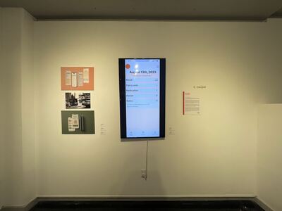
Drifting Through It All - Caitlyn Cooper
Caitlyn Cooper
My body of work combines Graphic Design and UI/UX design to investigate and problem solve how to make well-designed products that are interesting and accessible to the broader public. UI/UX work has allowed me to design with intention, finding purpose in my choices and making the experience easy to navigate for the end-user. Accessibility is not an afterthought but a cornerstone of the creative process. Whether crafting a website, a mobile app, or a digital interface, each project must be approached with a deep understanding of its context, audience, and objectives, ensuring that every design choice aligns seamlessly with overarching goals. My design process includes using tools such as Figma, Adobe Illustrator, and Adobe Photoshop. Inspired by the study of Sociology, a fascination with the human experience and the patterns of human behavior within design has emerged as a primary theme within my practice. Language, behavioral patterns, and social norms are shaped by our culture. Learning how to apply sociological knowledge to design allows one to work with human behavior rather than against it. “Alpha-Gal Pal” is a UI/UX mobile design mockup centering around Alpha Gal, an allergy causing intolerance to red meat and other mammalian products. The app that I conceptualized and designed would allow users to scan grocery items while shopping, checking the ingredient list and product for known allergens. The app’s visual design and functionality would ideally allow users to feel safer when shopping, as the FDA is not required to alert consumers about red meat by-products in ingredient lists. By making the design accessible and helpful, allergens become easier to navigate for users. Massimo Vignelli is an influential Graphic Designer and his work has shaped my approach to design and typography. Studying Vignelli’s work, including his New York subway signage, has taught techniques for creating visually engaging typography and accessible design solutions. For a Web Design course at Murray State University, students were tasked with redesigning an Art Museums exhibitions website only using typography. Vignelli’s bold typography work inspired my work for the project and allowed for the creation of aggressive typography that reflected the Tate Museum and the contemporary art they exhibit. Although the typography is visually aggressive, navigation and accessibility were still important factors when constructing this design. Through the convergence of graphic design and UI/UX, I strive to redefine the boundaries of digital creativity, forging new paths that prioritize accessibility, intentionality, and above all, empathy. All of the works featured are Graphic Design works, with mockups and videos used to show the designs.
-

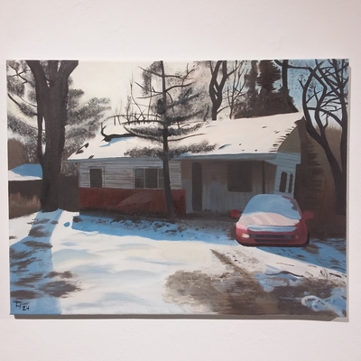
Teresa Hill BA/BS Drifting Through It All Exhibition Spring 2024
Teresa Hill
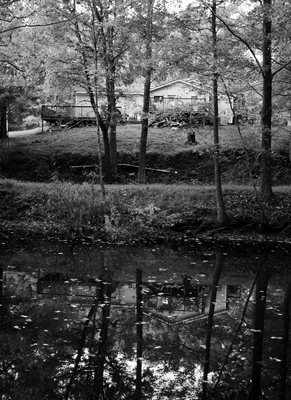
Among other themes, the idea of nature reclaiming what it had lost to humanity is what has been driving my work recently. The evidence of it appears all around us; wandering past run-down homes with choking vines and knee-high weeds, traveling past old gas stations with rust-covered pillars, even old gardens left in disrepair for the wilderness to take back. I’ve been surrounded by older buildings and lived in places filled with greenery, and the interaction the buildings and plant-life have is so interesting to me. In my eyes, it makes the buildings have a new purpose outside of keeping wildlife safe. It makes those buildings feel quiet and somber, yet beautiful. Sitting there, in the weeds and grasses of what used to be a home or gas station, gives a sense of peaceful reflection.
I mostly use traditional drawing, painting, and ceramics more often to get the effects I want in my works, wanting to connect to that peaceful reflection I feel while adding a curiosity to it. All three forms are processes that call out louder than others due to the textures, forms, and vast array of hues I can get.
My ceramics have functional and/or sculptural elements that mimic plant-life while blending in animalistic traits. The pushing and pulling of forms lets me break from rigid plans of how something may look and adapt them based on how the clay reacts to being manipulated and changed. My drawings have the grain of the paper and the original color of the paper, acting as a type of middle ground for the colors. From scratchy free-handed markings to smooth blended markings, I use them all to give the drawing the best balance of color and texture while keeping the grain noticeable. For my paintings, I focus on texture and detail of the scene I’m painting. Taking more time to render the scene and giving it the same feeling I felt when originally seeing it in real-life. Whether it be a run-down gas station or an old family home, I want that same emotion I first felt to be immortalized in my paintings.
Aside from inspirations I find in my life, there have been artists that have inspired me as of late; one being Bonnie Seeman. Seeman’s use of floral and anatomical traits to create the charmingly disturbing vessels while giving them an awareness of life itself. The use of textures and colors causes leaves to look like flesh, bones to hold the structures together, and tiny details like eyelashes and insects connecting everything to each other. Another artist who has influenced my work one way or another is Edward Hopper. Hopper’s use of scenery and color scheming leads his paintings to be reflective of the beauty and/or depression of aloneness in urban and rural settings. That reconnecting of his works to real life being one of the many reasons his works influence my own.
-

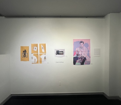
A Showcase of Digital Design
Grant Hoffman
As an artist, my design is heavily inspired by a lifelong passion for creativity and desire to effectively communicate with an audience. My work tends to lean into the realm of swiss design, characterized by simplistic layout and bold san-serif typography. The use of neutral tones and bold hierarchy contribute in building an effective but unique way of communication to the viewer. Oftentimes, my work conveys complex ideas that provoke the viewer to deeper understanding behind a seemingly superficial piece of work. I enjoy exploring the concepts of reliance on technology, false imitation and abstraction within a composition.
I find outside influence in several designers such as Saul Bass and Paul Rand. Bass possessed the ability to captivate the viewer through the use of non-traditional typography and simplistic but contrasting color pallets. This can be seen in several poster design series throughout his career. Rand however, primarily drew his inspiration from the Dada movement. The use of geometric figures and child-like illustrations promotes an abstracted but modern portrayal of childrens book covers. Although both of these artists use several methods of unique abstraction, they also are excellent at logo design. Similarly, I hope to portray both sides of Bass and Rands abstraction and clean straightforward design within my work.
Along with these well known designers, I also have outside influences that have shaped the composition and concepts within my design. Growing up I feel that my family promoted this constant expectation of perfection and unachievable expectation. Often in my work, this idea of flawed perfection is transparent and highlighted to better convey the message. Additionally, as a High School student I also enjoyed creating and listening to all genres of music. This influenced my work to be more aligned with pop culture and better able to express myself through abstraction.
As a college student, I'm continuing to grow and learn more about the principles of design as well as the balance between abstraction and simplistic composition. In past work, this has been done through the use of geometric shapes paired with a contrasting collage style. I've also found using simple compositional techniques such as repeating elements or a drop shadow can also be effective. I'm looking forward to designing, creating, and implementing these principles in the future.
-

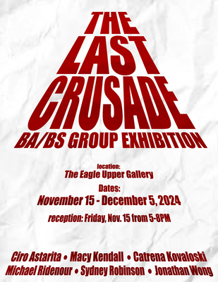
The Last Crusade
Macy Kendall
Since I was little, I was always drawing and it has always fascinated me. Drawing was something that allowed me to let my overactive imagination roam as a child and it also allowed me to bond with people. I remember being in Elementary School and I would have inside jokes with friends about some art project we came up with together. Growing up, in high school I was still the ‘quiet kid’ that people like my current partner thought didn’t even speak, until they saw me in the art room. Truth was, the art room was a release for me and I felt safe there. I felt free. I became infatuated with realism and how astonishing of a talent it was for someone to create, by hand, all of the intricate details that can be seen in the real world, even down to a microscopic level like the individual skin cells on large drawings of the human face. From what started out originally as a hobby, art soon became my life and I found myself striving to create realism. To be honest, I always knew I wanted to be an artist, but financially, I knew it would be a struggle to only create art. Therefore, going into college, I decided to pursue Graphic Design, hoping to continue to draw.
Looking at the illustrations I have created, my drawing style can still be seen peeking through. Somewhere along the way of developing said style, while I was originally wanting to do cartoons, I was taken back by realism. Eventually, my style began to be more and more detailed. When it comes to drawing, I think of compositions in my head about what I could create. While the subject comes to me relatively fast, I very roughly gesturally sketch my idea onto paper, then I make notes to the side if it’s necessary to establish anything I’m specifically thinking about, any ideas I have in the moment, or maybe colors that come to mind. Afterwards I typically get a few reference photos and then start to create the artwork itself.
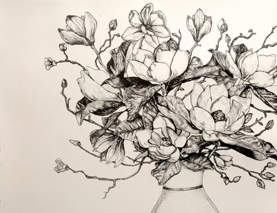
There is one goal that I have as an artist, I take inspiration from others, but I refuse to take inspiration from the subject matter of their work. With this being said, I’m inspired by Renaissance artists like Leonardo da Vinci, not by his famous painting Mona Lisa, but how he studied the world around him in drawings like Vitruvian Man. In fact, I’ve always taken inspiration from the Renaissance for my own artwork which has influenced me to create realism as well. Moreover, I’m inspired by Georgia O'Keeffe and her array of beautifully painted flowers, not to mention, her determination to continue painting even when her eyesight began to fail, which inspires me, someone with terrible eyesight, who will never have 20/20 vision, to continue to do something like realism. Even if I have doubts in my capabilities or the quality of my work, O’Keeffe helps me remember that it doesn’t affect my abilities as an artist and she motivates me to keep creating what makes me happy. I also take inspiration from David Carson, a graphic designer that creates work with the intention of breaking the rules, yet he creates something successful and cohesive, reminding me I don’t always have to follow the rules to be a successful designer. I’m not sure where my next work will take me, but I am excited for the journey that is yet to come.
Printing is not supported at the primary Gallery Thumbnail page. Please first navigate to a specific Image before printing.