

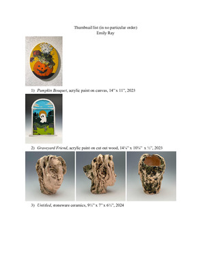
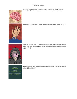
-

Professional Blend XX
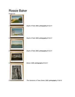
Rossie RF Baker
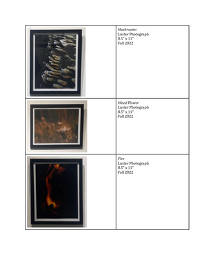
Over the years and with lots of considerations photography relating to landscape and nature are crucial to what I as an artist and photographer want to work with.These four photographs were a way for me as an artist to have free range on what I wanted to capture. Not only did I have free range with what I wanted to capture but as well as how I wanted to capture my photographs. At first glance it just seems that there are four photographs of trees. The point is not to just look and see trees but to look and see the different variations in the trees. See the different textures and see how some have open parts in them while others are full. I want the audience to take time to actually look and see how these trees are different and how they all have different histories behind them. We are constantly surrounded by trees but we never take the time to fully analyze what makes these trees different from each other. That's why with these photographs I want them to be a way they can be viewed from another perspective.
-

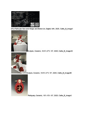
Callie Bowland - Various Works
Callie E. Bowland
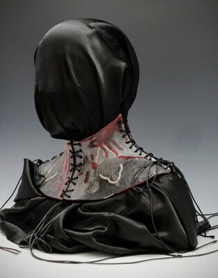
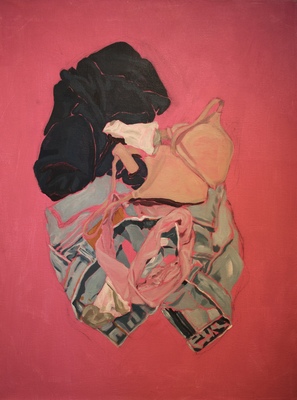
My ceramic works explore stress, masking, and how they affect the body over time, in addition to what can be considered the true self, and how society reacts to it. They all feature an element of abstract, twisting flesh.
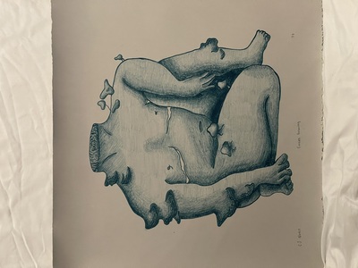
Reliquary uses it as a very literal interpretation of inner beauty, turning flesh and bone into an ornate vessel, playing with the parallel of the human body as a vessel for the mind. It also poses the question of what makes up a person, by contrasting the corporeal flesh and bone with a mask- like face–are we the physical body itself, or the image we have of ourselves?
Itch uses it in a wound, as a representation of physical tension and the human psychological state that parallels how an animal can end up scratching or licking at a painful spot until it is raw, not understanding that it is making their pain worse.
Ecdysis uses it to make up a figure that represents mental struggles and parts of the self that get hidden from others through masking the toll that takes on the body, as well as the relief that comes from removing the “mask”. With this piece I was thinking about how mental illness is often represented as demons and monsters that afflict the victim, and how people with mental illness, despite there being more understanding of it in today’s society, are often still treated with fear, disgust, and judgement.
Two significant influences for my ceramic work are Junji Ito and Louise Bourgeois. Ito’s particular handling of horror, especially in Uzumaki and The Enigma of Amigara Fault, inspire the way I’m abstracting flesh, and the body in general, as ropelike, twisted coils.
With Louise Borugeois, I’m especially interested in the ways she distorted the feminine form to critique how women are treated in patriarchal society. Her piece Arch of Hysteria in particular was an influence in Ecdysis, where I referenced and then distorted my own form.
My design work, a style guide for the hypothetical restaurant brand Of a Particular Size and Shape and Below Us, combines brutalism and concepts from nuclear semiotics to create an experimental dining experience that is expressly anti-human. The main influence for the style guide, nuclear semiotics, originates in a report titled “Expert judgment on markers to deter inadvertent human intrusion into the Waste Isolation Pilot Plant”, which contains proposals on how to deter future humans from entering nuclear waste disposal sites.
-
 by Kara Buchanan")
Professional Practices (ART 399)
Kara Buchanan
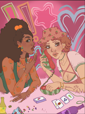
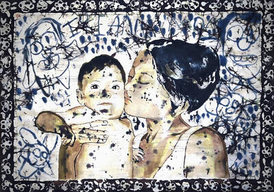
The National Library of Medicine reports that 1 in 4 girls are sexually abused
before the age of 18, and 81% of women in substance abuse detox centers report sexual abuse in their earlier years. Throughout my work I showcase the naivety and innocence of girlhood and how it can be tainted into hypersexuality and addiction in adult life.
With my work, I express difficult feelings and scenarios through a childlike, girly,
and whimsical lens. In scenarios of child sexual abuse and early addiction, there is a complicated combination of guilt, nostalgia for a time that never really existed, and desire. Although you don’t want those things to happen to you, without them you can feel undesirable or less than, which only adds to the cyclical nature of abuse. You continue to seek out that “high,” whether it be from drugs, sexual partners, or a reversion to a childlike state.
I work with a variety of fabrics, textures, and materials; as well as, what I call, a
“birthday party” color palette. Since I want my work to have an early 2000s, princessy, nostalgic feel; I use soft pinks, purples, blues, and yellows to give off a warm, fun tone to the immediate viewer. I often look to Maddie Duda as artistic inspiration, as she uses similar imagery and themes to me; I also heavily look to her textile pieces and how she uses color, layering, and texture throughout her work. Throughout my work, there is repeated imagery of fawns and deer to symbolize the innocence of young girls during childhood. It is important to me that while the work appears cute and whimsical, it is not mistaken for, or accidentally portraying, a romanticization or fetishization of these sensitive topics.
My work is typically autobiographical. I pull from memories of my childhood as
well as frequent imagery I was influenced by at a young age. I also reference old picture albums, diaries, baby books, toys, and other memorializing items of the time. Imagery of cigarettes is also repeated throughout my work. Substance abuse and smoking coincides with, not only my own, but many young girls, experience with sexual abuse and embarrassment. Children are heavily impacted by watching their parents, or other people with power over them, smoke as kids. It starts arguments, ruins trips, destroys your walls and your clothes, and damages your confidence. However, substances are also used as tools of manipulation and coercion into sexual acts from adults. This creates a blanket of embarrassment over the victim all the time. As the years go on, you can even find yourself turning to the exact same vices, becoming exactly what you swore you’d never be or relying on the exact vices used to hurt you. While in adulthood addiction is still embarrassing, there’s an additional layer of guilt for all of it.
I use a lot of markmaking in my work because I feel that the expressive quality of
the lines enhances the emotions being portrayed. Through lithography I am able to achieve a hand-drawn storybook quality that plays into the childlike aspects of my work. I also use screenprinting to build and layer color, and play with different fabrics and textures, in fun and childlike ways as well. The moments of play are just as important in my work as the structured and prepared elements. I incorporate elements of space through implied surroundings; while I don’t render entire environments for my figures, I use simple or abstracted elements to give them a space to exist in. I like to incorporate a range of values while maintaining monochromatic or analogous color palettes.
-

ART 399 Portfolio
Julia L. Burke Ms.
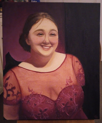
Julia Burke was born in Hopkinsville, Kentucky. She is a 21 year old artist who is a senior at Murray State University working on her B.A. in Studio Art emphasizing in painting and minoring in Museum Studies. In 2022, she participated in Governers School for the Arts for the visual arts category inspiring her to become a professional artist. Julia is an active member in the Hopkinsville Art Guild and an assistant to Griffen Studio’s Art Camp in the summers. Her work has been shown within the Pennyroyal Arts Council and in SRISA gallery in Florence, Italy where she studied abroad in 2025.
Julia’s work is a critique to the growing use of A.I. She uses her work to highlight the individuality and uniqueness of visual art by exploring the imperfection of painting mediums. Themes of her work focuses on the human experience by looking towards her community and rediscovering her german heritage. Creating portraits, landscapes, and still lives using watercolor, oil paintings, and ceramics.
-

Art399-01-SP26 - Final Portfolio/Promotional Packet
Lisa A. Greene
I am an interdisciplinary and multidisciplinary artist deeply committed to the exploration of creative expression across a myriad of media. Emulating the spirit of a modern polymath, my work is a tapestry woven from diverse influences. My journey of creating my work fills me with immense joy. It empowers me to confidently express my unique approach to artmaking in a spontaneous and energetic manner. I hold a profound affection for the tactile experience of painting on canvas. This has evolved into a process akin to sculpting clay directly on canvas.
In my recent work, I have delved deeply into the motivation of my work and discovered that when creating my pieces, I have begun to be open about what it is like to live with chronic pain, limitations, and disabilities. My work has moved from an exploration of beauty to an investigation into conversations with myself about what it is like to live with chronic pain and disabilities.
My new work has evolved into a new form of sculptural abstract art for me. It invites viewers to explore the emotional layers embedded in my pieces. I have created canvases that, in themselves, evoke a sense of movement. These layers of fabric on canvas allow the structure of the pieces to reveal hidden aspects of the work that emerge only when paint is added to the fabric-ed canvas. These pieces have taken on spontaneity and purposeful mark-making to create a visual representation of a momentary feeling. Additionally, I have drawn inspiration from the works of Sam Gilliam, blending colors within the fabrics of my pieces. Some of these moments have been brought together to continue a conversation, like a thought or a sentence. These woven fabrics and textiles I have incorporated into my work strive to evoke a sense of beauty and intrigue, expressing the private journey I have been on with chronic pain.
I want my work to be free from explicit meaning or direction from myself. I wish to encourage viewers to engage with the authenticity of my creations, allowing them to carve out their own interpretations. I would like the viewer to experience the wonder of the art I have created and, simply by its existence, be prompted to reflect and form a personal connection that transcends traditional narratives.
-

Olivia Hargis Art399 Portfolio
Olivia Hargis
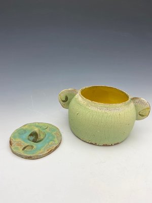
The works displayed were all created with the rural aspects of my life in mind. Each of these pieces are personally significant but more important than that, they serve as a mental bridge for anyone who grew up in the country. The mudpie is a childhood past time for so many children who grew up on farms, having fun with what materials they had available to them. The heroic form serves as a decorative object, with the form developed from the idea of a seated hummingbird feeder. This unique form, floral design, and simple color palette elevate the surface of the piece and invite the viewer to move around the work. The design of the metal broach was developed from memory of a tractor tire. The broach was made for a left handed individual, my father, who works relentlessly to provide for his family, like many others in a rural community.
-

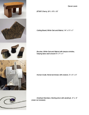
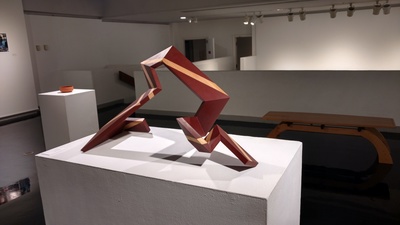
A Study on Architecture
Daven W. Lewis
My name is Daven Lewis and I am a multidisciplinary artist who mainly focuses with the mediums of metalsmithing and woodworking. I am currently an undergraduate at Murray State University, with an estimated graduation in the fall of 2027. Through my practice, I make work about modern architecture and its correlation to the loss of craftsmanship found in everyday life, using metal and wood to create geometric sculptures meant to emphasize the forms I see in this architecture every day. Through my work I aim to talk about the increasing industrialization of the world, along with the complacency that coincides with economical hierarchies. I use these broad ideas to research into specific concepts such as human scale, modern Greek revival, and the simplification of form in order to follow function. The forms used to express these concepts are based off the artworks of individuals such as Eleanor Moty and Lee Peck.
-

Art 399 Portfolio Final
Ansley M. Singer
What inspires me to make my work is my quirky personality and how my mind works. I want people to understand that art does not have to look perfect or that the artist is not good enough. Personally, I have never really felt good enough to be an artist, and I continue to question why I am an art major. My mental health has been a really important part of my art. I use art to work through my emotions. Using clay helps me show the way I want to communicate to people about my art. Nothing has to be perfect. I want to show people that it is okay to feel awkward and out of place, like I have most of my life, and I still do. I hide my true emotions away from people because I am scared of being judged. Art is how I cope; I’m not making it for someone. I’m making it for myself. My work is Chaotically Beautiful.
-

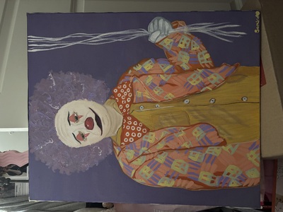
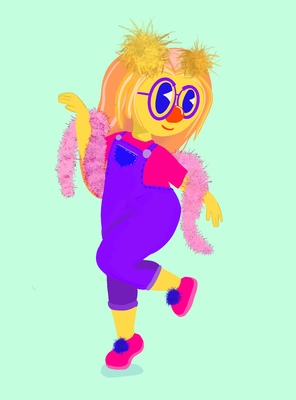
"Jakyah Acree's ART399 Portfolio"
Jakyah Acree
When viewing one of my artworks, one will usually see a painting, drawing, or digital work. The painting or drawing will be that of a portrait or a subject matter. The subject at times can learn toward realism, other times I like to create more animated styled characters.
While I’ve always had a passion for creating detailed value-filled portraits in realism, my journey began with the excitement of bringing art to life with illustration.Growing up in a small town of Cadiz KY, there was very little excitement. Not only that, but I was a girl of few words, finding it hard to express myself to others. Until I found my love for making art. Art became my expression, I find great joy in creating beautiful characters or portraits that exclude both depth and emotion. After losing my mother in my early college years, I learned that I have an infatuation with being a character artist. In my formative years I’ve always loved the endless creativity of illustration and it has since then evolved into a boundless exploration of my nostalgic imagination. I yearn to rekindle the childlike sense of wonder within my audience. Taking inspiration from color and expression like that of Takashi Murakami and Karen Kilimnik. Creating these original characters allows me to storytell which I enjoy. It reminds me of my childhood of watching a lot of cartoons and animations. Between telling a story or expressing an emotion, It all plays into the tone of the piece that I’m looking for.
While on my artistic journey trying to figure out what I truly enjoy, I came to the realization that I just wanna have fun. I want to enjoy what I do and for my art to speak to viewers as so. My dream would be to specialize in character design or become a doll designer. I really enjoy creating the subjects themselves, bringing my childhood memories and fantasies to life.
-

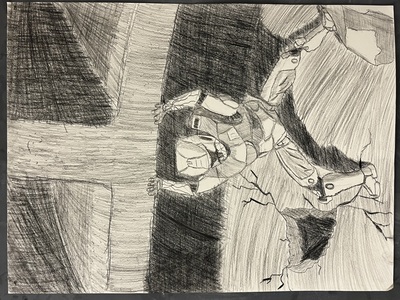
Zach Alexander Art399 Portfolio
Zachariah M. Alexander
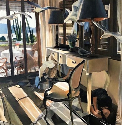
The work I create theatrically explores my identity through reflections on personal experiences. Each piece is layered with multiple meanings, like the pros and cons of childhood or learning about self-reliance. Across mediums, there are aesthetic choices to convey the accuracy felt in moments of low spirits. There's an eccentric and personal aspect in the pieces that intertwine with my life. The common trait in the work often incorporates movement to convey past emotions. Darker tones create disorientation and confusion, setting the scene and foreshadowing deeper meanings. Some pieces reflect the past and address ongoing issues."Echoes of Childhood" reflects my complex relationship with my past. A teddy bear symbolizes innocence and nostalgia, with a clay heart wrapped in wire to represent trauma and the lasting impact of childhood memories.
Another example is "Alone," a photograph capturing the experience of feeling isolated as a new adult. Using Rembrandt lighting, I conveyed emptiness, with the figure holding herself to symbolize self-reliance during sorrow. "The Imperfect Balance," a ceramic piece, explores identity by rejecting conventional forms. Finger markings create dynamic movement. The clay is shaped into an unconventional form with an odd texture and moody colors. A bright mossy interior contrasts with the exterior, enhancing the appeal. These stylistic choices and meanings illustrate a journey of self-discovery, capturing the mind's chaotic nature through reworked mediums, symbolizing overcoming obstacles and personal growth.
Going into the central theme of the works, there are a couple of direct influences from artists in each of the pieces. The photograph took inspiration from David Lachaplle's use of vivid imagery and unique compositions to create a more striking and emotionally impactful scene. “Echoes of Childhood" blends the innocent image of a teddy bear with a haunting twist, like the artist Marcel Dzama's work. The juxtaposition of the familiar and the eerie is a hallmark of Dzama's work, making the piece thought-provoking. “The Imperfect Balance” used influence from Marlou Fernanda's concepts by featuring expressive forms with rhythmic finger marks. In conclusion, the work is a journey of healing and growth, illustrating vulnerability and progress. Upon reflecting on the art , it is ulinately a visual representation of an artist finding their way and healing their soul piece by piece.
-

AdamAshlock Art399 Portfolio
Adam R. Ashlock Mr.
Art is a space where humor and absurdity are welcomed with open arms. It's a way to break down barriers and connect with others—especially when traditional social interactions are challenging. Growing up with Autism Spectrum Disorder (ASD) means I've navigated a world that often feels out of sync with how my brain works. Conversations are challenges, and it’s easy to feel disconnected from the people around me. Humor, however, has always been my in. It's a great way to find common ground and create a shared experience that feels natural even when other forms of connection don’t. Whether through animation or live-action, humor and storytelling in these films serves as a way to reveal deeper truths about life, even in the most ridiculous parameters.
Aesthetic choices often lean toward subversion and unpredictability, taking the ordinary and transforming it into something strange or comedic. Freelance is a perfect example of this approach, a live-action project reflecting the experiences of a broke, full-time college student. The video follows my attempts to earn money through odd jobs over two days, only for it to vanish in an instant as debt takes over. The punchline, “I hate my life,” followed by a bouncy credits song, captures that dark humor and highlights how even the mundane struggles of life can become a source of comedy. Humor here is more than just entertainment—it's a coping mechanism and a way to make these universal struggles more relatable and enjoyable. I work in both animation and live-action, using each medium to explore humor in different ways—animation gives me the freedom to push the boundaries of reality, while live-action offers a more grounded, human experience.
With Autism, thinking is unpredictable and often non-linear. I don't fully plan out my projects—just a rough outline—because trusting instinct and letting ideas develop in real time is how the best work happens. Thoughts jump from one idea to another in unexpected ways, and the unpredictability is something I embrace in the film process. This free-flowing approach often leads to random, absurd ideas, and it’s in this space that the most interesting creative decisions are made. Animation, in particular, resonates with me because it most mirrors how my mind operates; It's silly, whimsical, and a little detached from a straight pathway. It's a special interest that's very near and dear to me.
In the same light, the work of contemporary artists deeply shapes how I approach storytelling and comedy. Craig McCracken was a man who started young in the industry and hit gold with his brilliant techniques, his shows having emotional depth, character-driven stories, and bold visual styles. The defiance of Everett Peck’s Duckman was like hate mail to the censors, defying the expectation that crude, rude and dark humor couldn't touch your heart and be a major player in adult animation. It's here where I derived my comedic philosophy that nothing is truly off limits, and that Comedy should always leave you different than when it found you. John Baldessari’s use of humor to break down conceptual barriers is another influence. His ability to challenge the status quo while engaging with absurdity is something I aim to replicate—high-concept humor mixed with accessibility, challenging norms while inviting people in to laugh along.
Ultimately, my goal is simple: to entertain. Having Autism has made connecting with others difficult in many ways, but through these films, I’ve found a way to bridge that gap, and show people the many facets of who this artist is. This work is a conversation with the audience. No matter the reaction, the only hope is that the experience will create a lasting memory, one we can both share. Through my work, the message is clear: This is who I am, and I hope you enjoy what you see, friend. -

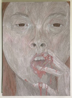
Isabel Bolanos
Isabel Bolanos
Creating art serves as a profound and meaningful avenue for me to connect with my inner self, particularly during moments when words seem feeble and inadequate. The struggle to articulate my emotions verbally often leaves me feeling lost, but through the act of creating, I find a refuge—a safe space to delve into my thoughts, cherished memories, and personal challenges. By immersing myself in various artistic mediums, I explore intricate themes of memory, identity, and emotional resilience. I hope that my artwork not only serves as a form of personal expression but also helps my family gain insight into the complexities of my experiences, illuminating the struggles I often cannot convey through speech. Living with Bipolar II has significantly shaped my artistic path, transforming the act of creation into an indispensable means of communication with the world around me. The nuances of my personal experiences and treasured memories deeply inform the subject matter of my work. I primarily utilize pencil and charcoal, employing meticulous realism and rich symbolism to express my emotions and ideas. While I typically embrace a more monochromatic palette in my drawings, photography allows me a different realm of expression. In this medium, I revel in the vibrancy of bright colors and bold contrasts, which evoke a nostalgic feeling that resonates deeply within me. Ultimately, my memories manifest themselves in my art, serving as poignant symbols of the miscommunication that frequently permeates my life. Additionally, I am drawn to 3D works, as I thrive on the tactile experience of interacting with my creations, pouring my dedication and labor into every piece. Though I've navigated the art world for some time, I find myself at a crossroads, grappling with uncertainty about the essence of my work. This introspection leaves me struggling to articulate both my personal narrative and the stories embedded within my art, creating a sense of vulnerability that I continue to navigate.
-

Ryan Bridgforth ART399 Portfolio
Ryan Bridgforth
Inspired by the philosophies of design duo Dunne & Raby, my work bridges research, future thinking, and creativity through a process known as speculative design. Partially inspired by my own experience with chronic illness, as well as interest in human technology interaction through writers like Charlie Brooker, my recent work focuses on telling the story of neuromodulation, a technology that uses stimulation to alter nerve activity, typically to fight drug-resistent pain and chronic conditions. Product design, advertisements, and other future objects are used to envision a world where this technology is as prevalent as smart phones.
Though the topic is extrapolated, this technology could allow us to control our emotions and states of being in the future, bringing up new debates about the ethics of human inhibition and enhancement and our reliance on technology. Presenting this as a possible future through my work forces viewers to be confronted with new values and considerations about the future. For instance, the posters REHABILITATION, NOT MANIPULATION and Give Second Chances, Safely present a debate in which the government has proposed a law in which incarcerated individuals could receive neuromodulation treatment in exchange for reduced sentences.
The creative process behind these pieces is heavily inspired by the work of design-based research studio Extrapolation Factory, who scan for signals of possible futures and imagine them through design and happenings. I work in many mediums: graphic design, digital fabrication, sculpture, video, whichever communicates the topic best. Focusing on creating bold, contrasting designs that catch the eye, I mold imagery and typography into rhythmic compositions. Creating shared connections between my pieces through common imagery, as well as subtle details that imply bigger concepts, I reward close inspection. Ultimately, my goal is to consider what we are made of: not by providing all the answers, but by asking questions and bringing new debates to the table, sparking conversations to help navigate our future.
-

method in madness
McKenna A. Brownfield
My art allows me to show people the world from my perspective. I have autism, so many things are different for me. Through bold lines, geometric shapes, and intense contrast, she creates work that captures her unique perception. I use charcoal, and color conveys unrealistic and unnatural forms that exist to emphasize that they're in my mind rather than reality.
The art has a lot of floral aspects; it makes the connection between nature and people; without people, nature will overgrow and demolish any/everything, yet without nature, people would never survive. The deformed people are based on me; I deal with horrible body dysmorphia, the deformed/masked face is what I see, with the use of harsher colors or cuts like in the ceramic faces to show people what I am seeing. In some pieces, there is the use of symbols and items that are associated with witchcraft, like the triple goddess in the light part of my self-portrait and the candles on the table. Colors in my pieces help with the unrealistic nature, like the highlights not making sense or being overly dark. I use leading lines. I use fabrics in pieces almost as a break from the solid shapes and never-ending lines. The harsh shadows and strong lights give the viewer more fluid, soft breaks in the piece, as seen in the figure drawing, in the woman's dress. I primarily use charcoal and conte to create my pieces.
Like my favorite phrase, “There is method in his madness.” Shakespeare, Hamlet. Tim Burton’s recognizable, unnerving style inspires the exaggerated features in my pieces. John Nolan’s bold palettes relate to how I use color to exaggerate elements of the piece, like in my self-portrait. Philip Gusto’s deliberate, sharp use of line is similar to my figure drawing. When I use charcoal, it's for the flexibility it has as a medium and the mess it creates, which helps the piece become mine. I use color to separate some aspects that I want to highlight. The use of the messy medium shows the madness that I see.
-

Professional Practices Art399
Bronwen K. Chun-Ming
I work in oil paint, as well as clay. These mediums allow for expressive and textured application of medium. My love for ceramic work started in a 6th grade ceramics class and has continued to grow during my time at Murray State. Clay as a medium lends itself to the themes of my work, human and bodily experiences. Clay keeps a record of every touch and mark, creating a deeper connection between myself, the work, and viewer. My ceramic work is handbuilt and intentionally related to the figure/body. Finished pieces are rarely glazed and are instead treated with oxide or salt washes to keep the integrity of the touched surface. Glazed pieces are done in thin, sculptural glazes, adding texture to the surface while still preserving details on the surface of the clay.
Oil painting was introduced to my practice until my time at Murray State. Oil Paint is a rich and expressive tool in creating works of the figure. Much of my stylistic and technical process is drawn from the baroque period, inspired by bold lighting, expressive and dynamic compositions, and intense emotion. I have recently started exploring techniques in grisaille and impasto to achieve dramatic and painterly qualities within my work.
In both ceramics and painting, I explore conversations of human emotions and bodily experiences. Creating works that deal with bodily representations of experiences and feelings allows for a personal connection between the work and the viewer, unique to each individual. Influences for my work come from a wide variety of media, both visual and otherwise. A large influence on the form of bodies come from stage performers, including dancers, theatre productions, and singers. Non-visual influence often comes from my own bodily and emotional experiences, as well as music and books.
While at Murray State, I have had the pleasure of meeting Sunkoo Yuh and watching his process in ceramic sculpture building. His technique of building large, self supporting structures and sketch-like approach to the human figure have impacted my own process, inspiring a looser approach to the figure. Loie Hallowell’s approach to her own bodily experiences and expression of her lived experiences in her work has been a driving force into my own exploration of similar topics. In my continuing work I strive to connect with my audience through addressing shared experiences and feelings, creating a space for connection and reflection.
-

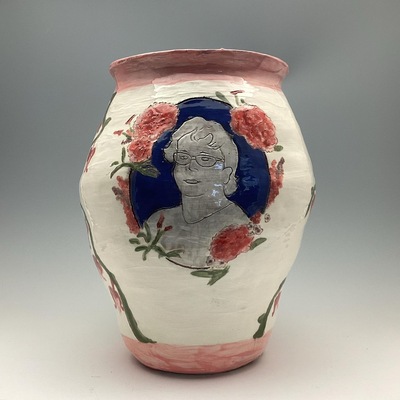
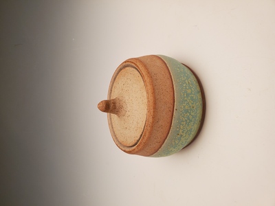
Rose Craig Art399 Portfolio
Rose m. Craig
My work often explores personal narratives related to family and childhood, using line, shape, form, and value in a representational style. Heirloom, a cylindrical nickel box with a symmetrical design of organic and geometric shapes, reminiscent of 1930s pill boxes, featuring a mother-of-pearl. Inside the box is a small brass pillbox hat. I chose to create a design and a hat that calls back to the word pill to not only symbolize heirlooms but also how mental illness can be passed down generationally. The mother of pearl symbolizes my family’s traditions of passing down heirlooms from mother to daughter.
While developing my 2-D and 3-D mediums skills is important, I feel most connected to 3-D art. My piece, Nature's Security Blanket solidified this. No matter the medium, I always start by sketching my ideas to resolve any compositional issues, with many of my compositions having asymmetrical balance or using rule of thirds.
When I began creating in 2-D, Caravaggio's use of contrast heavily influenced my work. Recently, I've shifted towards a more colorful, dynamic style, inspired by artist Janet Fish’s use of color. My piece Fair, showcases this with its giant colorful swirl, lights, and golden rope trim. Jewelry artist Belle Brooke Barer also inspires me, especially her use of shapes and space, which influences both my pieces Heirloom and Fair. Moving forward, I’m committed to exploring personal narratives using space and color to draw the viewers deeper into the story behind each piece.
-

Ella Cate Downing Art 399 Portfolio
Ellen C. Downing
Artist Statement
Ella Cate Downing
Rooted in subjects such as Faith, growth, and Biblical truth, while incorporating child development and how a child interprets certain subjects, is found throughout my work. Drawing from narratives that come from the Bible, and how children learn and understand these topics. My work draws directly from scripture and utilizes symbolism to help children learn and deepen their Faith. Intertwining both how a child learns and my Faith is ultimately what my works are about.
Soft, vibrant colors and a more simplistic style are what viewers see within my work. Using a more illustrative minimalist style makes it pleasing to the eye and easier for children to comprehend. The medium of painting lets this style come through very successfully. Within painting, it gives you the chance to blend and mix fun, vibrant colors and smooth textures. When all of these things combine, it creates a smooth, seamless composition. Within the world of painting, I have explored oil paint, but have recently focused more on using acrylic paints. Using this type of medium is more versatile, while still giving a texture that looks polished like.
These works are drawn from a variety of influences, one big one being the Bible. Combining scripture along with childhood experiences and how children develop is what brings my work to life. Drawing on impactful parables and stories from scripture, I utilize imagery and simple forms to effectively communicate and break down important truths. Exploring different artists who either use scriptural references or are children's book illustrators is what has physically influenced my work the most. All of these influences come together to make work that is grounded in Faith and growth.
All of this comes together to make up work that is rooted in Faith and Biblical truth, along with making it easy for all to understand. Using parables, narratives, symbolism, and imagery, and intertwining child development makes the work easy to understand. Combining both how a child learns along faith is what my work encapsulates.
-

Bryce Drake ART399 Portfolio
Bryce R. Drake
Every person has to grow up, but that doesn’t mean we have to let go of our childlike wonder. Our imaginations can be an escape, letting us temporarily run away from reality to something refreshing and healing. My work embraces my love of everything soft, round, and whimsical to create art that embodies the safety, joy, and adventure of childhood.
By working digitally, I create works with bright colors and larger-than-life characters that have a sense of whimsy, separated from the physical world. When working in Adobe Illustrator or Photoshop, I begin by sketching layouts and characters on paper or on a tablet. I then transfer those sketches into the programs and build designs underneath them, starting either with simple shapes or varied lines. The Harbor Seals flyer uses curved shapes to build a soft seal character who, though believable, also seems to have a friendly smile. The flyer’s rounded, legible typography in various weights feels both exciting and safe. Distorting the proportions of characters can allow them to be more expressive and relatable, like the characters in my illustration, The Lion and The Mouse. Their facial expressions are exaggerated to connect their emotions with the audience, and their bodies are rounded like the world around them, making them seem more playful. Even in my brand designs such as Cozies Café, using bubbly, rounded typography can make the brand feel more inviting and entertaining, and creating dynamic type lockups adds movement and excitement.
My use of bright, saturated colors and playful proportions are inspired by Devin Elle Kurtz and Sam Yang, who use these elements to create larger-than-life scenes that draw the viewer into another world. Kiana Khansmith also uses these lively proportions along with strong expressions and movement to create characters that feel exciting and relatable. These three artists challenge my use of color and proportion, pushing it further so that I can make a world that sweeps a viewer back to younger, safer, happier times.
-

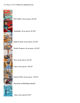
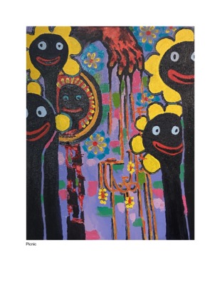
Raini Evergarden: ART399-FA25 Portfolio Final
Raini Evergarden
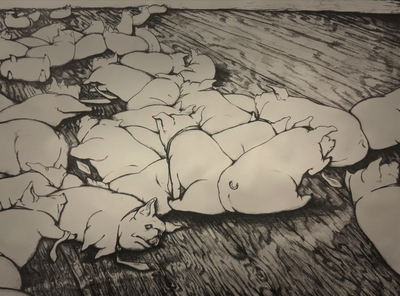
The value of an American worker has long since been measured in the value they provide in the enlargement of a billionaire’s wallet. Manipulated and oppressed by the system, American laborers have been reduced to shells of themselves, their sole purpose to keep the machine running. My work picks up the broken narrative and reflects the modern effects of violent American Capitalism on the working class.
Lithography and book arts are inherently anti-capitalist. The process and laborious nature of printmaking and bookbinding is inefficient, unruly, and full of failure. It resists the capitalist obsession with speed, productivity, and optimization. Through these methods, my work offers a perspective on working-class life. One that represents American workers and their lives honestly, their struggles, sympathetically. By using corporate objects and controversial livestock animals–such as pigs– to represent workers' simultaneous complacency and oppression, I can better reflect the underlying injustice that the American system perpetuates. Printmaking evokes lustrous textures and expressive linework that is often a nod to the underlying exhaustion behind the figures and objects. Inspired by Micheal Barnes surrealist landscapes and soft rendering, I make imagery that might not always be real, but is always, reflective of the real emotion.
Much of my inspiration comes from both observation and conversation. Inspired by Kelly and Kyle Phelps, ceramicists who depict American labor, my lithography book, Inheritance, was inspired by an inside wireman at IBEW 702, who described her life as, “Inherited labor, with no reward”, influencing my use of negative space, and rich values, to illuminate how capitalism has structured her life. Ultimately, my work is a wake-up call. One that seeks to reflect an emotion that the average laborer can resonate with, one that might inspire them to move beyond their slaughter, and promote resistance.
-

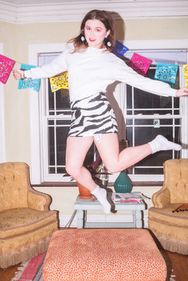
Kailee Goff Art 399 Portfolio
Kailee Goff
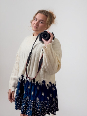
My current body of work explores the intersection of graphic design and photography through the format of a lifestyle magazine. This work highlights individuality and diversity, an appreciation for the uniqueness that each person has to share. By combining visual storytelling, portraiture, and thoughtful layout and typography, this project creates a space where people can be seen for who they are and celebrated for their individuality.
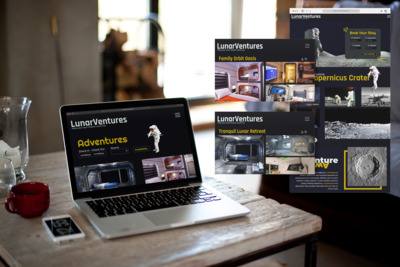
I sought out and photographed some individuals I had never met before, engaging with their lives, perspectives, and stories. Each photography and layout design was created using Adobe Creative Suite, merging image and typography to celebrate individuality. I purposefully selected iconography, such as re-occurring objects from their daily lives, to emphasize key aspects of their character. To highlight the subjects’ differences, I separated them using monochromatic color pallets, allowing the iconography, typography, and imagery to stand out and distinguish each section of the magazine in a playful way. Influences such as Paula Scher, who uses design as a form of storytelling and representation, Cipe Pineles, whose playful modernist style connects image and type in editorial work, and JR, whose portraits give my approach and reinforce the purpose behind this project.
At its core, this work reflects my growing understanding of the value found in every person’s identity. Beyond our differences – we all deserve to be acknowledged, understood, and celebrated. Each composition serves as a reminder that diversity is not just something to observe, but something to embrace as a defining part of what connects us all.
-

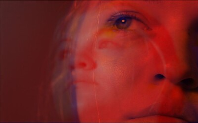
Katie Hart Art399 Portfolio
Katie Hart
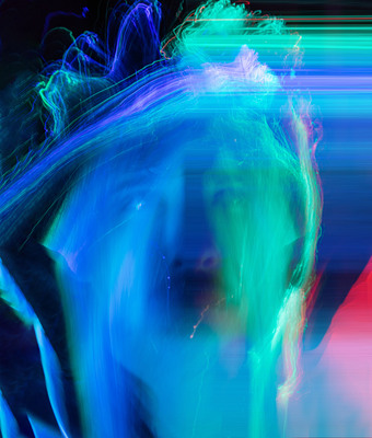
Recently, I have begun exploring color as an emotional language—one that can communicate the complex and often contradictory aspects of the human experience. Color is not merely a visual tool; it is a deeply emotional medium that conveys the subtle tensions, contrasts, and harmonies inherent in the process of self-discovery. Through photography, I delve into the concept of self-duality, the coexistence of seemingly opposing forces within us, and how these forces shape our understanding of who we are. Within some of my portraits, I explore the tension between organic and geometric forms. By applying contrasting values—highlights, shadows, and tonal ranges—to suggest depth and mood. This conflicts with other photos, where the geometric forms engage with pattern and rhythm instead. The transition of focus through the depth of field is central to my digital work, allowing me to play with texture and tone in different ways, but the underlying goal remains the same: a snapshot of an emotional and psychological state that may evolve or transform as time moves forward. Through this process, color becomes a visual representation of transformation itself. Self-duality reflects the inherent contradictions of the human condition. We are constantly negotiating between light and darkness, certainty and uncertainty, peace and turmoil. Color becomes a way to explore this internal conflict, embodying the emotional and psychological spaces between these contrasting states. By using color, I am able to reflect the fluid and dynamic nature of identity, acknowledging that who we are is never static. Our emotional landscapes are layered, ever-changing, and composed of diverse hues that can both clash and coexist. Photographer Uta Barth and her study with light and how it interacts and abstracts onto things, has been a recent new influence for me. One such example that I wish to explore further by pairing two pictures that share either a small moment or juxtaposed with one another in some way. Whether it be implemented with abstract self portraits combined with natural landscapes or lighting, the connection between the two will seem to meld into a feeling. Ultimately, my work is about more than the visual—it’s about preserving the beauty that exists in small, often unnoticed details, and offering a glimpse into the emotional layers beneath them. This intentionality is influenced by the work of Sally Mann and Imogen Cunningham, who inspire my approach to tone and composition, Uta Barth’s study of abstraction in light, as well as Brooke Shaden with her past projects involving a closer look at the concept of death.
All this to showcase that I’m still developing which I will pair together, but the emotion the two either display will be something that seems fleeting, the question of whether or not we are the result of our own making or if we can go against ourselves and change. -
 by Hugo S. Hodge HSH")
Future - 2025 (2nd Annual Juried Exhibition, Promotion, Sales)
Hugo S. Hodge HSH
Hello. Hugo Hodge is a creative working artist in Saint Louis, Missouri for graphic design and illustration. The work involved includes the student work of unofficial brands and collateral designs from both material and phantom companies like the Cincinnati Art Museum’s unofficial “Corporate Annual Report”, Grephone’s digital “Logo Package”, and the fictitious Mach Pizza’s “Branding Style Guide” from my Graphic Design classes. The main idea behind the work is to communicate a “vibe” or “strong image” for the subject it’s designing around, in order to tell the viewer Additional student work include engaging user interfaces for mobile applications (UI/UX Class) and appealing children’s book illustrations (Illustration). Outside of my student work, Hugo Hodge had a Romeo Films internship for a movie trailer/poster series (1207, Cocaine Time Machine) and a bunch of posters for advertising an art gallery (“Today I See Myself”). Work on his own time includes unofficial collateral merch (posters pamphlets, coins) for 2024’s Quakecon convention in Grapevine, Texas.
In addition to digital work like graphic design and user interface, there is a large array of physical work to look at. Pen drawing and comic work specializing in reference and imagination drawing for figures/still life is a strong point in Hugo Hodge’s portfolio. These drawings often stylistically involve linework of various pen thickness marking forms that change perspective, shape, and posing to deliver a feeling of dynamism through these repeating forms in space. With his observational skills in conjunction with the design sense of typography, white space, and composition, he will have work that’s versatile enough for whatever artistic need you have. -

Matthew Lopez Art399 Portfolio
matthew W. Lopez mr.
Artist Statement — Matthew Lopez
At the heart of my practice lies Lucky Void, a persona and creative extension of myself that thrives within and alongside the warfighting community. My work is a tribute to the culture and contradictions that define the modern warrior. Through the use of mediums such as graphic novels, videography, photography, illustration, and the reworking of "acquired" military gear, I explore the identity and aesthetics of those who live within our niche community.
The visual language of Lucky Void rejects the overused tropes that dominate both mainstream and military art—the endless parade of skulls, nods, and clichés. Instead, my work draws from the shared imagery many of us grew up with and reinvents it through the scope of military life, much like the transformative process of indoctrination itself. What emerges is something familiar yet still completely distorted—a reflection of how the individual becomes part of a collective story.
Ultimately, my work exists almost exclusively “for the boys” as both an act of creative expression and a communal rallying point. It’s constantly a reminder that even within structure, there’s room for distortion, humor, absurdity, and art. Through my work, I aim to redefine what warfighter art can be: raw, self-aware, and deeply human.
-

Luke Medley
luke c. medley
Creating artwork with physical durability and enduring conceptual impact in order to leave behind a tangible legacy, or something permanent, in a world that is constantly changing is my goal. In this art form, I make two-dimensional drawings, three-dimensional objects, and functional wearable art. I am truly exploring how I can make art in a way that not only looks good but can be used with an aspect of craftsmanship.
For example, I emphasize value with dark and light areas of a subject to show lots of detail just like artist Chuck Close when creating the charcoal drawing of my grandfather. In this work, form is strongly evident in my three-dimensional works as seen in my cardboard chair, which I translated an unconventional material into a functioning chair to sit in. Texture is an impactful element that I utilized in my artwork of the chair, incorporating a tangible woven pattern that engages with the user. For Example, Tim Kowalczyk who creates three-dimensional ceramics with the intent to make dishware look as if it were made of cardboard, helped with my building process of the chairs design. The principle of proportion is shown through the example of my cast silver rings. The use of measuring and accurate sizing was necessary for the casting process as well as the filing and sanding. I used emphasis as a method to show detail while allowing the rings to have an implied texture from the porous cuttlefish bones. Taking inspiration from artist Isamu Noguchi, I used unity by incorporating the same shapes to the top of the silver rings as he did in his free-formed furniture.
My artistic process begins with a vision of a final product and tested through a series of fixing mistakes and learning what works while continuing to be inspired by similar artists. Keeping my mind active helps me to visualize the final result which I personally find to be the best part of the process.
-

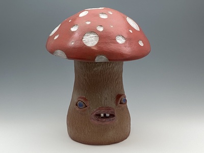
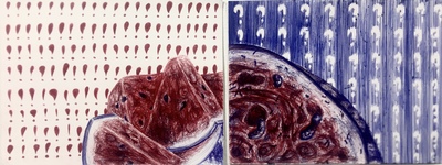
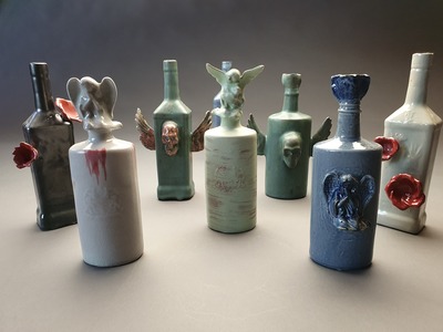
Profession Practice Portfolio Spring 2025
Cheyenne L. Pender
Artist Statement
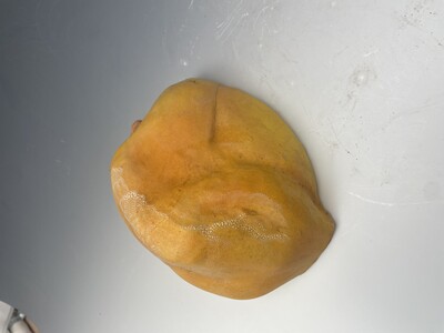
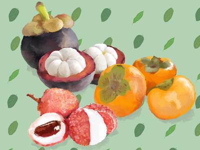
Fruits have long been used as a metaphor for women, reducing them to symbols of ripeness, sweetness, or fertility. Fruit is scientifically defined as “the fleshy or dry ripened ovary” of a plant. However, with my experience with making ceramic sculptures, I continue to find more and more similarities between the two that I wish for those around me to discover as well. My work is an experimentation on how the female body can be portrayed through fruit and how beauty is subjective.
In developing these artworks, I study fruit shapes and women figures combining coil building with carving to shape fruit figures. I am focusing on “zooming in” on the figure to have the audience decipher what I am showing and why. I study how different body types in the same position differ, and make them into sculptures to make my audience see them and compare them to fruit you would buy at a fruit market.
In Spring of 2024, I looked into Jessica Stoller whose work deals with idealized femininity and objectification. Her sculptures work with the female body and food, making comparisons more with desserts. Upon researching Jessica Stoller, I quickly became inspired by Feminization Theory which talks about how femininity is framed through a variety of contexts such as age, sexuality, body size, style, and culture. Femininity is defined differently by people based on their beliefs in the contexts mentioned above. However, many of these are passed down beliefs, and it influenced me to let my audience know how they observe/objectify.
My most recent inspiration has been Daniel Maidmen, a 2-D artist who focuses on drawing figures. I take inspiration from his female portrait poses, which focus on the curves and form of the female figure. He purposefully sketches voluminous poses such as stretches, bending down, and fetal positions
Printing is not supported at the primary Gallery Thumbnail page. Please first navigate to a specific Image before printing.